Prototyping of the main page of flamp.ru articles
The task
Redo the Articles page ( http://novosibirsk.flamp.ru/articles ). The result is one layout in PNG. Task: make the user want to stay on this page as long as possible.
Small lynch
')
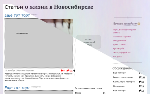
(the picture is clickable)

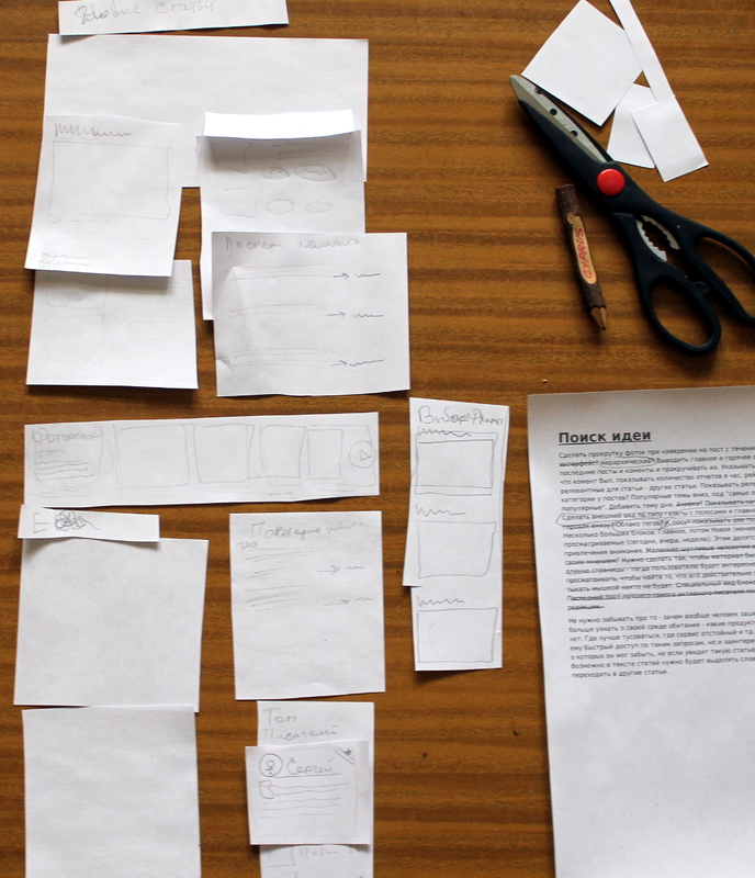
Search for an idea - I think about the task and write out everything that comes to mind
Do you scroll through the photos when you hover over the post over time, tiled interface? hierarchical? Display the main and hot right. Show recent posts and comments and scroll through them. Indicate in them a link to what was a comment, show the number of reports per hour, the rating of articles. Show relevant articles - other articles. Show relevant reviews? Tags, categories in posts? Popular topics are down, under "most discussed" and "most popular." Add a topic of the day. Achivki? Show the beginning of the text from the article. Make the look of a newspaper with stripes and the main theme. Topics in other cities below? Tag Cloud? To post show two similar in the form of lines. Some big blocks: Main, then New (less active)? Most viewed (today, yesterday, week). Are they sharing this? Unusual news to attract attention. Little funny people in the design with tips and their opinions? It is necessary to make the material diverse across the entire length of the page - then the user will be interested in scrolling and viewing it to find what really interests him. Once again, no one will poke the mouse. Special type of blocks for photo reports. The last post is the best most active post writer, top writers. Editor's Choice.
Do not forget about that - why did people go to this page? He wants to learn more about his habitat - what foods to eat and what not. Where better to hang out, where service sucks and so on. It is necessary not only to show him quick access to such requests, but also to be interested in similar problems, which he could forget, but if he sees such an article, he will remember it. Perhaps the text of the articles will need to highlight words so that you can move on to other articles.
Making an application from modules
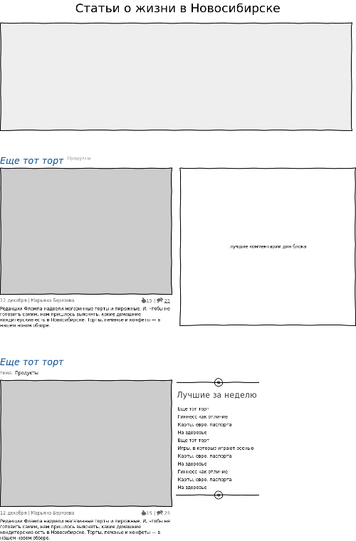
Sketch # 1
We send the picture under the heading in the block, because the picture above the heading is applied somewhat in other situations. Add the best in plain text. They will click on the best just because it is the best. Since the titles of the articles are rather short, one can play with the place and position of the best. We are thinking about putting out the most important news in the form of a large block, so far I don’t like it. Add a section for the article, because many look at the section before reading the article. Add the name of the author of the article. A person should be proud of the fact that his name is emblazoned on the main one, because people generate content - loyalty is needed. Yes, and people will throw links in the spirit of "look at my article" not only on a specific article, but also on the main page with articles. We are thinking of putting the best comments next to the block - often people come into an article to read comments with a better rating, because more often they carry more useful information than the article itself. We add the beginning of the article, because guided only by the image and title - it is difficult to understand whether you need to read the article or not. It is better to make a person “catch his eyes” for the key words for him.
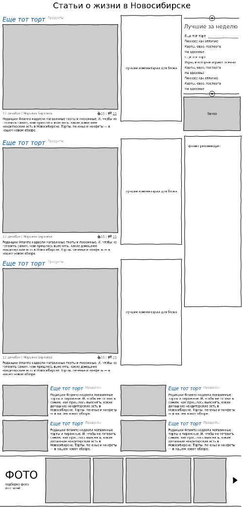
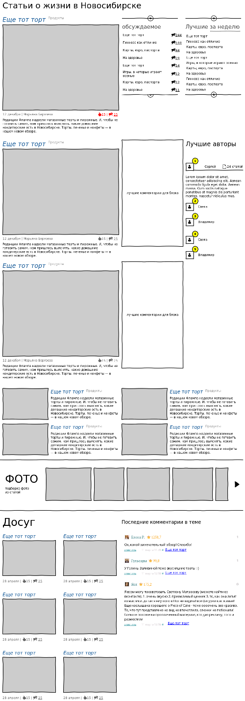
Sketch number 2
We leave in the main block 7 articles, 3 with large pictures, and 4 - less. We decide to leave comments for the first three blocks, remove the large main banner, take the best to the top, add the best period, add “Flamp recommends”. Add a strip of random photos from articles. This bar serves several purposes at once: visually divides the page into parts, we force the user to click on the picture he likes, we force the user to look at the pictures, just by flipping through them. Click on the picture should send in with the appropriate article.
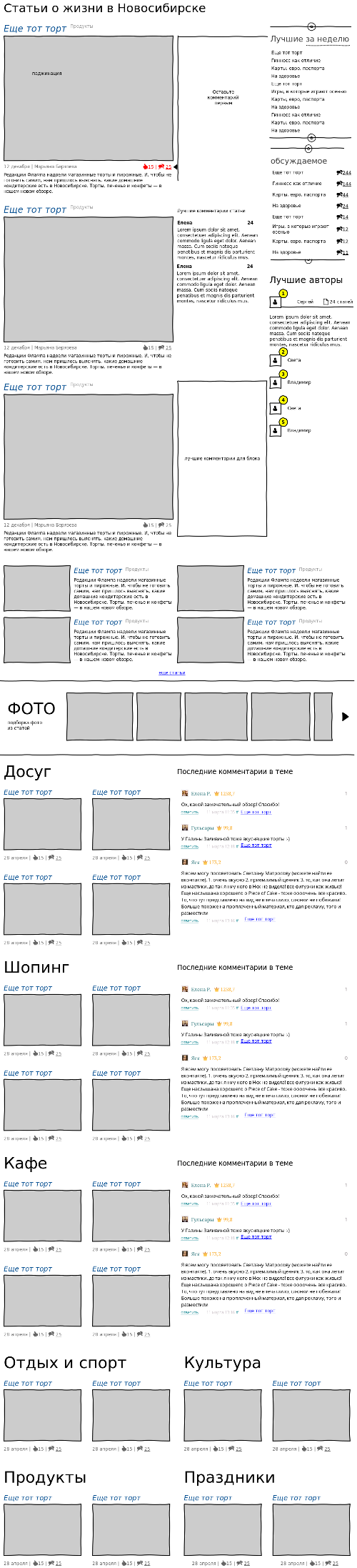
Sketch number 3
Rearrange the blocks, see how it turns out. Too much text on top. All the same, we give the third column to the block, even if it has no comments, and in the fourth we write all kinds of additional information. Below for each topic we take our block, for each block we make our own display highlight. If the number of comments exceeds the conceivable and inconceivable limit, the comments icon is red.
Sketch number 4
We draw an approximate kind of comments for the topic block, if there are no comments yet - we set an invitation (you can also have a banner too). Below we have the big blocks for each theme 3 pieces and then the themes under them in order to get some semblance of a fractal. The blocks at the bottom of the page turned out too pattern-like, it is necessary to fix it somehow. Most likely the blog "Shopping" will have to change a little.
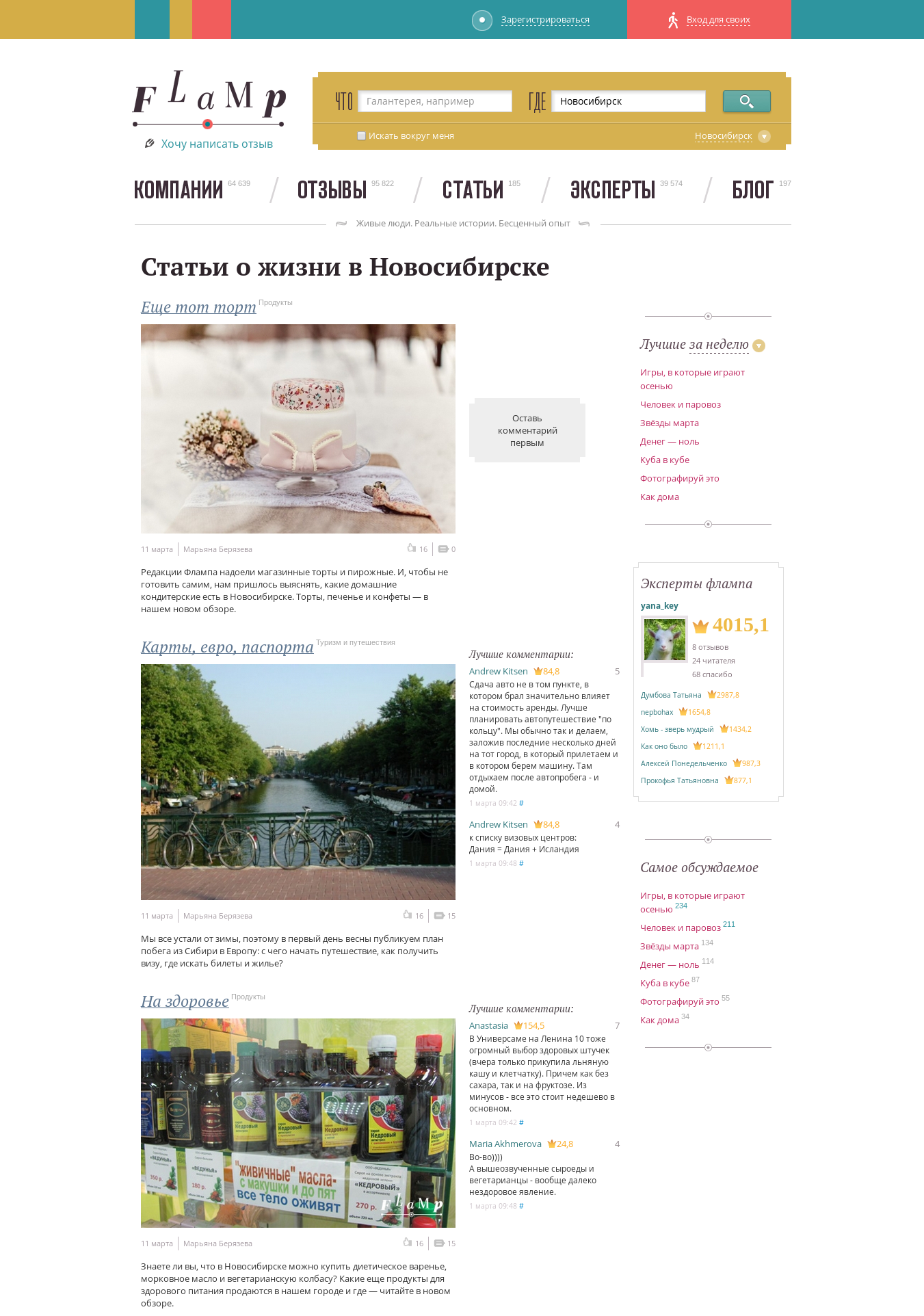
Summary page
We remove too much, we leave only enough that a person can see and does not feel that the page is empty. The upper part (before the photo) details more, because its user more attentively considers, under the photos we add a couple of articles from each category, in the hope of “hooking” the user with the article you like. The strip with photos serves as a visual separator for the user and allows him to look at random photos, thereby increasing the time spent on the page.
Now there are two large visual parts, the upper one (containing the squeeze) and the lower one (details for each section).
What do we have?
I spent a total of 2 days at work and it is not finished. The next step is a survey of the focus group, and the transfer of the layout to the designer so that the designer will work as close as possible to perfection.
What would have delayed you on the articles page longer? (Habr we do not take into account, he has perfected the look of the pages for centuries).
PS This is a 2gis test task for interface designers.
PPS In order not to disappear for good, I decided to post it on a habr.
Source: https://habr.com/ru/post/174873/
All Articles