Some useful tools for plotting (plot) in MATLAB
Recently, once again checking the homework of my students, I was eager to automate this process. The task was to compile a working table for the deviation of the magnetic compass and to construct a deviation curve.
The input data were the readings of the magnetic compass (MC), the synchronously observed readings of the gyrocompass (GC), the GC correction and the value of the magnetic declination for the area in which the measurements were made.
All data were recorded in a table and divided from 10 columns with input data and 25 rows - values of input data for each of the options. For the convenience of reading data into MATLAB, they were recorded as a text file and imported into the workspace using the importdata function.
According to the calculation method, it was necessary to process the data using several empirical formulas for filling the working table of the MK deviation table. However, the main and most obvious result of the work is the construction of the MK deviation curve.
')
For plotting, the plot function was selected, which has a large number of settings that allow you to get the result in the desired form. The code was compiled:
And received the following schedule:

Let us analyze the code line by line, consider what parameters you can specify to customize the display of graphs.
Here you can set input data for plotting. The number of values on the x-axis and on the y-axis should be the same. According to this data are vectors with 36 values.
Actually, the function of building a graph in which data and parameters are transmitted. In addition to the obvious input, the function parameter is the type of the displayed line, encoded by a three-character combination. In this case, “b” - blue, line color; “O” is the type of marker that indicates the points of the graph and “-” is the type of line, in this case - solid.
Below is a list of parameters for setting the displayed line.
Marker line color
c blue
m purple
y yellow
r red
g green
b blue
w white
k black
Marker Line Type
- continuous
- - stroke
: dotted
-. dash-dotted
Marker Marker Type
. point
+ plus sign
* star sign
o circle
x sign "cross"
The command that turns the grid on the chart.
Captions for the schedule and the corresponding axes. Here is the “\ circ” character encoding of the degree.
Axis control command. In this case, set the parameter “auto” - automatic arrangement of axes. This is where the work of MATLAB did not suit me. the axes did not automatically attach to the extreme values of the graph, but “added” extra space along the “X” axis.
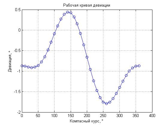
Using the “help axis” command, I found several more parameter options for the axes, in particular, I tried the “tight” parameter, which had to dock the borders of the graph to the extreme values of the curve. However, the result of this parameter did not satisfy me either. The result was as follows:
The graph looks “clamped”, moreover, the parts of the curve that are between the maximum values are “lost”.
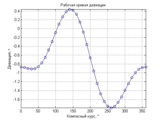
To get a visual result, we had to adjust the “X” axis separately using the following commands:
The latter function sets the boundary values separately for the “X” axis, which allowed me to limit the graph to maximum values along this axis.
And the last command:
Allowed to set the captions and pitch for the “X” axis. The “set” function is quite general, its operation depends on the transmitted parameters. In this case, “gca” means that the parameters will be set for the grid of the graph, “XTick” means that the signature of the axis “X” will be controlled, and the parameter “0: 45: 360” sets the minimum value, step and maximum value .
The result was a fairly graphic graph of the deviation curve, comparing the shape of which with the shape of the graph obtained by the student, you could quickly assess the correctness of the work done. Also, thanks to loading data from a file for all options, with a further choice of the latter, only the option number had to be changed in order to get the result.
I hope that this article will be useful not only for MATLAB beginners, but also for advanced users.
In the end, I would like to note the usefulness of the “help” command - it not only allows you to get the necessary information on a function or command from the command line, but also to do it much faster than through a search in MATLAB help.
The input data were the readings of the magnetic compass (MC), the synchronously observed readings of the gyrocompass (GC), the GC correction and the value of the magnetic declination for the area in which the measurements were made.
All data were recorded in a table and divided from 10 columns with input data and 25 rows - values of input data for each of the options. For the convenience of reading data into MATLAB, they were recorded as a text file and imported into the workspace using the importdata function.
According to the calculation method, it was necessary to process the data using several empirical formulas for filling the working table of the MK deviation table. However, the main and most obvious result of the work is the construction of the MK deviation curve.
')
For plotting, the plot function was selected, which has a large number of settings that allow you to get the result in the desired form. The code was compiled:
% X=[0:10:360]; Y=SC; plot(X,Y,'bo-'); grid on; title(' '); xlabel(' , \circ'); ylabel(', \circ'); axis auto xlim([0,360]) set(gca, 'XTick',0:45:360) And received the following schedule:
Let us analyze the code line by line, consider what parameters you can specify to customize the display of graphs.
X=[0:10:360]; Y=SC; Here you can set input data for plotting. The number of values on the x-axis and on the y-axis should be the same. According to this data are vectors with 36 values.
plot(X,Y,'bo-'); Actually, the function of building a graph in which data and parameters are transmitted. In addition to the obvious input, the function parameter is the type of the displayed line, encoded by a three-character combination. In this case, “b” - blue, line color; “O” is the type of marker that indicates the points of the graph and “-” is the type of line, in this case - solid.
Below is a list of parameters for setting the displayed line.
Marker line color
c blue
m purple
y yellow
r red
g green
b blue
w white
k black
Marker Line Type
- continuous
- - stroke
: dotted
-. dash-dotted
Marker Marker Type
. point
+ plus sign
* star sign
o circle
x sign "cross"
grid on; The command that turns the grid on the chart.
title(' '); xlabel(' , \circ'); ylabel(', \circ'); Captions for the schedule and the corresponding axes. Here is the “\ circ” character encoding of the degree.
axis auto Axis control command. In this case, set the parameter “auto” - automatic arrangement of axes. This is where the work of MATLAB did not suit me. the axes did not automatically attach to the extreme values of the graph, but “added” extra space along the “X” axis.
Using the “help axis” command, I found several more parameter options for the axes, in particular, I tried the “tight” parameter, which had to dock the borders of the graph to the extreme values of the curve. However, the result of this parameter did not satisfy me either. The result was as follows:
The graph looks “clamped”, moreover, the parts of the curve that are between the maximum values are “lost”.
To get a visual result, we had to adjust the “X” axis separately using the following commands:
axis auto xlim([0,360]) The latter function sets the boundary values separately for the “X” axis, which allowed me to limit the graph to maximum values along this axis.
And the last command:
set(gca, 'XTick',0:45:360) Allowed to set the captions and pitch for the “X” axis. The “set” function is quite general, its operation depends on the transmitted parameters. In this case, “gca” means that the parameters will be set for the grid of the graph, “XTick” means that the signature of the axis “X” will be controlled, and the parameter “0: 45: 360” sets the minimum value, step and maximum value .
The result was a fairly graphic graph of the deviation curve, comparing the shape of which with the shape of the graph obtained by the student, you could quickly assess the correctness of the work done. Also, thanks to loading data from a file for all options, with a further choice of the latter, only the option number had to be changed in order to get the result.
I hope that this article will be useful not only for MATLAB beginners, but also for advanced users.
In the end, I would like to note the usefulness of the “help” command - it not only allows you to get the necessary information on a function or command from the command line, but also to do it much faster than through a search in MATLAB help.
Source: https://habr.com/ru/post/174697/
All Articles