Icon Fonts for Mobile
For quite a long time, we have been supporting two mobile versions of Mail.Ru Search. This post would like to reveal some technical information about graphical interfaces.
The first version focuses on simple phones that are slowly but surely leaving the modern market of mobile devices, but not yet completely forgotten. We include phones without a full-fledged operating system, browsers in which are outdated, do not understand full-fledged JavaScript-code, and because of their limitations cannot support rapidly developing Internet technologies. For this group, we had to apply the proven old method - .png- and .gif-graphics.
The second version, which we support and develop, is designed for smartphones. About her today and will be discussed.
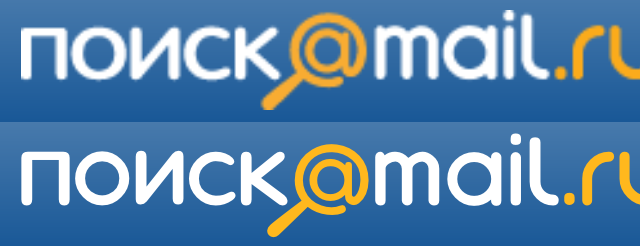
Modern smartphones have a number of features that can not be forgotten and which have to adapt. One of them is the appearance of screens with increased pixel density (in particular, Retina-screens), the possibility of increasing the page and, as a result, the blurring of ordinary images. Because of this, there is a need to use scalable graphics, which would look clearly both on a 1: 1 scale, and after a multiple increase. The way out of this situation was the use of icon fonts. The picture below shows two options: the top shows a picture .png, enlarged 2 times, and the bottom shows the result of applying a font with icons with the same magnification.
')
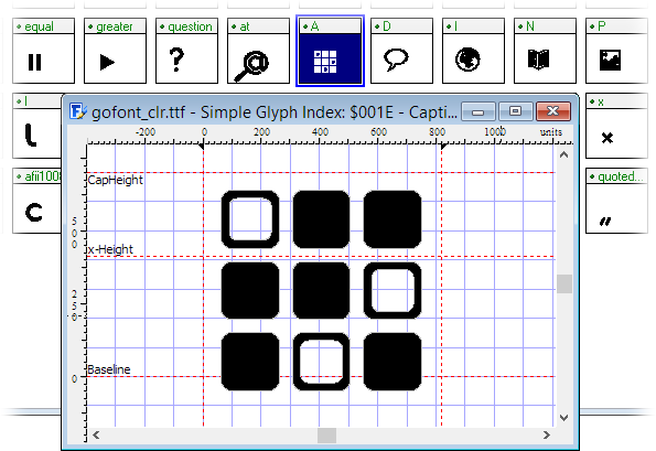
The essence of the process is that in the font file the letters are replaced with graphic icons - in fact, a unique font is created. In our case, for example, the “@” icon is replaced with a magnifying glass, the English letter “I” (from the Internet) - with the icon of the globe, the letter “P” (from pictures) - with the icon of images, and so on. When replacing, it is desirable to adhere to the relative similarity of graphics and letter-symbols, so that if for some reason the font is not loaded, the user will still be able to navigate the site.
Loading a non-standard font is the same as for a PC, using the CSS-design @ font-face. The only difference and a big plus is that when working with smartphones you do not need to worry about supporting various font formats (.eot, .woff, .ttf, .svg), as this is necessary for PCs due to the variety of browsers.
For phones based on iOS, Android, bada and BlackBerry operating systems, it is enough to load one .ttf format. It is well understood not only by the built-in browsers, but also by mobile Firefox, hrome and Opera Mobile.
In the stylesheet, the subload looks like this:
And yet, despite the fact that modern smartphones have characteristics that are sometimes comparable with personal computers, there are among them those that require a special approach. In the struggle to improve the quality of the site display, we had to select a group of smartphones, which are given pictures. This group includes devices on OSs such as Windows Phone 7 and Android versions below 2.2, as well as the Opera Mini browser, which is open on the phone with any OS. We made this separation after experimenting with test devices.
On the server side, each device that goes to go.mail.ru is determined by the user agent and other parameters. Then this data is transferred to the template engine - Jinja is used on the Mail.Ru Search project. Record on the definition of the need to give the user a font or image looks like this:
The switchFont variable is true if the device is running iOS, BlackBerry, bada, or Android operating systems with a version greater than or equal to 2.2, and the is_opera_mini variable is false. Further, depending on the switchFont value, one of the two is displayed in the templates.
Below is a piece of code in a template using a logo example:
Styles for him look like this:
If the template engine decided to use the font option, for each letter having the class .logo__ttf, a non-standard 'goMailIco' font is applied, in which the standard letter m is replaced with the letter from the corporate mail.ru font. It remains only to choose the right size using font-size, set the color, the shadows and, if desired, use all the features of CSS3.
In the case when we take a picture, the situation is almost standard, not counting the fact that we load the image twice as much as necessary. For example, to show a 200x300 pixel image on a screen with increased pixel density, you need to upload a 400x600 pixel image and then reduce it using CSS attributes, html parameters, or, as in our case, an image as a background with the necessary container sizes, background in which it is compressed twice using the “background-size: 100% auto;” style.
With this option, it is possible to download redundantly large images for smartphones with a standard screen resolution (device-pixel-ratio: 1), which are not suitable for magnification. This is compensated for by encoding the background image into base-64 format, which allows you to win the difference in file size and eliminate the need to store and maintain images in two formats - 1 to 1 and 2 to 1. Plus, this method significantly minimizes the number of http - requests to the server, which increases the overall download speed.
Having discussed the technical details of connecting the font with icons, we will describe how such a font is developed. If you already have icons or other graphics in vector format, then half the work is done; otherwise, the existing raster icons will have to be redrawn in the vector editor. You can arrange the entire set of graphics layers in one document, but for the assembly in the font is better to export each character into separate files, the format of which can import an existing font editor.
It is preferable to work with large object sizes, from 500 to 1000 pixels. At the same time, it is worth avoiding excessive detailing, because the icon can be rasterized on a 16-32 pixel screen. Use monochrome forms, without strokes and no effects; color and other effects, for example, a shadow, can be applied to the icon already during page layout. If you need to use several colors in the icon, you will have to break it into elements, each of which make a separate font character, which will then be superimposed on each other and painted accordingly.

There are several editors, such as Font Creator (for Windows), Glyphs (for Mac) or Inkscape (for Windows, Mac, Linux) - you can immediately edit vector graphics and create a font in svg-format.
For the final result, it is not so important whether you are creating a new font or replacing the symbols of the finished one; but, adding a character to an empty font, you will have to manually search and assign the corresponding character index for different operating systems, then configure different metrics. It is easier to take as a basis a ready-made font with a license that allows for its change - for example, from the site font.cc. We import the prepared vector graphics, replacing the selected letters, and monitor the matching sizes, indents, align to the baseline.
If you have broken an icon into multi-colored elements, then it is better to keep their position and size relative to each other with further imposition. At this stage, you will probably have to test and, perhaps, clarify the position and size of the icon.
If your editor only saves the font to a format other than .ttf, you can use online services for converting, for example, Fontsquirrel . Such services also allow you to reduce the file size by removing unused characters, but it is better to do this at the design stage in the editor.
That's all. If you find some alternative solution for ultra-high resolution screens - share.
You can view the mobile version of the Search project by visiting the go.mail.ru link from a mobile device.
Dariya Skakun, developer of mobile versions of the project Search
Alexey Likhodzievsky, Head of Mobile Project Direction Search
The first version focuses on simple phones that are slowly but surely leaving the modern market of mobile devices, but not yet completely forgotten. We include phones without a full-fledged operating system, browsers in which are outdated, do not understand full-fledged JavaScript-code, and because of their limitations cannot support rapidly developing Internet technologies. For this group, we had to apply the proven old method - .png- and .gif-graphics.
The second version, which we support and develop, is designed for smartphones. About her today and will be discussed.
Part 1: Connecting Icon Fonts
Modern smartphones have a number of features that can not be forgotten and which have to adapt. One of them is the appearance of screens with increased pixel density (in particular, Retina-screens), the possibility of increasing the page and, as a result, the blurring of ordinary images. Because of this, there is a need to use scalable graphics, which would look clearly both on a 1: 1 scale, and after a multiple increase. The way out of this situation was the use of icon fonts. The picture below shows two options: the top shows a picture .png, enlarged 2 times, and the bottom shows the result of applying a font with icons with the same magnification.
')
The essence of the process is that in the font file the letters are replaced with graphic icons - in fact, a unique font is created. In our case, for example, the “@” icon is replaced with a magnifying glass, the English letter “I” (from the Internet) - with the icon of the globe, the letter “P” (from pictures) - with the icon of images, and so on. When replacing, it is desirable to adhere to the relative similarity of graphics and letter-symbols, so that if for some reason the font is not loaded, the user will still be able to navigate the site.
Loading a non-standard font is the same as for a PC, using the CSS-design @ font-face. The only difference and a big plus is that when working with smartphones you do not need to worry about supporting various font formats (.eot, .woff, .ttf, .svg), as this is necessary for PCs due to the variety of browsers.
For phones based on iOS, Android, bada and BlackBerry operating systems, it is enough to load one .ttf format. It is well understood not only by the built-in browsers, but also by mobile Firefox, hrome and Opera Mobile.
In the stylesheet, the subload looks like this:
@font-face { font-family: 'goMailIco'; src: url("/font/goMailIco.ttf"); font-weight: normal; font-style: normal; } And yet, despite the fact that modern smartphones have characteristics that are sometimes comparable with personal computers, there are among them those that require a special approach. In the struggle to improve the quality of the site display, we had to select a group of smartphones, which are given pictures. This group includes devices on OSs such as Windows Phone 7 and Android versions below 2.2, as well as the Opera Mini browser, which is open on the phone with any OS. We made this separation after experimenting with test devices.
On the server side, each device that goes to go.mail.ru is determined by the user agent and other parameters. Then this data is transferred to the template engine - Jinja is used on the Mail.Ru Search project. Record on the definition of the need to give the user a font or image looks like this:
{% set switchFont = (detector.os in ('iphone os', 'blackberry', 'bada') or detector.os == 'android' and detector.osver >= 2.2) and (not detector.is_opera_mini) %} The switchFont variable is true if the device is running iOS, BlackBerry, bada, or Android operating systems with a version greater than or equal to 2.2, and the is_opera_mini variable is false. Further, depending on the switchFont value, one of the two is displayed in the templates.
Below is a piece of code in a template using a logo example:
{% if switchFont %} <div class="logo__ttf"> <a href="#"> <span class="logo__ttf_color">@</span>mail<span class="logo__ttf_color">.ru</span> </a> </div> {% else %} <a href="#"> <div class="logo__img"></div> </a> {% endif %} Styles for him look like this:
.logo__img { background: url(data:image/png) 0 0 no-repeat; background-size: 100% auto; width: 165px; height: 25px; } .logo__ttf { font-family: 'goMailIco'; color: #fff; font-size: 24px; } .logo__ttf_color { color: #ffb81d; } If the template engine decided to use the font option, for each letter having the class .logo__ttf, a non-standard 'goMailIco' font is applied, in which the standard letter m is replaced with the letter from the corporate mail.ru font. It remains only to choose the right size using font-size, set the color, the shadows and, if desired, use all the features of CSS3.
In the case when we take a picture, the situation is almost standard, not counting the fact that we load the image twice as much as necessary. For example, to show a 200x300 pixel image on a screen with increased pixel density, you need to upload a 400x600 pixel image and then reduce it using CSS attributes, html parameters, or, as in our case, an image as a background with the necessary container sizes, background in which it is compressed twice using the “background-size: 100% auto;” style.
With this option, it is possible to download redundantly large images for smartphones with a standard screen resolution (device-pixel-ratio: 1), which are not suitable for magnification. This is compensated for by encoding the background image into base-64 format, which allows you to win the difference in file size and eliminate the need to store and maintain images in two formats - 1 to 1 and 2 to 1. Plus, this method significantly minimizes the number of http - requests to the server, which increases the overall download speed.
Part 2: Font Design
Having discussed the technical details of connecting the font with icons, we will describe how such a font is developed. If you already have icons or other graphics in vector format, then half the work is done; otherwise, the existing raster icons will have to be redrawn in the vector editor. You can arrange the entire set of graphics layers in one document, but for the assembly in the font is better to export each character into separate files, the format of which can import an existing font editor.
It is preferable to work with large object sizes, from 500 to 1000 pixels. At the same time, it is worth avoiding excessive detailing, because the icon can be rasterized on a 16-32 pixel screen. Use monochrome forms, without strokes and no effects; color and other effects, for example, a shadow, can be applied to the icon already during page layout. If you need to use several colors in the icon, you will have to break it into elements, each of which make a separate font character, which will then be superimposed on each other and painted accordingly.
There are several editors, such as Font Creator (for Windows), Glyphs (for Mac) or Inkscape (for Windows, Mac, Linux) - you can immediately edit vector graphics and create a font in svg-format.
For the final result, it is not so important whether you are creating a new font or replacing the symbols of the finished one; but, adding a character to an empty font, you will have to manually search and assign the corresponding character index for different operating systems, then configure different metrics. It is easier to take as a basis a ready-made font with a license that allows for its change - for example, from the site font.cc. We import the prepared vector graphics, replacing the selected letters, and monitor the matching sizes, indents, align to the baseline.
If you have broken an icon into multi-colored elements, then it is better to keep their position and size relative to each other with further imposition. At this stage, you will probably have to test and, perhaps, clarify the position and size of the icon.
If your editor only saves the font to a format other than .ttf, you can use online services for converting, for example, Fontsquirrel . Such services also allow you to reduce the file size by removing unused characters, but it is better to do this at the design stage in the editor.
That's all. If you find some alternative solution for ultra-high resolution screens - share.
You can view the mobile version of the Search project by visiting the go.mail.ru link from a mobile device.
Dariya Skakun, developer of mobile versions of the project Search
Alexey Likhodzievsky, Head of Mobile Project Direction Search
Source: https://habr.com/ru/post/173881/
All Articles