Media responsive design
Webmaster training level: medium / high
We like working with data. We spend a lot of time researching analytical information about our websites. Any web developer who is also interested in this will surely notice how much the amount of traffic from mobile devices has increased recently. Over the past year, the percentage of page views of our main sites from smartphones and tablets has significantly increased. This means that more and more visitors use devices with modern browsers that support the latest versions of HTML, CSS and JavaScript. However, the width of the screens of such devices is usually limited to 320 pixels.
We strive to increase the availability of our products, that is, to provide all users with optimal opportunities to work with them. We faced a dilemma: to create special mobile versions of sites or to adapt existing sites and new projects for viewing on both desktop computers and mobile devices. Creating two versions of the site would allow us to optimize each of them for specific equipment, but using one common site makes it possible to save the canonical URL. This prevents complex redirects and simplifies the sharing of web addresses. Serviceability is an important factor, so we decided not to create different versions of the pages, but began to think about how to ensure the fulfillment of the following conditions:
- Clear display of pages on the screen with any resolution;
- the ability to view a group of content on any device;
- no horizontal scroll bar regardless of window size.
Changing content layout, navigation and zoom of images - Chrombuki
')
Implementation
To begin with, the semantic markup of the content makes it easy to rearrange the pages if necessary. Using the style sheet, we created a rubber layout . This is the first step towards achieving our goal. Instead of the
width attribute for containers, we began to specify max-width . The height attribute has been replaced by the min-height attribute so that a large font or multi-line text does not violate the boundaries of the container. To prevent fixed-width images from breaking rubber columns, the following CSS rule applies: img { max-width: 100%; } A rubber mockup is a good idea, but using this layout imposes some limitations. Fortunately, media queries are now supported by all modern browsers , including IE9 + and most mobile device browsers. This allows you to create websites that display quality in mobile browsers is not reduced, since they are optimized for a particular interface. But first you need to determine which features of smartphones should be considered by web servers.
Viewing areas
When is a pixel not a pixel? In that case, if we are talking about a smartphone. Typically, smartphone browsers mimic high-resolution desktop browsers, so pages are displayed in them, like on a monitor screen. That is why there appeared a “review mode” with small text that cannot be read without magnification. The default viewing area width in standard Android browsers is 800 pixels, and in iOS browsers it is 980 pixels, regardless of the actual number of physical pixels on the screen.
To switch the browser to a more readable mode, you need to use the viewport meta element:
<meta name="viewport" content="width=device-width, initial-scale=1"> There are many options for resolving mobile device screens, but the standard device-width reported by browsers is usually around 320 pixels. If the screen width of your mobile device is 640 physical pixels, the image width of 320 pixels will be scaled to the full width of the screen, and twice as many pixels will be used in the processing. Thus, twice the density of pixels provides a clearer display on a small screen compared with the desktop screen.
It is important that if device-width is specified as the value of the width element in the viewport meta tag, this value is updated if the user changes the screen orientation of the smartphone or tablet. In combination with media queries, this feature allows you to change the page layout when turning the device:
@media screen and (min-width:480px) and (max-width:800px) { /* Target landscape smartphones, portrait tablets, narrow desktops */ } @media screen and (max-width:479px) { /* Target portrait smartphones */ } Depending on how your site functions and looks on the screens of different devices, you may need to use different control points. You can also use a media query to select a specific orientation without regard to the pixel aspect ratio, if this feature is supported .
@media all and (orientation: landscape) { /* Target device in landscape mode */ } @media all and (orientation: portrait) { /* Target device in portrait mode */ } 
Content layout and image scale change - Institute of Culture
Example of using media queries
We recently launched a new version of the About Google page . To make it easier for users of devices with small screens, such as tablets and smartphones, to work with this page, in addition to the rubber layout, we added several media queries to its code.
Instead of targeting specific screen resolutions, we set a relatively wide range of control points. If the screen resolution is more than 1024 pixels, the page is displayed in its original form on a grid of 12 columns. If it is from 801 to 1024 pixels, a slightly compressed version of the page is displayed due to the rubber layout.
Only when the screen resolution is less than 800 pixels, the non-core content will be displayed at the bottom of the page:
@media screen and (max-width: 800px) { /* specific CSS */ } The latest media query is for smartphones:
@media screen and (max-width: 479px) { /* specific CSS */ } From this moment the download of large images stops; blocks of content are placed one above the other. We also added additional spaces between content elements to more clearly demarcate sections.
These simple techniques allowed us to optimize the site for viewing on a variety of devices.
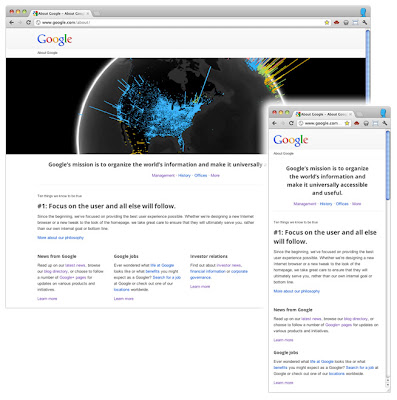
Content layout changes, large image deleted - About Google
Conclusion
It is important to understand that there is no simple solution that would allow making sites convenient for viewing on mobile devices and devices with narrow screens. Rubber layouts are good as a starting point, but their use imposes some limitations. Media queries also help optimize websites, but one should not forget that in 25% of cases, when visiting websites, computer browsers are used that do not yet support this technology. The presence of such requests affects the efficiency of their work. And if the site has a widget that is convenient to work with the mouse, it’s not at all the fact that it will be just as convenient on the touchscreen, where it is more difficult to perform precise actions.
It is extremely important to start testing in the early stages of development and not to stop it in the future. Looking at your sites on a smartphone or tablet, you do not waste time in vain. If you do not have the opportunity to test the site on real devices, use the Android SDK or iOS Simulator . Ask friends and colleagues to access the site from their devices and watch it work.
Website optimization for mobile devices will attract even more visitors to it. In addition, the study and development of the best methods of such optimization opens up new opportunities for professional development.
Other examples of responsive web design in Google:
- www.google.com/about/?hl=en
- www.google.com/goodtoknow/
- www.google.com/culturalinstitute
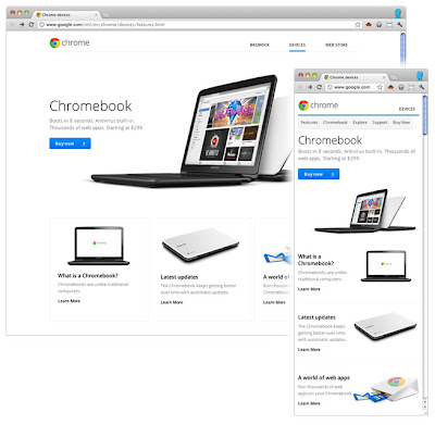
- www.google.com/intl/ru/chrome/devices
- picasa.google.com
Authors of the publication: Rupert Brayeni , Edward Jung , Matt Suerrer , Google team of webmasters.
Source: https://habr.com/ru/post/173861/
All Articles