Grid in the design of interfaces for Windows Phone: a strict teacher or a kind helper? (Part 2)
We continue to publish articles in the footsteps of Design Camp . Today we have a continuation of an article by Yegor Gilev ( yegorg ) about using a grid in Windows Phone. The article is given as is and displays the author's point of view on the design of applications under Windows Phone.
To align text vertically, I like the other solution much more - the baseline grid. This is just a uniform grid of horizontal lines, as in a school notebook. Here is an example of the screen of the “Prav.ru” application built on the basis of the baseline grid:

Unfortunately, there is no way to make friends a grid of base lines with our grid of squares. This is because the size of the module and indents do not have a common denominator. Remember, we worried about this, looking at the numbers 25 and 12? Here it is backfired:
')

What to do? In my opinion, we have three choices. And each is associated with some sacrifices. Well, you know - you will go to the right, you will lose a horse, and so on.
The first way : abandon the squares. Let us have 12 columns horizontally, and just a uniform grid of baselines vertically:

But, I will say right away, I absolutely do not like the rejection of the squares. With this approach, we will inevitably have completely absurd proportions of blocks, like 173 × 168. So I think this branch is a dead end.
The second way : reduce the size of the module from 25 pixels to 24. Then the module will be exactly 2 times the indentation, which will allow you to use the baseline grid in 12 or 24 pixel increments. But on the other hand, 6 pixels will be added from the edges of the screen, so the indent from the edge will be not 24 pixels, but 30:

This option looks much better than before, but I confess that I’m confused by the idea of sacrificing the standard size of external indents. This is a direct violation of the official leadership and can lead to a violation of the space-time continuum. So we will not do either.
The third way : I propose to think about whether we really need these most magical 12 columns, from which it all began, and because of which we got such a strange module size - 25 × 25 pixels. Of course, 12 is very well divided into 2, 3, 4 and 6. But first, in practice it is rare to need such flexibility when designing the screen of a tiny mobile device. And secondly, the 12-column is strong in its symmetry, and the interfaces for Windows Phone rarely cause symmetry. The main screen of Windows Phone 8 is an exception rather than a rule. So we don’t have a big need to maintain symmetry at the grid level.
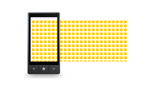
Let's try to start everything from a clean slate and spread the screen into 12 × 12 pixel cells in order to solve the problem of the common denominator once and for all:

We will also try to take into account the fact that when using the “Panorama” element, in fact, our screen is much wider than the hardware 480 pixels. On the other hand, the width of each segment of the panorama should be less than the physical width of the screen so that a piece of the next segment peeks from the edge. Including this, I meant when I said that the symmetry is not peculiar to the screens of the interfaces for Windows Phone:

The result is 36 cells for each segment of the panorama. 36 is a very good number! It is even divided into 12, with all the ensuing advantages. But we divide 36 not into 12, but only into 6, as Mike Gus did in his version of the grid. We obtain larger cells with the size of 6 small cells vertically and horizontally:

The same grid can be represented not only as cells, but also in 48 × 48 squares with indents of 24 pixels:
In some cases, we will need a smaller and more flexible grid, with squares of 12 pixels each:

The squares turned out beautiful, but how does it work in real life?
This is how the main screen of our application turned out:


In the following illustration, blocks of information, text and tiles are shown in gray boxes. It is clearly seen that these blocks stick to large grid lines, leaving 1 square indent, that is 12 pixels:

Notice how the base lines lined up on the first segment of the panorama:

On the second segment of the panorama, the centers of the icons are aligned exactly along the lines of the coarse grid, and the signatures inside the tiles lay down along the thin grid lines:

The third segment of the panorama with the news:

All intervals between the baselines here are multiples of two cells of the grid. Or 4 cells, or 6, if you need a larger indent.
The fourth segment of the panorama is similarly constructed with the latest blog entries:

Here you can pay attention to large headlines, where we need a longer line spacing. If the usual line spacing is 2 cells or 24 pixels, then in the case of large headers there are 3 cells, that is 36 pixels.
Document list screen:

Here it is clearly seen that the line spacing between large blocks is equal to the step of the coarse grid.
Search results screen:

Here we had to invent a new control instead of the standard pivot. The fact is that when I tried to insert the heading "Federal legislation", it immediately became clear that this would not work. Therefore, we have tiles with icons at the top, and not the names of sections. Taking this opportunity, I send rays of sympathy to the designers of the Windows Phone interfaces in German, with their impossibly long words.
Another screen with textual content is document content:

Screen "about the program":

Using this screen as an example, I want to draw your attention to the added advantage of using a regular grid. This advantage is manifested in the process of preparing a design specification or technical specification for programmers. Compare the two pictures, left and right:

On the left, it is shown how it is usually necessary to describe design elements in order for programmers to implement everything correctly. If we use a regular grid, we can do without this additional work. A mockup of a design with a grid imposed on it is in itself a fairly accurate task. In the process of testing, the benefits of the grid are also invaluable: you can simply put the grid on top of the screenshot and say: “Guys, why don’t you see it yourself?”.
===
I hope the solutions I proposed will help some of you to create beautiful Windows Phone applications faster and more pleasantly. At least as beautiful as our application "Prav.ru."
Baseline Grid
To align text vertically, I like the other solution much more - the baseline grid. This is just a uniform grid of horizontal lines, as in a school notebook. Here is an example of the screen of the “Prav.ru” application built on the basis of the baseline grid:
Unfortunately, there is no way to make friends a grid of base lines with our grid of squares. This is because the size of the module and indents do not have a common denominator. Remember, we worried about this, looking at the numbers 25 and 12? Here it is backfired:
')
What to do? In my opinion, we have three choices. And each is associated with some sacrifices. Well, you know - you will go to the right, you will lose a horse, and so on.
The first way : abandon the squares. Let us have 12 columns horizontally, and just a uniform grid of baselines vertically:
But, I will say right away, I absolutely do not like the rejection of the squares. With this approach, we will inevitably have completely absurd proportions of blocks, like 173 × 168. So I think this branch is a dead end.
The second way : reduce the size of the module from 25 pixels to 24. Then the module will be exactly 2 times the indentation, which will allow you to use the baseline grid in 12 or 24 pixel increments. But on the other hand, 6 pixels will be added from the edges of the screen, so the indent from the edge will be not 24 pixels, but 30:
This option looks much better than before, but I confess that I’m confused by the idea of sacrificing the standard size of external indents. This is a direct violation of the official leadership and can lead to a violation of the space-time continuum. So we will not do either.
The third way : I propose to think about whether we really need these most magical 12 columns, from which it all began, and because of which we got such a strange module size - 25 × 25 pixels. Of course, 12 is very well divided into 2, 3, 4 and 6. But first, in practice it is rare to need such flexibility when designing the screen of a tiny mobile device. And secondly, the 12-column is strong in its symmetry, and the interfaces for Windows Phone rarely cause symmetry. The main screen of Windows Phone 8 is an exception rather than a rule. So we don’t have a big need to maintain symmetry at the grid level.
From scratch
Let's try to start everything from a clean slate and spread the screen into 12 × 12 pixel cells in order to solve the problem of the common denominator once and for all:
We will also try to take into account the fact that when using the “Panorama” element, in fact, our screen is much wider than the hardware 480 pixels. On the other hand, the width of each segment of the panorama should be less than the physical width of the screen so that a piece of the next segment peeks from the edge. Including this, I meant when I said that the symmetry is not peculiar to the screens of the interfaces for Windows Phone:
The result is 36 cells for each segment of the panorama. 36 is a very good number! It is even divided into 12, with all the ensuing advantages. But we divide 36 not into 12, but only into 6, as Mike Gus did in his version of the grid. We obtain larger cells with the size of 6 small cells vertically and horizontally:
The same grid can be represented not only as cells, but also in 48 × 48 squares with indents of 24 pixels:
In some cases, we will need a smaller and more flexible grid, with squares of 12 pixels each:
What happened as a result
The squares turned out beautiful, but how does it work in real life?
This is how the main screen of our application turned out:
In the following illustration, blocks of information, text and tiles are shown in gray boxes. It is clearly seen that these blocks stick to large grid lines, leaving 1 square indent, that is 12 pixels:
Notice how the base lines lined up on the first segment of the panorama:
On the second segment of the panorama, the centers of the icons are aligned exactly along the lines of the coarse grid, and the signatures inside the tiles lay down along the thin grid lines:
The third segment of the panorama with the news:
All intervals between the baselines here are multiples of two cells of the grid. Or 4 cells, or 6, if you need a larger indent.
The fourth segment of the panorama is similarly constructed with the latest blog entries:
Here you can pay attention to large headlines, where we need a longer line spacing. If the usual line spacing is 2 cells or 24 pixels, then in the case of large headers there are 3 cells, that is 36 pixels.
Document list screen:
Here it is clearly seen that the line spacing between large blocks is equal to the step of the coarse grid.
Search results screen:
Here we had to invent a new control instead of the standard pivot. The fact is that when I tried to insert the heading "Federal legislation", it immediately became clear that this would not work. Therefore, we have tiles with icons at the top, and not the names of sections. Taking this opportunity, I send rays of sympathy to the designers of the Windows Phone interfaces in German, with their impossibly long words.
Another screen with textual content is document content:
Screen "about the program":
Using this screen as an example, I want to draw your attention to the added advantage of using a regular grid. This advantage is manifested in the process of preparing a design specification or technical specification for programmers. Compare the two pictures, left and right:
On the left, it is shown how it is usually necessary to describe design elements in order for programmers to implement everything correctly. If we use a regular grid, we can do without this additional work. A mockup of a design with a grid imposed on it is in itself a fairly accurate task. In the process of testing, the benefits of the grid are also invaluable: you can simply put the grid on top of the screenshot and say: “Guys, why don’t you see it yourself?”.
===
I hope the solutions I proposed will help some of you to create beautiful Windows Phone applications faster and more pleasantly. At least as beautiful as our application "Prav.ru."
Source: https://habr.com/ru/post/173363/
All Articles