Why modern interfaces are bad
In this article I will touch on modern interfaces. Not all of them are bad. But it seems that such software creation titans as Microsoft and Google are going the wrong way. And this path will lead all of us into a deep ... situation.
Attention, a lot of letters!
An ideal interface should not distract the user from his task. But now many users spend more effort on fighting interfaces. Here are a few reasons for this fight.
Sometimes it is not clear to the user how to accomplish his task and what is wanted of him.
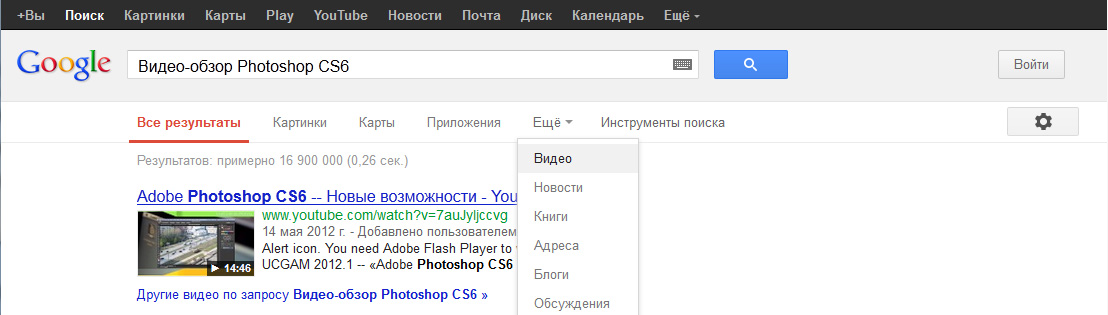
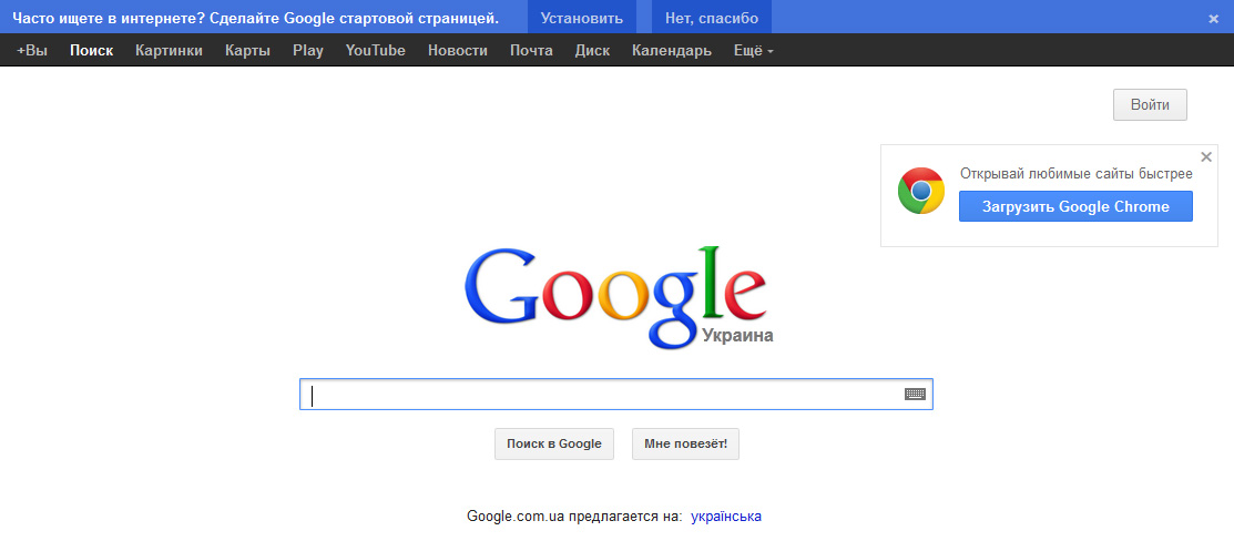
For example, google search. We introduce the "Video Review Photoshop CS6." As you can see, there is no “Video” button in the initial menu. She is hidden. I do not think that PC users are more often looking for "Maps" than video clips.
')
Example number 2. In the old design a link to the advanced search was located near the search field. Now it is hidden in the menu, which is far near the right edge of the window, and in the mobile version at the bottom of the page (and when you click on the menu, you are prompted to select the phone manufacturer and download the program).

Related items better to have a number. I would move the settings button closer or do as before.
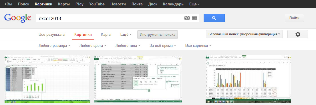
Example number 3. For example, I wanted to find an Excel 2013 image with a Russian interface. In the search for images from Google in the quick settings there is no choice of language among the search results. I have to go to the advanced search. These are unnecessary actions. First thought: "Hammer!".
Go to the advanced search. There is a choice of country, but there is no choice of language. And what if I want to find photos of Russian-speaking (online) immigrants in Canada? Mission Impossible.

Example number 4. From the registration page on Gmail you can not go to any other service from Google. Even the Google logo is not a link. The user is stuck.
Look at how many selections in the interface here:
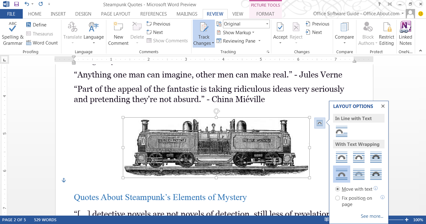
It is not clear where we are, because the “File” menu is more contrast highlighted, but now the active tab “Review”. Above all is the “Picture Tools” and it is highlighted in the third way. Who is more important and who is active now? If you follow the principle of nesting, then everything is nested in «Picture Tools» and it is the main one.
Also, the active button (or maybe it’s not a button, but an indicator) is “Track Changes”. But why highlight this indicator so much? It was possible to make the icon faded in the off state, and in the switched on state - to be contrast.
Also now active tool that adjusts the text wrapping text. Called "Layout options." So why not call it the "Image option". After all, he adjusts the image behavior. Not all users understand what a layer is. I don't know what a layer is in Word.
I think that this is a dead-end interface, and then you need to make a complete change, following the rules of subordination and nesting.
It is often difficult to understand where a button is, an input field or just a picture. Fields in the form of strips in Android 4:

For a new user, accustomed to a normal field in Windows, Linux or MacOS, this designation will be very unusual.
The worst thing is that it goes to the masses. For example, it was copied to Privat24, which will be used by people of all ages:

Some will not understand the purpose of this element.
Elements should clearly show how to interact with them.
The system must have built-in context help. The user must easily and quickly understand the purpose of the interface element.
Instead, Adobe Photoshop will send you to the Adobe site to read the user's manual and study the interface of the site, and Windows will launch a help program to which it would also be nice to attach reference materials.
The efficiency of some interfaces is negligible. The efficiency is calculated from the ratio of the information needed to complete the task to all the required information.
Consider the process of creating a mailbox on Gmail. The necessary information for creating an e-mail box are 2 fields: your login and password field (possibly a spare box).

But you are required to fill in 13 fields + 3 checkboxes. 2/13 = 15.4%. With checkboxes - 2/16 = 12.5%.
This is just user abuse. It is easier to fill in several fields than this one.
At school I was too lazy to carry some books, and I read a book from a neighbor behind me "upside down." But I have mastered some CAPTCHA times from the 9th, if I'm lucky. Sometimes, if you fail, you need to enter all the fields again - epic fail.
It's time to replace it with something else. For example, easy logical or arithmetic operations with objects, where the answer will be to click on one of the pictures (“3 oranges + 3 mandarins =?” Or “moving lever scales with an elephant and a bird”).
Maybe someone will say: “This will also affect traffic!” This is easier than listening to the audio version of CAPTCHA.
I rarely log in to Habré. I am not a masochist, so that every time I enter, I enter a CAPTCHA.
The developers were so insolent that their programs began to dictate their conditions to users! Programs should serve the user, not command them.
Sign up again for Gmail. Relative needed mail. Entered a simple password: qwerty12345. Gave a message that the password is too weak. Further the site does not let me. I enter q1w2e3r4t5y6. Do not let. And when I was able to push through this password, I was forced to re-fill in some fields and CAPTCHA.
If you issued a warning and the user does not want to change the password to another one (this will not cause a critical error), then let him complete the action. Do not torture him. You warned him.
On the pages of the corporation "good", spam and advertising regularly displayed annoying inscriptions "Make ... your home page?", "Set our miracle browser."
If you were told “No” 49 times, then for the 50th time “Yes” will not be said. This especially looks stupid if you remember that the wonderful browser has long been installed on my PC and is now running simultaneously with Opera.
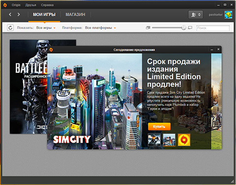
The second example is the Origin service from EA Games. Every time you start, Origin opens an additional window advertising its products, which you have to close without reading. If you like aggressive marketing so much, then at least select ads based on the customer’s purchase history. Instead, they offer me Simcity with Barbie when I bought Battlefield 3.
User data is paramount. The program should always warn about destructive actions and try to protect the data. Better to be safe.
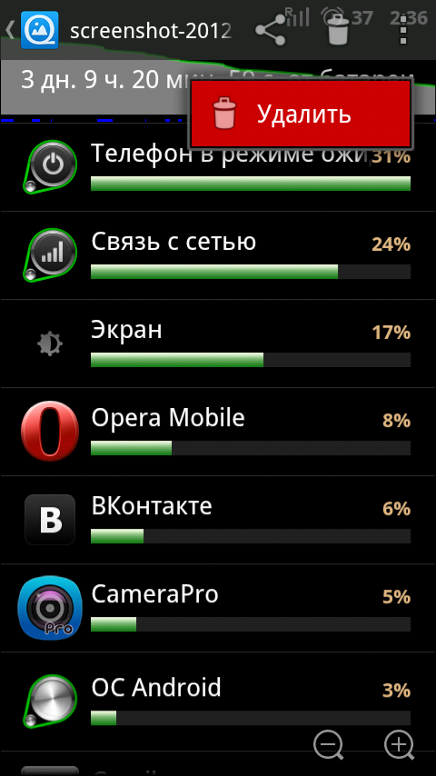
If you want to delete a picture in the QuickPic gallery on Android, then click on the icon with a basket. Something appears that says "Delete." Click and there is no file. No warnings or questions. The first time I accidentally lost a few photos, doing everything automatically.
Example number 2. Even the version of Photoshop CS6 can catch a bug and “fly out”. Sometimes this means that your PSD file will no longer open. Exit - when you open the program creates a copy of the file and works with it.
In humans, one locus of attention and in critical situations, the user especially concentrates on it and ignores everything else.
For example, Tomb Raider 2013:
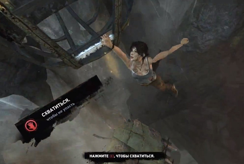
When I accidentally noticed the second message, Lara was already flying into the abyss.
You could just write: "Press grab [E], so as not to fall."
If your program works in the user's environment, then it is best to copy the working interaction principles from the user's native environment:
But everyone wants to be unique:
And some want it badly:
Unification is convenient for both the user and the developer.
If you are doing a series of products, then try to keystrokes, interfaces and basic principles were the same as possible.
About this they know nothing in Adobe.
The color selection dialog box in the Adobe CS6 series:
There are no identical items.
Example number 2. To undo the last action in Photoshop, press Ctrl + Z. Pressing Ctrl + Z again will redo the undone action. In Illustrator, pressing Ctrl + Z again will cancel all previous actions. For a similar effect in Photoshop, you need to press Ctrl + Alt + Z. Even the tool palettes in these products open up differently.
This causes the user to experience shock and relearn again. No one will buy a new version of the program with a new interface, if the cost of training will exceed the benefits of training.
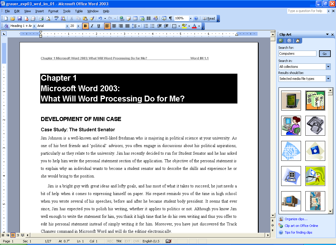
Let's take a brief history of Word.
Word 2003 is inconvenient. No clear structure.
Word 2007 is very convenient. Clear structure. A beginner will immediately understand where the button is.
Word 2010 - more beautiful, but less clearly.
Word 2013 - OMG. I hope that I do not have to work in it!
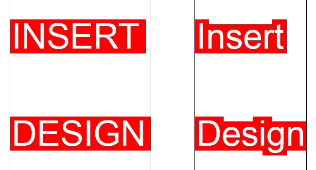
Note. A set of capital letters can be used where visual differences between the labels are not important or you want the user to read the title carefully. Such titles are difficult to read because of the identical shape of the letters and the inability to quickly view them. Usually we do not read the words to the end, but distinguish them by the form:
Some interfaces are just overwhelmed with buttons and labels. This creates only visual noise. Find similar, group, hide unimportant.
A good example is the Photoshop toolbar.
A bad example is Word 2013. One user solved the problem. He carried all the necessary elements in the window title:
Probably, this is also very inconvenient.
In order to save 1 customer required to develop a store design, where absolutely everything should be represented by icons. I wanted to save on the development of a multilingual interface.
This is hardly a good idea:
But if you have limited space and a lot of operations, then icons are your choice.
Sometimes standardization is good. In addition, as you write a guide to the product, if you do not know how it will look. Testing the interface will also not be very useful. Users are not interface specialists, unlike you.
If Google falls asleep to you with spam from advertising, then, for example, Yandex climbs your computer and changes your interface. It is like the HIV of the Internet. Not noticed a tick when installing a free program? Now restore the settings of all browsers and remove add-ons. This is very annoying to users.
I do not know how to get it out of here:

If you need to change the user interface, then leaving, tidy up after yourself.
Only lazy did not criticize Microsoft. I can not really say anything bad about the interface of Windows 8. I just did not put it and I will not install it. Here are the reasons:
Google and Microsoft are breaking through icebreakers into uncharted space, but not always in the right direction. Others are already on the "trodden path", copying fashion trends.
What do these problems in interface design lead to? This can lead developers to a dead end, and users will take a huge headache. The first may have to design new interfaces and revive their client base from the ashes, and the second will either have to endure and get angry, or learn new software products.
PS I hope that Google will not block me. Although 1 time on the exam on the right Google blocked my Motorola Defy as a "device for automatically sending information." Much wanted to say.
Attention, a lot of letters!
An ideal interface should not distract the user from his task. But now many users spend more effort on fighting interfaces. Here are a few reasons for this fight.
Modern interfaces ill-conceived
Sometimes it is not clear to the user how to accomplish his task and what is wanted of him.
For example, google search. We introduce the "Video Review Photoshop CS6." As you can see, there is no “Video” button in the initial menu. She is hidden. I do not think that PC users are more often looking for "Maps" than video clips.
')
Example number 2. In the old design a link to the advanced search was located near the search field. Now it is hidden in the menu, which is far near the right edge of the window, and in the mobile version at the bottom of the page (and when you click on the menu, you are prompted to select the phone manufacturer and download the program).
Related items better to have a number. I would move the settings button closer or do as before.
Example number 3. For example, I wanted to find an Excel 2013 image with a Russian interface. In the search for images from Google in the quick settings there is no choice of language among the search results. I have to go to the advanced search. These are unnecessary actions. First thought: "Hammer!".
Go to the advanced search. There is a choice of country, but there is no choice of language. And what if I want to find photos of Russian-speaking (online) immigrants in Canada? Mission Impossible.
Example number 4. From the registration page on Gmail you can not go to any other service from Google. Even the Google logo is not a link. The user is stuck.
Modern interfaces incomprehensible
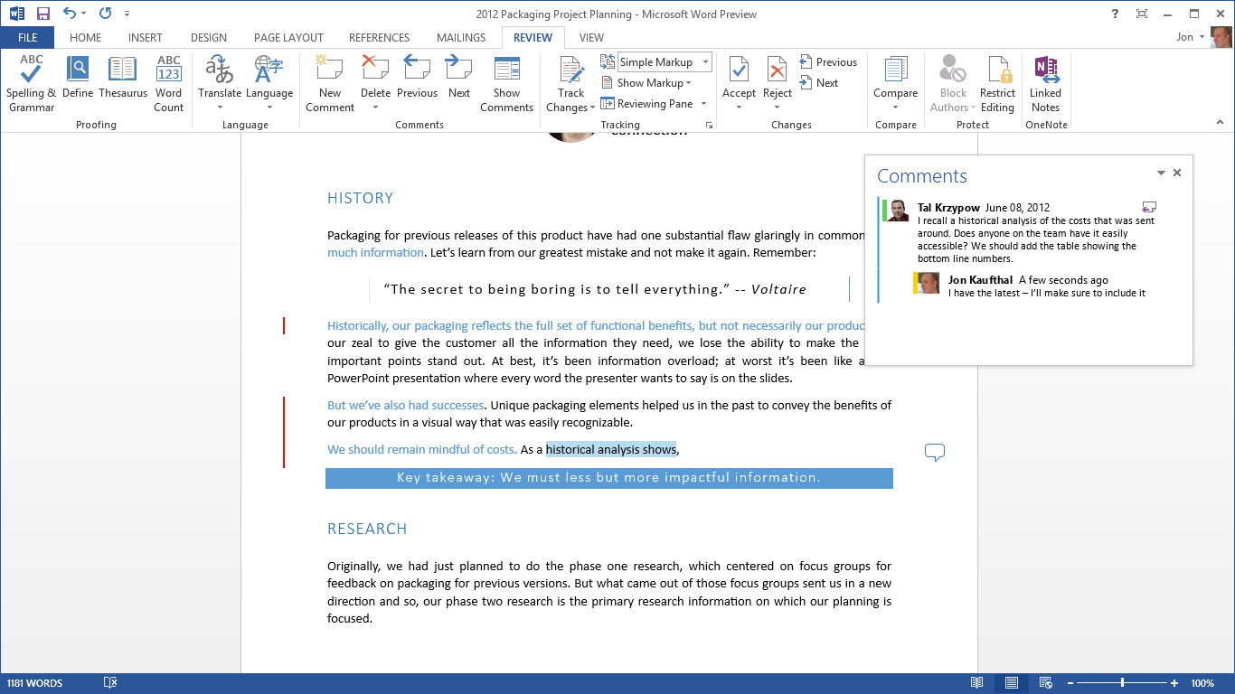
Look at how many selections in the interface here:
It is not clear where we are, because the “File” menu is more contrast highlighted, but now the active tab “Review”. Above all is the “Picture Tools” and it is highlighted in the third way. Who is more important and who is active now? If you follow the principle of nesting, then everything is nested in «Picture Tools» and it is the main one.
Also, the active button (or maybe it’s not a button, but an indicator) is “Track Changes”. But why highlight this indicator so much? It was possible to make the icon faded in the off state, and in the switched on state - to be contrast.
Also now active tool that adjusts the text wrapping text. Called "Layout options." So why not call it the "Image option". After all, he adjusts the image behavior. Not all users understand what a layer is. I don't know what a layer is in Word.
I think that this is a dead-end interface, and then you need to make a complete change, following the rules of subordination and nesting.
Modern interfaces are unclear
It is often difficult to understand where a button is, an input field or just a picture. Fields in the form of strips in Android 4:
For a new user, accustomed to a normal field in Windows, Linux or MacOS, this designation will be very unusual.
The worst thing is that it goes to the masses. For example, it was copied to Privat24, which will be used by people of all ages:
Some will not understand the purpose of this element.
Elements should clearly show how to interact with them.
Modern interfaces do not help your learning.
The system must have built-in context help. The user must easily and quickly understand the purpose of the interface element.
Instead, Adobe Photoshop will send you to the Adobe site to read the user's manual and study the interface of the site, and Windows will launch a help program to which it would also be nice to attach reference materials.
Modern interfaces require too much data from you.
The efficiency of some interfaces is negligible. The efficiency is calculated from the ratio of the information needed to complete the task to all the required information.
Consider the process of creating a mailbox on Gmail. The necessary information for creating an e-mail box are 2 fields: your login and password field (possibly a spare box).
But you are required to fill in 13 fields + 3 checkboxes. 2/13 = 15.4%. With checkboxes - 2/16 = 12.5%.
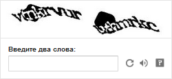
Spam protection CAPTCHA: guess the letter
This is just user abuse. It is easier to fill in several fields than this one.
At school I was too lazy to carry some books, and I read a book from a neighbor behind me "upside down." But I have mastered some CAPTCHA times from the 9th, if I'm lucky. Sometimes, if you fail, you need to enter all the fields again - epic fail.
It's time to replace it with something else. For example, easy logical or arithmetic operations with objects, where the answer will be to click on one of the pictures (“3 oranges + 3 mandarins =?” Or “moving lever scales with an elephant and a bird”).
Maybe someone will say: “This will also affect traffic!” This is easier than listening to the audio version of CAPTCHA.
I rarely log in to Habré. I am not a masochist, so that every time I enter, I enter a CAPTCHA.
Modern interfaces tell you what to do.
The developers were so insolent that their programs began to dictate their conditions to users! Programs should serve the user, not command them.
Sign up again for Gmail. Relative needed mail. Entered a simple password: qwerty12345. Gave a message that the password is too weak. Further the site does not let me. I enter q1w2e3r4t5y6. Do not let. And when I was able to push through this password, I was forced to re-fill in some fields and CAPTCHA.
If you issued a warning and the user does not want to change the password to another one (this will not cause a critical error), then let him complete the action. Do not torture him. You warned him.
Modern interfaces annoying
On the pages of the corporation "good", spam and advertising regularly displayed annoying inscriptions "Make ... your home page?", "Set our miracle browser."
If you were told “No” 49 times, then for the 50th time “Yes” will not be said. This especially looks stupid if you remember that the wonderful browser has long been installed on my PC and is now running simultaneously with Opera.
The second example is the Origin service from EA Games. Every time you start, Origin opens an additional window advertising its products, which you have to close without reading. If you like aggressive marketing so much, then at least select ads based on the customer’s purchase history. Instead, they offer me Simcity with Barbie when I bought Battlefield 3.
Modern interfaces rarely care about your data.
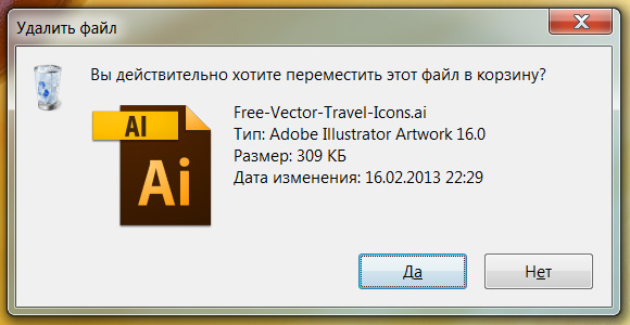
User data is paramount. The program should always warn about destructive actions and try to protect the data. Better to be safe.
If you want to delete a picture in the QuickPic gallery on Android, then click on the icon with a basket. Something appears that says "Delete." Click and there is no file. No warnings or questions. The first time I accidentally lost a few photos, doing everything automatically.
Example number 2. Even the version of Photoshop CS6 can catch a bug and “fly out”. Sometimes this means that your PSD file will no longer open. Exit - when you open the program creates a copy of the file and works with it.
Modern interfaces do not take into account the peculiarities of the psyche of people
In humans, one locus of attention and in critical situations, the user especially concentrates on it and ignores everything else.
For example, Tomb Raider 2013:
When I accidentally noticed the second message, Lara was already flying into the abyss.
You could just write: "Press grab [E], so as not to fall."
Modern interface developers want to stand out
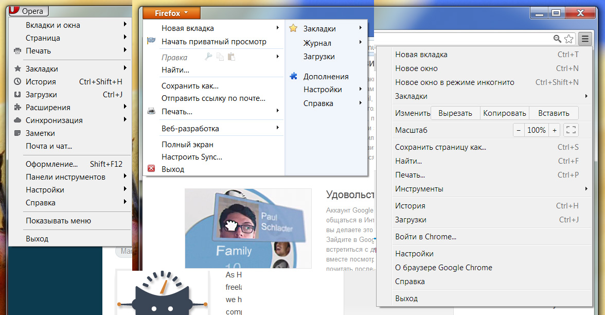
If your program works in the user's environment, then it is best to copy the working interaction principles from the user's native environment:
But everyone wants to be unique:
And some want it badly:
Modern interfaces force you to learn thousands of new keyboard shortcuts, operating principles and new interfaces.
Unification is convenient for both the user and the developer.
If you are doing a series of products, then try to keystrokes, interfaces and basic principles were the same as possible.
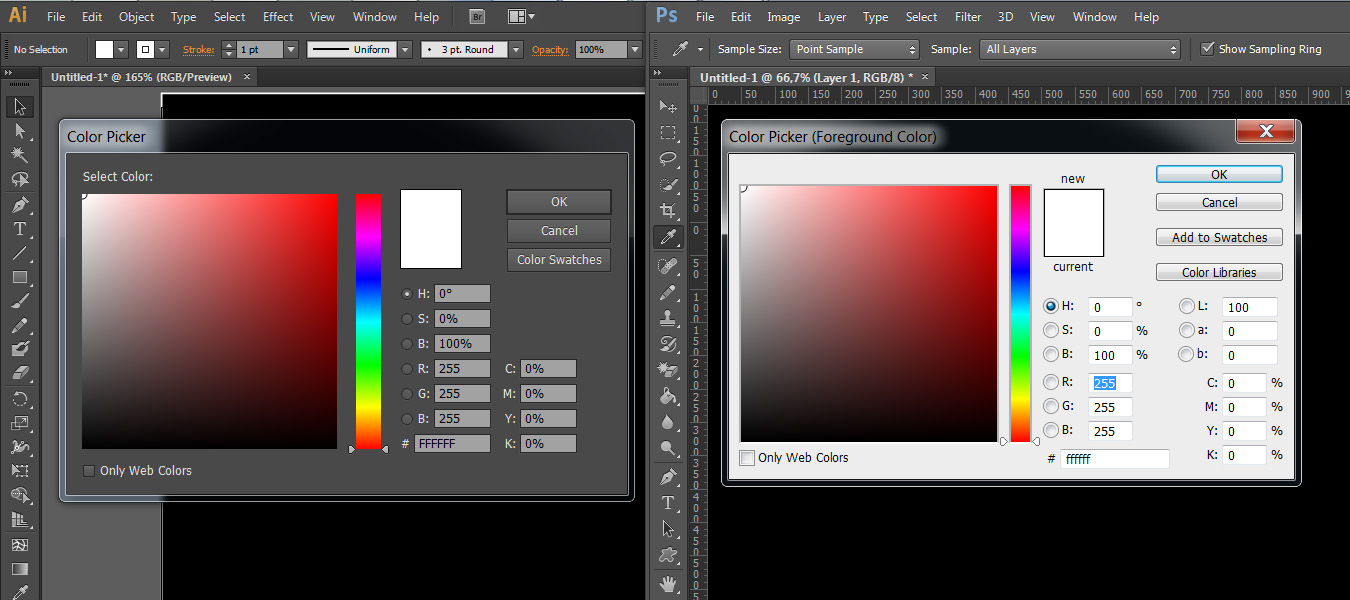
About this they know nothing in Adobe.
The color selection dialog box in the Adobe CS6 series:
There are no identical items.
Example number 2. To undo the last action in Photoshop, press Ctrl + Z. Pressing Ctrl + Z again will redo the undone action. In Illustrator, pressing Ctrl + Z again will cancel all previous actions. For a similar effect in Photoshop, you need to press Ctrl + Alt + Z. Even the tool palettes in these products open up differently.
Modern interfaces are often useless to change.
This causes the user to experience shock and relearn again. No one will buy a new version of the program with a new interface, if the cost of training will exceed the benefits of training.
Let's take a brief history of Word.
Word 2003 is inconvenient. No clear structure.
Word 2007 is very convenient. Clear structure. A beginner will immediately understand where the button is.
Word 2010 - more beautiful, but less clearly.
Word 2013 - OMG. I hope that I do not have to work in it!
Note. A set of capital letters can be used where visual differences between the labels are not important or you want the user to read the title carefully. Such titles are difficult to read because of the identical shape of the letters and the inability to quickly view them. Usually we do not read the words to the end, but distinguish them by the form:
Modern interfaces are overloaded with information
Some interfaces are just overwhelmed with buttons and labels. This creates only visual noise. Find similar, group, hide unimportant.
A good example is the Photoshop toolbar.
A bad example is Word 2013. One user solved the problem. He carried all the necessary elements in the window title:
Probably, this is also very inconvenient.
Modern interfaces are overloaded with icons
In order to save 1 customer required to develop a store design, where absolutely everything should be represented by icons. I wanted to save on the development of a multilingual interface.
This is hardly a good idea:
- You will not be able to pick up clear icons for all actions;
- Most likely, you will have to write a tooltip for each icon;
- Not all gestures have the same meaning throughout the world:
In Iran and Uruguay, this gesture means the threat of rape.
But if you have limited space and a lot of operations, then icons are your choice.
Some modern interfaces allow you to change yourself too much.
Sometimes standardization is good. In addition, as you write a guide to the product, if you do not know how it will look. Testing the interface will also not be very useful. Users are not interface specialists, unlike you.
Modern programs change your familiar interface.
If Google falls asleep to you with spam from advertising, then, for example, Yandex climbs your computer and changes your interface. It is like the HIV of the Internet. Not noticed a tick when installing a free program? Now restore the settings of all browsers and remove add-ons. This is very annoying to users.
I do not know how to get it out of here:
If you need to change the user interface, then leaving, tidy up after yourself.
Windows 8
Only lazy did not criticize Microsoft. I can not really say anything bad about the interface of Windows 8. I just did not put it and I will not install it. Here are the reasons:
- Removed transparency. Now I do not see what is behind the active window;
- Ugly flat interface. IMHO;
- When I saw the replacement of the standard Start, I thought:
Probably for me would be the perfect hybrid from the menu XP, 7 and 8.
Conclusion
Google and Microsoft are breaking through icebreakers into uncharted space, but not always in the right direction. Others are already on the "trodden path", copying fashion trends.
What do these problems in interface design lead to? This can lead developers to a dead end, and users will take a huge headache. The first may have to design new interfaces and revive their client base from the ashes, and the second will either have to endure and get angry, or learn new software products.
PS I hope that Google will not block me. Although 1 time on the exam on the right Google blocked my Motorola Defy as a "device for automatically sending information." Much wanted to say.
Source: https://habr.com/ru/post/172641/
All Articles