Drupal + Omega + Bootstrap: the rapid creation of fully custom skins without layout (Part 2. Bootstrap)
First part, introduction
In the first part of the article, I talked about the beautiful Omega framework for Drupal, which allows you to create your own design themes based on the grid, arbitrarily customize and change the location and size of regions without any modifications to the HTML code of the templates. We could stop at this, but there is a wonderful powerful CSS framework Bootstrap, which has its own implementation of the grid, a large number of ready-made CSS and JS components that are very easy to stylize, as well as a huge community, thanks to which we get the best quality and “licked” code compared to competitors.
In this part of the article I will tell you how to tie Bootstrap to Omega. But if you are not satisfied with Bootstrap for any reason, then you can similarly tie in any other framework to your taste in Omega. As in the first part of the article, I do not pretend to any uniqueness, just describe the things that can be learned from the documentation. There will be a lot of code and few pictures.
First, again, a little theory to get an idea of what we have to work with. So, the structure of the Omega framework:
')
Thus, in order to use Bootstrap with Omega, you need to do the following:
The basic theme will be created from the Omega HTML5 Startkit starter kit.
Next, we start editing the theme settings file
For convenience, the parameters in this file are divided into sections.
In the
In the
Below the
We took the format for the description of these sections from
We also create the starter kit from Omega HTML5 Startkit:
Our basic theme and starter kit are ready to use. But this is not the end, but rather only the beginning.
For a more visual representation of the process that will take place later, we will create a new theme using the method described in the first part of the article , using the Omega Tools, only in the Base theme (basic theme) choose Omega with Bootstrap , and in Starterkit (starter kit) our Omega HTML5 Starterkit with Bootstrap (Fig. 1).
one. 2
2  3
3  four.
four.  five.
five. 
Set our theme as default and go to settings.
All other settings are set in accordance with the recommendations from the first part of the article and save them. Then we can click the Export theme settings button, copy the settings and paste them into the
Bootstrap for styling elements uses classes that differ from standard Drupal classes. Therefore, it is necessary to add the Bootsrtap classes to the output of standard Drupal elements. To do this, we will use the standard features of the themeization of Drupal, namely, we redefine the
The theme functions will be overridden in the
To get started, let's get rid of the need to manually add the
We borrowed the code from the
Now you can remove unnecessary classes from the theme settings and set the number of columns in the region in the usual way.
Now we start embellishments. We take the code from the corresponding functions, slightly modify it for our needs and add the Bootstrap classes.
And so on along the same lines. If you need to add Bootstrap classes to standard Drupal output, you simply override the theme function (or template), all this is done using standard Drupal tools. You can borrow some additional functions from the Drupal-theme Bootstrap . You can also add these functions with additional parameters that can be changed in the theme settings. Examples of settings: the delimiter character in breadcrumbs,
Well, now let's move on to the practical part and see how all this can be used. To begin with, I would recommend setting up an auxiliary grid overlay to the width of the Bootstrap columns. To do this, you need to find PNGs from the Alpha base theme, modify them in the graphical editor, and override the
Please note that for the minimum version of jQuery for the JS-components Bootstrap - 1.7, so you need to connect it (or more recent) using the module jQuery Update .
Using the Block Class module (which was mentioned in the first part of the article), it is very convenient to add necessary classes to blocks, for example, standard
In the Views settings of the Views module, there is a standard opportunity to define arbitrary classes for almost all components, which opens up very wide possibilities for using Bootstrap.
Example 1: output materials grid. To do this, just add the class
Example 2: displaying news using the Bootstrap component Media object . To do this, add to Format - Unformatted list - Settings - Row class
Also, using the Views Bootstrap module (thanks to mrded ), you can use such Bootstrap components as Thumbnails and Carousel for the design of Views.
And finally, a small demonstration of some of the possibilities of the resulting theme preparation.
Figure 6. The finished theme with debugging blocks enabled.
Thanks for attention! I hope this article will be useful and will expand the scope of your use of Drupal.
In the first part of the article, I talked about the beautiful Omega framework for Drupal, which allows you to create your own design themes based on the grid, arbitrarily customize and change the location and size of regions without any modifications to the HTML code of the templates. We could stop at this, but there is a wonderful powerful CSS framework Bootstrap, which has its own implementation of the grid, a large number of ready-made CSS and JS components that are very easy to stylize, as well as a huge community, thanks to which we get the best quality and “licked” code compared to competitors.
In this part of the article I will tell you how to tie Bootstrap to Omega. But if you are not satisfied with Bootstrap for any reason, then you can similarly tie in any other framework to your taste in Omega. As in the first part of the article, I do not pretend to any uniqueness, just describe the things that can be learned from the documentation. There will be a lot of code and few pictures.
First, again, a little theory to get an idea of what we have to work with. So, the structure of the Omega framework:
')
- The basic theme of Alpha, which has the same functionality that allows you to set the location of zones and regions through the theme settings, as well as introducing a basic grid (grid) of different types (Fixed and Fluid) and the number of columns (12, 16, 24).
- Omega Base Theme, which is a subtext of the Alpha base theme, which overrides the core Drupal templates for HTML5.
- Starter kit, on the basis of which we are offered to create subtems based on Omega, either manually or automatically using the Omega Tools module.
Thus, in order to use Bootstrap with Omega, you need to do the following:
- Create a basic theme, which is an Omega subteam, which will connect Bootstrap and override the Omega (grid- *) grid classes in Bootstrap (span *), and add the necessary CSS classes for standard Drupal components (for example, buttons, system messages, Bread crumbs, pagination, etc.).
- Create a starter kit for our basic theme in order to quickly create sub-themes using Omega Tools.
The basic theme will be created from the Omega HTML5 Startkit starter kit.
Preparation of the basic theme and starter kit
- Copy the
omega/starterkits/omega-html5directory next to theomegadirectory and rename it toomega_bootstrap. - Rename the
starterkit_omega_html5.info→omega_bootstrap.info,css/global.css→css/omega-bootstrap.cssYOURTHEME-alpha-default-narrow.css, YOURTHEME-alpha-default-normal.css, YOURTHEME-alpha-default-wide.css, YOURTHEME-alpha-default.cssand deleteYOURTHEME-alpha-default-narrow.css, YOURTHEME-alpha-default-normal.css, YOURTHEME-alpha-default-wide.css, YOURTHEME-alpha-default.css. - Download Bootsrtap and add the
bootstrap.cssandbootstrap-responsive.cssfiles to thecssdirectory, and create thejsdirectory for thebootstrap.jsfile. There is no need to use minified versions; we can compress CSS and JS in the future using standard Drupal tools.
Next, we start editing the theme settings file
omega_bootstrap.info . First, we change the parameters name = Omega with Bootstrap and starterkit = FALSE .For convenience, the parameters in this file are divided into sections.
In the
ADDITIONAL REGIONS and ZONES we can add the zones or regions we need.In the
OPTIONAL STYLESHEETS section, change all [global.css] to [omega-bootstrap.css] and set something like Omega Bootstrap custom styles in the name parameter. Here we can also add additional CSS (for example, connect FontAwesome), which we can then turn on and off in the theme settings in the Toggle styles section (enable / disable styles).Below the
OPTIONAL STYLESHEETS section OPTIONAL STYLESHEETS create the OPTIONAL LIBRARIES and CSS GRID SYSTEMS sections: ; OPTIONAL LIBRARIES libraries[bootstrap][name] = 'Bootstrap' libraries[bootstrap][description] = 'Sleek, intuitive, and powerful front-end framework for faster and easier web development.' libraries[bootstrap][css][0][file] = bootstrap.css libraries[bootstrap][css][0][options][weight] = 1 libraries[bootstrap][css][1][file] = bootstrap-responsive.css libraries[bootstrap][css][1][options][weight] = 2 libraries[bootstrap][js][0][file] = bootstrap.js libraries[bootstrap][js][0][options][weight] = -1 ; CSS GRID SYSTEMS grids[bootstrap][name] = Bootstrap grids[bootstrap][layouts][normal] = Normal grids[bootstrap][columns][12] = 12 Columns We took the format for the description of these sections from
alpha.info and omega.info .We also create the starter kit from Omega HTML5 Startkit:
- Copy the
omega/starterkits/omega-html5directory next toomega_bootstrap, rename it toomega-html5-bootstrap. - Rename
starterkit_omega_html5.infotostarterkit_omega_html5_bootstrap.info, removeYOURTHEME-alpha-default-narrow.css, YOURTHEME-alpha-default-normal.css, YOURTHEME-alpha-default-wide.css, YOURTHEME-alpha-default.css - In the
starterkit_omega_html5_bootstrap.infofilestarterkit_omega_html5_bootstrap.infochange the parametersname = Omega HTML5 Starterkit with Bootstrapandbase theme = omega_bootstrap.
Our basic theme and starter kit are ready to use. But this is not the end, but rather only the beginning.
Creating a subteme
For a more visual representation of the process that will take place later, we will create a new theme using the method described in the first part of the article , using the Omega Tools, only in the Base theme (basic theme) choose Omega with Bootstrap , and in Starterkit (starter kit) our Omega HTML5 Starterkit with Bootstrap (Fig. 1).
one.
2 3 four. five. Set our theme as default and go to settings.
- On the Grid settings tab in the Grid system (grid type) a new type of Bootstrap has appeared, and select it (Fig. 2).
- In the Zone and region configuration tab, we add Bootstrap classes to zones and regions. In the Configuration section of the zone, in the Additional zone classes field, set the
rowvalue, and in the Additional wrapper classes field, set the value tocontainer. In the settings of the regions in the field Additional Region classes set the required classspan*for the number of columns we need. Omega allows you to define arbitrary classes for zones and regions, which we have used now, but in the future we will automate this process (Fig. 3). - On the Toggle libraries tab (enable / disable libraries), disable all standard Omega libraries and enable our Bootstrap (Fig. 4).
- On the Toggle styles tab (enable / disable styles), we also disable all styles in the Enable optional stylesheets section (enable additional styles) , except for Omega Bootstrap custom styles (all) - omega-bootstrap.css and Your custom global styles (all) - global. css (fig. 5).
All other settings are set in accordance with the recommendations from the first part of the article and save them. Then we can click the Export theme settings button, copy the settings and paste them into the
omega-html5-bootstrap/starterkit_omega_html5_bootstrap.info , replacing them with the settings in the THEME SETTINGS (DEFAULTS) section. In this case, all the new themes from our starter kit will immediately be customized in the way we want.Temization
Bootstrap for styling elements uses classes that differ from standard Drupal classes. Therefore, it is necessary to add the Bootsrtap classes to the output of standard Drupal elements. To do this, we will use the standard features of the themeization of Drupal, namely, we redefine the
theme_ -functions we need. You can learn more about Drupal theme themes from the documentation section using the theme layer ( http://drupal.org/node/933976 ).The theme functions will be overridden in the
template.php file at the root of our base theme omega_bootstrap , in which case they will be inherited by all our subtems.To get started, let's get rid of the need to manually add the
container and row classes to zones, as well as span* classes to regions. To do this, add the omega_bootstrap_process() function to template.php :omega_bootstrap_process ()
/** * Implements hook_process(). */ function omega_bootstrap_process(&$vars, $hook) { if (!empty($vars['elements']['#grid']) || !empty($vars['elements']['#data']['wrapper_css'])) { if (!empty($vars['elements']['#grid'])) { foreach (array('prefix', 'suffix', 'push', 'pull') as $quality) { if (!empty($vars['elements']['#grid'][$quality])) { array_unshift($vars['attributes_array']['class'], 'offset' . $vars['elements']['#grid'][$quality]); # offset* } } array_unshift($vars['attributes_array']['class'], 'span' . $vars['elements']['#grid']['columns']); # span* } $vars['attributes'] = $vars['attributes_array'] ? drupal_attributes($vars['attributes_array']) : ''; } if (!empty($vars['elements']['#grid_container']) || !empty($vars['elements']['#data']['css'])) { if (!empty($vars['elements']['#grid_container'])) { $vars['content_attributes_array']['class'][] = 'container'; # container } $vars['content_attributes'] = $vars['content_attributes_array'] ? drupal_attributes($vars['content_attributes_array']) : ''; } alpha_invoke('process', $hook, $vars); } We borrowed the code from the
alpha_process() function, which can be found in the omega/alpha/template.php file. As you can see, you still need to add a row . To do this, copy the template files from omega/alpha/templates/zone.tpl.php and omega/omega/templates/zone--content.tpl.php to the omega_bootstrap/templates directory and edit it as follows.File zone.tpl.php
<?php /** * @file * Alpha's theme implementation to display a zone. */ ?> <?php if ($wrapper): ?><div<?php print $attributes; ?>><?php endif; ?> <div<?php print $content_attributes; ?>><div class="row"> <?php print $content; ?> </div></div> <?php if ($wrapper): ?></div><?php endif; ?> File zone - content.tpl.php
<?php if ($wrapper): ?><div<?php print $attributes; ?>><?php endif; ?> <div<?php print $content_attributes; ?>><div class="row"> <?php if ($breadcrumb): ?> <div id="breadcrumb" class="grid-<?php print $columns; ?>"><?php print $breadcrumb; ?></div> <?php endif; ?> <?php if ($messages): ?> <div id="messages" class="grid-<?php print $columns; ?>"><?php print $messages; ?></div> <?php endif; ?> <?php print $content; ?> </div></div> <?php if ($wrapper): ?></div><?php endif; ?> Now you can remove unnecessary classes from the theme settings and set the number of columns in the region in the usual way.
Now we start embellishments. We take the code from the corresponding functions, slightly modify it for our needs and add the Bootstrap classes.
"Bread crumbs"
Since we use the Delta Blocks module for displaying system elements, we override its theme function.
/** * Implements theme_delta_blocks_breadcrumb(). */ function omega_bootstrap_delta_blocks_breadcrumb($variables) { $output = ''; if (!empty($variables['breadcrumb'])) { if ($variables['breadcrumb_current']) { $variables['breadcrumb'][] = l(drupal_get_title(), current_path(), array('html' => TRUE)); } $output = '<div id="breadcrumb" class="clearfix"><ul class="breadcrumb">'; $switch = array('odd' => 'even', 'even' => 'odd'); $zebra = 'even'; $last = count($variables['breadcrumb']) - 1; foreach ($variables['breadcrumb'] as $key => $item) { $zebra = $switch[$zebra]; $attributes['class'] = array('depth-' . ($key + 1), $zebra); if ($key == 0) { $attributes['class'][] = 'first'; } if ($key == $last) { $attributes['class'][] = 'last'; } else { $item .= '<span class="divider">/</span>'; } $output .= '<li' . drupal_attributes($attributes) . '>' . $item . '</li>'; } $output .= '</ul></div>'; } return $output; } System messages
Classes
messages change to alert . /** * Implements theme_status_messages(). */ function omega_bootstrap_status_messages($variables) { $display = $variables['display']; $output = ''; $status_heading = array( 'status' => t('Status message'), 'error' => t('Error message'), 'warning' => t('Warning message'), ); $class = array( 'status' => 'alert alert-success', 'error' => 'alert alert-error', 'warning' => 'alert', ); foreach (drupal_get_messages($display) as $type => $messages) { $output .= "<div class=\"{$class[$type]}\">\n"; if (!empty($status_heading[$type])) { $output .= '<h2 class="element-invisible">' . $status_heading[$type] . "</h2>\n"; } if (count($messages) > 1) { $output .= " <ul>\n"; foreach ($messages as $message) { $output .= ' <li>' . $message . "</li>\n"; } $output .= " </ul>\n"; } else { $output .= $messages[0]; } $output .= "</div>\n"; } return $output; } Button Owners
I like
nav-pills , I can replace it with nav-tabs . /** * Implements theme_menu_local_tasks(). */ function omega_bootstrap_menu_local_tasks(&$variables) { $output = ''; if (!empty($variables['primary'])) { $variables['primary']['#prefix'] = '<h2 class="element-invisible">' . t('Primary tabs') . '</h2>'; $variables['primary']['#prefix'] .= '<ul class="nav nav-pills">'; $variables['primary']['#suffix'] = '</ul>'; $output .= drupal_render($variables['primary']); } if (!empty($variables['secondary'])) { $variables['secondary']['#prefix'] = '<h2 class="element-invisible">' . t('Secondary tabs') . '</h2>'; $variables['secondary']['#prefix'] .= '<ul class="nav nav-pills">'; $variables['secondary']['#suffix'] = '</ul>'; $output .= drupal_render($variables['secondary']); } return $output; } Form buttons
Add
btn class. /** * Implements theme_button(). */ function omega_bootstrap_button($variables) { $element = $variables['element']; $element['#attributes']['type'] = 'submit'; element_set_attributes($element, array('id', 'name', 'value')); $element['#attributes']['class'][] = 'btn'; switch($element['#id']) { # case strpos($element['#id'], 'edit-submit') === 0: $element['#attributes']['class'][] = 'btn-primary'; break; case 'edit-preview': $element['#attributes']['class'][] = 'btn-warning'; break; case 'edit-delete': $element['#attributes']['class'][] = 'btn-danger'; break; } $element['#attributes']['class'][] = 'form-' . $element['#button_type']; if (!empty($element['#attributes']['disabled'])) { $element['#attributes']['class'][] = 'form-button-disabled btn-disabled'; } return ' <input' . drupal_attributes($element['#attributes']) . ' /> '; } Pagination
Class
pagination . /** * Implements theme_pager(). */ function omega_bootstrap_pager($variables) { $tags = $variables['tags']; $element = $variables['element']; $parameters = $variables['parameters']; $quantity = $variables['quantity']; global $pager_page_array, $pager_total; // Calculate various markers within this pager piece: // Middle is used to "center" pages around the current page. $pager_middle = ceil($quantity / 2); // current is the page we are currently paged to $pager_current = $pager_page_array[$element] + 1; // first is the first page listed by this pager piece (re quantity) $pager_first = $pager_current - $pager_middle + 1; // last is the last page listed by this pager piece (re quantity) $pager_last = $pager_current + $quantity - $pager_middle; // max is the maximum page number $pager_max = $pager_total[$element]; // End of marker calculations. // Prepare for generation loop. $i = $pager_first; if ($pager_last > $pager_max) { // Adjust "center" if at end of query. $i = $i + ($pager_max - $pager_last); $pager_last = $pager_max; } if ($i <= 0) { // Adjust "center" if at start of query. $pager_last = $pager_last + (1 - $i); $i = 1; } // End of generation loop preparation. $li_first = theme('pager_first', array('text' => (isset($tags[0]) ? $tags[0] : t('« first')), 'element' => $element, 'parameters' => $parameters)); $li_previous = theme('pager_previous', array('text' => (isset($tags[1]) ? $tags[1] : t('‹ previous')), 'element' => $element, 'interval' => 1, 'parameters' => $parameters)); $li_next = theme('pager_next', array('text' => (isset($tags[3]) ? $tags[3] : t('next ›')), 'element' => $element, 'interval' => 1, 'parameters' => $parameters)); $li_last = theme('pager_last', array('text' => (isset($tags[4]) ? $tags[4] : t('last »')), 'element' => $element, 'parameters' => $parameters)); if ($pager_total[$element] > 1) { if ($li_first) { $items[] = array( 'data' => $li_first, ); } if ($li_previous) { $items[] = array( 'data' => $li_previous, ); } // When there is more than one page, create the pager list. if ($i != $pager_max) { if ($i > 1) { $items[] = array( 'data' => '<span>…</span>', ); } // Now generate the actual pager piece. for (; $i <= $pager_last && $i <= $pager_max; $i++) { if ($i < $pager_current) { $items[] = array( 'data' => theme('pager_previous', array('text' => $i, 'element' => $element, 'interval' => ($pager_current - $i), 'parameters' => $parameters)), ); } if ($i == $pager_current) { $items[] = array( 'class' => array('active'), 'data' => "<span>$i</span>", ); } if ($i > $pager_current) { $items[] = array( 'data' => theme('pager_next', array('text' => $i, 'element' => $element, 'interval' => ($i - $pager_current), 'parameters' => $parameters)), ); } } if ($i < $pager_max) { $items[] = array( 'data' => '<span>…</span>', ); } } // End generation. if ($li_next) { $items[] = array( 'data' => $li_next, ); } if ($li_last) { $items[] = array( 'data' => $li_last, ); } return '<h2 class="element-invisible">' . t('Pages') . '</h2><div class="pagination pagination-centered">' . theme('item_list', array( 'items' => $items, )) . '</div>'; } } And so on along the same lines. If you need to add Bootstrap classes to standard Drupal output, you simply override the theme function (or template), all this is done using standard Drupal tools. You can borrow some additional functions from the Drupal-theme Bootstrap . You can also add these functions with additional parameters that can be changed in the theme settings. Examples of settings: the delimiter character in breadcrumbs,
nav-tabs or nav-pills , the size and location of the page numerator ( pagination-large / pagination-small / pagination-mini and pagination-centered / pagination-right ). Read more about this in the Creating advanced theme settings documentation ( http://drupal.org/node/177868 ).Using
Well, now let's move on to the practical part and see how all this can be used. To begin with, I would recommend setting up an auxiliary grid overlay to the width of the Bootstrap columns. To do this, you need to find PNGs from the Alpha base theme, modify them in the graphical editor, and override the
alpha-grid-debug class in our omega-bootstrap.css .Please note that for the minimum version of jQuery for the JS-components Bootstrap - 1.7, so you need to connect it (or more recent) using the module jQuery Update .
Using the Block Class module (which was mentioned in the first part of the article), it is very convenient to add necessary classes to blocks, for example, standard
well (see Fig. 6).In the Views settings of the Views module, there is a standard opportunity to define arbitrary classes for almost all components, which opens up very wide possibilities for using Bootstrap.
Example 1: output materials grid. To do this, just add the class
row whole Other view, add the CSS class , and in the class settings of the row, the Output form Format - Unformatted list - Settings - Row class specify the class with the required number of columns, for example, span2 .Example 2: displaying news using the Bootstrap component Media object . To do this, add to Format - Unformatted list - Settings - Row class
media class, in the parameters of the field with the image Style settings - Customize the field and label wrapper HTML - Create a CSS class add the class pull-left , and in the same parameters add the text field class media-body . Other fields can be added to the same field through the Rewrite results - Rewrite the output of this field , without forgetting to turn these fields off for output (Exclude from display) .Also, using the Views Bootstrap module (thanks to mrded ), you can use such Bootstrap components as Thumbnails and Carousel for the design of Views.
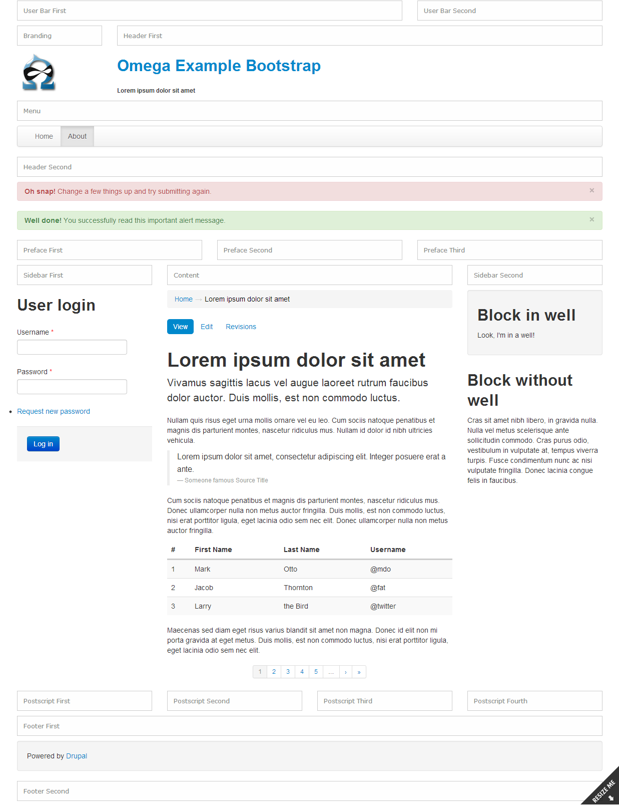
And finally, a small demonstration of some of the possibilities of the resulting theme preparation.
Figure 6. The finished theme with debugging blocks enabled.
Thanks for attention! I hope this article will be useful and will expand the scope of your use of Drupal.
Source: https://habr.com/ru/post/172585/
All Articles