Grid in the design of interfaces for Windows Phone: a strict teacher or a kind helper? (Part 1)
We continue to publish articles in the footsteps of Design Camp . Today we have the next report of Yegor Gilev ( yegorg ), who at the time of the camp worked for Parksis, but in February 2013 he went into free swimming and now works with his own co-founder of the studio Turbomilk Denis Kortunov on his own projects. The article is given as is and displays the author's point of view on the design of applications under Windows Phone.
I work as a User Experience Designer at Parcsis. In the form in which it exists today, it was formed as a result of the merger of two companies: Parcsis and Turbomilk. Parcsis is a kind of incubator that runs its own online projects. Turbomilk is a world-famous interface design studio in narrow circles. I am the co-founder of Turbomilk. About one and a half years ago, we united, and Turbomil’s design team became the UX-design department of the combined company.
In the company I am supposed to be an eccentric. It is believed that the designer should work on a large aluminum poppy and own an iPhone, preferably the last generation. I work on a laptop transformer with Windows 8, which I bought on the first day of Windows 8 sales in Russia. My white Lumia 710 serves as my phone - for the time being on Windows Phone 7.5. You can’t go wrong if you assume that I love Windows. Especially the new Windows interface, which used to be called Metro. I love him dearly, both as a user and as an interface designer.
')
Returning to our company. One of the main projects of Parxis is called "Prav.ru." This project includes a lot of interesting things, but for our today's conversation only one part of it is important to us - the one that is the reference and legal system available both on the web and on mobile devices. Now on Windows Phone:
As you understand, when we decided to make Pravo.ru, a mobile application for Windows Phone 7, the task of creating its interface naturally came to me, which I was very pleased about. Firstly, because I was pleased to draw it, and secondly, because it gave me the opportunity to understand the guidelines for the design of interfaces for Windows Phone in general, and the rules of working with the grid in particular.

“Draw on the grid!” - tells us the interface design guide from Microsoft. And this is impossible to argue. In the world of Windows Phone, the grid is the basis of everything, and the whole head, without it everything will fall apart and lose its meaning. Having established this, we proceed to the question: what should it be?
In the official manual we can only find the following illustration:

Actually, it is not even part of the manual, but simply illustrates one of the design principles for Windows Phone on the Windows Phone Dev Center website. Since there are no figures here, and there is no direct indication that such a grid should be used, we cannot accept this as a guide to action. Maybe it's just a picture on the topic of nets?
When official information is not enough, it is necessary to expand the scope of the search with information that is less official, but nonetheless reliable.
Here, for example, is a picture from the site of Mike Gus , one of the creators of the unique visual language of Windows Phone 7:

Here we see a grid of 6 columns, and not of 12, as in the previous picture. But, as you understand, from 6 it is easy to make 12 - and vice versa. So, we can hardly make a big mistake if we assume that exactly the same grid is shown here, only with missing grooves.
Having paid tribute to Mike Gus, let's move on to another insider's blog - Arturo Toledo. As I understand it, Arturo worked for Microsoft as an evangelist designer. His website is just a storehouse of useful information for the interface designer for Windows Phone. First of all I want to draw your attention to the series of articles 24 Weeks of Windows Phone Metro Design . The eleventh article in this series is about the topic that interests us, that is, the grid in the design for Windows Phone.
Finally here we see all the numerical parameters, and we can even download this grid in files of different formats:

If you put a number of pictures from the site of Gus and from the Toledo blog, it is not difficult to verify that this is essentially the same grid. If we lay additional grooves 12 pixels wide across the large squares in the Gus grid, squares 25 × 25 pixels in size, as in the Toledo grid, are formed. Thus, we can be one hundred percent sure that we have found a description of the very grid that should be used for the design of Windows Phone interfaces, although for some reason it is not in the official manuals.
So, the square modules are 25 × 25 pixels, and the gaps between them are 12 pixels. Tell me what you can find in these two numbers: 25 and 12? The correct answer is nothing. The lack of a common denominator for these numbers actually promises us problems, which I will talk about a little later. And now let's try to figure out where these figures come from, because they look really strange.
I can assume that it all started with the fact that Mike Gus, or one of his colleagues, decided to base the grid on the usual 12-column, tested for decades. As you know, 12 columns are the most convenient number of columns into which something can be divided. Because 12, in turn, is divided into 6, 3, 4, and 2. If we assume that the indent from the edges should be 2 times larger than the gap between the columns, the numerical parameters of this grid can be described with this formula :

Where w is the width of the screen, x is the width of the column, and y is the width of the gap between the columns.
Maybe, at first, Mike wanted to set the indents size to 10 pixels. Personally, I would start with the number 10. But then the fractional width of the column would be 27 pixels and a half. This, of course, is unacceptable. No matter how small the pixels on current devices, I think you need to treat them with due respect. The dimensions of all elements in pixels must be integer. Therefore, the next step we will try to make the gap between the columns 12 pixels wide, and magically, this formula gives us the width of the column 25. Bingo! The number, although strange and incomprehensible in the neighborhood of 12, but at least a whole.
We figured out how to split the screen horizontally. And what is vertical? Vertically everything is absolutely the same. Square modules with the same indentation horizontally and vertically allow you to place on the screen square blocks of different sizes as we like. And not only square.
Here is how this grid works on the example of the main screens of Windows Phone 7 and 8:

The layout of the main screen is different, but the grid has not changed. Which well illustrates its flexibility and suitability for building a variety of solutions.
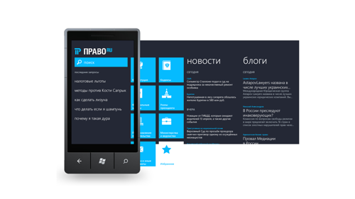
Inspired by the example of the work of the authors of the Metro style, I tried to apply this magic in the design of the application Pravo.ru for Windows Phone. The main screen immediately turned out very beautiful:

I can not say that it was difficult, because it almost completely repeats the main screen of the Windows Phone 7 system. It is not surprising that all the elements successfully lay on the grid.
But with the news feed screen there are difficulties:

Text content on the grid did not want to go down. Separate coincidences of the base lines of the text with the lines of the grid here can be considered random, just as a broken clock twice a day shows the correct time.
The first conclusion, which suggests itself here, sounds quite unflattering to me: the mesh gets in the way of a poor designer. By analogy with the bad dancer, which prevents what is known. However, before plunging into depression from the awareness of my own professional incompetence, I tried to attach this grid to the official templates from Microsoft.
What do we see? Individual templates are drawn on the grid:

Others completely ignore the grid:

Others follow the grid only partially:

Obviously, I inadvertently embodied the Russian proverb of the people that if you make a fool to pray to God, he can hurt his forehead.
In search of help, we will try again to turn to the help of our friend Arthur Toledo. There are three videos on the layout of elements on the screen:
If Arturo works with tiles in the first two parts, and, of course, he is very clever enough to place them on the grid, in the third part Arturo deals with a more complex case with textual content. In this example, Arturo first sprinkles the following composition:

As you can see, all elements are subordinate to the grid. But Arturo quite rightly draws our attention to the too small distance between the blocks, and begins to push them, keeping the reference to the grid:

See what Arturo does? All elements lie on the grid, the distances between the blocks are increased, but now they are different! Because some blocks are stuck to the upper bounds of the grid squares, and others to the bottom. This, of course, a disgrace. Therefore, in the next step, Arturo turns off the grid altogether and makes all vertical intervals between elements multiple of 12 pixels, that is, 12 and 24 pixels:

Now everything is beautiful, but the grid to this beauty is no longer directly related.
What can we conclude? The proposed grid works well for the layout of rectangular blocks, but does not help with the placement of textual content, and, by and large, is not intended for this. And some squares will not be full. I do not know how in your application, but in our text it is much more than squares, whatever one may say. Of course, we can follow Arturo’s path and turn on the grid when working with tiles and other rectangular elements, and also use it to align text blocks horizontally, and turn off the grid when positioning text vertically. But, I confess, I do not really like this approach. This is not technological, inconvenient, and I am too lazy to waste precious time on moving elements back and forth in search of harmony, as Arturo shows in his video.
To be continued...
I work as a User Experience Designer at Parcsis. In the form in which it exists today, it was formed as a result of the merger of two companies: Parcsis and Turbomilk. Parcsis is a kind of incubator that runs its own online projects. Turbomilk is a world-famous interface design studio in narrow circles. I am the co-founder of Turbomilk. About one and a half years ago, we united, and Turbomil’s design team became the UX-design department of the combined company.
In the company I am supposed to be an eccentric. It is believed that the designer should work on a large aluminum poppy and own an iPhone, preferably the last generation. I work on a laptop transformer with Windows 8, which I bought on the first day of Windows 8 sales in Russia. My white Lumia 710 serves as my phone - for the time being on Windows Phone 7.5. You can’t go wrong if you assume that I love Windows. Especially the new Windows interface, which used to be called Metro. I love him dearly, both as a user and as an interface designer.
')
Returning to our company. One of the main projects of Parxis is called "Prav.ru." This project includes a lot of interesting things, but for our today's conversation only one part of it is important to us - the one that is the reference and legal system available both on the web and on mobile devices. Now on Windows Phone:
As you understand, when we decided to make Pravo.ru, a mobile application for Windows Phone 7, the task of creating its interface naturally came to me, which I was very pleased about. Firstly, because I was pleased to draw it, and secondly, because it gave me the opportunity to understand the guidelines for the design of interfaces for Windows Phone in general, and the rules of working with the grid in particular.
What is the grid?
“Draw on the grid!” - tells us the interface design guide from Microsoft. And this is impossible to argue. In the world of Windows Phone, the grid is the basis of everything, and the whole head, without it everything will fall apart and lose its meaning. Having established this, we proceed to the question: what should it be?
In the official manual we can only find the following illustration:
Actually, it is not even part of the manual, but simply illustrates one of the design principles for Windows Phone on the Windows Phone Dev Center website. Since there are no figures here, and there is no direct indication that such a grid should be used, we cannot accept this as a guide to action. Maybe it's just a picture on the topic of nets?
When official information is not enough, it is necessary to expand the scope of the search with information that is less official, but nonetheless reliable.
Here, for example, is a picture from the site of Mike Gus , one of the creators of the unique visual language of Windows Phone 7:
Here we see a grid of 6 columns, and not of 12, as in the previous picture. But, as you understand, from 6 it is easy to make 12 - and vice versa. So, we can hardly make a big mistake if we assume that exactly the same grid is shown here, only with missing grooves.
Having paid tribute to Mike Gus, let's move on to another insider's blog - Arturo Toledo. As I understand it, Arturo worked for Microsoft as an evangelist designer. His website is just a storehouse of useful information for the interface designer for Windows Phone. First of all I want to draw your attention to the series of articles 24 Weeks of Windows Phone Metro Design . The eleventh article in this series is about the topic that interests us, that is, the grid in the design for Windows Phone.
Finally here we see all the numerical parameters, and we can even download this grid in files of different formats:
If you put a number of pictures from the site of Gus and from the Toledo blog, it is not difficult to verify that this is essentially the same grid. If we lay additional grooves 12 pixels wide across the large squares in the Gus grid, squares 25 × 25 pixels in size, as in the Toledo grid, are formed. Thus, we can be one hundred percent sure that we have found a description of the very grid that should be used for the design of Windows Phone interfaces, although for some reason it is not in the official manuals.
Why such a grid?
So, the square modules are 25 × 25 pixels, and the gaps between them are 12 pixels. Tell me what you can find in these two numbers: 25 and 12? The correct answer is nothing. The lack of a common denominator for these numbers actually promises us problems, which I will talk about a little later. And now let's try to figure out where these figures come from, because they look really strange.
I can assume that it all started with the fact that Mike Gus, or one of his colleagues, decided to base the grid on the usual 12-column, tested for decades. As you know, 12 columns are the most convenient number of columns into which something can be divided. Because 12, in turn, is divided into 6, 3, 4, and 2. If we assume that the indent from the edges should be 2 times larger than the gap between the columns, the numerical parameters of this grid can be described with this formula :
Where w is the width of the screen, x is the width of the column, and y is the width of the gap between the columns.
Maybe, at first, Mike wanted to set the indents size to 10 pixels. Personally, I would start with the number 10. But then the fractional width of the column would be 27 pixels and a half. This, of course, is unacceptable. No matter how small the pixels on current devices, I think you need to treat them with due respect. The dimensions of all elements in pixels must be integer. Therefore, the next step we will try to make the gap between the columns 12 pixels wide, and magically, this formula gives us the width of the column 25. Bingo! The number, although strange and incomprehensible in the neighborhood of 12, but at least a whole.
We figured out how to split the screen horizontally. And what is vertical? Vertically everything is absolutely the same. Square modules with the same indentation horizontally and vertically allow you to place on the screen square blocks of different sizes as we like. And not only square.
Here is how this grid works on the example of the main screens of Windows Phone 7 and 8:
The layout of the main screen is different, but the grid has not changed. Which well illustrates its flexibility and suitability for building a variety of solutions.
Attempt to put into practice
Inspired by the example of the work of the authors of the Metro style, I tried to apply this magic in the design of the application Pravo.ru for Windows Phone. The main screen immediately turned out very beautiful:
I can not say that it was difficult, because it almost completely repeats the main screen of the Windows Phone 7 system. It is not surprising that all the elements successfully lay on the grid.
But with the news feed screen there are difficulties:
Text content on the grid did not want to go down. Separate coincidences of the base lines of the text with the lines of the grid here can be considered random, just as a broken clock twice a day shows the correct time.
The first conclusion, which suggests itself here, sounds quite unflattering to me: the mesh gets in the way of a poor designer. By analogy with the bad dancer, which prevents what is known. However, before plunging into depression from the awareness of my own professional incompetence, I tried to attach this grid to the official templates from Microsoft.
What do we see? Individual templates are drawn on the grid:
Others completely ignore the grid:
Others follow the grid only partially:
Obviously, I inadvertently embodied the Russian proverb of the people that if you make a fool to pray to God, he can hurt his forehead.
Arturo will help us
In search of help, we will try again to turn to the help of our friend Arthur Toledo. There are three videos on the layout of elements on the screen:
If Arturo works with tiles in the first two parts, and, of course, he is very clever enough to place them on the grid, in the third part Arturo deals with a more complex case with textual content. In this example, Arturo first sprinkles the following composition:
As you can see, all elements are subordinate to the grid. But Arturo quite rightly draws our attention to the too small distance between the blocks, and begins to push them, keeping the reference to the grid:
See what Arturo does? All elements lie on the grid, the distances between the blocks are increased, but now they are different! Because some blocks are stuck to the upper bounds of the grid squares, and others to the bottom. This, of course, a disgrace. Therefore, in the next step, Arturo turns off the grid altogether and makes all vertical intervals between elements multiple of 12 pixels, that is, 12 and 24 pixels:
Now everything is beautiful, but the grid to this beauty is no longer directly related.
What can we conclude? The proposed grid works well for the layout of rectangular blocks, but does not help with the placement of textual content, and, by and large, is not intended for this. And some squares will not be full. I do not know how in your application, but in our text it is much more than squares, whatever one may say. Of course, we can follow Arturo’s path and turn on the grid when working with tiles and other rectangular elements, and also use it to align text blocks horizontally, and turn off the grid when positioning text vertically. But, I confess, I do not really like this approach. This is not technological, inconvenient, and I am too lazy to waste precious time on moving elements back and forth in search of harmony, as Arturo shows in his video.
To be continued...
Source: https://habr.com/ru/post/172387/
All Articles