5 secrets of a good interface. Personal experience
For the past few years I have been working hard on developing interfaces for a wide variety of devices, from banal smartphones and tablets to smartTV applications and some esoteric devices like set-top boxes for broadcasting music through TV.
I admit honestly - I'm a bad theoretician. It seems that I have not fully mastered a single book on the development or design of the interface and I practically don’t read the blogs of popular evangelists from usability. But, perhaps, for you there is a positive side to this - I have formed my own set of rules, which I use to create the interface.
Under the cut, you will find a long text, two tips and three techniques, generously seasoned with examples from personal experience, in which I tried to describe in steps the process of creating good, intuitive applications and sites, and which affects, of course, many near-interface solutions.
')
The overall concept is only in the head.
It sounds a bit crazy, but personally, quick sketches for me make it difficult to cover the whole picture, and procrastination, often, does not even allow me to take a notebook. When I take a pencil in my hands, and in simple cases, immediately a mouse, I should already know what I want to come to. Let this picture be with a bunch of white spots, let it change 20 times as it is realized, but the first, still unconnected idea gives rise to ideas that never appear at the stage of sketches.

But how to make yourself think in the right way? Thoughts disappear in a second if you specifically sat in a quiet place and meditate. There is a little secret. Imagine all the work already done. Everything is ready, working, thousands of users every minute use your service and praise without stopping.
What are they discussing? What words? How do you see this product yourself? Why do they want to use it? Peer at this picture in your imagination. And at this moment, suddenly it becomes crystal clear how this should work. Hold on to this thought - this is the last time you are crystal clear what to do :).
Sometimes it doesn't work. If the product is too narrowly specialized, or if it doesn’t inspire you personally. Social-network-catalog of cleaning products for sewage does not want to be visualized in the head. Bad, but it does not matter - maybe you should talk with the customer / developer / someone from the target audience. These people with burning eyes tell you the secrets of their field and can seriously inspire and give a lot of inspiration. It happened to me more than once - initially a very dubious idea suddenly turns into a super service in my head, after I was enthusiastically told by one person for the 50th time.
First, the design, then the grid elements / wireframe.

Yes, the controversial rule. I myself find it strange that I write it - but it gives a result faster and with a higher level of quality than vice versa. After the idea and draft sketches to fix the key points, you can proceed to the design. In no case should we try to make it all — we just need beautiful pictures of a pair of key screens. Better in several ways. Each next design, the essence, is not just a new concept, but an iteration of the work on the idea - the successful moves go to the next, the dubious ones leave.
If the project is simple enough from a logical point of view, and the design is very successful, then you can even skip the prototyping stage and immediately proceed to the finalization of the design and layout.
Why does this work?
First, the free elaboration of small things that are not tied to a rigid grid of elements gives a much more creative approach and does not pinch the designer in the cage of the existing grid of elements. I mainly paint myself, but I worked in design communities for advertising agencies for a long time to know one of the killers of a good design in the face - a bad sketch.
Secondly, at this stage there is a concentration on the main directions - actually, that's why I mentioned the “key moments”. There are no forms of logins and exhausting payment chains in 3 different ways, only the general style of the site / interface / application. If you manage to create a good style, it will greatly inspire the team for further work, including the interface developer.
Third, and most important , you have something to show. Need to report to the investor? See, here is the presentation, and here is the sketch. You can, on its basis, create several posters or banners to attract additional investment. You can brag to your parents.
But seriously, believe me, a good, presentable screenshot of your future service will greatly simplify your life in the future.
Another news - most likely in the final version of the original design will not be anything. This is normal.
We proceed to the practical part:
For myself, I derived several techniques that are somewhat banal, but effective in practice, when you do not know where to start and how to evaluate the result. It turned out that it is very difficult to formulate them, although I sincerely believed that the description of all three would take at most a few paragraphs.

The application operates with a different number of elements. We need to estimate this amount. There may be five, as tabs in instagramme, and maybe a billion, as search results in Google. Each number of elements requires its own graphical and logical approach.
So, we estimate the number of elements:
About 5 - the withdrawal of all elements with details.
If this is a menu, then the details for them will be very concise - just a caption under the icon.
Question to the customer - how many tire models do you have? If the answer is five, you do not need to do a drop-down list, a search with a hint and smart auto-complete. Just show all these five types of tires with specifications. Everything. There is nothing to think about - any action with them will be a complication of searching for them.
7 - 15 - list output without details.
Categories, if any, are subordinate to the elements and are presented simply as information.
Any person will most likely view 10 items faster than clicking into categories to see two or three items. If you have 10 models of sofas, you do not need to create sections for them - show them, hiding the details under the cut, if there are a lot of them.
All the arguments about "think that we have a little of everything, let's make the categories better" nonsense. If the user opens the category "rattan furniture" and sees that there is already one element in it, it is much worse than just bringing all the models to the main one. No pseudo-elements will deceive the current user, who sees these tricks a million a day.
15-25 items - open categorized or grouped list.
A classic example is the restaurant menu. There are 6 categories, in which, say, 18 dishes. Bad restaurants will do this: one page - one category - three dishes, occupying three lines. Good - will bring the entire list of dishes on a single turn, grouping them into categories - soups, hot dishes, drinks and so on.
25 - 150 items - closed categorized list.
A typical small online store, a range of up to 150 products. It would be crazy to dump all this diversity on one page, but there’s no point in doing full-text search at the heart of the search. Man will not find what he needs. Of course, an additional search will not be superfluous, but I am talking about the main method that is offered to the user.
150-500 items - categorized catalog with filters.
Here you can turn on smart algorithms for predicting elements that are interesting and important to the user. For news, these are the latest materials from the correct region, for the household appliances catalog - promotions and popular offers.
500-10k items - categorized catalog with filters + required full-text search
All the same as in the previous case, but full-text search becomes an essential element. An example is a directory of old cards for MTG. This game contains a huge number of cards, most of which are of interest only to collectors. We can divide all the cards by editions and colors, but hundreds of cards wander from the editorial board to the editorial board, sometimes even disappearing from them, as the balance improves. Without a full-text search, you will have little chance of finding something specific, but requiring the player to keep in mind the names of the cards in order to simply look at some ancient set would be sadism.
10k - 500k items - full-text search + catalog with filters.
Everything is correct, the same as in the previous version, just the opposite. In design, from changing places of components, the result changes. The search comes out on top, and the filters, yielding, to the second. Example - Yandex.Market.
I will not dwell on large projects, each of them has its own specifics, and behind me (or rather on the shoulders) only one project with a base of about half a million positions - but a smart search that takes into account the maximum amount of known information is what you need.
Another nuance - such a base, usually, is no longer just a part of the application, and this is already our application, and everything else revolves around it, like 14 satellites around Jupiter.
More than 500k items - smart full-text search and filters.
I do not know if there is a global base of the population of our country, but if there is, there would have to be something similar there. A search string with a smart, ordered output result and many filters that cut off the results of the first searches.
For example, if we type the name "Loboda", we get a list of all people with this name. We specify the region, we specify the gender, we specify the age - and before us, sooner or later, that one will appear. Record. In the database.
I repeat - not the other way around. First, a text search, and then already - clipping filters. You can not first set the region, and then find out that in this region there is no such name. Maybe she is in the next. If there is no text and cannot be, then, of course, we proceed immediately to categorization.
Fuh, sort of sorted out. Let's fix it up, I will explain the general rule - the user does not like to hold more than 21 elements in his head. I took this figure from the ceiling at the time of writing, but it seems close to reality to me.
If you have a list of 76 categories in each of which have 300 results, try to break it down into at least 4 sections. There will be about 20 categories in each. Conclusion 300 results make a page by page, approximately 20 per page. A good tone at least try to show the most relevant results already at the first.
Fuh. We smoothly move on to the next big whale of good usability -

This is not at all what you thought about - but it’s not so easy to choose the name of the abstraction that I use to create a good grid. These are NOT user scripts, although they somehow resemble them. Let's leave the user scenarios for testing - by the way, you can do it perfectly right at the design stage, but I hope this is understandable.
User profiles are a collection of several abstract personalities who are our target audience and who use our interface. As a rule, it is better to take extremes - they have the most diametrical goals and the level of proficiency in equipment. Regular users will be somewhere in between.
In addition, later, part of the profiles can be used to write user scripts for an already finished application, revealing a number of flaws that are not obvious to the developer.
Now for examples. To dilute this huge sheet of text a bit, I will try to come up with some vigorous examples on the example of a non-trivial application.
For example, a social network for communicating zoophiles and animals ... No ... An application for communicating with the dead ... No, that's also not the same ... And, there is:

Given: iPhone app for finding sexual partners for one night.
Planned functionality: Registration, synchronization with social networks, uploading photos, profile with personal data, location determination (geolocation), text status system, ad unit that will pay for all this disgrace.
Customer expectations: Many downloads, many ad views, a lot of money. The customer's expectations, by the way, is also only one of the scenarios - I just assume that he wants exactly this, in practice there are funny exceptions. But let's not complicate.
I'm starting to write profiles. Once again - these are just portraits of people who may be using your application. I always listen with interest to the conversations of people in cafes and fellow travelers, if they relate to some services and communicate with interest with existing users. I will not dilute the water, about how to invent them and where to take psychological portraits of users. Here you will experience and imagination. If someone thinks that he knows everything about how users will behave - this person is a self-assured idiot, run away from him, such are more dangerous than just idiots.
I provided profiles with thoughts out loud from our characters, for clarity, but it is clear that there is no need to prescribe this .
So:
So, we have the first script ready. I suggested that I could force such a person to fill out their profile and leave the application on their phone.
After its compilation, it becomes quite obvious that registration on social networks should not be made mandatory, and one should not force the user to fill out a profile before trying to search the catalog. Similarly, it is impossible to show him an empty database on his potential request - in any of the three cases listed above, he will simply remove the application.
Let's go write the following script.
The second scenario is ready. I’m not focusing too much on those points that have already been mentioned in other scenarios, but it’s advisable to duplicate them anyway - the greater the number of identical patterns used by each role - the greater the amount of attention should be paid to this functionality.
The third scenario.It turned out somewhat crazy, but in general, what is needed - based on user expectations, I predict the functionality and the order of its use. In practice, of course, everything looks much more prosaic, but the general idea remains - the profile reveals the real needs of users in m. It will be very useful marketing skills to create surveys, as well as the ability to approximate a small sample on a larger scale.
With the scenarios, I hope, I have clarified a little, and now let us turn to particular cases, the answers to which we cannot receive using the script. Does this item in a separate button or add it to the main menu?

This is another fundamental rule - higher predictability, in fact, means more convenient . But why even honestly keeping this rule in mind can create a terrible non-usable monster that users will complain about for years?
I add to this rule the concept of "calories" or just points. The amount of energy that a person needs to spend to perform an action. This is a synthetic value, which, very arbitrarily, I consider as points of difficulty in agile- 1, 2, 3, 5, 8, 13 and 21 .
click (or tap) is always 1 point. Minimally complex action for the user. .Any other basic action, svayp, wright-click, ctrl + click, or any of the additional buttons on the remote is 2 . I also take into account the concept of a “complex” click, when you need to get to a certain item located in an array of other elements. This will also add a penalty one.
Reading one word or phrase is also 1 , but the whole sentence, a homogeneous list of several words, or a pop-up hint after pointing is at least 3 .
Study a complex sentence, a text paragraph or a non-uniform / long list (let it be 7 elements), at least 5 points.
If a person is in a situation where he does not know where to click and cannot find information about this element, then you can safely write out at least 13 , or even all 21 at once. An experienced user will follow the path of least resistance and just pereklatsa all menu items, spending only one click per click, but this is not always available if there are many elements or if the clicks may be irreversible - as is the case with payment systems.
By the way, when a user does not know whether actions after a click are reversible, he will have to solve this problem, and if he cannot, he will have to ask for help from outsiders, more experienced users, or abandon this project altogether. Do you recognize your mom ?:
Let's now think logically why it is permissible for a cash register to simply make a set of pictures on the main page, and in the menu on the site, which, in fact, represents the same range of products, it is not.
Naturally, the difference in the preparation of the user. The cashier works all day with a cash register, she does not need to read signatures, she already knows them. Therefore, she spends only one on tap on the screen. Make it expand the categories or read the obvious, from the point of view of the experienced user, inscriptions - and complicate the interface exactly twice.
The user of the site almost never knows the range of pictures and details. For him, every click will be accompanied by the reading of the accompanying inscription. And if it does not exist, then by clicking, reading the label, returning to the main screen, which, of course, will not make the site more attractive to the user.
At the time of the second and subsequent launch of the application - the user will already have a certain experience from the previous time, and the points will go down less and less each time, until he becomes an experienced user, when reading the text or instructions will only complicate the use. This causes the difference between an online store with a constant influx of new users and a professional application, which is usually used for quite a long time.
I hope I was able to convey the idea. As usual, I will repeat the beginning - predictability is more important than clicks . If you managed to make the element's behavior more predictable by adding a couple of clicks, it is worth it.
Conclusion:
I will be glad if this text seems interesting to someone, but it will make me doubly happy if it helps someone to create more convenient and high-quality products.
If you have already met a description of similar techniques when designing - write me, please, in the comments or in a personal note, I will be happy to read and, perhaps, streamline my knowledge by drawing something from smart people.
... and proud, proud of those who read this far, thank you!
One of the interfaces mentioned in the article
I admit honestly - I'm a bad theoretician. It seems that I have not fully mastered a single book on the development or design of the interface and I practically don’t read the blogs of popular evangelists from usability. But, perhaps, for you there is a positive side to this - I have formed my own set of rules, which I use to create the interface.
Under the cut, you will find a long text, two tips and three techniques, generously seasoned with examples from personal experience, in which I tried to describe in steps the process of creating good, intuitive applications and sites, and which affects, of course, many near-interface solutions.
')
So, advice number 1.
The overall concept is only in the head.
It sounds a bit crazy, but personally, quick sketches for me make it difficult to cover the whole picture, and procrastination, often, does not even allow me to take a notebook. When I take a pencil in my hands, and in simple cases, immediately a mouse, I should already know what I want to come to. Let this picture be with a bunch of white spots, let it change 20 times as it is realized, but the first, still unconnected idea gives rise to ideas that never appear at the stage of sketches.
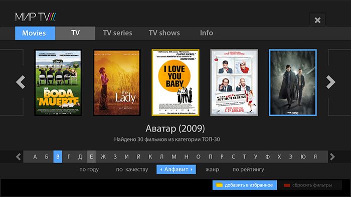
An example from life, about the picture on the main
As an example, I can give a catalog of films on smartTV for 5,000 positions. In fact, there was a request for developing a search for them in the TK. After an hour of reflection, it becomes clear that we don’t need to concentrate on searching at all - 5k films are too few to give the user something relevant to his query. No tricks with smart filters will not show the user what he wants - the full-text search for the necessary films simply will not appear in the database, and the sample by genre is not smart enough to produce something interesting without writing dozens of additional conditions. Therefore, the original idea was transformed into a kind of showcase - the user is given a choice of 5 top movies on the first screen and the top 50 side by side. Movies are selected manually fresh and, subjectively, interesting. Subsequently, the "showcase" begins to take into account the tastes of the user, increasing the percentage of films that are similar to what he watched. And the search itself, with all its filters, goes into the background - for those who know what they want.
This system has shown its effectiveness from the very first set-up - high conversion, ease of understanding, simple and pleasant appearance, even in advertising, the first screen appears as a good poster, and not as a form with filters.
What would it all cost if I started with a sketch, concentrating on the search?
But how to make yourself think in the right way? Thoughts disappear in a second if you specifically sat in a quiet place and meditate. There is a little secret. Imagine all the work already done. Everything is ready, working, thousands of users every minute use your service and praise without stopping.
What are they discussing? What words? How do you see this product yourself? Why do they want to use it? Peer at this picture in your imagination. And at this moment, suddenly it becomes crystal clear how this should work. Hold on to this thought - this is the last time you are crystal clear what to do :).
Sometimes it doesn't work. If the product is too narrowly specialized, or if it doesn’t inspire you personally. Social-network-catalog of cleaning products for sewage does not want to be visualized in the head. Bad, but it does not matter - maybe you should talk with the customer / developer / someone from the target audience. These people with burning eyes tell you the secrets of their field and can seriously inspire and give a lot of inspiration. It happened to me more than once - initially a very dubious idea suddenly turns into a super service in my head, after I was enthusiastically told by one person for the 50th time.
And if things are really bad?
It happens that everyone does not care about the idea. Programmers are waiting with horror for some kind of creativity, designers with disgust imagine a dull gray sketch on 100,500 forms with auto-completion, the management makes sure that no one is late for work, and the customer is interested only in whether we can dial 1000 users in 3 months, to report to the investor .
Then we go straight to the competitors - I try to use this opportunity as a last resort, otherwise, if I get carried away by copying, you can skip something important. But even if there is nothing to steal from the competitors, everything is gray-gray, we just sit down and do something, then we walk for an hour - and we try to improve it. Hour walk - sit down to improve. Or remodel. And so, through N iterations, you can get the result.
Then we go straight to the competitors - I try to use this opportunity as a last resort, otherwise, if I get carried away by copying, you can skip something important. But even if there is nothing to steal from the competitors, everything is gray-gray, we just sit down and do something, then we walk for an hour - and we try to improve it. Hour walk - sit down to improve. Or remodel. And so, through N iterations, you can get the result.
Second tip:
First, the design, then the grid elements / wireframe.
picture from the cycle “the world is opposite”
Yes, the controversial rule. I myself find it strange that I write it - but it gives a result faster and with a higher level of quality than vice versa. After the idea and draft sketches to fix the key points, you can proceed to the design. In no case should we try to make it all — we just need beautiful pictures of a pair of key screens. Better in several ways. Each next design, the essence, is not just a new concept, but an iteration of the work on the idea - the successful moves go to the next, the dubious ones leave.
If the project is simple enough from a logical point of view, and the design is very successful, then you can even skip the prototyping stage and immediately proceed to the finalization of the design and layout.
Why does this work?
First, the free elaboration of small things that are not tied to a rigid grid of elements gives a much more creative approach and does not pinch the designer in the cage of the existing grid of elements. I mainly paint myself, but I worked in design communities for advertising agencies for a long time to know one of the killers of a good design in the face - a bad sketch.
Secondly, at this stage there is a concentration on the main directions - actually, that's why I mentioned the “key moments”. There are no forms of logins and exhausting payment chains in 3 different ways, only the general style of the site / interface / application. If you manage to create a good style, it will greatly inspire the team for further work, including the interface developer.
I sometimes mention the designer and developer of interfaces as different people - but this does not always correspond to our realities, I understand perfectly. This may be one person, no problem, just need to remember that these are different parts of the work, and they have different local goals. Such a variant of a split personality - to come into conflict with itself.
Third, and most important , you have something to show. Need to report to the investor? See, here is the presentation, and here is the sketch. You can, on its basis, create several posters or banners to attract additional investment. You can brag to your parents.
But seriously, believe me, a good, presentable screenshot of your future service will greatly simplify your life in the future.
Another news - most likely in the final version of the original design will not be anything. This is normal.
We proceed to the practical part:
For myself, I derived several techniques that are somewhat banal, but effective in practice, when you do not know where to start and how to evaluate the result. It turned out that it is very difficult to formulate them, although I sincerely believed that the description of all three would take at most a few paragraphs.
1. The rule of the number of elements.
The application operates with a different number of elements. We need to estimate this amount. There may be five, as tabs in instagramme, and maybe a billion, as search results in Google. Each number of elements requires its own graphical and logical approach.
So, we estimate the number of elements:
About 5 - the withdrawal of all elements with details.
If this is a menu, then the details for them will be very concise - just a caption under the icon.
Question to the customer - how many tire models do you have? If the answer is five, you do not need to do a drop-down list, a search with a hint and smart auto-complete. Just show all these five types of tires with specifications. Everything. There is nothing to think about - any action with them will be a complication of searching for them.
7 - 15 - list output without details.
Categories, if any, are subordinate to the elements and are presented simply as information.
Any person will most likely view 10 items faster than clicking into categories to see two or three items. If you have 10 models of sofas, you do not need to create sections for them - show them, hiding the details under the cut, if there are a lot of them.
All the arguments about "think that we have a little of everything, let's make the categories better" nonsense. If the user opens the category "rattan furniture" and sees that there is already one element in it, it is much worse than just bringing all the models to the main one. No pseudo-elements will deceive the current user, who sees these tricks a million a day.
15-25 items - open categorized or grouped list.
A classic example is the restaurant menu. There are 6 categories, in which, say, 18 dishes. Bad restaurants will do this: one page - one category - three dishes, occupying three lines. Good - will bring the entire list of dishes on a single turn, grouping them into categories - soups, hot dishes, drinks and so on.
25 - 150 items - closed categorized list.
A typical small online store, a range of up to 150 products. It would be crazy to dump all this diversity on one page, but there’s no point in doing full-text search at the heart of the search. Man will not find what he needs. Of course, an additional search will not be superfluous, but I am talking about the main method that is offered to the user.
You can add filters and subcategories, if necessary, but if you divide 100 elements into five categories, it will be about 20 elements, which you can easily view by simply scrolling through the screen. Most likely you will not have a good reason to filter these items to a list of 3 positions. Once again, additional filters can be made, but they should not be at the head of the corner. Gently, unobtrusively, somewhere behind the drop-down menu.
150-500 items - categorized catalog with filters.
Here you can turn on smart algorithms for predicting elements that are interesting and important to the user. For news, these are the latest materials from the correct region, for the household appliances catalog - promotions and popular offers.
500-10k items - categorized catalog with filters + required full-text search
All the same as in the previous case, but full-text search becomes an essential element. An example is a directory of old cards for MTG. This game contains a huge number of cards, most of which are of interest only to collectors. We can divide all the cards by editions and colors, but hundreds of cards wander from the editorial board to the editorial board, sometimes even disappearing from them, as the balance improves. Without a full-text search, you will have little chance of finding something specific, but requiring the player to keep in mind the names of the cards in order to simply look at some ancient set would be sadism.
Someone may argue that they can come up with categorization of unique alternative music for their catalog, which has neither genres nor performers. Let's look a little wider - we still have a date (year of release), name (alphabet), length (up to 10 seconds, up to a minute, up to 10 minutes, up to an hour, longer than an hour), place of recording (country), a set of tools, number of downloads, user rating ... You can continue for a long time. And this is even if you take on some unique algorithms evaluating the frequency and length of the sound of a strong beat, for example.
10k - 500k items - full-text search + catalog with filters.
Everything is correct, the same as in the previous version, just the opposite. In design, from changing places of components, the result changes. The search comes out on top, and the filters, yielding, to the second. Example - Yandex.Market.
I will not dwell on large projects, each of them has its own specifics, and behind me (or rather on the shoulders) only one project with a base of about half a million positions - but a smart search that takes into account the maximum amount of known information is what you need.
For our project (application catalog), we use the following information for ranking: the number of reviews of an application, the number of comments on the appstore, the app's rating by users, the release date, the number of updates issued, and much more. But it seems to me that this is not enough and I want to take into account such things as the time spent by users on the application page and the percentage of conversion (how many people went to the apple site after studying), social graphs and other costly algorithms.
Another nuance - such a base, usually, is no longer just a part of the application, and this is already our application, and everything else revolves around it, like 14 satellites around Jupiter.
More than 500k items - smart full-text search and filters.
I do not know if there is a global base of the population of our country, but if there is, there would have to be something similar there. A search string with a smart, ordered output result and many filters that cut off the results of the first searches.
For example, if we type the name "Loboda", we get a list of all people with this name. We specify the region, we specify the gender, we specify the age - and before us, sooner or later, that one will appear. Record. In the database.
I repeat - not the other way around. First, a text search, and then already - clipping filters. You can not first set the region, and then find out that in this region there is no such name. Maybe she is in the next. If there is no text and cannot be, then, of course, we proceed immediately to categorization.
Of course, there are still technical limitations - programmers look at the passage above with bewilderment. Wouldn't it be more logical to first delineate the search area and not load the server with a search across the entire database, making other users wait because of insufficiently powerful hardware? If people really have to wait, then of course it is more logical! But we must remember that this is a technical limitation that must be taken into account. This is a topic for a separate article. But if our if server capacity is guaranteed to be enough with a margin, then it is better to use a more convenient way.
Fuh, sort of sorted out. Let's fix it up, I will explain the general rule - the user does not like to hold more than 21 elements in his head. I took this figure from the ceiling at the time of writing, but it seems close to reality to me.
If you have a list of 76 categories in each of which have 300 results, try to break it down into at least 4 sections. There will be about 20 categories in each. Conclusion 300 results make a page by page, approximately 20 per page. A good tone at least try to show the most relevant results already at the first.
A couple of examples that will not work the way it seems at first glance.
1. Take a minimal page of the site with funny stories. Everyone probably guessed what I mean. Is it possible to make quotes on her 500, not 21? Yes, you can without problems. Each quote is the ultimate goal, no one needs to keep in mind all 500 quotes, for some reason, then to choose one of them. Those. this material does not need categorization or search, do not complicate. Any quotation may be funny, especially since they were moderated. But if you want to show a funny quote to your friends, then it will be much more convenient for you to remember about which page it was than to sort through all 500 on one page, and here this rule works perfectly.
2. News portal. How many items are there? 100 000? What do we need to navigate it? Only search line? Not. Let's conditionally divide it into a news feed and archive material. Indeed, in essence, news is just something for the last few days, if we are talking about household news, everything else is an archive. Now everything falls into place. About 30-40 news items are the entire content of the site that the user is interested in, so we can easily apply the usual list output, but the archive should already provide serious mechanisms for navigating through it.
2. News portal. How many items are there? 100 000? What do we need to navigate it? Only search line? Not. Let's conditionally divide it into a news feed and archive material. Indeed, in essence, news is just something for the last few days, if we are talking about household news, everything else is an archive. Now everything falls into place. About 30-40 news items are the entire content of the site that the user is interested in, so we can easily apply the usual list output, but the archive should already provide serious mechanisms for navigating through it.
Fuh. We smoothly move on to the next big whale of good usability -
2. User profiles.
This is not at all what you thought about - but it’s not so easy to choose the name of the abstraction that I use to create a good grid. These are NOT user scripts, although they somehow resemble them. Let's leave the user scenarios for testing - by the way, you can do it perfectly right at the design stage, but I hope this is understandable.
User profiles are a collection of several abstract personalities who are our target audience and who use our interface. As a rule, it is better to take extremes - they have the most diametrical goals and the level of proficiency in equipment. Regular users will be somewhere in between.
- Profiles will help us understand what is a key element of the interface, and what is a special case. The more often an element is found in all the invented profiles - the more attention it is worth paying.
- Profiles will help us put ourselves in the user's place and look at the world at the application with new eyes.
- Profiles will help give us food for the ideas of further development of the functionality or, on the contrary, put something in the back box.
In addition, later, part of the profiles can be used to write user scripts for an already finished application, revealing a number of flaws that are not obvious to the developer.
I got the idea with profiles once a long time ago in an interview with some stern developer from the world of game-maiden, who even had names. It seems John, Stanley and Mike. Three basic gamer archetypes - the winner, the builder and the collector of achievements.
Our coverage is, as a rule, wider - for example, for IPTV this may be a schoolboy, a programmer, and a pensioner.
Now for examples. To dilute this huge sheet of text a bit, I will try to come up with some vigorous examples on the example of a non-trivial application.
For example, a social network for communicating zoophiles and animals ... No ... An application for communicating with the dead ... No, that's also not the same ... And, there is:
very strange illustration
Given: iPhone app for finding sexual partners for one night.
(No, in fact there is no such application, enough to write to me in PM, honestly :)
Planned functionality: Registration, synchronization with social networks, uploading photos, profile with personal data, location determination (geolocation), text status system, ad unit that will pay for all this disgrace.
Customer expectations: Many downloads, many ad views, a lot of money. The customer's expectations, by the way, is also only one of the scenarios - I just assume that he wants exactly this, in practice there are funny exceptions. But let's not complicate.
I'm starting to write profiles. Once again - these are just portraits of people who may be using your application. I always listen with interest to the conversations of people in cafes and fellow travelers, if they relate to some services and communicate with interest with existing users. I will not dilute the water, about how to invent them and where to take psychological portraits of users. Here you will experience and imagination. If someone thinks that he knows everything about how users will behave - this person is a self-assured idiot, run away from him, such are more dangerous than just idiots.
I provided profiles with thoughts out loud from our characters, for clarity, but it is clear that there is no need to prescribe this .
So:
Sasha, a marketer in a large company.
Hm, the app to find a girlfriend. Surely complete crap, full of bearded men. Need to download and make sure.
[comes on appstor and looks at the picture of the application]
Hah, they have on the preview of the application - solid sexy girls. They know their target audience, well done.
[looks at the picture on the site, downloads the application to the iPhone].
So what is there? License agreement ... Yes, I agree, I agree, more ... [accepts the license agreement].
Tutorial? They are written for idiots, where is the "skip" button
[skips tutorial]
So, you can connect your social network account. Oh, no, I know these mudo-developers, then the whole wall in Contact will be in messages from this wonderful application. And I have a mom in friends there.
[rejects the proposal to synchronize with social. networks]
Now you need to fill out the questionnaire. No, I'm a busy person, I have no time to fill out a form. And there is no need, firstly, I have a girlfriend and I love her, and secondly, no one will write to me anyway. I just want to look at the photos of the girls not heavy behavior nearby.
[clicks on all tabs in searches, hmm, search]
So, here, literally in my apartment there are 8 sentences ... And, well, yes, you need to say that I am a man and I am looking for women.
[returns to profile, fills in the column "gender" and "orientation"]
There are two sentences left, not bad either. Oh, what a horror ... And, well, yes, you need to put the age [returns to the profile, fills the age column, and also, at the same time, the other parameters. Height, weight, eye color, financial status and necessarily tonight]
Hmm, now there are a dozen sentences left on the district. No, sex for money does not interest me.
[puts a tick "is not ready to become a sponsor of the meeting"]
Well, clearly, there is only one offer left for the area and then, there is a sign of a massage parlor on the avatar. As I thought. Everywhere deception, everywhere commerce and loafers. I'll go better download a new game.
[exits the application, prudently not deleting it, but what if someone writes]
So, we have the first script ready. I suggested that I could force such a person to fill out their profile and leave the application on their phone.
After its compilation, it becomes quite obvious that registration on social networks should not be made mandatory, and one should not force the user to fill out a profile before trying to search the catalog. Similarly, it is impossible to show him an empty database on his potential request - in any of the three cases listed above, he will simply remove the application.
Let's go write the following script.
Vova, schoolboy and troll
To get the app to search CHIKI for NIGHT! I knew that somewhere it should be - otherwise, how on earth on the Internet so much nuclear porn!
(user puts the application and passes tutorial and registration via vkontakte)
So, fill out the profile. Everyone fits me, except, of course, all sorts of old women. Older than 25 exclude. No men are needed either, we have a Trudovik if someone suddenly needs a lot.
(fills profile)
Oh my God. Here Fedorov is ... And Petrov! Strange, are they in terms of location right next to me? I thought next to me only Kolyan-Ghoul lives. Stopudovo Petrov his guest just. I'll write to her too, let her come to me later! The best day in my life! (browses profiles, statuses and uses a private messaging system)
Damn, uncomfortable happened. I went out into the street, like Petrova and requested, in some shorts, rubber boots, a hat with earflaps and a fishing rod, and there stood Kolyan-Ghoul with the boys and neighing. Also filmed on camera. Sheep, pancake. I also know how - I will register an account on behalf of our class, he will come to me. In flippers.
(deletes account, registers, enters fake data)
The second scenario is ready. I’m not focusing too much on those points that have already been mentioned in other scenarios, but it’s advisable to duplicate them anyway - the greater the number of identical patterns used by each role - the greater the amount of attention should be paid to this functionality.
Natasha, student
Wow! Prilozhenitsa to search, oh, well, no, I'm so loud, even afraid to think. Anka told me about him. No, well, can not be so she enjoyed. Now I will find her there.
(downloads the app)
So, the entrance through the social network ... Well, of course, it is easier to log in via vKontakte than to drive in some data there a million times later. (connects the social network)
Ahaha, here it is, what the picture is! Fuuuuuu! Cheap! And Irka is here! I did not expect it from her! It's just some kind of holiday! I'll go tell Vike!
(looks through the profiles of his friends)
OH MY GOD! I wrote a man that wants me ... what? What kind of word is that? How to remove this crap!? Horror one more wrote! In the meantime, I deleted it, wrote another 104 people!
(dealt with message blocking and deleting system)
Oh no! Vika! I just went there to go! This is probably some kind of virus on my phone climbed! I was not looking for anyone there! Thank you for not telling anyone much, I’ll clean it up right now!
(dealt with the status system, sets himself "invisible")
The third scenario.It turned out somewhat crazy, but in general, what is needed - based on user expectations, I predict the functionality and the order of its use. In practice, of course, everything looks much more prosaic, but the general idea remains - the profile reveals the real needs of users in m. It will be very useful marketing skills to create surveys, as well as the ability to approximate a small sample on a larger scale.
With the scenarios, I hope, I have clarified a little, and now let us turn to particular cases, the answers to which we cannot receive using the script. Does this item in a separate button or add it to the main menu?
3. Predictable result points
This is another fundamental rule - higher predictability, in fact, means more convenient . But why even honestly keeping this rule in mind can create a terrible non-usable monster that users will complain about for years?
I add to this rule the concept of "calories" or just points. The amount of energy that a person needs to spend to perform an action. This is a synthetic value, which, very arbitrarily, I consider as points of difficulty in agile- 1, 2, 3, 5, 8, 13 and 21 .
Several times I ran across the definition - good usability = less clicks. Not. Good usability is, first of all, the predictability of the result and the second - fewer clicks.And now deployed: A
click (or tap) is always 1 point. Minimally complex action for the user. .Any other basic action, svayp, wright-click, ctrl + click, or any of the additional buttons on the remote is 2 . I also take into account the concept of a “complex” click, when you need to get to a certain item located in an array of other elements. This will also add a penalty one.
Reading one word or phrase is also 1 , but the whole sentence, a homogeneous list of several words, or a pop-up hint after pointing is at least 3 .
Study a complex sentence, a text paragraph or a non-uniform / long list (let it be 7 elements), at least 5 points.
If a person is in a situation where he does not know where to click and cannot find information about this element, then you can safely write out at least 13 , or even all 21 at once. An experienced user will follow the path of least resistance and just pereklatsa all menu items, spending only one click per click, but this is not always available if there are many elements or if the clicks may be irreversible - as is the case with payment systems.
By the way, when a user does not know whether actions after a click are reversible, he will have to solve this problem, and if he cannot, he will have to ask for help from outsiders, more experienced users, or abandon this project altogether. Do you recognize your mom ?:
, , – - , , , , .
Let's now think logically why it is permissible for a cash register to simply make a set of pictures on the main page, and in the menu on the site, which, in fact, represents the same range of products, it is not.
Naturally, the difference in the preparation of the user. The cashier works all day with a cash register, she does not need to read signatures, she already knows them. Therefore, she spends only one on tap on the screen. Make it expand the categories or read the obvious, from the point of view of the experienced user, inscriptions - and complicate the interface exactly twice.
The user of the site almost never knows the range of pictures and details. For him, every click will be accompanied by the reading of the accompanying inscription. And if it does not exist, then by clicking, reading the label, returning to the main screen, which, of course, will not make the site more attractive to the user.
At the time of the second and subsequent launch of the application - the user will already have a certain experience from the previous time, and the points will go down less and less each time, until he becomes an experienced user, when reading the text or instructions will only complicate the use. This causes the difference between an online store with a constant influx of new users and a professional application, which is usually used for quite a long time.
I hope I was able to convey the idea. As usual, I will repeat the beginning - predictability is more important than clicks . If you managed to make the element's behavior more predictable by adding a couple of clicks, it is worth it.
Just in case, another example:
, .
. , – 1 – «» « » . ? .
- . , ,
? .
Not! ? , , , . , , - , .
- «» . , . . , , , .
-, , – . . ? , . - .
- , , , , , . windows-.
. , – 1 – «» « » . ? .
- . , ,
? .
Not! ? , , , . , , - , .
- «» . , . . , , , .
– , 7 . , – , , 7 – . . – . , , . , . .
-, , – . . ? , . - .
- , , , , , . windows-.
Conclusion:
I will be glad if this text seems interesting to someone, but it will make me doubly happy if it helps someone to create more convenient and high-quality products.
If you have already met a description of similar techniques when designing - write me, please, in the comments or in a personal note, I will be happy to read and, perhaps, streamline my knowledge by drawing something from smart people.
... and proud, proud of those who read this far, thank you!
Source: https://habr.com/ru/post/171819/
All Articles