Combining responsive layout and templates for mobile
The article is a translation of an excellent, inspiring, albeit small post Mixing Responsive Design and Mobile Templates from one of the creators of the CodePen , Chris Coyer .
So, you are engaged in a strategic study of the behavior of your site for mobile devices. In theory, you should choose one thing - or responsive design, or create a separate site for mobile. Well, perhaps it is not. Maybe you can combine several strategies at once.
Every day we are working hard with the CodePen development team. But there are only three of us. The development of our mobile strategy is just one of the last forces to complete the project, when 1) it is time and 2) there are good ideas how to deal with all this.
')
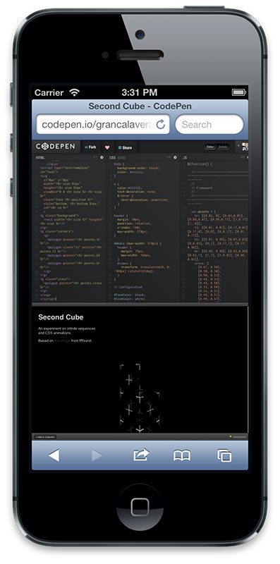
For example, our Recent Activity page. It is so simple that a couple of media queries are enough to scatter elements a bit, and JavaScript drops to switch filters:

Now let's take a look at the Details page on the desktop:

This page is much more complex. It uses the same markup as the editor. There you can stretch the preview window with the mouse. Keyboard commands are used there. For mobiles, this version of this page clearly did not fit, the text looked microscopic. And when using the appropriate meta tags and loading the texts in the adapted for mobile size, the design made it completely awkward and gave birth to absolutely obscene scrolls wherever possible.
This was our worst mobile page.

I would have to make a real war, arm with CSS to bring this page back to normal. But even if I succeeded, there would still be a decent piece of JavaScript code that no longer carried any payload. But instead of all this, I decided to write a special template for mobile. This option made it possible to completely control both HTML, CSS, and JavaScript - and therefore, download only what is necessary. And now it is possible to use duplicate elements in almost everything , because we have already assembled all this from modules. I could put together the necessary fragments of HTML, JS-modules, make a new CSS with a minimum of effort.
Now the Details page has become much more convenient for perception, not to mention the download speed.

If interested, then we use the browser gem to select which template to run for the controller-level render. In essence, this is User-Agent tracking, which is not very good, but at least this all happens on the server and runs on regularly updated open-source software.
Ruby Code:
To the note: everything that can be done in the desktop browser can be done in the mobile.
Not all CodePen templates are adapted to small screens yet. For example, the Editor page — perhaps the most important part of the entire application — in general has neither a responsive design nor a mobile version.
It looks quite normal on the iPad and other large tablets, but on a small screen it looks far from perfect. This is not the page that we would like to keep awake, so we leave it only in the desktop version until a good enough idea to solve this problem appears. Most likely it will be implemented as a separate template for mobile.
Look at the user profile page:

This is an adaptive template. In my opinion, it is perfectly worked out in everything except the tab area, which is divided into two lines. It looks unimportant, and it won't be normal to scale if we have to add a few more points. Therefore, to navigate in the Profile, we replace tabs with a drop-down list in this place
So, you are engaged in a strategic study of the behavior of your site for mobile devices. In theory, you should choose one thing - or responsive design, or create a separate site for mobile. Well, perhaps it is not. Maybe you can combine several strategies at once.
Every day we are working hard with the CodePen development team. But there are only three of us. The development of our mobile strategy is just one of the last forces to complete the project, when 1) it is time and 2) there are good ideas how to deal with all this.
')
An example of an adaptive template
For example, our Recent Activity page. It is so simple that a couple of media queries are enough to scatter elements a bit, and JavaScript drops to switch filters:
An example of a special template for mobile
Now let's take a look at the Details page on the desktop:
This page is much more complex. It uses the same markup as the editor. There you can stretch the preview window with the mouse. Keyboard commands are used there. For mobiles, this version of this page clearly did not fit, the text looked microscopic. And when using the appropriate meta tags and loading the texts in the adapted for mobile size, the design made it completely awkward and gave birth to absolutely obscene scrolls wherever possible.
This was our worst mobile page.
I would have to make a real war, arm with CSS to bring this page back to normal. But even if I succeeded, there would still be a decent piece of JavaScript code that no longer carried any payload. But instead of all this, I decided to write a special template for mobile. This option made it possible to completely control both HTML, CSS, and JavaScript - and therefore, download only what is necessary. And now it is possible to use duplicate elements in almost everything , because we have already assembled all this from modules. I could put together the necessary fragments of HTML, JS-modules, make a new CSS with a minimum of effort.
Now the Details page has become much more convenient for perception, not to mention the download speed.
If interested, then we use the browser gem to select which template to run for the controller-level render. In essence, this is User-Agent tracking, which is not very good, but at least this all happens on the server and runs on regularly updated open-source software.
Ruby Code:
if browser.mobile? render :template => 'details/mobile', :layout => "mobile-pages" else render :template => 'details/index', :layout => "pages" end To the note: everything that can be done in the desktop browser can be done in the mobile.
Example of “nuuuu-not-quite-finished” page
Not all CodePen templates are adapted to small screens yet. For example, the Editor page — perhaps the most important part of the entire application — in general has neither a responsive design nor a mobile version.
It looks quite normal on the iPad and other large tablets, but on a small screen it looks far from perfect. This is not the page that we would like to keep awake, so we leave it only in the desktop version until a good enough idea to solve this problem appears. Most likely it will be implemented as a separate template for mobile.
An example of the use of template fragments for mobile in responsive design
Look at the user profile page:
This is an adaptive template. In my opinion, it is perfectly worked out in everything except the tab area, which is divided into two lines. It looks unimportant, and it won't be normal to scale if we have to add a few more points. Therefore, to navigate in the Profile, we replace tabs with a drop-down list in this place
.


.


, CodePen . . , - .

URL, , . . , .
.
.
, CodePen . . , - .
URL, , . . , ..
.
, CodePen . . , - .
URL, , . . , .
.
, CodePen . . , - .
URL, , . . , .
.


.


, CodePen . . , - .

URL, , . . , .Source: https://habr.com/ru/post/171709/
All Articles