Example - clock on CSS3 without images and javascript
This article is about how the Wall Clock in Pure CSS3 demo was made. Initially, I intended to write this article in the form of a step-by-step tutorial, but in the process I realized that such an example was not enough for this. Therefore, I decided to dwell only on the details that, in my opinion, are the most interesting, and the implementation of the rest can be seen in the code.
For a start, the actual example itself is on codepen.io or cssdesk.som
')
About my acquaintance with HTML
I became acquainted with HTML in 1999 and since then I have occasionally been involved in frontend development for the web, as a rule, rather as a hobby, and very occasionally, as part of some large working draft. Since 2012, I have gone to work in freelance, and frontend-development for the Web has become one of the most sought-after skills.
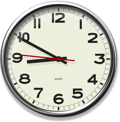
Clock
And it so happened that while digging into the New Year holidays in a stack of old CDs, I found this very first page on which I studied HTML and allowed me in 1999 to get a credit at the institute. On it was inserted into Java applet with the clock.
And I just finished a small project with intensive use of CSS3, and, the idea to make a clock, but already on pure CSS3 lay on the surface. I understood that such an idea for the purposes of demonstrating the modules CSS3 Animation and CSS3 Transformation would not be new, and decided to make them at least realistic. Plus, I decided not to look in advance how it was implemented by someone else. Well, as far as I was able to judge you.
Ikea

Periodically, when I was at IKEA, I often paid attention to the IKEA PUGG watch (picture on the right) because of the fascinating typeface of numbers. That is why at first this particular watch was chosen as a model, but then I found a similar watch from another manufacturer and they no longer had a stupid stepped frame edging.
Size selection and scaling using font-size
I immediately decided that I would not be tied to the pixels to leave the possibility of scaling.
Percentages would have been perfect, but there was one problem. Since it would be decided not to use graphics, the numbers on the dial needed a font, and it would not be possible to set the font size as a percentage of the block size.
Therefore, everything was imposed on em-units. Thus, you can set the desired size of the clock, you can set the font size for the block. Initially, the clock was made up in the size of 100em x 100em and scaled through the font-size setting.
Later, due to scaling bugs and for demonstration purposes on codepen.io, I reduced the “internal scale” to 10em.
Magic box-shadow

The effect of the chrome frame required three nested containers: the first for the outer part of the frame, the second for the inner part of the frame, and the third was the base of the dial.
The effect itself will be created by the shadow elements in the box-shadow for all three containers. Used both external and internal types of shadows. The following pseudocode and a picture will help you to understand the principle of shadow overlay, as well as the order and priority of overlay:
<div id="a"><div id="b"><div id="c">...</div></div></div> #a { box-shadow: inset . ai1, inset . ai2, ao1, ao2; } #b { box-shadow: inset . bi1, inset . bi2, bo1, bo2; } #c { box-shadow: inset . ci1, inset . ci2, co1, co2; } 
To achieve at least a small likelihood of chrome plating, we had to study more than one dozen photographs, and more than one hour of time. I will not give the result in CSS here; those who wish can experiment with the resulting code, for example , codepen.io
Place tags
In order not to produce many entities and be content with a minimum of CSS rules, the following HTML markup of a block of five tags was invented
<b><i><i><i><i></i></i></i></i></b> These five tags represented labels of minutes from 0 to 4 and at the same time from 30 to 34. Nested tags allowed to rotate them relative to its axis with just one rule in CSS
b > i, i > i { transform:rotate(6deg) ; } The marks themselves were drawn using the upper (0-4) and lower (30-34) borders. Taking into account the design, we obtained the following output result from these five tags:

The remaining five blocks of tags were placed in a similar way by placing them in each other:
<b><i>…<b><i>…<b><i>…<b><i>…<b><i>…<b><i>…</b></b></b></b></b></b> Accordingly, the following rule places the remaining blocks in the right places.
b>b { transform: rotate(30deg) ; } But surprisingly, such a simple code in the context of my example "put in a quandary" most browsers:

Surprisingly, the correct result was only shown in IE9. There are already bugs in IE10.
Firefox and Webkit browsers found a fundamental bug related to rounding intermediate coordinate values during nested transformations. Because of this bug, as you can see, there is an accumulation of error, and the last tags are placed far enough from the required place.
Opera in general refused to show the transformation correctly. It's certainly great that Opera has passed ACID3, but the quality of the other code, as we can see, is not reflected. And later, I was not surprised by the collapse of the development of Presto, although, frankly, I was upset.
In order to bypass browser bugs, I had to use a more clumsy implementation of label drawing. At the same time, I retained the ability to switch between versions in my playground-e to demonstrate the working version on the one hand and the problems found on the other.
Numbers
Layout numbers on the dial does not deserve special attention, a beautiful solution as in the case of marks did not work. Much more time was spent on the font for numbers.
Since I didn’t delete a commercial font, even if it was similar to the one used in the watch, it was decided to make my own font by vectorizing the numbers in the picture. Immediately, I note that not one of the “vectorizers” could not produce any acceptable result, so I had to draw the numbers manually.
To turn an image into a proper font, a good “How To Make Your Own Symbol Font” guide was found, suggesting to use the following software chain for this:
[Image] -> Inkscape -> [SVG Font] -> freefontconverter.com -> [TTF Font] -> fontsquirrel.com/fontface/generator -> [Web Font Set]
The font turned out to be quite beautiful, but with one problem - due to the peculiarities of InkScape, all the letters were of the same width. The problem was solved by editing the TTF font using the free Type 3.2 Light font editor.

Later, Chrome gave me an unexpected surprise and had to return to the font question. But more on that below.
Arrows
There were no difficulties in implementing the hour and minute hands, and to move the hands on the dial in accordance with the time, as originally planned, CSS3 animation of the turn of the arrow with a period of 12 * 60 * 60 seconds and 60 * 60 seconds, respectively, was used.
The movement was almost imperceptible and, to give the dynamics of the clock, I decided to add a second hand. Having realized the movement of the second hand in the image and likeness of the others, I realized that the linear movement of the second hand does not suit me, because the step motion looks more familiar.
Replacing the
animation-function c linear property with steps(60) was closer to what I wanted, but over time I began to notice that teleportation of the second hand from one label to another looks unnatural.The simplest option to implement the second-hand movement of the second hand would be an extension of the
@keyframes block responsible for the animation, where it would be necessary to describe the stop of the hand on each of the second tags.But laziness is the engine of progress. Above, for labels, I have already used the transformation of the element within which the other has transformed. And it pushed me to the following idea:
add to the linear function of the rotation of the arrow the oscillatory function of the movement by a period of one second, such that their sum would be a stepwise (and, according to the task, continuous) function.

One rotation function is set to animate the actual arrow, the other to animate the container. As a result, the function of moving the arrow relative to the screen is the sum of these two, that is, the step function I need, and the code responsible for such movement is placed in several lines.
.container { animation: tick 1s normal infinite linear; } @keyframes tick { 0% { transform: rotate(0deg); } 8.3% { transform:rotate(5.5deg); } 100% { transform: rotate(0deg); } } .arrow { animation: a360 60s normal infinite linear; } @keyframes a360 { 0% { transform: rotate(0deg) } 100% { transform: rotate(360deg) } } UPDATE:
Due to complaints about the performance of the seemingly simplest movement of the arrows, a small reseach was carried out and all the linear animation functions were replaced by an approximation. For example, in the animation code of the minute hand, instead of
linear now steps(3600) can be seen steps(3600) .Shadows
Having implemented the arrows, I immediately added a shadow for them using box-shadow and transparency. In addition to the unpleasant bug with a shadow during the stepwise movement of the second hand, the following unpleasant pattern of superimposing shadows in the center was found.

Therefore, the box-shadow was removed, and the shadow was implemented by creating a copy of the arrows with the fill color of the shadow and placed under the numbers and labels. For this, we had to add a few tags and a couple of CSS rules.
Show current time
Of course, the clock is a clock, not a stopwatch, and it should show the current time. This could be done with a couple of lines in JavaScript, but it would not be kosher. Therefore, setting the time is a server script that generates CSS with the preset values of the angles of rotation of the arrows at the time of the request. And yes, Greenwich Meridian Time is used.
Playground
The resulting CSS3 without fixes turned out to be quite small - just over 200 rules, and no copy-paste code. HTML code also turned out to be quite compact and consistent with the paradigm: one entity - one tag.
But having understood that the result that works in all browsers is significantly different from pure CSS3, I made a small test page, where, apart from the actual clock, you can see and evaluate how well the browser copes with the version without fixes.
Actually playground @ github-pages
Compatibility and baaaaagi.
The clock was developed in Firefox (no prefixes!), And, as it was developed, it was checked in the latest versions of all fairly popular browsers. But I admit that the quality result surprised me. Best of all, the development campaign coped with the implementation of the IE9 standards (sic!), It’s a pity that the lack of support for CSS animation brought it out of the game.
As for the other browsers, it seems that the speed of implementation of the new CSS functionality significantly affected the quality of the result (in a bad way), which affected even IE10.
I described one common bug for several browsers (we will call it a meta-bug) with calculating the transformations above. The only thing worth adding is that as a result of using the scaling built into these browsers, we get even more significant artifacts.
The second meta-bug, which turned out to be common for all browsers except IE, is a violation of the arrow animation when the clock is resized. The bug is perfectly reproduced when, simultaneously with the animation of the arrows, we change the size of the clock with the CSS3 transition.
Webkit (Chrome)
After the funeral of Presto, it can be stated that of the three remaining Webkit - as the richest in CSS3 functionality engine, at the same time is the most buggy by the results of this example.
Size bug
If you have already opened rummaged in the playground using Chrome, then they saw it immediately.
With some defined font sizes, the calculation of em sizes for some reason is disturbed in Webkit, and the clock refuses to decrease.
Font Surprise
When the clock was almost finished, and I began to prepare for a public presentation, I suddenly noticed that in Chrome the dial numbers lost antialiasing.
By manipulation, it was found that the animation of the arrows within the text of the figures was to blame. A long haul on the Internet did nothing, except for a heap of useless CSS-specific properties that were supposed to control anti-aliasing. That is, the face is just a Chrome bug under Windows.
Fortunately, I came across an interesting article on the libraries Chrome uses to render fonts under Windows. This gave me the idea of trying to convert a Truetype font to a PostScript font - and hooray! anti-aliasing reappeared.

As for the PostScript font, the conversion of TrueType curves into PostScript curves was done using the Type3.2 Light font editor and the font was saved in the OpenType format to be connected to the page.
In the course of the play, it also turned out that Chrome under Windows, using the same system libraries as for example IE, did not pay attention to the kerning table specified in OpenType, which does not distinguish it favorably from Firefox.
Results
After an unexpectedly large amount of time, I still managed to finish the seemingly simple demo, make my little playground and write this article.
In my opinion, that gain is, in terms of CSS3:
• Stepwise moving second hand
• Pseudo-chrome rim
• Insequential label placement with transform: rotate
• Ability to change the size of the clock by setting the font-size for the container.
• Small CSS file size (excluding cross-browser compatibility)
and the lack of duplicate pieces in the CSS code
• Small HTML, one entity - one tag.
Links
Demo @ codepen.io
Demonstration @ cssdesk.om
Playground @ github pages
Github project
One of the first implementations of clocks on CSS that I found when I finished developing my example:
Paul Hayes in 2009
Zoltan Hawryluk in 2010
Lennart Schoors in 2010
And of course I am waiting for comments and I am ready to answer questions.
UPDATE: The performance of the example is somewhat improved, the description above.
UPDATE 2: An example is slowly spreading over the Internet
and sometimes interesting tweets emerge, for example:

Source: https://habr.com/ru/post/171015/
All Articles