Comparison of methods for creating mobile versions of sites
Not so long ago, the availability of an adaptive or mobile site became not a trend, but a real necessity - traffic from devices continues to grow, and users are already beginning to abandon large computers in favor of smartphones and tablets. For the creation of such sites now, basically, three methods are used: adaptive layout, development of a separate mobile version and RESS. Johan Johansson has published a comparison of these methods, the translation of which we present to your attention. Under the cut a lot of text and pictures.
It seems that the debate about the technologies of creating mobile sites in the near future will not subside. In these areas, for example, Google is committed to developing responsive web design , while Jacob Nielsen, a renowned usability consultant, advocates the creation of individual mobile sites .
The third option that is already becoming popular is when the web server generates the corresponding HTML and CSS depending on the device using the parameters obtained from the URL.
In this article we will look at each of these methods and give real examples.
The iPhone 4 with iOS 5.0 was used for testing.
')
Responsive web design typically uses CSS3 Media Queries to customize the layout of a web page based on the size of the viewport. You can use the same HTML to display different web page layouts for desktops, tablets, mobile devices, TVs, etc.

The Starbucks site is a great example of the pros and cons of responsive web design. All their content is available on mobile devices, each page uses the same URL, there is no redirection.
Unfortunately, their website is hard to download (about 15 seconds on a 3G smartphone), and you need to scroll a lot to read the entire page.
Results :
Average load time: 14.99 seconds
Average page size: 1,193.88 KB
Number of HTTP requests: 142
The WWF website is a good example of responsive web design. Navigation is optimized for mobile tasks.
However, the download time on the 3G smartphone leaves much to be desired (it takes about 7 seconds). In addition, some internal pages (for example, their confirmation form) were not optimized for mobile devices and remained inconvenient for use on a mobile device.
Results :
Average load time: 6.91 seconds
Average page size: 885,97 KB
Number of HTTP requests: 72
The site of the Boston Globe - perhaps one of the best large-scale projects with responsive design. The site uses “rubber” images and optimizes JavaScript so that it does not affect performance on mobile devices.
Results:
Average load time: 5.55 seconds
Average page size: 605,27 KB
Number of HTTP requests: 87
To make the site convenient for mobile users, some webmasters create separate sites. The most common story is with redirecting mobile users to a special subdomain (for example, mobile.examplesite.com for examplesite.com).

Walmart mobile site shows incredibly fast download time - just 1.35 seconds
Results:
Average load time: 1.35 seconds
Average page size: 272.29 KB
Number of HTTP requests: 45

Like Walmart, Amazon’s mobile site pages load faster than adaptive scoring (2.25 seconds).
Strange, however, that not all pages on the site have mobile versions. For example, if you search on Google using a smartphone, many results will relate to the “big” version of the site without redirecting to the mobile version. In addition, if you access the mobile page from a desktop computer, you will not be redirected to the full version.
Results:
Average load time: 2.25 seconds
Average page size: 103.66 KB
Number of HTTP requests: 16

Mobile BBC website pages load faster than adaptive (3.40 seconds), but almost half of this time is redirected by users (1.65 seconds).
Unlike the Amazon site, if you try to access a mobile page from a desktop computer, you will automatically be redirected back to the “large” version of the site.
Results:
Average load time: 3.40 seconds
Average page size: 56,04 KB
Number of HTTP requests: 22
This mobile site creation method uses server-side programming to create CSS and HTML for various devices. That is, mobile users receive one set of code, while desktop users receive a different set of code.
This is done to improve the efficiency of the site and works best in conjunction with adaptive layout.
This method was called responsive web design + server-side software (RESS).
When using this method, it is important that the type of Vary HTTP headers is included (for details, see the Google Help, a guide to creating optimized websites), so that search robots will visit both desktop and mobile versions.

The mobile version uses a combination of HTML and CSS optimized for mobile PCs, while the desktop version uses significantly more HTTP requests and JavaScript.
Navigation is also specially designed specifically for mobile tasks.
Results:
Average load time: 3.46 seconds
Average page size: 163,12 KB
Number of HTTP requests: 28

As in CNN, HTML and CSS are customized for the mobile version of eHow. Top-level navigation is the same for both sites, focusing on search and seven main headings.
Results:
Average load time: 6.15 seconds
Average page size: 188.95 KB
Number of HTTP requests: 31

Mobile and desktop versions of SlideShare are completely different. The mobile version uses responsive web design, while the desktop version does not. Each site uses different HTML and CSS. For example, JavaScript is much less in the mobile version. Each site also uses different navigation structures.
Results:
Average load time: 6.15 seconds
Average page size: 188.95 KB
Number of HTTP requests: 31
In theory, responsive web design is the best solution. But in practice, most of these sites are implemented incorrectly and lead to an increase in download time.
My tests show that the best load times are for mobile sites, but there are significant drawbacks to this implementation of the task.
In my opinion, it is best to use a combination of responsive web design and RESS. In this case, we get all the advantages of “rubber layout” and solve two big problems: the use of multiple files and slow loading.
Dmitry Vasiliev, NetCat : “For professionals - designers, designers, layout designers - an adaptive site is a much more interesting task than the traditional bundle of“ widescreen-mobile ”sites. But the disadvantages of adaptive sites in the article are described in some detail. I would also add the difficulty of preparing content after the launch of the site. Imagine: the secretary is assigned the task in the section “About the Company” to place a large photo of the director and a table with important milestones in the history of development. Of course, she will not be able to prepare responsive content, even if she wants. The correct approach is to transfer the task to a professional, but in doing so we increase the cost of owning the site for the user.
But there are sites that are objectively better initially to make adaptive. For example, these are corporate business cards or other sites without complex functionality. And we believe that the developer should have a choice. Therefore, a site running NetCat can operate in one of three modes: a regular site, a mobile version of a regular site, and an adaptive site (and all system modules also support these modes).
As for RESS, this is an interesting approach, but it does not remove all the problems associated with adaptive layout. In addition, it is often better for the smartphone user to offer a choice, to watch a regular website or a mobile one, because the web usage scenarios on the phones may be different. For example, I often go to the poster from the phone. If I want to choose a movie or cafe, I go to the regular version of the site, if I look at where the movie I want goes, or find out some address - on the mobile. And I am pleased that the site does not decide for me how to view content, but gives a choice.
Summarizing: I believe that for most tasks, the “regular site plus mobile version” approach is the path of least resistance, the benefit of modern CMS is to dramatically minimize the cost of creating a second site. But there will not be a definite victory of one of the competing approaches in the near future. ”
What methods do you use to create mobile sites? Share your thoughts on this topic in the comments or tick the option of the survey.
It seems that the debate about the technologies of creating mobile sites in the near future will not subside. In these areas, for example, Google is committed to developing responsive web design , while Jacob Nielsen, a renowned usability consultant, advocates the creation of individual mobile sites .
The third option that is already becoming popular is when the web server generates the corresponding HTML and CSS depending on the device using the parameters obtained from the URL.
In this article we will look at each of these methods and give real examples.
The iPhone 4 with iOS 5.0 was used for testing.
')
Responsive Web Design
Responsive web design typically uses CSS3 Media Queries to customize the layout of a web page based on the size of the viewport. You can use the same HTML to display different web page layouts for desktops, tablets, mobile devices, TVs, etc.
Benefits
- Content Security : Your site saves content and HTML markup, regardless of the device used. This approach will become increasingly important as more and more people use smartphones as their primary means of accessing the web.
- One URL for web pages : This simplifies the process of sharing content and eliminates unnecessary redirects in order to get a better view of the pages for different devices (as opposed to individual mobile sites).
disadvantages
- The materials will not be fully optimized for mobile devices : If you do not use an approach that primarily designs a mobile page, your website will contain the same information as its desktop brother. Compare this to a separate mobile site where you could potentially adapt the content of web pages only to mobile users.
- Slow work : according to January'13 data, the average web page today weighs around 1.3 MB. Theoretically, this size can be avoided by using an adaptive design, but in practice, 86% of “rubber sites” weigh just that much or even more.
- It can be difficult to navigate the site : The tasks of mobile users tend to be different from normal. In addition, they may be more accustomed to using the mobile version of the interface, and if you do not think over the navigation structure for each device, there may be problems with usability.
Examples:
Starbucks
The Starbucks site is a great example of the pros and cons of responsive web design. All their content is available on mobile devices, each page uses the same URL, there is no redirection.
Unfortunately, their website is hard to download (about 15 seconds on a 3G smartphone), and you need to scroll a lot to read the entire page.
Results :
Average load time: 14.99 seconds
Average page size: 1,193.88 KB
Number of HTTP requests: 142
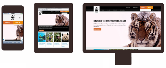
World Wildlife Fund
The WWF website is a good example of responsive web design. Navigation is optimized for mobile tasks.
However, the download time on the 3G smartphone leaves much to be desired (it takes about 7 seconds). In addition, some internal pages (for example, their confirmation form) were not optimized for mobile devices and remained inconvenient for use on a mobile device.
Results :
Average load time: 6.91 seconds
Average page size: 885,97 KB
Number of HTTP requests: 72
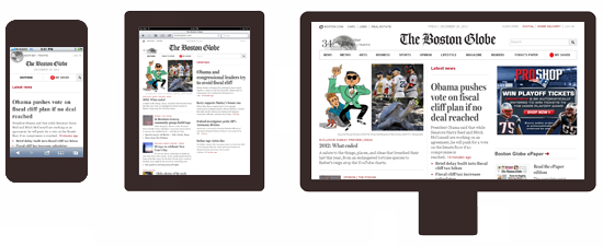
The boston globe
The site of the Boston Globe - perhaps one of the best large-scale projects with responsive design. The site uses “rubber” images and optimizes JavaScript so that it does not affect performance on mobile devices.
Results:
Average load time: 5.55 seconds
Average page size: 605,27 KB
Number of HTTP requests: 87
Separate mobile site
To make the site convenient for mobile users, some webmasters create separate sites. The most common story is with redirecting mobile users to a special subdomain (for example, mobile.examplesite.com for examplesite.com).
Benefits:
- It is easier to make changes to mobile and regular sites : Changes may apply only to the mobile version or only the regular version.
- Fast download time : As you develop a version only for mobile sites, you can simplify and optimize it specifically for mobile devices.
- Easier to navigate : the structure of navigation and content are thought out for the tasks performed by mobile users.
Disadvantages:
- Several addresses for each page : Sharing a web page on social networks becomes a problem, because mobile users will share a mobile URL, while regular users can also click on the link and go to the mobile version. In order to avoid duplicate content, SEO professionals need to use meta tags rel = "alternative" and rel = "canonical". In addition, when a Google mobile search user clicks the link in the results, they will be taken to the desktop version or redirected to the mobile version. But if the mobile version of this page does not exist, it will receive an error message.
- The difference in content and functionality : the creation of a separate mobile site means getting rid of some of the content and functionality, resulting in a completely different user behavior. In addition, you may have two different sets of content that may adversely affect the overall content strategy.
- Redirections Required : Mobile users should be redirected to an optimized version and vice versa. Redirects add to page load time. They may also have consequences for your site’s SEO.
Examples of dedicated mobile sites
Walmart
(mobile.walmart.com)Walmart mobile site shows incredibly fast download time - just 1.35 seconds
Results:
Average load time: 1.35 seconds
Average page size: 272.29 KB
Number of HTTP requests: 45
Amazon
(www.amazon.com / GP / AW / h.html)Like Walmart, Amazon’s mobile site pages load faster than adaptive scoring (2.25 seconds).
Strange, however, that not all pages on the site have mobile versions. For example, if you search on Google using a smartphone, many results will relate to the “big” version of the site without redirecting to the mobile version. In addition, if you access the mobile page from a desktop computer, you will not be redirected to the full version.
Results:
Average load time: 2.25 seconds
Average page size: 103.66 KB
Number of HTTP requests: 16
Bbc
(www.bbc.co.uk / mobile)Mobile BBC website pages load faster than adaptive (3.40 seconds), but almost half of this time is redirected by users (1.65 seconds).
Unlike the Amazon site, if you try to access a mobile page from a desktop computer, you will automatically be redirected back to the “large” version of the site.
Results:
Average load time: 3.40 seconds
Average page size: 56,04 KB
Number of HTTP requests: 22
RESS: Displaying different HTML and CSS on the same URL
This mobile site creation method uses server-side programming to create CSS and HTML for various devices. That is, mobile users receive one set of code, while desktop users receive a different set of code.
This is done to improve the efficiency of the site and works best in conjunction with adaptive layout.
This method was called responsive web design + server-side software (RESS).
When using this method, it is important that the type of Vary HTTP headers is included (for details, see the Google Help, a guide to creating optimized websites), so that search robots will visit both desktop and mobile versions.
Benefits:
- Easier to navigate : the navigation structure can be customized for various tasks performed from mobile and desktop computers.
- Fewer elements on the page : Instead of creating hidden page elements for mobile devices, they can be removed from HTML or CSS. This will reduce the amount of data loaded and speed up loading time.
- Fast load times : Unnecessary JavaScript can be removed from HTML, which frees up the CPU, memory and cache on a mobile device.
Disadvantages:
- Additional server resources are required : Dynamic HTML creation will increase server load.
- Determining devices is required : mobile users must somehow be computed, and the device detection technology is not reliable enough yet.
RESS examples
CNN
The mobile version uses a combination of HTML and CSS optimized for mobile PCs, while the desktop version uses significantly more HTTP requests and JavaScript.
Navigation is also specially designed specifically for mobile tasks.
Results:
Average load time: 3.46 seconds
Average page size: 163,12 KB
Number of HTTP requests: 28
eHow
As in CNN, HTML and CSS are customized for the mobile version of eHow. Top-level navigation is the same for both sites, focusing on search and seven main headings.
Results:
Average load time: 6.15 seconds
Average page size: 188.95 KB
Number of HTTP requests: 31
Slideshare
Mobile and desktop versions of SlideShare are completely different. The mobile version uses responsive web design, while the desktop version does not. Each site uses different HTML and CSS. For example, JavaScript is much less in the mobile version. Each site also uses different navigation structures.
Results:
Average load time: 6.15 seconds
Average page size: 188.95 KB
Number of HTTP requests: 31
Summary
In theory, responsive web design is the best solution. But in practice, most of these sites are implemented incorrectly and lead to an increase in download time.
My tests show that the best load times are for mobile sites, but there are significant drawbacks to this implementation of the task.
In my opinion, it is best to use a combination of responsive web design and RESS. In this case, we get all the advantages of “rubber layout” and solve two big problems: the use of multiple files and slow loading.
Dmitry Vasiliev, NetCat : “For professionals - designers, designers, layout designers - an adaptive site is a much more interesting task than the traditional bundle of“ widescreen-mobile ”sites. But the disadvantages of adaptive sites in the article are described in some detail. I would also add the difficulty of preparing content after the launch of the site. Imagine: the secretary is assigned the task in the section “About the Company” to place a large photo of the director and a table with important milestones in the history of development. Of course, she will not be able to prepare responsive content, even if she wants. The correct approach is to transfer the task to a professional, but in doing so we increase the cost of owning the site for the user.
But there are sites that are objectively better initially to make adaptive. For example, these are corporate business cards or other sites without complex functionality. And we believe that the developer should have a choice. Therefore, a site running NetCat can operate in one of three modes: a regular site, a mobile version of a regular site, and an adaptive site (and all system modules also support these modes).
As for RESS, this is an interesting approach, but it does not remove all the problems associated with adaptive layout. In addition, it is often better for the smartphone user to offer a choice, to watch a regular website or a mobile one, because the web usage scenarios on the phones may be different. For example, I often go to the poster from the phone. If I want to choose a movie or cafe, I go to the regular version of the site, if I look at where the movie I want goes, or find out some address - on the mobile. And I am pleased that the site does not decide for me how to view content, but gives a choice.
Summarizing: I believe that for most tasks, the “regular site plus mobile version” approach is the path of least resistance, the benefit of modern CMS is to dramatically minimize the cost of creating a second site. But there will not be a definite victory of one of the competing approaches in the near future. ”
What methods do you use to create mobile sites? Share your thoughts on this topic in the comments or tick the option of the survey.
Source: https://habr.com/ru/post/170807/
All Articles