Creating your own control based on TabControl in C #
At one point, the task arose of making TabControl by a rendered design, with tabs on the left side. The difficulty was that the project was already written using winform and did not want to redo it entirely. I tried to implement this task using the classic TabControl, but I encountered many problems associated with it.
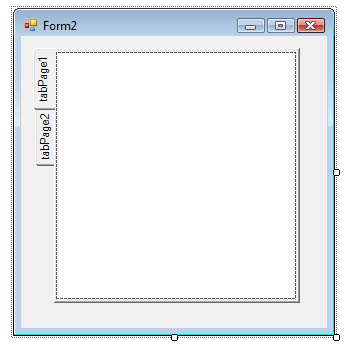
The first problem was that if you position the tabs on the left side, we get the following picture:
')
But I needed the inscriptions to go horizontally. Having studied this control a little deeper, I decided to use the DrawMode = OwnerDrawFixed parameter. All inscriptions were erased, and on the button it became possible to write and draw. But the background of the button itself remained, which could not be completely painted over.
The next step was to change Appearance c Normal to Buttons, there was also a FlatButtons variant, but it was not possible to put it through the constructor, and setting the code did not affect anything.
In the Buttons mode, such nonsense came out:
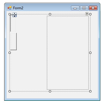
The picture shows that there is a distance between the buttons and the TabPages set. From where it came from and what parameter is regulated, I could not figure out.
For some time I studied the existing paid and free libraries of controls for the possibility of changing TabControl tabs for themselves, but they either suggested using pre-created styles or allowed a maximum change in color.
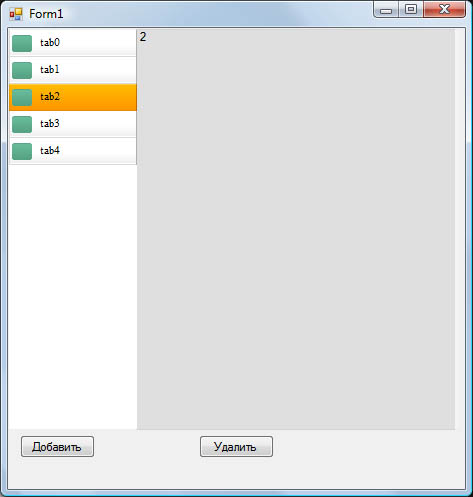
As a result, having suffered from it, I decided to write my control, based on the standard one. The goal was to hide the standard tabs and replace them with their own, tying them to the control.
I will try to describe in detail all that had to be done for this.
Step 1
First, you need to create a new control in the project. To do this, in the Solution Explorer panel, click the right button on the project, then Add-> Component, in the opened panel enter the name of the new control (I have this NewTabControl)
Step 2
After creation, open the code of the created control. In the code we make the following edits:
append
using System.Windows.Forms;
using System.Drawing;
We create three classes, inheriting them from the classes of standard controls.
Class new TabControl
public partial class NewTabControl: System.Windows.Forms.TabControl
New control class
public class NewTabPanel: System.Windows.Forms.Panel
Single tab class
public class PanelTP: System.Windows.Forms.Panel
Now we need to reload the following method in the NewTabControl class:
protected override void WndProc(ref Message m) { if (m.Msg == 0x1328 && !DesignMode) m.Result = (IntPtr)1; else base.WndProc(ref m); } This action will allow us to hide the standard tabs.
Now we need to link all the classes together. I will not describe all the code, I will attach it to this article. I will describe only the most interesting moments.
Step 3
Compose all the elements in the NewTabPanel class:
private void InitializeComponent() { this.panel2 = new System.Windows.Forms.Panel(); // this.tabControl = new NewTabControl(); this.Controls.Add(this.tabControl); this.Controls.Add(this.panel2); this.Size = new System.Drawing.Size(311, 361); this.panel2.Dock = System.Windows.Forms.DockStyle.Left; this.tabControl.Dock = System.Windows.Forms.DockStyle.Fill; tabControl.ControlAdded += new ControlEventHandler(tc_ControlAdded); // tabControl.ControlRemoved += new ControlEventHandler(tc_ControlRemoved); // tabControl.Selected += new TabControlEventHandler(tc_Selected); // } Step 4
Now you can set the format for the tab itself.
At this stage, you can arrange the text, picture or any other element on the future tab. And also set the size and background of the tab itself.
I bring the icon and the name of the tab.
In the PanelTP class we create the method:
private void InitializeComponent() { this.Height = 27; this.Width = 128; this.BackgroundImage = Tabpanel.Properties.Resources.tab_c_74; this.Click += new EventHandler(Select_Item); PictureBox Icon; Icon = new PictureBox(); Icon.Width = 25; Icon.Height = 26; Icon.Left = 3; Icon.Top = 5; Icon.Image = Tabpanel.Properties.Resources.green_dialbut_611; this.Controls.Add(Icon); Label lname; lname = new Label(); lname.Width = 95; lname.Height = 25; lname.Left = 28; lname.Top = 5; lname.Font = new System.Drawing.Font("Times New Roman", 8f, FontStyle.Regular); lname.Text = this.name; lname.Click += new EventHandler(Select_Item); this.Controls.Add(lname); } Step 5
I will not describe the methods that process events; they are described in detail in the attached project. I turn to the application.
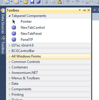
After we’ve saved everything, new components will appear on the Toolbox.
Now we can place it in our form as we want.
To add a tab use:
newTabPanel1.TabPages.Add("TabName"); To delete:
newTabPanel1.TabPages.Remove(newTabPanel1.TabPages[id]) Where id is inbox number
With this implementation of TabControl, you can always customize the sorting between tabs or hide the selected tab, make a tab of any size and design, make the tabbed panel loosenable and expandable.
By the same principle, you can create any of your controls by assembling and programming it from the existing ones.
Perhaps, for someone I described the obvious things, but I hope there will be those for whom this article will be useful.
Project sources can be downloaded here .
Binary here .
You may also be interested in my article How to connect a third-party browser in a C # application
Source: https://habr.com/ru/post/170375/
All Articles