Interactive infographics with CSS and SVG animations
One of the least discussed features, increasingly appearing in recent browsers, is support for SVG files. This format is characterized by absolute freedom in display: it is easily resized, can be displayed in any resolution without loss of quality. In many cases, SVGs weigh much less than, for example, PNG or JPG.
But the coolest SVG feature that many developers don't know about is that this format is built on the XML specification. Using this, we can manipulate elements of an SVG file using technologies like CSS or JavaScript, with which developers are already familiar.
')
With the right application of technology and a modern browser, developers can create impressive animations and effects using SVG. Today we will look at the possibilities of SVG and create an interactive vector infographic, the demo version of which can be viewed here .
There are many ways to create SVG graphics, from the familiar Adobe Illustrator to the free Inkscape. Regardless of the choice of software, it is very important to group objects together and give these groups names. This will allow us to turn our SVG into a specific hierarchy, which we will later use in CSS and / or JavaScript.

In our example, when we save our SVG and open it in a text editor, we get the following structure:
The code mentioned above was purposely reduced in order to simply show you the structure to which we are going. You will surely notice a lot of familiarity from HTML, but new moments are also present.
As we can see, each <g> tag contains a group of objects that can be placed in other groups. Of course, during the creation of SVG, it is not necessary to assign an id to each object or group, this is done only to make it easier to use SVG in the future when working with CSS and JavaScript.
There are many ways to embed SVG inside HTML. This can be done using the <img>, <embed> tag, or even using the background-image CSS property.
First, we will create a div inside our HTML document:
Then, using jQuery.load, we will load the SVG file into the #stage div and assign it the svgLoaded class, which we will later use for animation:
Important: We load the SVG file using javascript to access the HTML content of the file. Chrome (and possibly other browsers) will not allow this to happen locally; this only works if you use the HTTP protocol for security purposes. Thus, if you have problems downloading the SVG file, make sure that you are testing from the web server or localhost
Please note that in this tutorial CSS will not contain any styles for certain browsers, but you can find them in the source.
The first thing we do is assign styles to the container div. The standard behavior of an SVG file when loading is to change its scale to fit the container, so it is important to configure the container according to the size of the SVG file.
The key to animating an element within an SVG is in the transform-origin parameter. By default, all transformations begin at (0px, 0px). For each element that we transform (for example, rotate or scale), we need to assign a transform-origin parameter relative to the upper left corner of the SVG.
Since we used non-standard fonts, we need to include them in our webpage for correct display. To do this, you must correctly specify the name of the font inside the SVG file:
As we can see, the SVG file was created using the 'LeagueGothic' font, the name of which we simply copy into CSS.
Well that's all! I hope you liked our tutorial, and it turned out to be useful and informative for you. Write in the comments about your examples of using SVG and share your experience with us!
DOWNLOAD SOURCES | SEE DEMO
From the translator. With all the wishes and comments about the translation, please contact me in PM. Thank!
But the coolest SVG feature that many developers don't know about is that this format is built on the XML specification. Using this, we can manipulate elements of an SVG file using technologies like CSS or JavaScript, with which developers are already familiar.
')
With the right application of technology and a modern browser, developers can create impressive animations and effects using SVG. Today we will look at the possibilities of SVG and create an interactive vector infographic, the demo version of which can be viewed here .
SVG file preparation
There are many ways to create SVG graphics, from the familiar Adobe Illustrator to the free Inkscape. Regardless of the choice of software, it is very important to group objects together and give these groups names. This will allow us to turn our SVG into a specific hierarchy, which we will later use in CSS and / or JavaScript.
In our example, when we save our SVG and open it in a text editor, we get the following structure:
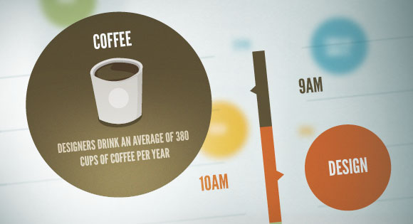
<g id="background"> <g id="bg-lines-left"> <!-- --> </g> <g id="bg-lines-right"> <!-- --> </g> </g> <g id="logo"> <!-- --> </g> <g id="quote"> <g id="quote-left-brace"> <!-- --> </g> <g id="quote-right-brace"> <!-- --> </g> <g id="quote-text"> <!-- --> </g> </g> <g id="timeline"> <g id="coffee"> <rect id="coffee-bar" /> <polyline id="coffee-arrow" /> <g id="coffee-time"> <!-- --> </g> <g id="coffee-badge"> <circle id="coffee-circle" /> <g id="coffee-title"> <!-- --> </g> <g id="coffee-details"> <!-- , --> </g> </g> </g> <g id="design"> <rect id="design-bar" /> <polyline id="design-arrow" /> <g id="design-time"> <!-- --> </g> <g id="design-badge"> <circle id="design-circle" /> <g id="design-title"> <!-- --> </g> <g id="design-details"> <!-- , --> </g> </g> </g> <g id="build"> <rect id="build-bar" /> <polyline id="build-arrow" /> <g id="build-time"> <!-- --> </g> <g id="build-badge"> <circle id="build-circle" /> <g id="build-title"> <!-- --> </g> <g id="build-details"> <!-- , --> </g> </g> </g> <g id="complain"> <rect id="complain-bar" /> <polyline id="complain-arrow" /> <g id="complain-time"> <!-- --> </g> <g id="complain-badge"> <circle id="complain-circle" /> <g id="complain-title"> <!-- --> </g> <g id="complain-details"> <!-- , --> </g> </g> </g> <g id="beer"> <rect id="beer-bar" /> <polyline id="beer-arrow" /> <g id="beer-time"> <!-- --> </g> <g id="beer-badge"> <circle id="beer-circle" /> <g id="beer-title"> <!-- --> </g> <g id="beer-details"> <!-- , --> </g> </g> </g> </g> The code mentioned above was purposely reduced in order to simply show you the structure to which we are going. You will surely notice a lot of familiarity from HTML, but new moments are also present.
As we can see, each <g> tag contains a group of objects that can be placed in other groups. Of course, during the creation of SVG, it is not necessary to assign an id to each object or group, this is done only to make it easier to use SVG in the future when working with CSS and JavaScript.
Loading SVG to HTML with JavaScript
HTML
There are many ways to embed SVG inside HTML. This can be done using the <img>, <embed> tag, or even using the background-image CSS property.
First, we will create a div inside our HTML document:
<div id="stage"> <!-- --> </div> Javascript
Then, using jQuery.load, we will load the SVG file into the #stage div and assign it the svgLoaded class, which we will later use for animation:
$(function(){ $("#stage").load('interactive.svg',function(response){ $(this).addClass("svgLoaded"); if(!response){ // SVG! } }); }); Important: We load the SVG file using javascript to access the HTML content of the file. Chrome (and possibly other browsers) will not allow this to happen locally; this only works if you use the HTTP protocol for security purposes. Thus, if you have problems downloading the SVG file, make sure that you are testing from the web server or localhost
CSS
Please note that in this tutorial CSS will not contain any styles for certain browsers, but you can find them in the source.
The first thing we do is assign styles to the container div. The standard behavior of an SVG file when loading is to change its scale to fit the container, so it is important to configure the container according to the size of the SVG file.
#stage { width: 1024px; height: 1386px; } Styling SVG elements: assigning the transform-origin parameter
The key to animating an element within an SVG is in the transform-origin parameter. By default, all transformations begin at (0px, 0px). For each element that we transform (for example, rotate or scale), we need to assign a transform-origin parameter relative to the upper left corner of the SVG.
#coffee { transform-origin: 517px 484px; } #coffee-badge { transform-origin: 445px 488px; } #coffee-title { transform-origin: 310px 396px; } #coffee-details { transform-origin: 311px 489px; } #design { transform-origin: 514px 603px; } #design-badge { transform-origin: 580px 606px; } #design-title { transform-origin: 712px 513px; } #design-details { transform-origin: 710px 620px; } #build { transform-origin: 511px 769px; } #build-badge { transform-origin: 445px 775px; } #build-title { transform-origin: 312px 680px; } #build-details { transform-origin: 310px 790px; } #complain { transform-origin: 512px 1002px; } #complain-badge { transform-origin: 586px 1000px; } #complain-title { transform-origin: 718px 921px; } #complain-details { transform-origin: 717px 1021px; } #beer { transform-origin: 513px 1199px; } #beer-badge { transform-origin: 444px 1193px; } #beer-title { transform-origin: 313px 1097px; } #beer-details { transform-origin: 316px 1202px; } Apply initial transformations
[id$=badge] { /* id, "badge" */ transform: scale(0.5, 0.5); } [id$=title] { transform: scale(1.8) translate(0px, 48px); } [id$=details] { transform: scale(0, 0); } Add: hover and apply transitions
#timeline > g:hover [id$=badge], #timeline > g:hover [id$=details] { transform: scale(1, 1); } #timeline > g:hover [id$=title] { transform: scale(1) translate(0px, 0px); } [id$=badge], [id$=title], [id$=details] { transition: transform 0.25s ease-in-out; } Intro animation
@keyframes left-brace-intro { 0% { transform: translateX(220px); opacity: 0; } 50% { opacity: 1; transform: translateX(220px); } 100% { transform: translateX(0px); } } @keyframes right-brace-intro { 0% { transform: translateX(-220px); opacity: 0; } 50% { opacity: 1; transform: translateX(-220px); } 100% { transform: translateX(0px); } } @keyframes fade-in { 0% { opacity: 0; } 100% { opacity: 1; } } @keyframes grow-y { 0% { transform: scaleY(0); } 100% { transform: scaleY(1); } } @keyframes grow-x { 0% { transform: scaleX(0); } 100% { transform: scaleX(1); } } @keyframes grow { 0% { transform: scale(0, 0); } 100% { transform: scale(1, 1); } } Create an animated intro sequence.
.svgLoaded #logo { animation: fade-in 0.5s ease-in-out; } .svgLoaded #quote-text { animation: fade-in 0.5s ease-in-out 0.75s; animation-fill-mode: backwards; } .svgLoaded #quote-left-brace { animation: left-brace-intro 1s ease-in-out 0.25s; animation-fill-mode: backwards; } .svgLoaded #quote-right-brace { animation: right-brace-intro 1s ease-in-out 0.25s; animation-fill-mode: backwards; } .svgLoaded #background { animation: grow-y 0.5s ease-in-out 1.25s; transform-origin: 512px 300px; animation-fill-mode: backwards; } .svgLoaded #background > g { animation: grow-x 0.25s ease-in-out 1.75s; animation-fill-mode: backwards; } .svgLoaded #background > g:last-of-type { transform-origin: 458px 877px; } .svgLoaded #background > g:first-of-type { transform-origin: 563px 877px; } .svgLoaded #coffee, .svgLoaded #design, .svgLoaded #build, .svgLoaded #complain, .svgLoaded #beer { animation: grow 0.25s ease-in-out; animation-fill-mode: backwards; } .svgLoaded #coffee { animation-delay: 2s; } .svgLoaded #design { animation-delay: 2.25s; } .svgLoaded #build { animation-delay: 2.5s; } .svgLoaded #complain { animation-delay: 2.75s; } .svgLoaded #beer { animation-delay: 3s; } Web font
Since we used non-standard fonts, we need to include them in our webpage for correct display. To do this, you must correctly specify the name of the font inside the SVG file:
<!-- ... --> <text font-family="'LeagueGothic'" font-size="28">12PM</text> <!-- ... --> As we can see, the SVG file was created using the 'LeagueGothic' font, the name of which we simply copy into CSS.
@font-face { font-family: 'LeagueGothic'; url("../fonts/league-gothic/league-gothic.eot.woff") format("woff"); } Well that's all! I hope you liked our tutorial, and it turned out to be useful and informative for you. Write in the comments about your examples of using SVG and share your experience with us!
DOWNLOAD SOURCES | SEE DEMO
From the translator. With all the wishes and comments about the translation, please contact me in PM. Thank!
Source: https://habr.com/ru/post/168681/
All Articles