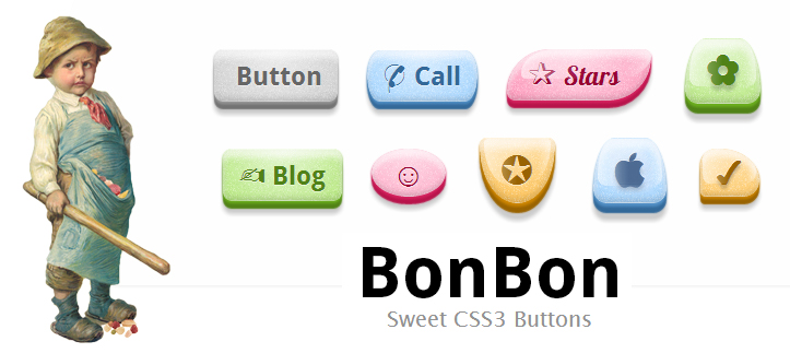
BonBon - Sweet CSS3 Buttons
Hello to all!
Inquisitiveness of mind (and not only) makes you look for new and better solutions in one direction or another. This led me to the blog pages of a certain @simurai . Perhaps someone is already familiar with the developments of Comrade Samurai , with the rest I just want to share interesting ideas from a pseudo-Japanese guru. In this article I want to consider one of his projects: BonBon - Sweet CSS3 Buttons (at the request of readers, the other works of the author will be brought to attention in subsequent articles). The initial goal: to create CSS buttons that look good, have flexible settings, and at the same time will have the simplest markup.
The author tried to invest in the idea of maximum ease of use, without the "mnogabukav"; Elementary example of the final implementation ( Demo ):

')
You can also change the appearance by adding a couple of classes to the button, for example: orange and glossy ( Demo ):

If you want to add an icon, to make the web element more associative, you can use an HTML5 attribute, like this: data-icon = "S". This allows the use of Unicode characters , icon fonts and many others.
This CSS code adds an icon in front of the button content, which allows you to save semantic markup and change icons without editing CSS styles ( Demo ):

If we add the role = ”button” attribute to our buttons and use TabIndex, we can make them active and select them one by one. Alternatively - if you use the tag
I tried to imitate various materials: " matte ", " glossy " and " glass ". You can evaluate the results yourself ( Demo ):

The glossy shape is created using the : after selector with a gradient background on top
For the sake of focus, you can try to apply the HTML5 attribute contenteditable = "true" , with the result that we get a funny editable button ( Demo ):

All the experiments described above can be represented as such a “manual” list (here all the additional class names with which you can play on your own using Firebug or another tool):
Demo : lab.simurai.com/buttons/
Source : github.com/simurai
As a result, I propose to discuss the concept in principle: suggestions for improvement, comments on shortcomings, constructive criticism (without “what’s the bootstrap didn’t please ....”).
Also, please vote ... Thank you.
: before
Inquisitiveness of mind (and not only) makes you look for new and better solutions in one direction or another. This led me to the blog pages of a certain @simurai . Perhaps someone is already familiar with the developments of Comrade Samurai , with the rest I just want to share interesting ideas from a pseudo-Japanese guru. In this article I want to consider one of his projects: BonBon - Sweet CSS3 Buttons (at the request of readers, the other works of the author will be brought to attention in subsequent articles). The initial goal: to create CSS buttons that look good, have flexible settings, and at the same time will have the simplest markup.
Markup:
The author tried to invest in the idea of maximum ease of use, without the "mnogabukav"; Elementary example of the final implementation ( Demo ):
<a href="#" class="button">Label</a> ')
You can also change the appearance by adding a couple of classes to the button, for example: orange and glossy ( Demo ):
<a href="#" class="button orange glossy">Label</a> Icons:
If you want to add an icon, to make the web element more associative, you can use an HTML5 attribute, like this: data-icon = "S". This allows the use of Unicode characters , icon fonts and many others.
.button:before { content: attr(data-icon); } This CSS code adds an icon in front of the button content, which allows you to save semantic markup and change icons without editing CSS styles ( Demo ):
<a href="" class="button orange glossy" data-icon=""> Label</ a> Availability:
If we add the role = ”button” attribute to our buttons and use TabIndex, we can make them active and select them one by one. Alternatively - if you use the tag
, "disabled" (Demo).


:
- , - « » PNG- - . - CSS3: text-shadows , box-shadows , gradients borders . , , , : morphing (Demo).


Border-radius – , , , "/"

border-radius: 5em / 2em; border-radius: .4em .4em 2em 2em / .4em .4em 3em 3em;
, "disabled" (Demo).
:
- , - « » PNG- - . - CSS3: text-shadows , box-shadows , gradients borders . , , , : morphing (Demo).
Border-radius – , , , "/"
border-radius: 5em / 2em; border-radius: .4em .4em 2em 2em / .4em .4em 3em 3em; , "disabled" (Demo).
:
- , - « » PNG- - . - CSS3: text-shadows , box-shadows , gradients borders . , , , : morphing (Demo).
Border-radius – , , , "/"
border-radius: 5em / 2em; border-radius: .4em .4em 2em 2em / .4em .4em 3em 3em;
, "disabled" (Demo).
:
- , - « » PNG- - . - CSS3: text-shadows , box-shadows , gradients borders . , , , : morphing (Demo).
Border-radius – , , , "/"
border-radius: 5em / 2em; border-radius: .4em .4em 2em 2em / .4em .4em 3em 3em; I tried to imitate various materials: " matte ", " glossy " and " glass ". You can evaluate the results yourself ( Demo ):
The glossy shape is created using the : after selector with a gradient background on top
For the sake of focus, you can try to apply the HTML5 attribute contenteditable = "true" , with the result that we get a funny editable button ( Demo ):
Flexibility:
All the experiments described above can be represented as such a “manual” list (here all the additional class names with which you can play on your own using Firebug or another tool):
- Color: orange , pink , blue , green , transparent
- Font: serif
- Material: glossy , glass
- Size: xs , xl
- Shape: round , oval , brackets , skew , back , knife , shield , drop , morph
- Icon only: icon
- Disabled: disabled
after
This material is just a demo version, which is not intended for use on work projects. Not all browsers support this solution. The goal of the development was to show a couple of methods for using some of the new CSS3 / HTML5 features.(c) simurai
Demo : lab.simurai.com/buttons/
Source : github.com/simurai
As a result, I propose to discuss the concept in principle: suggestions for improvement, comments on shortcomings, constructive criticism (without “what’s the bootstrap didn’t please ....”).
Also, please vote ... Thank you.
Source: https://habr.com/ru/post/168117/
All Articles