Stop misusing drop-down lists.
Forms consist of a variety of interface elements. If you do not know how to handle them correctly, you can make it very difficult to fill out the forms. Most often wrong, using drop-down lists (select menu).
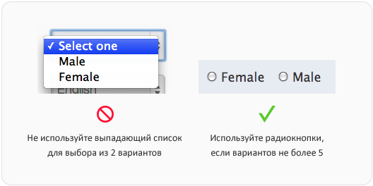
Sometimes you can find drop-down lists with 2 options, sometimes with more than 20. In both cases, this is wrong. If the user has less than 5 choices, you should use the radio buttons. So the choice will be easier and faster, because the user only needs to look at the options and click once. With the drop-down list, he needs to click on it, find a suitable option and click again. Also, other options are not visible until you click on the drop-down list. If there are less than 5, it is better to visually show them in the form of radio buttons - users can quickly view them.

')
If there are more than 15 choices, this is also bad. If there are so many options in the drop-down list, it will slow down the user who will have to scroll and view a long list. It happens that there are so many options that their list occupies the entire screen. If there are more than 15 options, you should either reduce their number or provide the user with a text field for entering their data. The text field will save users from messing around with a huge list and make filling out the form faster and easier.

Like any other form element, the drop-down list should have a name next to it (label). However, the inscription that the user chooses must be inside the element. It should clearly describe the set of options. Disabled users who use screen readers to fill in forms (screen readers) will not have enough universal “Please select”. Adding a name both outside and inside the drop-down list will allow any user to make choices faster and without any hitch.

Try not to offer users the default option. When filling out the form, the user may inadvertently skip the drop-down list with the inappropriate default option. It will be more reliable to report an unselected version, rather than take a form with incorrect data. You can substitute the default option only if you are more than 90% sure that users will choose this option. Then it will protect the majority of your users from messing around with the drop-down list.

If the choices have a hierarchy, divide them into groups using the optgroup tag. This will allow you to quickly find the desired option by viewing the names of groups, rather than a general list of options. Group names must not be available for selection. They only list the hierarchy and facilitate the search. Users with disabilities will not be confused by groups, since on-screen announcers do not read them out.

Most drop-down lists are used in forms, but sometimes for navigation. On some sites, drop-down lists are used to filter or organize content. By selecting the option, the user is sent to a new page. For screen speakers, this will work if you can go to the drop-down list with a tab and use the arrow buttons to reach the desired option without leaving the new page immediately. The drop-down list should direct to a new page by pressing the enter key. Javascript is turned off at the individual screen speakers. In order for the drop-down lists to serve as navigation when javascript is turned off, a confirmation button should be placed next to it. Users will be directed to a new page after selecting an option and clicking on this button.

Although you will find drop-down lists used in navigation, we recommend using them only in forms. Mobile sites often use them as primary navigation to save space. However, this solution has issues related to usability, accessibility and search engine optimization.

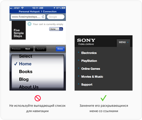
At first glance, navigation using the drop-down list looks out of place, as it does not match the design of the site. It is also inconvenient because clicking on the drop-down list results in a spinning wheel, which is used to select from options in mobile forms. The user must click on the drop-down list, find and select an option, click the "Finish" button, and this is a lot of action. Not to mention the fact that the “Previous”, “Next” and “Autocomplete” buttons are useless in this situation, since you do not fill out the form.
Your drop-down list can not be used for navigation if javascript is disabled. This applies to users of some screen speakers. A menu that will open when you move the tab to it and allow the same tab to go through other options will be available. This is only possible if the menu items are real links. For the same reason, drop-down menus are useless in terms of search engine optimization. If you want your navigation to be optimized for search engines, do not use the drop-down lists, but offer drop-down menus to users.
There are a lot of incorrectly used drop-down lists in the network. This is due to a misunderstanding of the basic principles of their use. Armed with this knowledge, help put an end to this - make sure that the drop-down lists on your site work correctly.
In different companies and even among different specialists within the same company there are various translation options: select menu, dropdown menu, etc. I have been designing websites since 2008, and in this article I use Russian terms that are familiar to me. Please do not judge strictly, if you are accustomed to other options. In this case, the original terms are indicated in parentheses.
When to use
Sometimes you can find drop-down lists with 2 options, sometimes with more than 20. In both cases, this is wrong. If the user has less than 5 choices, you should use the radio buttons. So the choice will be easier and faster, because the user only needs to look at the options and click once. With the drop-down list, he needs to click on it, find a suitable option and click again. Also, other options are not visible until you click on the drop-down list. If there are less than 5, it is better to visually show them in the form of radio buttons - users can quickly view them.

')
If there are more than 15 choices, this is also bad. If there are so many options in the drop-down list, it will slow down the user who will have to scroll and view a long list. It happens that there are so many options that their list occupies the entire screen. If there are more than 15 options, you should either reduce their number or provide the user with a text field for entering their data. The text field will save users from messing around with a huge list and make filling out the form faster and easier.

How to call
Like any other form element, the drop-down list should have a name next to it (label). However, the inscription that the user chooses must be inside the element. It should clearly describe the set of options. Disabled users who use screen readers to fill in forms (screen readers) will not have enough universal “Please select”. Adding a name both outside and inside the drop-down list will allow any user to make choices faster and without any hitch.

When to substitute the default option
Try not to offer users the default option. When filling out the form, the user may inadvertently skip the drop-down list with the inappropriate default option. It will be more reliable to report an unselected version, rather than take a form with incorrect data. You can substitute the default option only if you are more than 90% sure that users will choose this option. Then it will protect the majority of your users from messing around with the drop-down list.

Grouping choices
If the choices have a hierarchy, divide them into groups using the optgroup tag. This will allow you to quickly find the desired option by viewing the names of groups, rather than a general list of options. Group names must not be available for selection. They only list the hierarchy and facilitate the search. Users with disabilities will not be confused by groups, since on-screen announcers do not read them out.

Use for navigation
Most drop-down lists are used in forms, but sometimes for navigation. On some sites, drop-down lists are used to filter or organize content. By selecting the option, the user is sent to a new page. For screen speakers, this will work if you can go to the drop-down list with a tab and use the arrow buttons to reach the desired option without leaving the new page immediately. The drop-down list should direct to a new page by pressing the enter key. Javascript is turned off at the individual screen speakers. In order for the drop-down lists to serve as navigation when javascript is turned off, a confirmation button should be placed next to it. Users will be directed to a new page after selecting an option and clicking on this button.

More suited for forms, not navigation
Although you will find drop-down lists used in navigation, we recommend using them only in forms. Mobile sites often use them as primary navigation to save space. However, this solution has issues related to usability, accessibility and search engine optimization.

At first glance, navigation using the drop-down list looks out of place, as it does not match the design of the site. It is also inconvenient because clicking on the drop-down list results in a spinning wheel, which is used to select from options in mobile forms. The user must click on the drop-down list, find and select an option, click the "Finish" button, and this is a lot of action. Not to mention the fact that the “Previous”, “Next” and “Autocomplete” buttons are useless in this situation, since you do not fill out the form.
Your drop-down list can not be used for navigation if javascript is disabled. This applies to users of some screen speakers. A menu that will open when you move the tab to it and allow the same tab to go through other options will be available. This is only possible if the menu items are real links. For the same reason, drop-down menus are useless in terms of search engine optimization. If you want your navigation to be optimized for search engines, do not use the drop-down lists, but offer drop-down menus to users.
Stop misusing drop-down lists.
There are a lot of incorrectly used drop-down lists in the network. This is due to a misunderstanding of the basic principles of their use. Armed with this knowledge, help put an end to this - make sure that the drop-down lists on your site work correctly.
From translator
In different companies and even among different specialists within the same company there are various translation options: select menu, dropdown menu, etc. I have been designing websites since 2008, and in this article I use Russian terms that are familiar to me. Please do not judge strictly, if you are accustomed to other options. In this case, the original terms are indicated in parentheses.
Source: https://habr.com/ru/post/167219/
All Articles