Yandeks.Kartinki: the path of the interface solution from idea to implementation
Pictures are one of the most heavily loaded Yandex services. Its daily audience approaches 6 million people, and the number of image views is almost 120 million. To make it faster and more convenient, at the same time with the full redesign in September, we have significantly updated the technological component. We continue updating the interface now, for which we are constantly conducting new experiments and testing new ideas.
I want to tell you today about how ideas appear and what way they go before getting into the mass service interface.
')
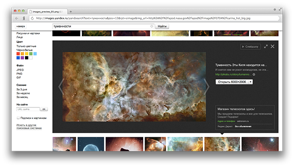
In September, we launched a new Yandex.Kartinok interface, in which we refused to view the image on a separate page. The sidebar of the preview, which was “pushing” the picture output, we called “vest” within the team.

In the development of interfaces, they always make a start from what people do in the service and for what purpose. As you know, this is called user scripts. The main task of the September update was to improve the script “quickly find the right picture” and “get an idea of how something looks like.” At the same time, the person should be able to see the image he liked quickly and without losing the context of the search results - i.e. the viewport should not have blocked and changed it. In the new interface, in order to select a different image, the user only needs to skip the page to the next preview he liked. And since most of the images on the Internet are horizontal and people mostly use widescreen screens, we have allocated more screen space for horizontal pictures.
In the previous version of the Yandex.Kartinok interface, the thumblene grid was very sparse and the thumbnails were resized to a maximum width of 150 pixels. For the September update, by default we hid the signatures to the tumbler for the hover and resize it to a maximum height of 150 pixels. So on the search results page, the screen space became more optimally used and we were able to show people more thumbnails of the images found.
In addition to the “quickly find the right picture” scenario, we highlighted the “go to the website” script (often in order to see more similar images) or “download the image”. And we set a goal to make it easier for people to solve these problems.
Conceptually, we didn’t change the veil, but began to work with its content. At the first stage, you just had to look at how different controls get along with each other and what you need to pay attention to.
It was decided to show one snippet of the most relevant page with the found image and suggest a way to get it in the highest resolution. It was assumed that when you turn on the “Wallpaper” filter, the button, clicking on which opens the image in the largest size, leads to a picture with a resolution of the user's screen or a larger image, but with the same aspect ratio.

In this layout, the button that includes the slideshow received much less attention than in the current production interface. We were just starting to think about where to put the full screen mode in it.
At the same time, it was necessary to solve the problem of how to separate out the “vest” in the issue. So we made her background dark. In order to clear the right functional block, we placed the button “Similar pictures” and icons of the sharing on the picture itself. In addition, since they have become a little more contextual to where users intuitively expect these features.

For the picture itself, we allocated more space and made more understandable the inscription on the button, which allows you to get the found image in the highest resolution.

We had to figure out how to organically add to the interface the ability to see the picture on other sites and in other sizes. We decided to use pseudo links for this, on click on which lists from other permissions and sites appear.

Not always some image on the Internet has a duplicate in high resolution. In the previous screenshot, you can see how we solved the task to accurately show in the resulting preview version in small sizes.
After we decided on the functionality and location of the buttons, the team began working on the design of the entire preview frame. In order that the snippet on the right could not be confused with Direct, we selected the right functional block and began to try how to sign the picture.

In this version, the “Slideshow” and “Full Screen” buttons have received too much attention, if we compare this with how often people have a need for this functionality.
So, the transition to full-screen viewing of the picture was implemented by analogy with the transition to full-screen mode in Windows windows. The caption to the image moved to the right block, and the arrows with which the person will thumb through the pictures have become more noticeable. The place in the inset was also released for viewing vertical pictures.

In all these ways, we came to the decision on which we carried out usability testing, and at the end of last year it was decided to launch a “vest” with two background variants: dark and light. As a result, we saw that the preview frame helps the user to better solve problems in which you need to go to the page with the found picture or download it. It also confirmed the hypothesis that the dark background of the preview frame helps to highlight the image better, allows users to better concentrate directly on it and, in principle, improves all the scenarios we formulated above.

But during testing, one unpleasant flaw appeared: people perceived the line “3000x2400 Biggest Picture” as a description of its version, which is shown in the preview, and thought that by right-clicking on the image they kept it in the highest resolution. It was necessary to come up with how to explicitly designate that in order to do this you need to follow the URL to the big picture. To solve this problem, we decided to use a much more prominent control to go to the URL of the largest image.
Next we returned the “Slideshow” button and added the title of the page on which the picture is located. So we got the final layout, which within a month will be rolled out to all Yandex.Kartinok users. In the meantime, the service continues the experiment that we started at the end of 2012.
We are not the only ones who came to this decision. Recently, Google began to use a similar implementation in its image search. As many of you could see, Apple also uses the “vest” to display a list of songs in iTunes 11.

PS In our view window, you can flip through the images with the a and d keys.
I want to tell you today about how ideas appear and what way they go before getting into the mass service interface.
')
In September, we launched a new Yandex.Kartinok interface, in which we refused to view the image on a separate page. The sidebar of the preview, which was “pushing” the picture output, we called “vest” within the team.
In the development of interfaces, they always make a start from what people do in the service and for what purpose. As you know, this is called user scripts. The main task of the September update was to improve the script “quickly find the right picture” and “get an idea of how something looks like.” At the same time, the person should be able to see the image he liked quickly and without losing the context of the search results - i.e. the viewport should not have blocked and changed it. In the new interface, in order to select a different image, the user only needs to skip the page to the next preview he liked. And since most of the images on the Internet are horizontal and people mostly use widescreen screens, we have allocated more screen space for horizontal pictures.
In the previous version of the Yandex.Kartinok interface, the thumblene grid was very sparse and the thumbnails were resized to a maximum width of 150 pixels. For the September update, by default we hid the signatures to the tumbler for the hover and resize it to a maximum height of 150 pixels. So on the search results page, the screen space became more optimally used and we were able to show people more thumbnails of the images found.
In addition to the “quickly find the right picture” scenario, we highlighted the “go to the website” script (often in order to see more similar images) or “download the image”. And we set a goal to make it easier for people to solve these problems.
Conceptually, we didn’t change the veil, but began to work with its content. At the first stage, you just had to look at how different controls get along with each other and what you need to pay attention to.
It was decided to show one snippet of the most relevant page with the found image and suggest a way to get it in the highest resolution. It was assumed that when you turn on the “Wallpaper” filter, the button, clicking on which opens the image in the largest size, leads to a picture with a resolution of the user's screen or a larger image, but with the same aspect ratio.
In this layout, the button that includes the slideshow received much less attention than in the current production interface. We were just starting to think about where to put the full screen mode in it.
At the same time, it was necessary to solve the problem of how to separate out the “vest” in the issue. So we made her background dark. In order to clear the right functional block, we placed the button “Similar pictures” and icons of the sharing on the picture itself. In addition, since they have become a little more contextual to where users intuitively expect these features.
For the picture itself, we allocated more space and made more understandable the inscription on the button, which allows you to get the found image in the highest resolution.
We had to figure out how to organically add to the interface the ability to see the picture on other sites and in other sizes. We decided to use pseudo links for this, on click on which lists from other permissions and sites appear.
Not always some image on the Internet has a duplicate in high resolution. In the previous screenshot, you can see how we solved the task to accurately show in the resulting preview version in small sizes.
After we decided on the functionality and location of the buttons, the team began working on the design of the entire preview frame. In order that the snippet on the right could not be confused with Direct, we selected the right functional block and began to try how to sign the picture.
In this version, the “Slideshow” and “Full Screen” buttons have received too much attention, if we compare this with how often people have a need for this functionality.
So, the transition to full-screen viewing of the picture was implemented by analogy with the transition to full-screen mode in Windows windows. The caption to the image moved to the right block, and the arrows with which the person will thumb through the pictures have become more noticeable. The place in the inset was also released for viewing vertical pictures.
In all these ways, we came to the decision on which we carried out usability testing, and at the end of last year it was decided to launch a “vest” with two background variants: dark and light. As a result, we saw that the preview frame helps the user to better solve problems in which you need to go to the page with the found picture or download it. It also confirmed the hypothesis that the dark background of the preview frame helps to highlight the image better, allows users to better concentrate directly on it and, in principle, improves all the scenarios we formulated above.
But during testing, one unpleasant flaw appeared: people perceived the line “3000x2400 Biggest Picture” as a description of its version, which is shown in the preview, and thought that by right-clicking on the image they kept it in the highest resolution. It was necessary to come up with how to explicitly designate that in order to do this you need to follow the URL to the big picture. To solve this problem, we decided to use a much more prominent control to go to the URL of the largest image.
Next we returned the “Slideshow” button and added the title of the page on which the picture is located. So we got the final layout, which within a month will be rolled out to all Yandex.Kartinok users. In the meantime, the service continues the experiment that we started at the end of 2012.
We are not the only ones who came to this decision. Recently, Google began to use a similar implementation in its image search. As many of you could see, Apple also uses the “vest” to display a list of songs in iTunes 11.
PS In our view window, you can flip through the images with the a and d keys.
Source: https://habr.com/ru/post/167029/
All Articles