How we ported the Silverlight application to Windows 8
Recently, we ported a relatively large business application to Windows 8 — a editor for charts, flow charts, and other business graphics . Initially, this editor was written for the Silverlight platform, but we rewrote it under the Windows Runtime and successfully placed it in the Windows 8 Store . Unfortunately, we really didn’t have enough standard controls, so we had to write our own library of controls along the way. And now we are ready to share our experience. This article contains a number of nuances of developing applications for Windows 8 - from designing a user interface to technical details for working with DirectX.
From a technical point of view, porting was surprisingly easy. Although we had to solve some API compatibility issues (which we hope to cover in the next posts), most of the C # code and XAML markup required only very simple transformations, such as renaming namespaces and some class members.
But the main problem for us was the reworking of the user interface in the style of Microsoft Design Language (formerly known as the Windows Store UI, formerly known as Modern UI, formerly also known as Metro UI). Compliance with this style is a prerequisite for certification when placing an application in a store, or simply a good tone rule, without which the application will look alien and incomprehensible to the user.
If you watched materials and presentations on the principles of building a new UI, then you probably noticed that all the examples are quite simple in terms of the interface. They are dedicated to applications that are intended solely for the consumption of content. Therefore, if you are developing a Line-Of-Business application, then you are practically alone with the raw guidelines, proclaiming very beautiful principles like: “Always put content before chrome” , which are completely incomprehensible how to apply in real life.
')
In this article, we will try with the example of our application to illustrate some design decisions that we made when switching to a new platform.
As already mentioned, the basic principle of Microsoft Design Language: "Always put content before chrome . " Your application should allow the user to focus on the data as much as possible; control elements should not distract him. In our editor, we decided to take the whole screen to display the edited document and show controls only when necessary.

See how the space allocated to the user to work directly with the document has grown. This is especially valuable when working on a tablet where the physical dimensions of the screen are quite small.
Another one of the fundamental principles of the new UI is “Design for a touch-first experience” , which means “design everything so that it is convenient to point with a finger, then somehow they will somehow fall with the mouse” . Naturally, this imposes a number of restrictions. For us, when developing a graphic editor, the following were the most relevant:
Here is how the set of controls for the selected object has changed during the transition to the new version:

In Windows 8, navigation between equivalent elements, which undoubtedly are open editable documents, is supposed to be placed on the top AppBar. AppBars are such horizontal controls that appear on the screen when you slide your finger from the top or bottom edge of the screen on the touchscreen, or when you right-click.

Commands for manipulating documents are also supposed to be placed on the AppBar, with the right:

Some commands that run in context over selected objects can also be placed on the lower AppBar. Please note that contextual commands should be placed on the left, and AppBar should pop up automatically in cases where the command becomes relevant. For example, when selecting an object of the appropriate type.
In our application, this solution is used to control the selection mode of a set of objects. In the desktop version of the application to select multiple objects, just hold down the Shift key, but in the tablet version the physical keyboard may not be available. Therefore, for the simultaneous allocation of several objects had to provide a special mode. To exit this mode, use the context AppBar:

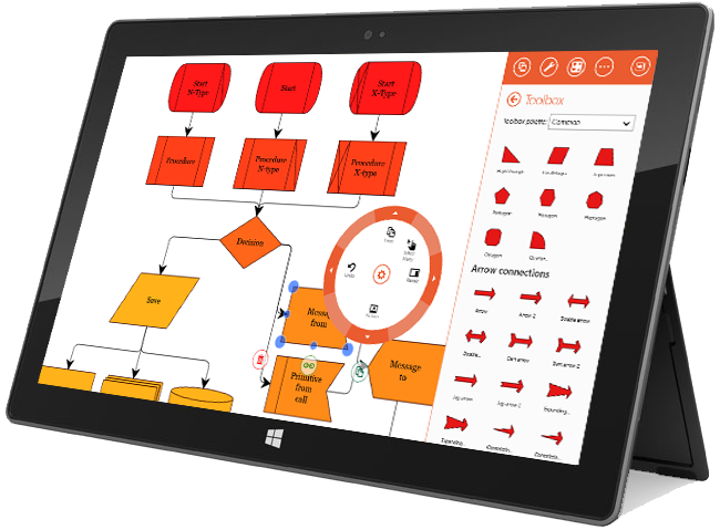
The most interesting new element is the radial menu. This is the original replacement for the classic context menu used in Microsoft OneNote. It looks like this:

In addition to the usual commands, quite complex controls can be placed on the sub-levels of this menu, such as the color picker and sliders:

Obvious advantages of this element are an unusual attractive design and the minimum distance to each command from the place of the initial location of the cursor pointer (or finger when working with the touch-screen). In addition, this element looks normal only if no more than 8 teams are placed on the same level. This forces the interface designer to avoid overloaded with menus and more carefully design user interaction. But psychologists have long known that consciousness can work effectively with no more than 7-9 elements at a time.
Unfortunately, this wonderful control is not in the standard library. So we had to write it ourselves. In our program, he completely replaced the classic context menus and took over part of the commands that were located on the ribbon.

All other controls we placed on the pop-up panel located on the right side of the screen:

A number of actions (calling the settings dialog, printing, etc.) in the new interface must be done using the Charms Bar, which is caused by sliding the finger from the right edge of the screen. In fact, this is an analogue of the above-described AppBar, on which the system management functions and actions that are performed in the same type for all applications are located.
This is how the print dialog call looks like:

Without a doubt, one of the mandatory features of the diagram editor should be the ability to export the result to some graphic format. Under Silverlight, this was done very simply - you could take the entire visual tree and render it into a picture. For some reason, this functionality was removed in WinRT. In particular, the WriteableBitmap .Render () method is no longer present. There is a class XamlUIPresenter with the help of which you can probably do it somehow , but with its use you can not get into the Windows Store.
There was an idea to implement export via HTML5, but its raster canvas didn’t have enough for our vector needs. Therefore, we have only one way to go - use DirectX. As you know, the only sane way to use DirectX under C # is SharpDX . This wonderful open-source library provides the full DirectX API for the .NET platform. For these purposes there are other products ( SlimDx , MDX , etc.), but the creation of normal applications for Windows 8 only supports SharpDx. If you have never worked with this library before, examples and documentation will help you. If you just need to create a 2D image and save it as a graphic file, then you need a template with Stackoverflow .
It is worth bearing in mind one more thing. Although the authors of SharpDx and boast that all their assemblies are successfully certified, this is not entirely true. When we first tried to get certified, we received messages of this type:
So try to avoid using some rare methods. But if you decided to use some kind of exotic functionality, it is better to first make sure that it will be certified in the Windows Store.
As you can see, creating a version of a business application for Windows Store will require significant reworking of the user interface. Fortunately, the style adopted by Microsoft (everything is very, very square and with solid fills) makes this task for the programmer much easier.
From a technical point of view, porting was surprisingly easy. Although we had to solve some API compatibility issues (which we hope to cover in the next posts), most of the C # code and XAML markup required only very simple transformations, such as renaming namespaces and some class members.
But the main problem for us was the reworking of the user interface in the style of Microsoft Design Language (formerly known as the Windows Store UI, formerly known as Modern UI, formerly also known as Metro UI). Compliance with this style is a prerequisite for certification when placing an application in a store, or simply a good tone rule, without which the application will look alien and incomprehensible to the user.
If you watched materials and presentations on the principles of building a new UI, then you probably noticed that all the examples are quite simple in terms of the interface. They are dedicated to applications that are intended solely for the consumption of content. Therefore, if you are developing a Line-Of-Business application, then you are practically alone with the raw guidelines, proclaiming very beautiful principles like: “Always put content before chrome” , which are completely incomprehensible how to apply in real life.
')
In this article, we will try with the example of our application to illustrate some design decisions that we made when switching to a new platform.
Content Before Chrome
As already mentioned, the basic principle of Microsoft Design Language: "Always put content before chrome . " Your application should allow the user to focus on the data as much as possible; control elements should not distract him. In our editor, we decided to take the whole screen to display the edited document and show controls only when necessary.
See how the space allocated to the user to work directly with the document has grown. This is especially valuable when working on a tablet where the physical dimensions of the screen are quite small.
Editing graphics primitives
Another one of the fundamental principles of the new UI is “Design for a touch-first experience” , which means “design everything so that it is convenient to point with a finger, then somehow they will somehow fall with the mouse” . Naturally, this imposes a number of restrictions. For us, when developing a graphic editor, the following were the most relevant:
- Interactive elements should be tritely larger in size in order to compensate for the lower accuracy of the touch interface compared to the mouse one.
- No backlight mode. If in classical interfaces it was possible to show controls when you hover the mouse over an object, then in the touch interface you need to click on the object. Also, you cannot use cursor shape changes to prompt the user for the type of interaction, since there is no cursor in the touch interface.
- The functionality of mouse actions can be significantly expanded by using the mouse in combination with Ctrl / Shift / Alt. In the new paradigm it is necessary to use a separate control element for each action.
- On the fingers there is not only a wheel, but also the right button. But you can touch the screen with several fingers at once.
Here is how the set of controls for the selected object has changed during the transition to the new version:
| Item number | Why do you need | Desktop | Windows 8 |
|---|---|---|---|
| one | Controls the size | Was small | Became big |
| 2 | Controls the rotation angle | Was small | Became big |
| 3 | Manages different geometric properties. | Was small | Became big |
| four | Used to connect elements | Context appeared over the object under the cursor | Only applies to the selected item. |
| five | Deletes selected items. | You could press the Del key | A new item has appeared |
| 6 | Used to create and move a copy. | You could just drag the item with Ctrl pressed | A new item has appeared |
| 7 | Serves to call the context menu | You could click the right mouse button | A new item has appeared |
Navigation and work with documents
In Windows 8, navigation between equivalent elements, which undoubtedly are open editable documents, is supposed to be placed on the top AppBar. AppBars are such horizontal controls that appear on the screen when you slide your finger from the top or bottom edge of the screen on the touchscreen, or when you right-click.
Commands for manipulating documents are also supposed to be placed on the AppBar, with the right:
Contextual actions
Some commands that run in context over selected objects can also be placed on the lower AppBar. Please note that contextual commands should be placed on the left, and AppBar should pop up automatically in cases where the command becomes relevant. For example, when selecting an object of the appropriate type.
In our application, this solution is used to control the selection mode of a set of objects. In the desktop version of the application to select multiple objects, just hold down the Shift key, but in the tablet version the physical keyboard may not be available. Therefore, for the simultaneous allocation of several objects had to provide a special mode. To exit this mode, use the context AppBar:
Radial menus
The most interesting new element is the radial menu. This is the original replacement for the classic context menu used in Microsoft OneNote. It looks like this:
In addition to the usual commands, quite complex controls can be placed on the sub-levels of this menu, such as the color picker and sliders:
Obvious advantages of this element are an unusual attractive design and the minimum distance to each command from the place of the initial location of the cursor pointer (or finger when working with the touch-screen). In addition, this element looks normal only if no more than 8 teams are placed on the same level. This forces the interface designer to avoid overloaded with menus and more carefully design user interaction. But psychologists have long known that consciousness can work effectively with no more than 7-9 elements at a time.
Unfortunately, this wonderful control is not in the standard library. So we had to write it ourselves. In our program, he completely replaced the classic context menus and took over part of the commands that were located on the ribbon.
Pop up panels
All other controls we placed on the pop-up panel located on the right side of the screen:
Sharms (miracle buttons)
A number of actions (calling the settings dialog, printing, etc.) in the new interface must be done using the Charms Bar, which is caused by sliding the finger from the right edge of the screen. In fact, this is an analogue of the above-described AppBar, on which the system management functions and actions that are performed in the same type for all applications are located.
This is how the print dialog call looks like:
Directx
Without a doubt, one of the mandatory features of the diagram editor should be the ability to export the result to some graphic format. Under Silverlight, this was done very simply - you could take the entire visual tree and render it into a picture. For some reason, this functionality was removed in WinRT. In particular, the WriteableBitmap .Render () method is no longer present. There is a class XamlUIPresenter with the help of which you can probably do it somehow , but with its use you can not get into the Windows Store.
There was an idea to implement export via HTML5, but its raster canvas didn’t have enough for our vector needs. Therefore, we have only one way to go - use DirectX. As you know, the only sane way to use DirectX under C # is SharpDX . This wonderful open-source library provides the full DirectX API for the .NET platform. For these purposes there are other products ( SlimDx , MDX , etc.), but the creation of normal applications for Windows 8 only supports SharpDx. If you have never worked with this library before, examples and documentation will help you. If you just need to create a 2D image and save it as a graphic file, then you need a template with Stackoverflow .
It is worth bearing in mind one more thing. Although the authors of SharpDx and boast that all their assemblies are successfully certified, this is not entirely true. When we first tried to get certified, we received messages of this type:
API D3DCompile in d3dcompiler_45.dll is not supported for this application type. SharpDX.D3DCompiler.dll calls this API. API D3DCompile2 in d3dcompiler_45.dll is not supported for this application type. SharpDX.D3DCompiler.dll calls this API. API D3DCompileFromFile in d3dcompiler_45.dll is not supported for this application type. SharpDX.D3DCompiler.dll calls this API. ... So try to avoid using some rare methods. But if you decided to use some kind of exotic functionality, it is better to first make sure that it will be certified in the Windows Store.
Conclusion
As you can see, creating a version of a business application for Windows Store will require significant reworking of the user interface. Fortunately, the style adopted by Microsoft (everything is very, very square and with solid fills) makes this task for the programmer much easier.
Source: https://habr.com/ru/post/165285/
All Articles