Touch-web: Swipe
In this post, we continue a series of articles on the development of web interfaces for touch devices.
Touchscreen smartphones are quite common and have become indispensable helpers for many of us. Therefore, one can not ignore their features in the development of mobile web interfaces.
Touch control is significantly different from the usual mouse control.
The user interacts with the fingers of the screen itself. And depending on what movements and how many fingers the user makes, the interface reacts differently: if you quickly touch the screen and release your finger, then click is triggered; if you touched and ran your finger across the screen - scroll; if held with two fingers - zoom; and a great many other reaction options.
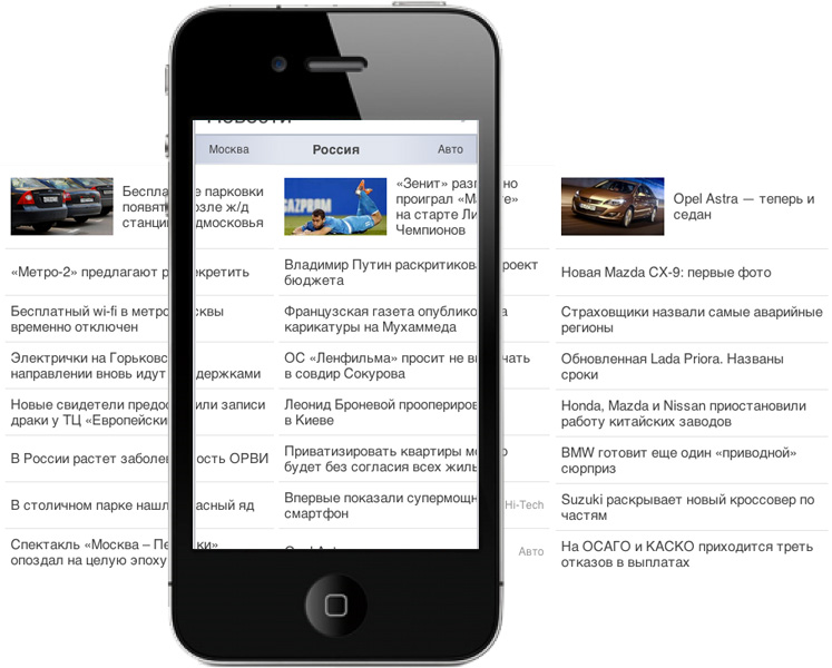
Today we will talk about the swipe, in the common people - listals. Swipe allows you to flip through the "pages" with the usual movement of your finger. I will tell you how to correctly implement the swipe using the example of a news block on the main page of the Mail.Ru portal.
')
Let's start with the key points that you need to pay attention to when developing listals:
The following events are implemented specifically for working with touch input devices in browsers:
But some browsers on touch devices — for example, WP IE — do not support these events.
In general, nothing would seem to interfere with imitating similar behavior through mouse events - like, for example, in desktop drag'n'drop:
But mouse events in mobile browsers work rather strangely ¬–
events occur only if there was a click (and then click first, and only then - mousedown, mousemove and mouseup).
Because swipe is implemented only on touch-events.
The touch-event contains useful information about touches:
Each touch is assigned a unique identifier. In different browsers it can have different values, in some it is constantly incremented, in others it is reset when there are no more touches.
Also, the touch object contains information about the coordinates relative to the viewport, the screen and the page.
The logic is pretty simple:
The algorithm for working with events is quite simple. It is easy to expand with new chips. For example, if the user moved the page a small distance, return to the original state by touchend. And if the user is very quickly held horizontally with a finger, but a value smaller than the threshold value for scrolling, it is still necessary to scroll.

In order to make a sheetfinder, you need to arrange the pages in a row.

Each of them must be a width of not more and not less than the parent.

The central one is always visible, the left ones are shifted by 100% to the left, and the right ones - by 100% to the right.

Many people want to use a table, but it does not fit for several reasons.
To get the page width of 100% of the parent, you need to somehow set the width of the entire table to <page count> * 100%, and the page itself to 100% / <page count>. Without additional JS-manipulations, this is impossible and threatens with errors and irregularities, as well as additional calculations.
Making pages float'ami is also not an option, because this will give an extra load on an already in many cases slow browser, even if you clean the stream.
We chose another option:
The block wrapper indicated the height, position: relative and overflow: hidden, thus significantly reducing the load on the browser during rendering and calculations - we get a separate branch of the DOM tree inside the list, the browser does not recalculate other parts of the tree when it changes inside.

Pages were divided into 3 logical groups:
To speed up the rendering, you need to isolate the pages as much as possible from each other, because for each page position: absolute is indicated; and corresponding coordinates and dimensions.
Next comes the question of shifting pages to the right and left.
Pages are animated using CSS transition.
If you animate left, it turns out very slowly. Translate works much faster, and even faster - translate3d from CSS transformations.
Therefore, all pages have left: 0 and both translate options - in case the browser does not support 3d transformations, with horizontal offset values of 100%, 0 and 100% for left, center and right pages, respectively.

Thus, we got the following: visible central page, and beyond the border of the visible part of the block there is a stack of pages on the left and a stack of pages on the right.

Three of all pages are selected:

Initially, the swipe__page_animating class (adds a CSS transition) is not installed. Upon the touchmove event, the page is set to the corresponding translate, with the horizontal offset value equal to the finger offset (or offset divided by the “drag coefficient”). Those. the page just moves with your finger.

In fact, everything is somewhat more complicated. Three pages simultaneously move: the current visible, and the page to the left and right, which creates the effect of continuous tape. Accordingly, for the right and left pages, the offset is equal to its width with the corresponding position of the sign (for the right - plus, for the left - minus) plus the offset of the finger.

On the event touchend or touchcancel, the pages are set to the swipe__page_animating class, which includes CSS animations, and the offset values corresponding to the final position — either scroll through or set the initial values.

On the transitionend event, i.e. at the end of the animation:
Thus, the block is in the initial state and is ready to interact with the user.
How to make it clear that the block can be flipped through - this is the topic of a separate report by the interface designer. I can only say that there must be some kind of visual hint or other switching path.

For example, in the case of a news block, on the example of which I am talking about the swipe, we made the usual tabs. The user can tap on the tab and turn the page. Plus tab is also the title, making it clear which page is visible at the moment.
This method is also good for compatibility with browsers that do not support touch-events. For example, in WP IE, a user might as well use a news block as on other devices.
That's all for today. Questions and discussion are welcome.
Yegor Dydykin,
leader of the development team for the main Mail.Ru page and cross-portal projects
Touchscreen smartphones are quite common and have become indispensable helpers for many of us. Therefore, one can not ignore their features in the development of mobile web interfaces.
Touch control is significantly different from the usual mouse control.
The user interacts with the fingers of the screen itself. And depending on what movements and how many fingers the user makes, the interface reacts differently: if you quickly touch the screen and release your finger, then click is triggered; if you touched and ran your finger across the screen - scroll; if held with two fingers - zoom; and a great many other reaction options.
Today we will talk about the swipe, in the common people - listals. Swipe allows you to flip through the "pages" with the usual movement of your finger. I will tell you how to correctly implement the swipe using the example of a news block on the main page of the Mail.Ru portal.
')
Let's start with the key points that you need to pay attention to when developing listals:
- First, you need to determine exactly what the user wants - turn the block page or scroll
- Secondly, you need to move the page when you move your finger behind it.
- Thirdly, if there is nowhere to scroll, you need to let the user understand
- Fourth, respond to touch only with the first finger
- And finally, turn the page in the right direction, when the user released his finger
Touch events
The following events are implemented specifically for working with touch input devices in browsers:
- touchstart - touched with a finger
- touchmove - finger up
- touchend - let go of your finger
- and touchcancel is almost like a touchend, but it happens at the moment when we did not let go of our finger, but we touch on another element. For example, an incoming call was received, and the browser is no longer on the screen.
But some browsers on touch devices — for example, WP IE — do not support these events.
In general, nothing would seem to interfere with imitating similar behavior through mouse events - like, for example, in desktop drag'n'drop:
- touchstart - mousedown
- touchmove - mousemove
- touchend, touchcancel - mouseup
But mouse events in mobile browsers work rather strangely ¬–
events occur only if there was a click (and then click first, and only then - mousedown, mousemove and mouseup).
Because swipe is implemented only on touch-events.
The touch-event contains useful information about touches:
- touches - a collection of all touches that are currently happening
- changedTouches - touches for which there are changes, i.e. directly those that caused the event
- targetTouches - touches associated with target events. Touches that occurred inside the element on which the current listener is hung
Each touch is assigned a unique identifier. In different browsers it can have different values, in some it is constantly incremented, in others it is reset when there are no more touches.
Also, the touch object contains information about the coordinates relative to the viewport, the screen and the page.
The logic is pretty simple:
Touchstart
/* started ( swipe) - touches. swipe toches , , , . */ if (e.touches.length != 1 || started){ return; } /* detecting = true, , touchmove , — , */ detecting = true; // touch = e.changedTouches[0]; x = touch.pageX; y = touch.pageY; Touchmove
/* : started, detecting, . */ if (!started && !detecting){ return; } /* */ if (detecting){ detect(); } if (started){ draw(); } /* */ function detect(){ /* changedTouches. , , . */ if (e.changedTouches.indexOf(touch) == -1){ return; } /* , , . , , , . */ if (abs(x - newX) >= abs(y - newY)){ /* , touchmove (, Android). swipe – */ e.preventDefault(); // , started = true; } // , .. detecting = false; } // function draw(){ /* , touchmove */ e.preventDefault(); /* changedTouches. , , . */ if (e.changedTouches.indexOf(touch) == -1){ return; } /* . , «» */ delta = x – newX; /* , « » . , , */ if (delta > 0 && !leftPage || delta < 0 && !rightPage){ delta = delta / 5; } // , moveTo(delta); } Touchend / Touchcancel
// , if (e.changedTouches.indexOf(touch) == -1 || !started){ return; } /* . , , , . */ e.preventDefault(); /* , */ swipeTo = delta < 0 ? 'left' : 'right'; // , swipe(swipeTo); The algorithm for working with events is quite simple. It is easy to expand with new chips. For example, if the user moved the page a small distance, return to the original state by touchend. And if the user is very quickly held horizontally with a finger, but a value smaller than the threshold value for scrolling, it is still necessary to scroll.
Rendering
In order to make a sheetfinder, you need to arrange the pages in a row.
Each of them must be a width of not more and not less than the parent.
The central one is always visible, the left ones are shifted by 100% to the left, and the right ones - by 100% to the right.
Many people want to use a table, but it does not fit for several reasons.
To get the page width of 100% of the parent, you need to somehow set the width of the entire table to <page count> * 100%, and the page itself to 100% / <page count>. Without additional JS-manipulations, this is impossible and threatens with errors and irregularities, as well as additional calculations.
Making pages float'ami is also not an option, because this will give an extra load on an already in many cases slow browser, even if you clean the stream.
We chose another option:
.swipe { position: relative; overflow: hidden; height: 300px; } The block wrapper indicated the height, position: relative and overflow: hidden, thus significantly reducing the load on the browser during rendering and calculations - we get a separate branch of the DOM tree inside the list, the browser does not recalculate other parts of the tree when it changes inside.
Pages were divided into 3 logical groups:
- pages left
- the central page is always the same
- and the pages on the right
.swipe__page { overflow: hidden; position: absolute; left: 0; top: 0; width: 100%; height: 100%; } To speed up the rendering, you need to isolate the pages as much as possible from each other, because for each page position: absolute is indicated; and corresponding coordinates and dimensions.
.swipe__page_animating { transition: transform 200ms linear; } Next comes the question of shifting pages to the right and left.
Pages are animated using CSS transition.
If you animate left, it turns out very slowly. Translate works much faster, and even faster - translate3d from CSS transformations.
.swipe__page_left { transform: translate(-100%, 0); transform: translate3d(-100%, 0, 0); } .swipe__page_center { transform: translate(0, 0); transform: translate3d(0, 0, 0); } .swipe__page_right { transform: translate(100%, 0); transform: translate3d(100%, 0, 0); } Therefore, all pages have left: 0 and both translate options - in case the browser does not support 3d transformations, with horizontal offset values of 100%, 0 and 100% for left, center and right pages, respectively.
Thus, we got the following: visible central page, and beyond the border of the visible part of the block there is a stack of pages on the left and a stack of pages on the right.
Three of all pages are selected:
- central, visible
- next page left
- next page on the right
transform: translate(delta, 0); Initially, the swipe__page_animating class (adds a CSS transition) is not installed. Upon the touchmove event, the page is set to the corresponding translate, with the horizontal offset value equal to the finger offset (or offset divided by the “drag coefficient”). Those. the page just moves with your finger.
In fact, everything is somewhat more complicated. Three pages simultaneously move: the current visible, and the page to the left and right, which creates the effect of continuous tape. Accordingly, for the right and left pages, the offset is equal to its width with the corresponding position of the sign (for the right - plus, for the left - minus) plus the offset of the finger.
On the event touchend or touchcancel, the pages are set to the swipe__page_animating class, which includes CSS animations, and the offset values corresponding to the final position — either scroll through or set the initial values.
On the transitionend event, i.e. at the end of the animation:
- class swipe__page_animating is removed
- the “next” pages are selected again, the _left, _center, _right classes are switched according to the new position. For example, if the user turned over to the left, then the central page becomes right, the left - central, the right one is simply put in the right, and the new “next” is selected from the left.
- the offsets set by the script are reset so that when the width of the entire page is changed - for example, when the device orientation changes - the block pages are automatically adapted by the browser to the new conditions
- cleared installed flags like started
Thus, the block is in the initial state and is ready to interact with the user.
How to make it clear that the block can be flipped through - this is the topic of a separate report by the interface designer. I can only say that there must be some kind of visual hint or other switching path.
For example, in the case of a news block, on the example of which I am talking about the swipe, we made the usual tabs. The user can tap on the tab and turn the page. Plus tab is also the title, making it clear which page is visible at the moment.
This method is also good for compatibility with browsers that do not support touch-events. For example, in WP IE, a user might as well use a news block as on other devices.
That's all for today. Questions and discussion are welcome.
Yegor Dydykin,
leader of the development team for the main Mail.Ru page and cross-portal projects
Source: https://habr.com/ru/post/165213/
All Articles