Hover effect CSS masks
On many portfolio sites, works are presented in the form of small thumbnails with pleasant hover effects. This article will discuss how to make this effect using CSS masks. It works only in modern browsers, but fortunately in old layouts it looks correct and does not move out.
Examples
First, a few examples from the collection with beautiful portfolio pages - Rally Interactive , I Am Yuna , Mickael Larcheveque , Haus :
')

Implementation
For effect, only HTML & CSS is used. So that the page is correctly displayed in all browsers, we use transparent PNG as a mask, and not CSS Shapes or some other unusual technique:

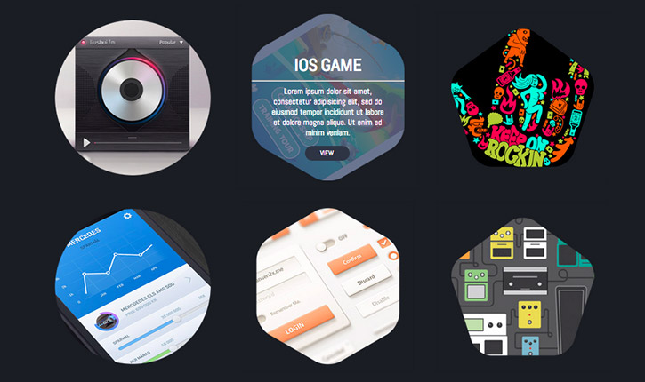
Visual scheme of the whole structure:

- .overlay - mask PNG file
- .details - content: title, description, link
- .bg - layer with background color
- .base - thumbnail picture portfolio
- .shape - a layer that brings everything together
HTML markup:
<div class="shape"> <a href="{URL}" class="overlay {round|hexagon|pentagon}"></a> <div class="details"> <span class="heading">{TITLE}</span> <hr /> <p>{DESCRIPTION}</p> <a href="{URL}" class="button">VIEW</a> </div> <div class="bg"></div> <div class="base"> <img src="{IMAGE URL}" alt="" /> </div> </div> JavaScript is not needed to implement the effect. Pseudocode is used : hover and CSS animation.
A piece of code for CSS animations
.shape .overlay { display:block; width: 310px; height: 310px; position: absolute; top:-5px; left:-5px; -webkit-transform: scale(1,1); -webkit-transition-timing-function: ease-out; -webkit-transition-duration: 0.6s; -moz-transform: scale(1,1); -moz-transition-timing-function: ease-out; -moz-transition-duration: 0.6s; transform: scale(1,1); transition-timing-function: ease-out; transition-duration: 0.6s; z-index:500; /* allow user to actually perform actions underneath this layer */ pointer-events:none; background-repeat: no-repeat; } ...... /* hover effect */ .shape:hover .overlay { -webkit-transform: scale(1.07,1.07); -webkit-transition-timing-function: ease-out; -webkit-transition-duration: 0.3s; -moz-transform: scale(1.07,1.07); -moz-transition-timing-function: ease-out; -moz-transition-duration: 0.3s; } .shape:hover .bg { -ms-filter: "progid:DXImageTransform.Microsoft.Alpha(Opacity=80)"; filter: alpha(opacity=80); -moz-opacity: 0.8; -khtml-opacity: 0.8; opacity: 0.8; display:block; } .shape:hover .details { -ms-filter: "progid:DXImageTransform.Microsoft.Alpha(Opacity=100)"; filter: alpha(opacity=100); -moz-opacity: 1; -khtml-opacity: 1; opacity: 1; z-index:450; display:block; } Full CSS
.shape { width: 300px; height: 300px; position: relative; } .shape .overlay { display:block; width: 310px; height: 310px; position: absolute; top:-5px; left:-5px; -webkit-transform: scale(1,1); -webkit-transition-timing-function: ease-out; -webkit-transition-duration: 0.6s; -moz-transform: scale(1,1); -moz-transition-timing-function: ease-out; -moz-transition-duration: 0.6s; transform: scale(1,1); transition-timing-function: ease-out; transition-duration: 0.6s; z-index:500; /* allow user to actually perform actions underneath this layer */ pointer-events:none; background-repeat: no-repeat; } /* different shapes */ .shape .overlay.round { background: url(round.png); } .shape .overlay.hexagon { background: url(hexagon.png); } .shape .overlay.pentagon { background: url(pentagon.png); } /* hover effect */ .shape:hover .overlay { -webkit-transform: scale(1.07,1.07); -webkit-transition-timing-function: ease-out; -webkit-transition-duration: 0.3s; -moz-transform: scale(1.07,1.07); -moz-transition-timing-function: ease-out; -moz-transition-duration: 0.3s; } .shape:hover .bg { -ms-filter: "progid:DXImageTransform.Microsoft.Alpha(Opacity=80)"; filter: alpha(opacity=80); -moz-opacity: 0.8; -khtml-opacity: 0.8; opacity: 0.8; display:block; } .shape:hover .details { -ms-filter: "progid:DXImageTransform.Microsoft.Alpha(Opacity=100)"; filter: alpha(opacity=100); -moz-opacity: 1; -khtml-opacity: 1; opacity: 1; z-index:450; display:block; } /* content styles */ .shape .bg, .shape .details { position: absolute; width: 300px; height:300px; display:table-cell; vertical-align:middle; text-align:center; top:0; left:0; opacity:0; -webkit-transition: all 0.3s ease; -moz-transition: all 0.3s ease; -o-transition: all 0.3s ease; transition: all 0.3s ease; display:none; } .shape .bg { background: #4b5a78; } .shape .details span.heading { font-family: 'Roboto Condensed', serif; font-size:30px; display:block; margin-top:70px; color:#fff; text-decoration:none; } .shape .details p { font-family: 'Abel', sans-serif; color:#fff; width: 70%; font-size:14px; margin:0 auto; } .shape a.button { padding:5px 15px; font-family: 'Abel', sans-serif; font-size:12px; -webkit-border-radius: 20px; -moz-border-radius: 20px; -ms-border-radius: 20px; -o-border-radius: 20px; border-radius: 20px; background: #2f3644; text-decoration:none; color:#fff; display:block; width:50px; margin:0 auto; text-align:center; margin-top:15px; } .shape a.button:hover { background: #fff; color: #2f3644; } Demonstration of the resulting effect . As for cross-browser compatibility, the effect works correctly in modern browsers, as well as in Internet Explorer 8.
And here is another way to display elements of a portfolio on a site using CSS Transform and Masking ( demo ):

It is curious how in this example the mask is constructed in the form of a hexagon:

Useful reading material and material used:
- Good CSS CSS Masking by HTML5Rocks
- W3C CSS Masking
- Display Images with Shape Masking and Nifty Zoom Effect
- Create Beautiful Hexagon Shapes With Pure CSS3

Source: https://habr.com/ru/post/164409/
All Articles