Hovering links: do you need a reaction?
Greetings, dear Habralyudi.
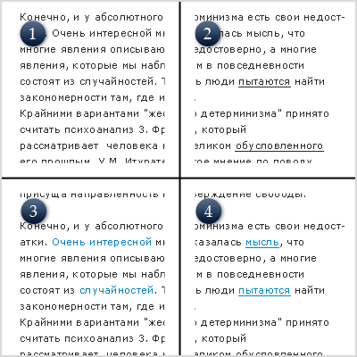
Looking at night, I had some heated argument with theonlyboy about whether to hover over the link - somehow change this link: remove / add underline of the link, change color?

')
This topic was created solely in order to learn new knowledge and still understand - both from the point of view of usability and UI design correctly, and finally stop the senseless, but heated argument.
Below is a summary of this issue on popular resources - Yandex, Google, etc.
Google
Google is the exact opposite of Yandex; links do not react anywhere, and this again does not prevent me from adequately perceiving the Google interface, because all links are underlined. It is quite convenient, and the lack of response to guidance - does not interfere.
PS: (I don’t know why I chose these sites - perhaps they seemed to be the most respected sources)
PPS: Please do not disparage this topic, because the topic is really very important, and the problem is urgent. Thank.
PPPS: If you have links to any articles in which this moment is covered - heels.
Looking at night, I had some heated argument with theonlyboy about whether to hover over the link - somehow change this link: remove / add underline of the link, change color?

')
This topic was created solely in order to learn new knowledge and still understand - both from the point of view of usability and UI design correctly, and finally stop the senseless, but heated argument.
Below is a summary of this issue on popular resources - Yandex, Google, etc.
Yandex
Yandex turned out to be a supporter of the fact that it’s worth highlighting links. Their default links are gray, when hovering - orange-red. In principle, I do not complain that this fact hinders me in any way.Microsoft
Microsoft is mixed. In some places he uses underscores, in some places - highlighting in color, in some places - links do not react at all. I'm rather uncomfortable - confused.Yahoo!
At Yahoo! In my opinion - a complete pipets. Nowhere are links underlined, in some places even the colors are not highlighted, everything is mixed and inconvenient. When hovering - emphasized, but this situation does not save.Habrahabr
Habrahabr - no doubt convenient. A large array of information does not interfere at all with convenient and fast navigation, everything is intuitive. All links are underlined, some respond to guidance.37signals
I could not get around such a respected office . All links are underlined, reactions to guidance are none, which does not interfere with easy navigation. Everything is stylish and comfortable.guicci.ru
Quite a famous site that I could not get around with all my desire. Links react to pointing - by changing the color, sometimes underlining. Some links are not underlined, which in my opinion is a bit uncomfortable, but it looks good.GUI.ru
On this site, some links react, some do not. Everything is underlined, everything is stylish, mobile and convenient. For me. The only controversial, in my opinion, moment - underlining the title - is necessary or not. On this site, the underscore header occurs when you hover.Mail.ru
The second most visited Russian portal could not pass over. What we have there: links are underlined, when hovering, they change color and remove underlining. It seems to me that you need to leave there only one thing - either remove the underline, or change the color. Now I'm a little lost by hovering over the link. Some links are not underlined, which in my opinion is not good.Art. Lebedev Studio
Again - the Russian leader , who is difficult to leave aside from this topic. Let's see what they have: all links are underlined; when hovering, they change color. Actually, like in Yandex (for obvious reasons).PS: (I don’t know why I chose these sites - perhaps they seemed to be the most respected sources)
PPS: Please do not disparage this topic, because the topic is really very important, and the problem is urgent. Thank.
PPPS: If you have links to any articles in which this moment is covered - heels.
Source: https://habr.com/ru/post/16425/
All Articles