Technology to quickly create backgrounds for 2D games based on 3D blanks (48 hours of development)
Instead of the preface
This technology at one time was someone's know-how, but now, after a few years, it is absolutely impossible to figure out who its author is. Despite the fact that I have come to its use on my own - I will not take the liberty to say that I am the author. Exactly the same authors will be dozens, if not hundreds, of people, since good thoughts, as a rule, come into a multitude of heads simultaneously.
Before starting, I would like to focus on two points:
The first. We assume that the reader is familiar with such packages as 3D Studio MAX (or any other 3D modeling package) and Photoshop (or any equivalent). In this particular case, I'm going to use the terminology of these two packages. However, despite this, the same principles can be used, using any other software.
The second. In my work, I always proceed from one simple truth: simplicity is the key to success. And if the first position is very clear, then I would like to disclose the second one somewhat wider. Starting, sadly, it is from theory.
')
I am a very relative techie and many things available to other techies for me are a dark forest. In spite of this, I believe that it’s enough for a master to have one or two favorite tools to make masterpieces, and mediocrity, in turn, doesn’t have enough of a suitcase of these tools, because there will be no external glamor, no effects and no professionalism.
I also want to note that I do not consider myself to be masters who make masterpieces. I make this note for those evil people who say (or say after publication) that I am arrogant, that have brought me under heaven, and those who, instead of working, prefer to speak evil of Kiyr from my favorite book Oscar Luts, Spring.
With the preambles finished we get to the point.
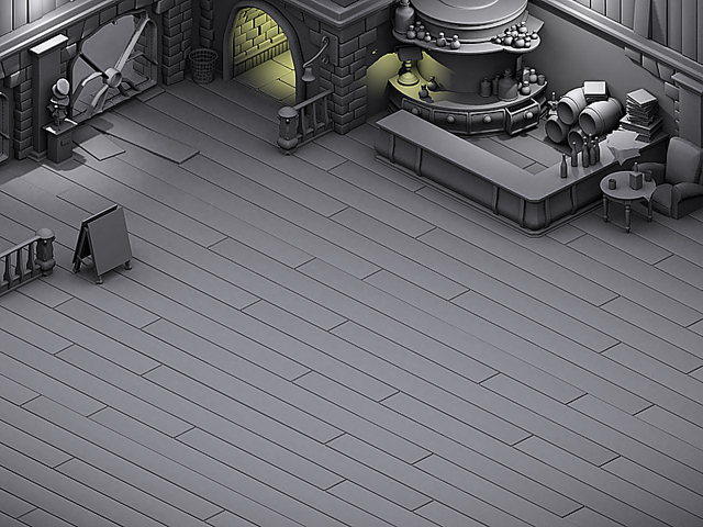
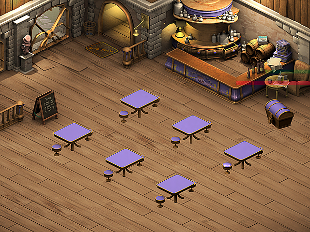
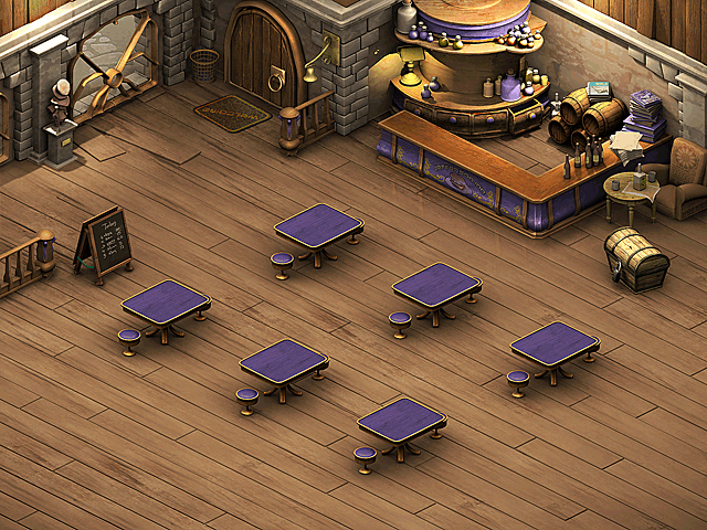
I affirm and it is not groundless that a good background can and should be created not in a week, not in five days or even not in three. To make a good picture for a casual game, no matter what i-spy is, match-3 or arcade, 48 hours is enough. Of course, provided that the person is engaged in work, and not sitting down his pants.
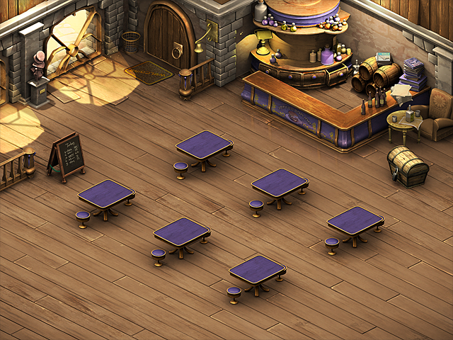
Please pay attention to the illustration (see above). In my opinion, a good background for 48 hours of work, isn't it? We now turn to the technology for developing such backgrounds. I am often asked, "Do you draw all this?" I answer - "partially yes, partially no ... most of this 3D scene, but with a powerful post-processing layer." In this case, a person usually frustratedly pulls out "oooh ... but I thought that was a drawing."
Long ago, I was upset at hearing this - now I know the answer. We do our job so that it pleases the player. We do our work quickly because life is short and you have a lot to do for it. We do our work in any way convenient for us (not contradicting ethics and laws) not at all because we have the task to prove to anyone that we can draw anything. We do not want to prove anything to anyone, except that we can, want, and know how to make games well. On it with the theory and the introductions it is finished - we will be engaged, at last work.
Lighting and procurement colors
As I said earlier, we presume that those who read this article can hold a mouse in their hands and understand a lot about modeling. If suddenly it happened and the article is read by the artist, who doesn’t know a damn about models, there is no reason to be upset. There are free model libraries ( Turbosquid ), from which you can easily create the next scene.
Suppose you made a scene, but do not know how to light it. You also remember that I am a mediocre techie and can’t do anything. Knowledgeable people would have showered you with the settings of external and internal renders, with thousands of settings and foaming at the mouth, they would prove that the rendering they offered is the best.
I go the other way. I learn to use those tools that are the easiest and fastest to use. In this case, I suggest you use the standard tools of 3D Studio Max, namely, two types of light sources. These are the Omni (point source of illumination) and SkyLight - simulated ambient lighting.
Necessary digression: Let's add to the fact that I am a mediocre techie and also that I will not stuff you with technical terms in which I myself understand little. As we know the buzz words are not yet a sign of intelligence - so let's learn easily.
Let's return to our sources. How to get to them?

When launching Max (I’ve been used to calling him by name for a long time), there is a certain control panel on the right in the standard configuration. There you can choose primitives, bones, modifiers, a line in a mortar, sources of light ... ba, what you need. Sources of light.
Pay attention to the picture. Step by step. We click on the “lamp” icon, in the opening miscarriage (no, perhaps we need to be more careful with terms), choose Standart, and as the saying goes, “we do not need any slobbering mammoths” © Ice Age (this is about more complex light sources with which We understandably do not know how to work).
Where do we start? Perhaps the fact that it will be easier. Those. with skylight. Feel free to click on its button and then place it anywhere in the scene. This is his charm. Then ... visit this window to activate it.

In the opened tab (the panel with these options is at the top, under the Max header) select the LightTracer item and click, a window will immediately fall out (what I have in the figure to the right). Scared?
And do not be afraid. You have already done everything you need. LightTracer - active. You can close the window.
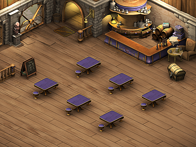
Having dealt with this source of lighting can render the scene. It will look something like this.

In the event that you used the material that Max assigns to models by default when there are no textures on them. And this, by the way, is what we need. The result was a very dull scene. Autumn and rainy day. But we ... need more fun and more credibility. So the bar looks like when everyone goes home.
Now we need to turn on the lamps in the bar so that visitors, if they will, would not be scared. Any Omni source (and I think that you have already put it on the stage while I was chatting) is put on the stage in the same way. And with its settings, we still have to work. Expose light sources where they should be according to the mind, i.e. in the area of the hallway, lamps and two or three places just above the zone that we see and let's adjust them.

To be able to customize the light source that you put on the scene, go to the Modify tab (in the picture on the left and on the left-to-right), tick the source for it to cast Shadows shadows, choose Ray Traced Shadows in the drop-out window, since for good light and shadow we choose accents need sharp shadows, and then move to Far Attenuation . For what? In order to configure the zone that will cover the light source. If you do not use this feature - your light sources will act around the perimeter of the scene. And we need them only in certain places.
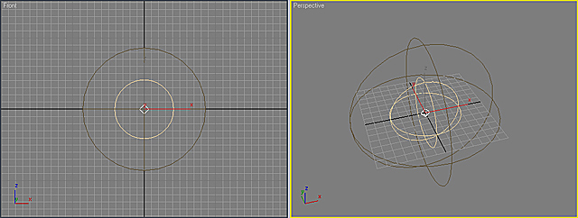
See these two circles around the light source? Let's call what is inside the first circle the zone of maximum light, and what is between the first zone and the second circle - the zone of light attenuation. And that's all. No more buzzwords.
As a result, you get this picture. In the event that you do not have SkyLight enabled. Fearfully?
Not?
Me too.
There are two types of light sources on your stage. We dismantled both. Together they form such a duet.
These are your omni and your skylight . Congratulations - we are done with the light. Now let's revive our gray days with multi-colored materials.
“Why,” you ask?
- What are you going to paint all this gray kingdom yourself? - I will answer the question with a question.
As you can see clearly, we have a group of models filled with one color material. We need to break it down by color so that it is more convenient to work with textures. As a rule, I use several colors to break the scene into logical materials. For example, I make a white stone, a yellow tree, a brown tree of a different type. Etc. In a word ... there are no norms and restrictions on colors. The only thing worth taking care of is harmony.
How will we color our models? Also simple. No textures - no settings. Press the M button or proceed to the tab shown in the figure. You are now in the material editor. See these wonderful balls? That's what we need.
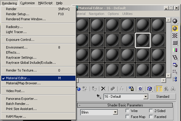
Click on the diffuse color of the material and select the color you need in the window that appears. Click Ok. Set up the required amount of material-balls in this way, and assign them to the model on the stage. This is done with the help of the small icon that is circled. Yes, I completely forgot, before that, to get something you need to at least select a model in the viewport.

The result is something like this.
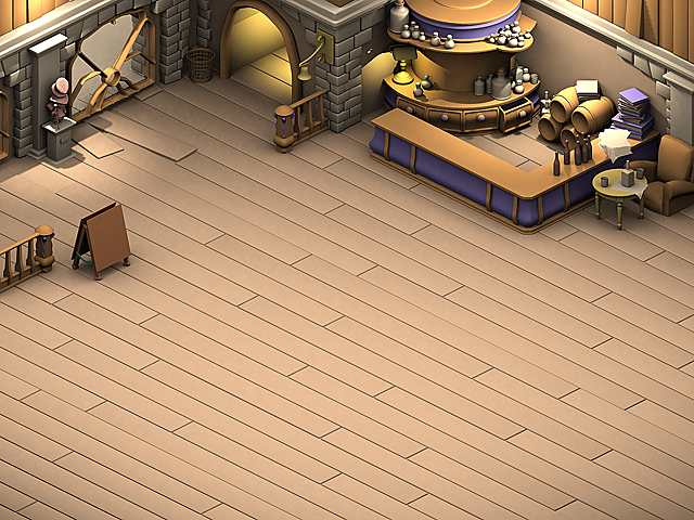
Already not bad at all, right? Further it will be even easier and more beautiful.
I did not speak for nothing about simplicity at the very beginning. Strongly resisting everything new, I feel quite comfortable in the old. It's like a comfortable, but worn down shirt. The best and comfortable attire you will not think up. The main thing that your wife did not see you in this rag. In women, there are several other ideas about how a man should look. Actually, just like we have about women ... also their own ideas. Nothing amazing. No America was open.
Summary:
My reasoning about what I need from 3D Studio Max was as follows:
• I want to have soft diffused lighting here, like on a cloudy day
• I want to have several directional light sources with hard shadows to emphasize accents.
For the first case, I used SkyLight, for the second one there are several sources like Omni. Those. I managed the standard means of the package, without resorting to any tricks. Since tricks I do not like. Everything should be easy. Further, what is typical will be even easier.
The main thing that you remember that one of the most important things in any job is light and shade . The second point will be the consistency of lighting. Put (or draw) it where it is appropriate. No need to poke sources of illumination anywhere. Remember about harmony. In our scene, lamps, though not visible, but they are in logical places without causing discomfort.
This is a table lamp with a yellow light, two light bulbs on the walls (well above the visual part of the scene), one source in the doors (all the Omni light sources with shadows listed, and that same SkyLight .
Adjusting the intensity of light sources, do not forget about the very harmony. No need for nuclear explosions and acid colors. Remember that they will look at it, and you will not look only.
Texturing
Now that we’ve dealt with the light, we need to cover our scene with textures. “These are the times,” others exclaim, “texturing ... means not to do without UVW mapping, sweeps and other tambourine dances.”
"Dudki" I will answer you. No modifiers are needed, and set aside your shaman tambourines. Your communication with the 3D modeling package ended in the last chapter. It's true. Fair. Everything else will be done by your hands. So…
To begin with, let’s be aware of the fact that we no longer work with 3D and move to Photoshop . Before you start working, I would recommend to remember a few things that underlie this method of development:
• Your render is in the first and lowest layer in terms of orientation layer, all the rest are superimposed on top.
• All invoices, you work with the shadow through the Overlay & Multiply filters - this is necessary in order for your render to be always visible, and so that it can be changed on the fly. This tutorial has a situation when I “forgot” certain details and then integrated them into the “scene” in a few minutes.
• I recommend to work in the resolution exceeding the final picture at least twice. This allows you to work with some things more carelessly than usual, but when you decrease it is a little noticeable. Those. large size is not strange - it saves you time.
Now you can proceed. All you need to understand is that each object requires a well-chosen texture that is adequate to its essence. Do not "sculpt" metal on stone walls, but metal on wood and everything will be fine. Please pay attention to the following figure.

In addition to the picture on it there is a square circled in white frame. This is our future texture (of course it is applied without a white frame, and yes - it has already been processed with the Distort tool). Almost all the textures are superimposed by me in the Overlay blending mode.
In order to orient any photo or texture as it is done with me - use the Distort tool, it can be found through the menu of Photoshop whose branch looks like this: Edit / Transform / Distort

Now look at the image above. Each layer has its own blending modes. By default, the layer mode is set to Normal . We change it to Overlay . I have no desire to give you lengthy head, and most importantly, explanations sucked from my finger how this or that overlay mode works. As one of my friends says - do not be afraid to experiment.
All you need to know is that Overlay multiplies illumination and color, making the object beneath it lighter while adding its texture to it. What is your explanation?
Unscientific? I agree.
Not technologically and without knowledge of the subject? I'll eat this too. The essence of this will not change.
To enhance or weaken a particular layer, use its transparency. Ie Opacity (the transparency level slider is to the right of the blend mode that you just selected). If you use the transparency level of 100% - the picture may turn out too juicy. And we need to texture was air. So that the floor does not distract the viewer from the play of light and shadow, at the same time “speaking” to him - I see wooden.
In the same way, you apply all the other textures and get the following image at the output.

So what do we have? Funny is true We do not know how to texture, we own only one Distort tool, but at our whim the scene has acquired beautiful walls, a floor, a bar counter and even chic oak barrels, and I must say ... the scene already looks good. And by the way, we haven't even taken the tablet yet. We continue to detail? I assure you - the most delicious things are about to begin.
Detailing
The next stage will be fine detailing which so pleases the gamer's eye. Treat her carefully and with humor. Both players will appreciate in full. What is meant by detailing? Pay attention to the picture:
What do you see? There appeared patterns on the armchair, painting on wood on the bar, stickers on bottles of wine, covers on books, etc. How it's done? Very simple. Or the Internet to help, or a bank of your own photos. Both are equally good. Open "Google" and type in the search bar "labels for wine."
Switch to the “pictures” tab, select the label you are interested in and send it to your work window via the clipboard. After that, take the Distort tool to reach which can be through the tabs Edit / Transform / Distort and with the help of the guide points you can bend the image so that it fits adequately into the scene. Overlay it in any blend mode that is convenient for you. Simply? Simply. The same principle is used to distort in the right direction the textures that we put on the floor and on the rest of the objects in the scene.
This simple method you equip the entire scene with fine detail. I think I still said something about humor? Yes. It was the case. At one time, I often chipped off jokes to verify the acceptance of a particular customer. What exactly was on this or that scene, I will not speak, try to find something familiar on your own on this stage.
I can only say one thing. Almost every my background or work is filled with mini-tributes and gigs. This raises the fan if your game is successful. It is well known that “old eggs” are still found in old games and, despite the past years, do not get tired of looking for them again and again. In the “project of detail”, we need to acquire such a thing as tables and chairs.
In the end this is a pub or dance floor? In the modeling package I had made such blanks, and now it is time to try them on our stage.
Tables we put on top of our texturing layers and objects, so as not to break the work done. What do we see? Our tables float sadly in the air. What have we forgotten? At least paint them.

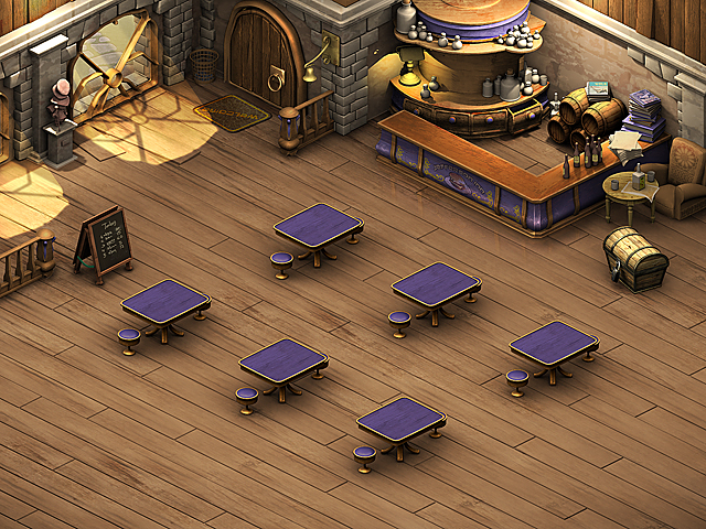
Everything is still bad. Why? That's right - we forgot to count the lights in the scene. We return to the modeling editor and recalculate the scene. Since all subsequent layers (textures and objects) were superimposed with the help of Overlay or Multiplay blending modes, the substitution of the bottom layer with our render will not affect the quality of the image and we will not have to redo anything. If you do not believe, look at the following picture.
Along the way, with a shadow on the floor, I grabbed a door from the scene forgotten there and painted it in our own way. Textured. Through so many times mentioned overlay mode (Overlay). However, attentive readers will notice the difference in the appearance of the door. She with light and highlights.
I apologize, but I could not resist and doused the door with the Dodge tool. Do not get carried away by it much. But remember that this is a quick way to "burn out" any surface. Using Dodge is very easy, and most importantly, you can quickly make glare metal.
True, I practically do not use it in my work. Is that the last stage, when all layers are merged into one. The fact is that for me it is important that the scene until the last moment retains its layers. Suddenly, I would like to replace something below, as we have already done with the door and the shadow under the tables? In this case, you will have to wave the brush again, and again apply the glare of the metal to the Dodge.

It is evident that I began to correct the shadow by applying manual soft contours under the objects I needed and that a reflection appeared. Is the 3D modeling package involved again? By no means. I just took it, cut the table, used the already mentioned Distort tool and distorted the table image so that it was under the table real, mirrored from below. Then he put this twisted table in Overlay mode with minimal barely noticeable transparency. Then wiped with a rubber band reflection where I did not need it.
So far I have used three tools. This is Distort for distorting image fragments at the angles I need, this is the method of blending Overlay and Dodge layers. Well, well, they persuaded - there was also a rubber band. Agree not too large-scale arsenal? I would even say simple and very easy to learn. I will try in terms of ease and simplicity of work not to disappoint you in the future.
Additional lighting
Let's ask ourselves a question ... what are we missing in this scene? Without waiting for the assumptions answer myself. Not enough light. Light accents. The scene is quiet, calm. There is no liveliness in it. We will deal with this liveliness ... paying attention to fig. 9. What is it? This is a black and white mask of light drawn by hand. Believe ... it’s easier to draw light by yourself than to render with renders. In addition, this light, unlike the render, can always be turned off as a layer. What if you wanted to make a thunderstorm on the street? Or a passer-by passing by, who masked away the layer of light, which then begins to shine, as if nothing had happened?
The illustration shows the mask black and white. This is done solely for you to see the exact shape of the white mask. In reality, there is no black on the mask. Only white or yellowish.
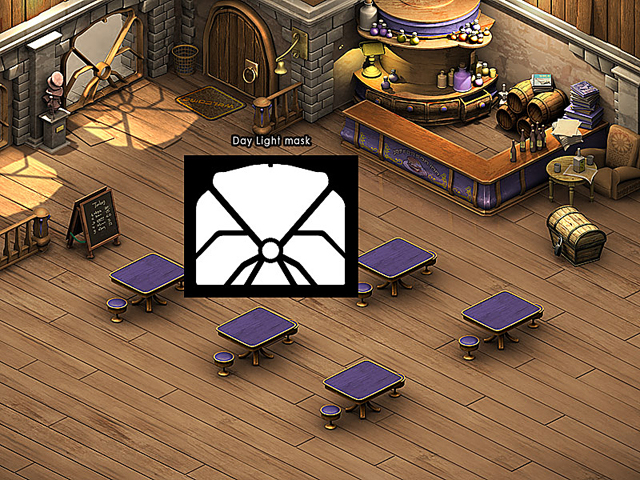
During blending, this layer consists of a white silhouette. We take out the familiar and familiar Distort, and twist the sprite so that it fits perfectly under the window. Change the blending mode from Normal to Overlay ... and voila ... light falls on the floor. Is the scene better? It has become ... but this is far from the limit. The rest of the time we will play it with the light, because we have finished work on texturing and objects a long time ago. We continue to work with the light and brush the light from the window with a brush. Understand how blend mode. Probably, I already bored you with it.
We now turn to our penultimate chapter. And we will bring this “drawing” to the end.
Chips, Erosion, Elements of aging, Traces of Life
No spectacular appearance and tricks did not work. Sorry, you have already read the headline. Therefore, it would be inappropriate to ask what is really the difference between a good background and what we have, dull and insipid. The answer is simple. See chapter cap.
A bit of enthusiastic theory. No render is able to replace the sense of measure, color and light that a good artist has. No render is not able to make the necessary accents where it is really needed. Any render at this stage of development is a soulless and very honest guy. He always tries to do everything honestly. And we do not need to be honest. We need interesting. Effectively. Fabulous.
Once one artist showed me one trick. "Chips". Under it, he meant any metal aging. After that, my metals became much better. Since I am often called the “rusty maniac”, the “follautist,” and many other nicknames, you will probably guess that I have gone much further than chipping.
My opinion on the design of certain things in games is simple. The player is not interested in an honest white wall. He is interested in a textured wall. The one that might interest him. The same applies to other objects. They should be textured, interesting, they should be memorable.
Take two games. Half-life 2 and FEAR In both games, normal maps are used to create relief and light. Only if we do not see anything else at all in the last one (except for the level from the cartons), then by turning off the same economy in Half-life 2 we will get almost the same wonderful picture as it was. Why?Because Valve approached the case by combining two technologies responsibly, rather than relying on one. If one does not work, the second works for two.
Normal-mapping is used there as an assistive technology. And in FEAR this technology is carrier. Those.without it, there are practically no “pictures”. What is the advantage of Half-life 2 in this case?
In photo-textures fairly hand-crafted, in color and light on levels. Those.in everything that I mentioned especially at the very beginning of this tutorial.

But back to our chips. Let's look at the picture just above. What appeared? Everything appeared. There was life. Small dust particles swirling in the windows, shabby floor, additional light on the walls, scuffs on the tree, scuffs on the bar, etc. This is what I call the “final passage.” When the artist passes over the stage with a picky look and begins to apply small light and erosive detailing. This can also be called "post-processing."
I can hardly surprise anyone if I say that all these specks and scuffs are applied in white or in close color to it on the appropriate layer with the Overlay blending mode.
Post-processing close-up
Still, I want to touch the post-processing separately. To do this, I created a special enlarged example. It clearly shows what I mean by this capacious term. And let's finally fix the material covered. Let's turn our gaze to the drawing and the last one this season.
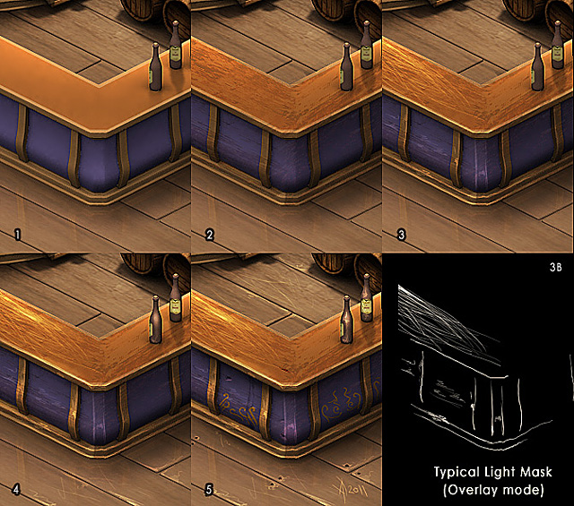
Let's go ... from left to right:
1. Render the scene without any changes based on multi-colored materials and typical sources of lighting.
2. Overlaying textures (Overlay)
3. Overlaying chips, scuffs, and other “echoes of war” (Overlay)
3B. White shows strokes that are applied over the image
4. More scuffs, glare on the bottles, large glare on the convex parts of the table.
five.The patterns are yellow in Overlay mode, small details like bolts on the floor, holes in the tree, and neat rubbing around them.
That's all ... as it turns out to make such a background simpler than steamed turnip. All that is needed is a belief in yourself, attention to detail, and practice. Practice, without which the hell what happens in general.
Epilogue
I would like to note a number of things that should not be forgotten under any circumstances, and which actually form the basis of this method.
• Carefully select the color schemes for future work so that they please the eye, rather than straining it.
• Remember the importance of light and shade in any work. Without them, your work will be flat and boring.
• Carefully select the textures that are adequate for the scene. Your task is to create a harmonious picture, and not to show a riot of materials. Notice that in my scene the textures in many places have a rather pale look.
• Remember the processes of aging and erosion that accompany you around. You can find clean and sterile items only in the hospital. European of course.
• Carefully notice the little things around you in life and transfer them to your work. Any relevant detail makes your work more alive.
• Joke and smile, transfer your humor to work. Humor even in horror projects remains humor. With humor live more fun.
• Overlay & Multiply - your best friends.
Tip 1: When preparing the background, for example 800x600, it is better to work with the original canvas larger in size at least twice as large as the original, i.e. 1600x1200 This is due to the fact that in working with a large canvas you can afford quite strong carelessness in strokes, lines and shapes. All this will go away when you reduce your picture.
Tip 2:After reducing the picture in many places soap may occur. Those who love the image more clearly can use the Unsharp Mask filter, it works more correctly than the Sharpen filter, and has more degrees of adjustment.
(I, for example, do not leave any of my works without Unsharpa’s friend)
In addition, remember that success is based on simplicity. The simplicity of the chosen technology provides you with speed. Simplicity provides you with the convenience of using developed content. Set aside your suitcase with a thousand tools and search for a one-click plug-in, or a magical render that will “make you cool.” Take a couple of tools and hone using them to perfection. Let's see ... do you want to open your old suitcase after that?
Thank you all for your attention.I hope this tutorial was useful for you.
Last edited date in article: January 29, 2016, 5:21.
In connection with the incoming signal about the “loss” of images from the article, work was carried out to restore them. In the near future they will be uploaded to Habr so that similar incidents do not happen in the future.
Source: https://habr.com/ru/post/164175/
All Articles