Visualization of presentations in the style of IT-companies
I want to talk about how you can use the pronounced styles of the three IT companies to design the following visualization tools in the presentation:
A selection of visualizations, as well as techniques for the use of certain tools and styles can be useful to those who are looking for new (well forgotten old) techniques for designing slides, and serve as a tutorial for creating interesting presentations.
')
Examples of using tools from the life of a company’s products, presentations, interface elements of products and services, philosophy and concept:
Examples of visualization tools in action:
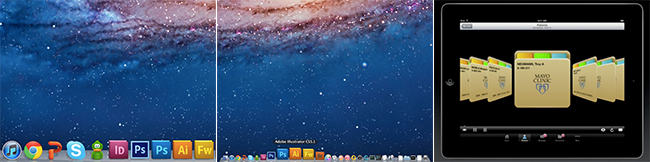
Apple
Placement of the image of the “real, living” subject in question at the moment.

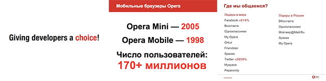
Opera
Placing the background image as a supplement to the main text message.

Microsoft
Using iconography, pictograph selection as the main semantic expression and addition with auxiliary text.

Apple
White text contrasting with a dark background.

Opera
Black and gray colors for the main text, red (corporate) color for highlighting on a white (or gray) background.
Microsoft
Different color text on a light / dark background, always contrasted. Highlighted in bold or different color.
Apple
Separate lists at different levels by changing the font size, indents, and highlighting in bold. Absence of bullet points, numbering.

Opera
Use a numbered and bulleted list.

Microsoft
In addition to a simple unmarked text list, a list with icons as markers and a non-linear matrix / table list are also used.

Apple
The title is a large text or a picture that carries all the meaning.

Opera
The text header is separated from other information on the slide.

Microsoft
The text header is embedded in other information on the slide.

Apple
The bottom toolbar as a footer with a focus on the item to be selected, as well as the gallery format, showing what has already been viewed, what the emphasis is now on and what will happen next.
Opera
In addition to simple numbering, a header (header) and a footer (footer) are used in the (lower right) corner of the slide.

Microsoft
Effect of panorama with focus on location.
Apple
The slide consists entirely of a sequence number or an object, indicating which object or which figures are currently being discussed.

Opera
Text selection of the name of the next section in the list of contents of the presentation Classic for tracker.

Microsoft
Displays all content with an emphasis on the current section due to the background.
While a new article is being prepared with a description of interesting tools and styles, I recommend watching a couple of popular Slideshare presentations for inspiration:
- Illustrations - help convey a message faster text.
- Color - allows you to put an accent.
- List - structures information for better perception.
- Headings (subheadings) - focus on the meaning of the slide.
- Pager (enumerator) - indicates the number / section on the slide from the general content.
- Tracker (cap) - reminds where in the presentation is a slide.
A selection of visualizations, as well as techniques for the use of certain tools and styles can be useful to those who are looking for new (well forgotten old) techniques for designing slides, and serve as a tutorial for creating interesting presentations.
')
Disclaimer
When studying the presentation styles of the company, the relevant guidelines of the companies were not taken as a basis.
Companies also use other tools and other slide styles.
The tools presented are not only used by the companies mentioned.
Images used for educational purposes.
The styles of the companies mentioned are collective images.
Companies also use other tools and other slide styles.
The tools presented are not only used by the companies mentioned.
Images used for educational purposes.
The styles of the companies mentioned are collective images.
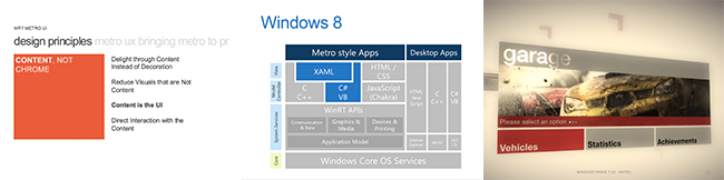
Stylish IT companies
Examples of using tools from the life of a company’s products, presentations, interface elements of products and services, philosophy and concept:
- Apple uses large objects on a slide (images, text), a gradient background, highlights and shadows on images.
- Opera works with text selection on a white background, as well as on a translucent strip.
- Microsoft proposed its own style: minimalism, iconography, grid (grid alignment), uniform and dull colors, oblong sans serif font Segoe UI.
Examples of visualization tools in action:
- Illustrations : from pictures to attract attention to infographics.
- Color : Select text on the background or image.
- List : from bullet points to comics.
- Headings : from a capital letter from a red line to a title page.
- Pager : You can specify the current slide as 2/5, or [1 2 3 4 5].
- Tracker : Insert a slide in the middle of a presentation - “10 slides left until the end of the presentation”.
1. Tool: illustrations
Apple
Placement of the image of the “real, living” subject in question at the moment.
Opera
Placing the background image as a supplement to the main text message.
Microsoft
Using iconography, pictograph selection as the main semantic expression and addition with auxiliary text.
2. Tool: color
Apple
White text contrasting with a dark background.
Opera
Black and gray colors for the main text, red (corporate) color for highlighting on a white (or gray) background.
Microsoft
Different color text on a light / dark background, always contrasted. Highlighted in bold or different color.
3. Tool: list
Apple
Separate lists at different levels by changing the font size, indents, and highlighting in bold. Absence of bullet points, numbering.
Opera
Use a numbered and bulleted list.
Microsoft
In addition to a simple unmarked text list, a list with icons as markers and a non-linear matrix / table list are also used.
4. Tool: headers
Apple
The title is a large text or a picture that carries all the meaning.
Opera
The text header is separated from other information on the slide.
Microsoft
The text header is embedded in other information on the slide.
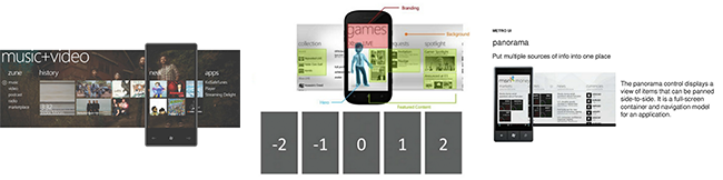
5. Tool: pager
Apple
The bottom toolbar as a footer with a focus on the item to be selected, as well as the gallery format, showing what has already been viewed, what the emphasis is now on and what will happen next.
Opera
In addition to simple numbering, a header (header) and a footer (footer) are used in the (lower right) corner of the slide.
Microsoft
Effect of panorama with focus on location.
6. Tool: tracker
Apple
The slide consists entirely of a sequence number or an object, indicating which object or which figures are currently being discussed.
Opera
Text selection of the name of the next section in the list of contents of the presentation Classic for tracker.
Microsoft
Displays all content with an emphasis on the current section due to the background.
And as a conclusion
While a new article is being prepared with a description of interesting tools and styles, I recommend watching a couple of popular Slideshare presentations for inspiration:
- 5 mistakes on the design of slides | You suck at PowerPoint 2
- Slideshare Linkedin Presentation | Linkedin and Slidehare
Source: https://habr.com/ru/post/162983/
All Articles