5 rules for preparing web page layouts
Do you have to work with the design that the client sends (the design is not done by your studio)? Is it always possible to realize the flight of fantasy, which is depicted on the PSD? It is even possible that you are familiar with the situation when, technically, it was impossible to accurately imprint the material sent. Remember?
Would you like the designer to understand the typesetter, continuing to continue to think in his own artistic categories, without going into all these "Ashtiemla" and "Tsesses"? Provided the layout designer with quality material for layout, which is one of the main factors affecting the time and quality of the layout ?
Compliance with these five rules is enough to find a common understanding with the client (provide them with these rules and explain that only when they are carried out, you can guarantee 100% compliance with the drawn ones), as well as ensure the productive joint work of the designer and the coder.
')
11/18/07. Previously, the article was called "5 rules of good design for the web", but some of this name seemed to be a substitute for concepts. This article is not about the aesthetic aspects of website design, but about technical rules for preparing design for layout. Thanks to everyone who supported me and those who understood what was meant in the original title.

Some design solutions limit the length of the content. It is not rational to use such elements in design, since Content is a dynamic part, suggesting a possible extension. You should be very careful when using limited space for dynamic content. The semicircle in the figure above limits the menu height. Because stretching a semicircle is impossible, then adding a few more items to the menu will rupture the design.
When designing HTML, the coder needs to determine all text properties (size, font name, letter and line spacing, line height, etc.). When rasterizing a text layer, the text becomes a picture, which means it loses all the properties listed above. In the figure, an example of rasterized text (information about the properties is missing).

Unfortunately, not one of the browsers does not support this property. Therefore, to see on your site really what is drawn, do not use text anti-aliasing in Photoshop (the value should be set to 'none', that is, without anti-aliasing - see the picture). The rule does not apply to design elements expected to be pictures: logos, banners, etc.
Using a non-standard font for text (see picture), you should understand that it may not be installed at the visitor. In this case, the text will be displayed in standard font (which is defined in the browser settings). At you everything will be displayed, as you planned (you have this font installed). Use a non-standard font for elements that will be pictures on the site; otherwise, use standard fonts included in the Windows package.
It is possible to upload a font to a user on a computer (although it can be blocked) and sIFR technology (thanks to Lev Eidinov for the link), but I cannot call both of these methods stable. From this rule number 4 is still relevant.
Logic elements should be laid out in sets. The process of layout sometimes requires non-trivial solutions for the implementation of design ideas, so the elements should not be glued together in one layer. The use of several layers makes it possible to work with each component separately. Good practice, but not so important, to name the layers by their contents.
Source: Web Development Blog and Ways to Improve It
Would you like the designer to understand the typesetter, continuing to continue to think in his own artistic categories, without going into all these "Ashtiemla" and "Tsesses"? Provided the layout designer with quality material for layout, which is one of the main factors affecting the time and quality of the layout ?
Compliance with these five rules is enough to find a common understanding with the client (provide them with these rules and explain that only when they are carried out, you can guarantee 100% compliance with the drawn ones), as well as ensure the productive joint work of the designer and the coder.
')
11/18/07. Previously, the article was called "5 rules of good design for the web", but some of this name seemed to be a substitute for concepts. This article is not about the aesthetic aspects of website design, but about technical rules for preparing design for layout. Thanks to everyone who supported me and those who understood what was meant in the original title.
Rule number 1: Consider the dynamic change of information in the block.
Some design solutions limit the length of the content. It is not rational to use such elements in design, since Content is a dynamic part, suggesting a possible extension. You should be very careful when using limited space for dynamic content. The semicircle in the figure above limits the menu height. Because stretching a semicircle is impossible, then adding a few more items to the menu will rupture the design.
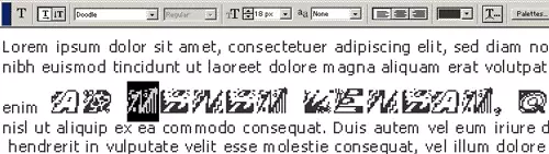
Rule number 2: The text should be in a separate layer (not rasterized).
When designing HTML, the coder needs to determine all text properties (size, font name, letter and line spacing, line height, etc.). When rasterizing a text layer, the text becomes a picture, which means it loses all the properties listed above. In the figure, an example of rasterized text (information about the properties is missing).
Rule number 3: Do not use anti-aliasing and blur on the text.
Unfortunately, not one of the browsers does not support this property. Therefore, to see on your site really what is drawn, do not use text anti-aliasing in Photoshop (the value should be set to 'none', that is, without anti-aliasing - see the picture). The rule does not apply to design elements expected to be pictures: logos, banners, etc.
Rule number 4: Use non-standard font for images only.
Using a non-standard font for text (see picture), you should understand that it may not be installed at the visitor. In this case, the text will be displayed in standard font (which is defined in the browser settings). At you everything will be displayed, as you planned (you have this font installed). Use a non-standard font for elements that will be pictures on the site; otherwise, use standard fonts included in the Windows package.
It is possible to upload a font to a user on a computer (although it can be blocked) and sIFR technology (thanks to Lev Eidinov for the link), but I cannot call both of these methods stable. From this rule number 4 is still relevant.
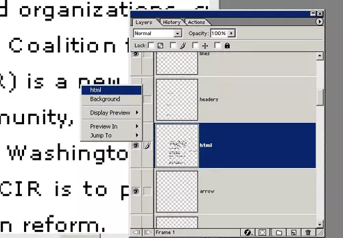
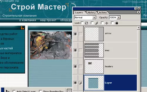
Rule number 5: All design elements must be in independent layers.
Logic elements should be laid out in sets. The process of layout sometimes requires non-trivial solutions for the implementation of design ideas, so the elements should not be glued together in one layer. The use of several layers makes it possible to work with each component separately. Good practice, but not so important, to name the layers by their contents.
Source: Web Development Blog and Ways to Improve It
Source: https://habr.com/ru/post/16292/
All Articles