Custom buttons in the Yandex.Maps API 2.0
The Yandex.Maps API 2.0 has a set of standard map controls:
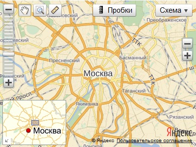
There are cases when the developer does not fit the layout of a particular control. For example, I want to add a red button to the map or it is not satisfied with the standard cork panel, which takes up a lot of space on the map.
In such cases, the developer needs to replace the existing element with his own. However, he can only change the part that is responsible for the appearance of the element and leave unchanged the logical part of the map control.
')
In order to create your own control layout, you need to understand parts of the API architecture. This article provides a brief overview of the concepts that a developer should become familiar with before performing this task and explains the general principle of the interaction between the logical and visual parts of controls. Three examples of creating layouts are also considered - from simple to complex.
The article is intended for developers who have already had experience with the Yandex.Maps API 2.0. For acquaintance with the basic concepts I recommend to read the developer's guide .
A layout is a visual representation of a control. In essence, a layout is an object that can generate html on the basis of the data transmitted to it.
The layout receives an object with fields as input:
A manager is a repository that allows you to set and retrieve values by key. The options manager also knows how to get options from parent elements if they are not found in the child.
You can get and set options or data as follows:
Options are recommendations for the appearance of the control. For example, the options are given the layout class ('layout'), the minimum width of the button ('minWidth'), etc.
An important feature of the options - the possibility of inheritance from parents. That is, options can be set both directly and through any of the parent elements. When specifying options via parent elements, as a rule, the prefix is used. For example, the 'layout' option for control.Button can be set via the map as 'buttonLayout' ('button' + 'layout').
Data is a set of fields that describe the content of an item. For example, the data may be the title of a list ('title') or the contents of a button ('content'). The data is not inherited from the parent elements and is set only directly into the object.
A state is a set of fields describing the current state of the control. Status fields may change as a result of user actions.
Examples of state fields:
The status fields are also not inherited from the parent elements and can change on their own as a result of actions on the control (for example, the state of the 'selected' button changes as a result of calling the button.select () method).
Most often, layouts are created using the special templateLayoutFactory factory. The factory allows you to set a text template with which the dom-representation of the element will be formed later.
Consider an example of creating your own layout for control.Button. What we want to get from the created layout:
1. There should be some inscription in the button;
2. The button has 2 states - when it is pressed and when it is not pressed.
The caption is the value of one of the button data fields. The standard button implementation uses the 'content' field:
Nothing prevents us from using another arbitrary data field, if necessary. For example:
In this case, we will manage with a standard data field.
In our example, the dom representation of the button will be a div element:
So, it is necessary that the field from the control data is substituted instead of the phrase "Button header". Creating a button layout will look like this:
Instead of the text 'Button Title' we inserted the template '$ [data.content]'.
The layout factory can handle data, option, or state managers. Therefore, we refer to the 'content' field through a dot - the factory will be able to independently determine that data is the data manager, and perform the data.get ('content') operation.
Now if we change the value of this field through the data manager, our layout will be automatically rebuilt.
We coped with the first item. Go to step two.
In its normal state, the button looks like this:
When pressed, it looks like this:
That is, a special class is added to the div element that changes the appearance of the button.
Modify our text template:
So, based on the data and the state of the button, we were able to create its layout. The button layout automatically responds to clicks and translates them into a control. So no additional logic is required in this example.
See an example
Let us consider a more complicated example - the creation of a control element for the map scaling factor, in other words, a 'zoom control'.
The html template of our control looks like this:
We want to get the following from the created layout: when clicking on an element with a plus or minus, you need to increase or decrease the zoom of the card by 1.
The documentation says that the layout control.SmallZoomControl implements the IZoomControlLayout interface. We read the description of the interface and find the description of the 'zoomchange' event:
Zoomchange - the event that initiates the change of the scale factor of the map.
An instance of the Event class. The names of the fields available through the Event.get method:
• newZoom - the new value of the zoom factor;
• oldZoom - the old value of the zoom factor.
This means the following - when the layout sends a 'zoomchange' event, the control catches it and responds accordingly (that is, changes the zoom ratio of the map).
It is necessary that after the formation of the html layout on certain elements of the listeners were hung. In particular, you need to listen to the 'click' event on the elements with id = 'zoom-in' and id = 'zoom-out'. In the click handlers, we will generate a 'zoomchange' event, into the fields of which the old and new map scaling factors will be transmitted.
Creating a layout for the zoom control will look like this:
See an example
Using the example of control.SmallZoomControl, we looked at how the control and its layout interact. Summarize the knowledge gained in the scheme:
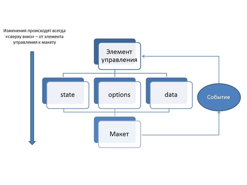
The control layout is based on the 'state', 'data' or 'options' fields and monitors their changes. When changing field values, the layout is rebuilt.
The layout, in turn, can change the state of the control using events that are specified in its interface. The control listens to the specified set of events and performs (or does not perform) the corresponding actions.
A group control is different in that you can add child elements to it. The layout of the group element, therefore, must have an html-element that will be the root for the html-layout of the child elements.
Create a layout for the drop-down list.
The html layout of the open list looks like this:
Let's write out what we want to get from the finished layout:
1. It is necessary that the title of the list be substituted into the layout;
2. It is necessary that the child elements of the list are automatically added to the specified dom-element of the parent;
3. Our list should be able to fold and unfold;
4. It is necessary to somehow define the appearance of the elements of the list.
We will substitute the list header into the layout by analogy with the example of the button layout:
We now turn to the second paragraph.
The parent dom element in our drop-down list is the <div id = 'my-listbox'> element.
The layout of a group control must implement the IGroupControlLayout interface. The peculiarity of this interface is the presence of the getChildContainerElement method. Through this method, the control gets the dom-element to which it needs to attach the html-layouts of the child elements.
When building the layout, the necessary dom element will be found, and the group control can add the child elements to the parent.
Since our layout contains the substitution of '$ [data.title]', it can be rearranged. As soon as this field is changed, the layout will call a couple of clear and build methods to update its html mapping. In this case, the dom element that serves as a container for the child elements will change (yes, it will be exactly the same as the previous one, but it will physically be another dom element).
The control does not monitor layout changes and does not recognize that the child container has changed. Therefore, we need to independently notify him about it.
Every time we rebuild, we will generate an IGroupControlLayout 'childcontainerchange' interface event.
Now when the layout is rebuilt, the control will be aware of the container change and transfer the child elements to the new dom element.
We need to make sure that our list knows how to fold and unfold.
The appearance of the control in a collapsed state:
The appearance of the control in the expanded state:
It turns out that in this example (depending on the state of the control) you need to show or hide the container with its child elements.
We set up a layout that responds to changes in the state of the control. Now you need to set up feedback - depending on the actions of the user, send to the control the “roll up” or “roll up” commands. Fortunately, control.ListBox is minimized or maximized by click on the layout by default. So in this example, no additional actions are required for this. If we were not satisfied with the default behavior, we could send commands to the control through the layout ourselves, as we did with the control.SmallZoomControl.
It remains to create a layout for the elements of the drop-down list. This is done quite simply.
See an example

To demonstrate the capabilities of the layouts, we selected the six most popular map controls in the API (Button, Drop-down List, Map Search, Simple Map Zoom Control, Traffic Control Panel, and Map Type Switch) and redesigned them using the popular css framework Twitter Bootstrap.
See an example
Githaba code
There are cases when the developer does not fit the layout of a particular control. For example, I want to add a red button to the map or it is not satisfied with the standard cork panel, which takes up a lot of space on the map.
In such cases, the developer needs to replace the existing element with his own. However, he can only change the part that is responsible for the appearance of the element and leave unchanged the logical part of the map control.
')
In order to create your own control layout, you need to understand parts of the API architecture. This article provides a brief overview of the concepts that a developer should become familiar with before performing this task and explains the general principle of the interaction between the logical and visual parts of controls. Three examples of creating layouts are also considered - from simple to complex.
The article is intended for developers who have already had experience with the Yandex.Maps API 2.0. For acquaintance with the basic concepts I recommend to read the developer's guide .
Basic concepts
What is a layout?
A layout is a visual representation of a control. In essence, a layout is an object that can generate html on the basis of the data transmitted to it.
The layout receives an object with fields as input:
- control - reference to the control;
- options - control options manager;
- data - control data manager;
- state - the state manager of the control.
What is the options manager (status, data)?
A manager is a repository that allows you to set and retrieve values by key. The options manager also knows how to get options from parent elements if they are not found in the child.
You can get and set options or data as follows:
smallZoomControl.options.get('layout'); // layout smallZoomControl.data.set('publicId', myId); // What is the difference between options, data and status?
Options are recommendations for the appearance of the control. For example, the options are given the layout class ('layout'), the minimum width of the button ('minWidth'), etc.
An important feature of the options - the possibility of inheritance from parents. That is, options can be set both directly and through any of the parent elements. When specifying options via parent elements, as a rule, the prefix is used. For example, the 'layout' option for control.Button can be set via the map as 'buttonLayout' ('button' + 'layout').
Data is a set of fields that describe the content of an item. For example, the data may be the title of a list ('title') or the contents of a button ('content'). The data is not inherited from the parent elements and is set only directly into the object.
A state is a set of fields describing the current state of the control. Status fields may change as a result of user actions.
Examples of state fields:
- 'expanded' - a sign that the drop-down list is expanded or collapsed;
- 'selected' - sign, pressed or pressed button.
The status fields are also not inherited from the parent elements and can change on their own as a result of actions on the control (for example, the state of the 'selected' button changes as a result of calling the button.select () method).
Example 1. Layout generation based on data, options, and control state
Most often, layouts are created using the special templateLayoutFactory factory. The factory allows you to set a text template with which the dom-representation of the element will be formed later.
Consider an example of creating your own layout for control.Button. What we want to get from the created layout:
1. There should be some inscription in the button;
2. The button has 2 states - when it is pressed and when it is not pressed.
The caption is the value of one of the button data fields. The standard button implementation uses the 'content' field:
myButton.data.get('content'); Nothing prevents us from using another arbitrary data field, if necessary. For example:
myButton.data.set('caption', ''); In this case, we will manage with a standard data field.
In our example, the dom representation of the button will be a div element:
<div class='my-button'> </div> So, it is necessary that the field from the control data is substituted instead of the phrase "Button header". Creating a button layout will look like this:
var ButtonLayout = ymaps.templateLayoutFactory.createClass("<div class='my-button'> $[data.content] </div>"); Instead of the text 'Button Title' we inserted the template '$ [data.content]'.
The layout factory can handle data, option, or state managers. Therefore, we refer to the 'content' field through a dot - the factory will be able to independently determine that data is the data manager, and perform the data.get ('content') operation.
Now if we change the value of this field through the data manager, our layout will be automatically rebuilt.
We coped with the first item. Go to step two.
In its normal state, the button looks like this:
<div class='my-button'> </div> When pressed, it looks like this:
<div class='my-button my-button-selected'> </div> That is, a special class is added to the div element that changes the appearance of the button.
Modify our text template:
var ButtonLayout = ymaps.templateLayoutFactory.createClass("<div class='my-button [if state.selected]my-button-selected[endif]'>$[data.content]</div>"); So, based on the data and the state of the button, we were able to create its layout. The button layout automatically responds to clicks and translates them into a control. So no additional logic is required in this example.
See an example
Example 2. Layout that interacts with the control.
Let us consider a more complicated example - the creation of a control element for the map scaling factor, in other words, a 'zoom control'.
The html template of our control looks like this:
<div> <div id='zoom-in'>+</div> <div id='zoom-out'>-</div> </div> We want to get the following from the created layout: when clicking on an element with a plus or minus, you need to increase or decrease the zoom of the card by 1.
The documentation says that the layout control.SmallZoomControl implements the IZoomControlLayout interface. We read the description of the interface and find the description of the 'zoomchange' event:
Zoomchange - the event that initiates the change of the scale factor of the map.
An instance of the Event class. The names of the fields available through the Event.get method:
• newZoom - the new value of the zoom factor;
• oldZoom - the old value of the zoom factor.
This means the following - when the layout sends a 'zoomchange' event, the control catches it and responds accordingly (that is, changes the zoom ratio of the map).
It is necessary that after the formation of the html layout on certain elements of the listeners were hung. In particular, you need to listen to the 'click' event on the elements with id = 'zoom-in' and id = 'zoom-out'. In the click handlers, we will generate a 'zoomchange' event, into the fields of which the old and new map scaling factors will be transmitted.
Creating a layout for the zoom control will look like this:
// . var MyZoomLayout = ymaps.templateLayoutFactory.createClass("<div>" + "<div id='zoom-in'>+</div>" + "<div id='zoom-out'>-</div>" + "</div>", { // , // . build: function () { // build. MyZoomLayout.superclass.build.call(this); // . $('#zoom-in').bind('click', ymaps.util.bind(this.zoomIn, this)); $('#zoom-out').bind('click', ymaps.util.bind(this.zoomOut, this)); }, clear: function () { // . $('#zoom-in').unbind('click'); $('#zoom-out').unbind('click'); // clear. MyZoomLayout.superclass.clear.call(this); }, zoomIn: function () { var map = this.getData().control.getMap(); // , // . this.events.fire('zoomchange', { oldZoom: map.getZoom(), newZoom: map.getZoom() + 1 }); }, zoomOut: function () { var map = this.getData().control.getMap(); this.events.fire('zoomchange', { oldZoom: map.getZoom(), newZoom: map.getZoom() - 1 }); } }); See an example
Using the example of control.SmallZoomControl, we looked at how the control and its layout interact. Summarize the knowledge gained in the scheme:
The control layout is based on the 'state', 'data' or 'options' fields and monitors their changes. When changing field values, the layout is rebuilt.
The layout, in turn, can change the state of the control using events that are specified in its interface. The control listens to the specified set of events and performs (or does not perform) the corresponding actions.
Example 3. Creating a group control layout
A group control is different in that you can add child elements to it. The layout of the group element, therefore, must have an html-element that will be the root for the html-layout of the child elements.
Create a layout for the drop-down list.
The html layout of the open list looks like this:
<div id='my-listbox-header'> </div> <div id='my-listbox'> <br/> <br/> </div> Let's write out what we want to get from the finished layout:
1. It is necessary that the title of the list be substituted into the layout;
2. It is necessary that the child elements of the list are automatically added to the specified dom-element of the parent;
3. Our list should be able to fold and unfold;
4. It is necessary to somehow define the appearance of the elements of the list.
We will substitute the list header into the layout by analogy with the example of the button layout:
var MyListBoxLayout = ymaps.templateLayoutFactory.createClass( "<div id='my-listbox-header'>$[data.title]</div>” + “<div id='my-listbox'></div>" ); We now turn to the second paragraph.
The parent dom element in our drop-down list is the <div id = 'my-listbox'> element.
The layout of a group control must implement the IGroupControlLayout interface. The peculiarity of this interface is the presence of the getChildContainerElement method. Through this method, the control gets the dom-element to which it needs to attach the html-layouts of the child elements.
var MyListBoxLayout = ymaps.templateLayoutFactory.createClass( "<div id='my-listbox-header'>$[data.title]</div>” + “<div id='my-listbox' ></div>", { build: function() { MyListBoxLayout.superclass.build.call(this); this.childContainerElement = $('#my-list-box')[0]; }, getChildContainerElement: function () { return this.childContainerElement; } }); When building the layout, the necessary dom element will be found, and the group control can add the child elements to the parent.
Since our layout contains the substitution of '$ [data.title]', it can be rearranged. As soon as this field is changed, the layout will call a couple of clear and build methods to update its html mapping. In this case, the dom element that serves as a container for the child elements will change (yes, it will be exactly the same as the previous one, but it will physically be another dom element).
The control does not monitor layout changes and does not recognize that the child container has changed. Therefore, we need to independently notify him about it.
Every time we rebuild, we will generate an IGroupControlLayout 'childcontainerchange' interface event.
var MyListBoxLayout = ymaps.templateLayoutFactory.createClass( "<div id='my-listbox-header'>$[data.title]</div>” + “<div id='my-listbox'></div>", { build: function() { MyListBoxLayout.superclass.build.call(this); this.childContainerElement = $('#my-list-box')[0]; // , // . this.events.fire('childcontainerchange', { newChildContainerElement: this.childContainerElement, oldChildContainerElement: null }); }, clear: function () { // // . // , // dom- ie. this.events.fire('childcontainerchange', { newChildContainerElement: null, oldChildContainerElement: this.childContainerElement }); this.childContainerChange = null; MyListBoxLayout.superclass.clear.call(this); }, getChildContainerElement: function () { return this.childContainerElement; } }); Now when the layout is rebuilt, the control will be aware of the container change and transfer the child elements to the new dom element.
We need to make sure that our list knows how to fold and unfold.
The appearance of the control in a collapsed state:
<div id='my-listbox-header'> </div> The appearance of the control in the expanded state:
<div id='my-listbox-header'> </div> <div id='my-listbox'> <br/> <br/> </div> It turns out that in this example (depending on the state of the control) you need to show or hide the container with its child elements.
var MyListBoxLayout = ymaps.templateLayoutFactory.createClass( "<div id='my-listbox-header'>$[data.title]</div>” + “<div id='my-listbox' style='display: [if state.expanded]block[else] none[endif];'></div>", { build: function() { MyListBoxLayout.superclass.build.call(this); this.childContainerElement = $('#my-list-box')[0]; // , // . this.events.fire('childcontainerchange', { newChildContainerElement: this.childContainerElement, oldChildContainerElement: null }); }, clear: function () { // // . // , // dom- ie. this.events.fire('childcontainerchange', { newChildContainerElement: null, oldChildContainerElement: this.childContainerElement }); this.childContainerChange = null; MyListBoxLayout.superclass.clear.call(this); }, getChildContainerElement: function () { return this.childContainerElement; } }); We set up a layout that responds to changes in the state of the control. Now you need to set up feedback - depending on the actions of the user, send to the control the “roll up” or “roll up” commands. Fortunately, control.ListBox is minimized or maximized by click on the layout by default. So in this example, no additional actions are required for this. If we were not satisfied with the default behavior, we could send commands to the control through the layout ourselves, as we did with the control.SmallZoomControl.
It remains to create a layout for the elements of the drop-down list. This is done quite simply.
ymaps.templateLayoutFactory.createClass("$[data.content]<br/>"); See an example
Another example implementation of custom layouts
To demonstrate the capabilities of the layouts, we selected the six most popular map controls in the API (Button, Drop-down List, Map Search, Simple Map Zoom Control, Traffic Control Panel, and Map Type Switch) and redesigned them using the popular css framework Twitter Bootstrap.
See an example
Githaba code
Source: https://habr.com/ru/post/161763/
All Articles