Web designer vs coder. Division of labor, or when you need a project manager (from the history of a startup)
Perhaps, many web designers (especially those involved solely in site design layouts, outside of layout and programming) faced the fact that their submitted and approved work, going through certain stages, underwent various changes and distortions. It is good if the development takes place in a well-coordinated team, where web designers work closely with the layout designers and programmers. With this position of the stars, it is likely that all angles will be eroded and the best results will be achieved. However, with the trends of individual hiring of freelancers, by the majority, cooperation does not arise.

The article may be of particular interest to customers of web services (website owners / businessmen who want to open their own startup). The material can also serve as a field for discussion by all parties to the issue - web designers , project managers , layout designers , site owners . The article describes the process of designing and developing a web design (with logical diagrams) of a startup, about monitoring the implementation and the subsequent “life” of the project and about its final closure. Not endowed with sufficient information for objective reasons for the closure of this startup, I will try to avoid speculation, gossip, and unreasonable conclusions. The purpose of my story is to reflect the view from the web designer on the implementation of his design on the site. The article contains practical advice on the quality control of the layout.
')
The inspiration for creating a post on the topic of segregation of duties in web development was the recent conversation with a friend. He began as a regular project manager. Now - with extensive experience in the implementation and maintenance of sites as Head of Project Development Department. A friend shared several fairly long-standing stories of transferring projects to other hands, terrible impressions of web-design distortion and disastrous consequences. Here I want to tell my own story from this area.
Actually, it will be a question of one dating site for which I developed web design. I call it a start-up for the reason that it was based on a unique idea that changes ideas about dating. This idea was simple and original - to redeem the placement of photo tapes (the so-called "Mordo-tapes") on many other third-party sites and thereby achieve mass availability (popularity) on the Internet. I will make a reservation that initially I experienced a certain rejection from the very name of the site (Morda Lenta.ru). However, the customer considered it to be quite relevant in the light of the fact that “among the people” this name is used for such tapes. Of course, I could not contradict the opinion of the customer, and began to work "with what is".
The second point on which it is worth inserting a comment is the fact of an order for a separate web design. I used to create websites from scratch, being responsible for every stroke in a project. The division of labor in this area is fraught with contradictions, which can be avoided under the following conditions:
My customer was essentially a businessman. As it turned out later, despite owning dozens of small sites, he did not have extensive knowledge in the field of web development, which did not prevent him from actually acting as a project manager. To blame him for it does not follow. I think most of the site owners think and act like him, and sometimes everything works out. (The client is always right in general.) Like many performers, I was also a kind of “businessman” (forgive me for being an oxymoron), and the temptation to have my copyright on a highly visited resource (I didn’t hide my interest in anything) overwhelmed the arguments of reason.
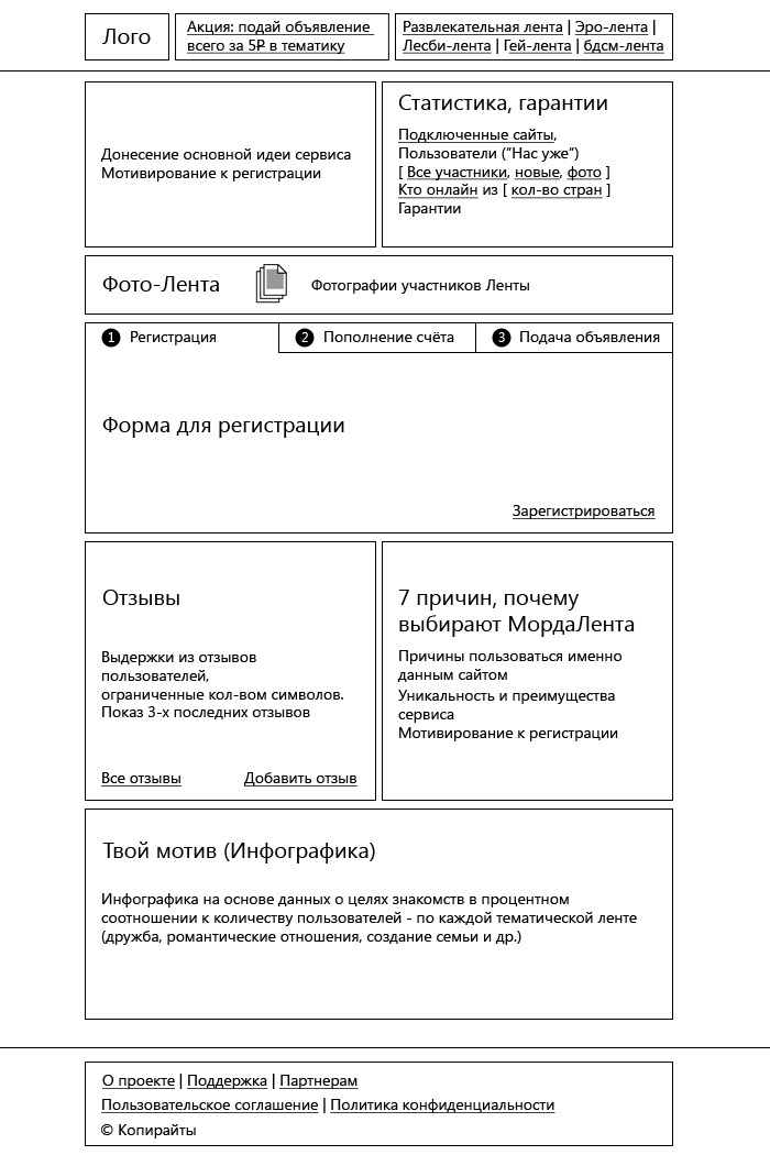
I must say, my customer already had experience of launching and developing a startup, but the previous project was not set. Those who were "second" were "first." The customer found an explanation in the fact that everything was done “by the way”, and now he expected to go the other way. I was impressed by his desire for quality, so when he asked before the meeting to prepare his thoughts on how the project should look like, I came up with a detailed question. Actually, at the meeting I sketched a logical scheme (the structure of the page is a basic sketch), simultaneously explaining the role of each of the conceived areas. My ideas came to taste the customer and were approved. Initially, the logical scheme of the main page of the site was as follows:

In my view, the main page of the dating site should directly involve visitors to the desire to get acquainted and enter into contacts with already registered users of the site. This purpose was served by the Cards of users with interesting offers for dating (slideshow in the right upper block, under the “menu”). In addition, they were a kind of examples for the publication of their own proposals. Additional motivation should have served as a description of the uniqueness and benefits of the service. Below was the very "MordaLenta" - in fact, a demonstration of a particular service: the tape, in which the site members were supposed to submit their ad. Then - the registration field, where you could immediately register, replenish your account and submit an ad (just three steps). The block with reviews served all the same task of additional motivation to use the service. Statistics gave a general idea of the participants (in fact, such statistics are classics for dating sites). The information area (“What is Morda Tape”) could have been claimed by seo optimizers in the future. I must say, nobody provided me with the texts, and they were written by me “from and to”. Web writing, in my opinion, is often inseparable from the concept of web design, but this is a topic for a separate article. Together with the information zone, the possibility of using infographics, which will become part of the web design in the future, was also discussed.
Later, the logic circuit was somewhat redefined. At the request of the customer, "Statistics" got into the right upper block, having removed the "User Cards". In place of the Statistics got "7 reasons why choose Morda Tape."

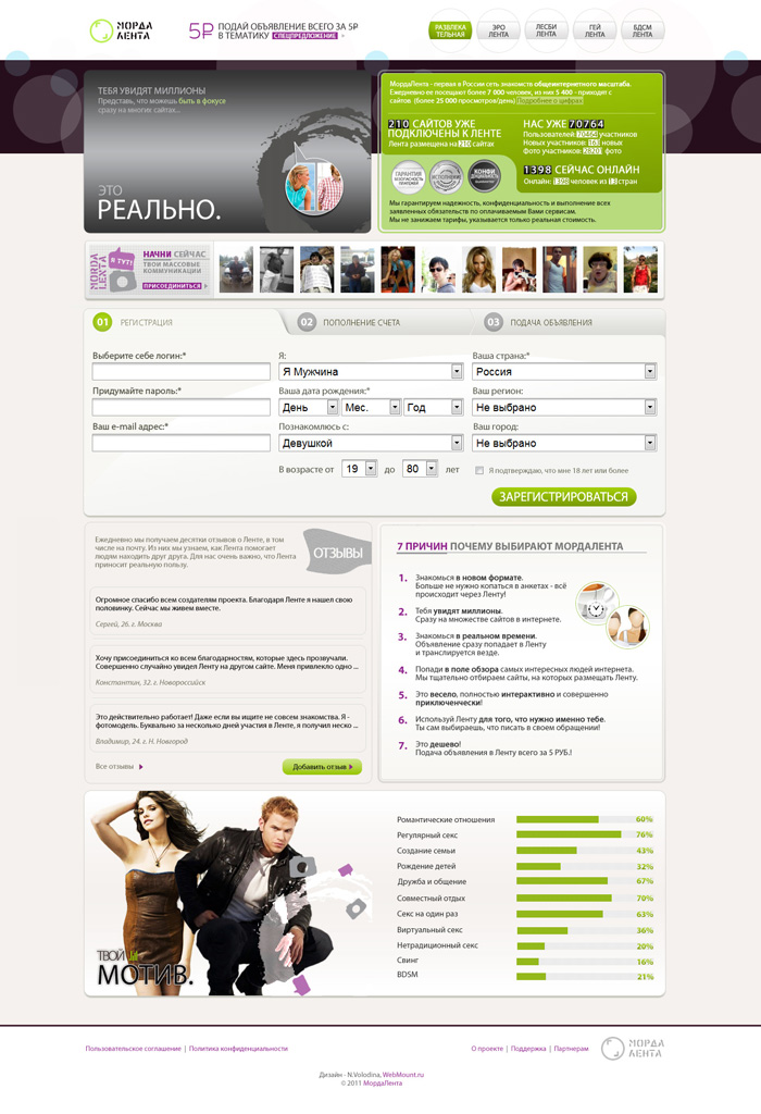
The final design layout:

The logical structure was kept common to each topic. In the design layouts prepared for each section, only the color schemes changed. So, for the “Entertainment Ribbon” layout, it was green (+ purple), for “Ero-tape” - red (+ purple), for “Lesbian-tape” - pink (+ purple), for “Gay-tape” - blue (+ purple), for BDSM tapes - brown (+ purple).
Some time after putting the design, he appeared on the site, and I felt uneasy. Being a practicing typesetter and a web programmer, I knew that the design in some places is difficult to execute on a web page, but quite realizable. What did I see? A number of gradients (color overflows), as well as fine processing of decorative elements were grossly disturbed. On the page there are new buttons that do not fit into the given color palette of web design (pink perfectly harmonized with one of the topics, but not to each of them). In the Statistics section there were no references, but only text (were they not provided for by the system?). And infographics, instead of reflecting real data for each thematic tape, was nothing more than a static picture that loses all meaning and role. There was no hint of the goals of dating datings, which could be a special feature of this site.
As I could, I told my thoughts to the customer about the design. Also, the principle and the role of infographics, which should be dynamic, clickable and for each tape - its own, also spoke especially. And not a static image duplicated on each of the topics. He seemed to understand, and even emotionally responded in the style of "eureka!". I do not know what happened in the future, and what obstacles did not allow the expected changes to be made, but after a long time of observations, they did not follow. On the main page only reviews changed. It is difficult to say for what reason the moderators missed the illiterate and primitive (or were they written by the developers themselves intentionally “popular”?), But they looked very unattractive.
I didn’t disturb the customer about the design anymore. I know that the project has significant funding problems associated with the departure of the second partner. In general, the project lasted less than a year after launch. Here I will leave the reader for my own conclusions. I will speak only about the position of the web designer, who, after the delivery of the design layout, in fact, do not have the authority to intervene in the subsequent implementation. I think many web designers watch projects silently, refraining from any comments.
The following small tips will help control the quality of the layout:

The article may be of particular interest to customers of web services (website owners / businessmen who want to open their own startup). The material can also serve as a field for discussion by all parties to the issue - web designers , project managers , layout designers , site owners . The article describes the process of designing and developing a web design (with logical diagrams) of a startup, about monitoring the implementation and the subsequent “life” of the project and about its final closure. Not endowed with sufficient information for objective reasons for the closure of this startup, I will try to avoid speculation, gossip, and unreasonable conclusions. The purpose of my story is to reflect the view from the web designer on the implementation of his design on the site. The article contains practical advice on the quality control of the layout.
')
Prehistory
The inspiration for creating a post on the topic of segregation of duties in web development was the recent conversation with a friend. He began as a regular project manager. Now - with extensive experience in the implementation and maintenance of sites as Head of Project Development Department. A friend shared several fairly long-standing stories of transferring projects to other hands, terrible impressions of web-design distortion and disastrous consequences. Here I want to tell my own story from this area.
Actually, it will be a question of one dating site for which I developed web design. I call it a start-up for the reason that it was based on a unique idea that changes ideas about dating. This idea was simple and original - to redeem the placement of photo tapes (the so-called "Mordo-tapes") on many other third-party sites and thereby achieve mass availability (popularity) on the Internet. I will make a reservation that initially I experienced a certain rejection from the very name of the site (Morda Lenta.ru). However, the customer considered it to be quite relevant in the light of the fact that “among the people” this name is used for such tapes. Of course, I could not contradict the opinion of the customer, and began to work "with what is".
The second point on which it is worth inserting a comment is the fact of an order for a separate web design. I used to create websites from scratch, being responsible for every stroke in a project. The division of labor in this area is fraught with contradictions, which can be avoided under the following conditions:
- availability of a competent project manager who understands the concept of the site and controls the quality at each stage of implementation;
- close cooperation of development participants (at least, web designer, layout designer, programmer; here I am silent about managers, internet marketers, loyalty specialists
agents, etc.).
My customer was essentially a businessman. As it turned out later, despite owning dozens of small sites, he did not have extensive knowledge in the field of web development, which did not prevent him from actually acting as a project manager. To blame him for it does not follow. I think most of the site owners think and act like him, and sometimes everything works out. (The client is always right in general.) Like many performers, I was also a kind of “businessman” (forgive me for being an oxymoron), and the temptation to have my copyright on a highly visited resource (I didn’t hide my interest in anything) overwhelmed the arguments of reason.
Designing the logical structure of the main page
I must say, my customer already had experience of launching and developing a startup, but the previous project was not set. Those who were "second" were "first." The customer found an explanation in the fact that everything was done “by the way”, and now he expected to go the other way. I was impressed by his desire for quality, so when he asked before the meeting to prepare his thoughts on how the project should look like, I came up with a detailed question. Actually, at the meeting I sketched a logical scheme (the structure of the page is a basic sketch), simultaneously explaining the role of each of the conceived areas. My ideas came to taste the customer and were approved. Initially, the logical scheme of the main page of the site was as follows:

In my view, the main page of the dating site should directly involve visitors to the desire to get acquainted and enter into contacts with already registered users of the site. This purpose was served by the Cards of users with interesting offers for dating (slideshow in the right upper block, under the “menu”). In addition, they were a kind of examples for the publication of their own proposals. Additional motivation should have served as a description of the uniqueness and benefits of the service. Below was the very "MordaLenta" - in fact, a demonstration of a particular service: the tape, in which the site members were supposed to submit their ad. Then - the registration field, where you could immediately register, replenish your account and submit an ad (just three steps). The block with reviews served all the same task of additional motivation to use the service. Statistics gave a general idea of the participants (in fact, such statistics are classics for dating sites). The information area (“What is Morda Tape”) could have been claimed by seo optimizers in the future. I must say, nobody provided me with the texts, and they were written by me “from and to”. Web writing, in my opinion, is often inseparable from the concept of web design, but this is a topic for a separate article. Together with the information zone, the possibility of using infographics, which will become part of the web design in the future, was also discussed.
Later, the logic circuit was somewhat redefined. At the request of the customer, "Statistics" got into the right upper block, having removed the "User Cards". In place of the Statistics got "7 reasons why choose Morda Tape."

Design layout
The final design layout:

The logical structure was kept common to each topic. In the design layouts prepared for each section, only the color schemes changed. So, for the “Entertainment Ribbon” layout, it was green (+ purple), for “Ero-tape” - red (+ purple), for “Lesbian-tape” - pink (+ purple), for “Gay-tape” - blue (+ purple), for BDSM tapes - brown (+ purple).
The implementation of the design layout on the site. “What has grown, has grown”
Some time after putting the design, he appeared on the site, and I felt uneasy. Being a practicing typesetter and a web programmer, I knew that the design in some places is difficult to execute on a web page, but quite realizable. What did I see? A number of gradients (color overflows), as well as fine processing of decorative elements were grossly disturbed. On the page there are new buttons that do not fit into the given color palette of web design (pink perfectly harmonized with one of the topics, but not to each of them). In the Statistics section there were no references, but only text (were they not provided for by the system?). And infographics, instead of reflecting real data for each thematic tape, was nothing more than a static picture that loses all meaning and role. There was no hint of the goals of dating datings, which could be a special feature of this site.
As I could, I told my thoughts to the customer about the design. Also, the principle and the role of infographics, which should be dynamic, clickable and for each tape - its own, also spoke especially. And not a static image duplicated on each of the topics. He seemed to understand, and even emotionally responded in the style of "eureka!". I do not know what happened in the future, and what obstacles did not allow the expected changes to be made, but after a long time of observations, they did not follow. On the main page only reviews changed. It is difficult to say for what reason the moderators missed the illiterate and primitive (or were they written by the developers themselves intentionally “popular”?), But they looked very unattractive.
I didn’t disturb the customer about the design anymore. I know that the project has significant funding problems associated with the departure of the second partner. In general, the project lasted less than a year after launch. Here I will leave the reader for my own conclusions. I will speak only about the position of the web designer, who, after the delivery of the design layout, in fact, do not have the authority to intervene in the subsequent implementation. I think many web designers watch projects silently, refraining from any comments.
From an example to practical advice
The following small tips will help control the quality of the layout:
- Ideally, a web designer and layout designer is one person (even better when he is also a programmer, but this is more of a rarity than a rule)
- Verify the design layout with the curtailed web design. It should be identical, except for typography (after all, raster is used in the layout)
- Do not be satisfied with the maker-up’s answer, saying that it’s impossible to do something. Do not ask "why?" (There will always be reasons). Better ask: "What do you need to make this possible?". Remember: you can impose almost any layout . So, if a complex background image is used in the design layout, in order to make it elongate according to the screen length, in most cases, it is enough to make repeated “inserts” (background fragments). If in the background image it is impossible to select strip-areas that could be repeated, but you have this image in good resolution, then you can adjust it to fit the screen size with js scripts. If the designer has planned a background for each sign in a certain number, and the layout designer simply puts the approximate background color for that number, this is wrong. In this case, the coder should say: “in order to achieve an exact match with the layout, it is necessary to break the total number into separate characters enclosed in tags”. This task can be easily performed by the programmer. If there is an infographic in web design, and it is intended to display a percentage, ask the programmer to prepare a module for capturing these values, and the layout designer places them appropriately. Organize the collective work of the coder and programmer. Give the coder the opportunity to contact the programmer if necessary.
- Let you have already paid off with the web designer for the design layout, do not hesitate to ask how he sees the layout of various elements of web design. Even if the web designer is not engaged in layout, he should be aware of possible solutions for implementing his layout. Including, it concerns the moment when design was ordered for a site with a “stretch” (“rubber” design).
- If you are planning to introduce new buttons or entire areas on the pages of the site, take care that their design fits the overall style and color scheme of the web design.
Source: https://habr.com/ru/post/160875/
All Articles