Introduction to R-project
 Throughout Habré, only a couple of articles on the above topic were found. And the theme is fertile. And last Wednesday the course " Introduction to Computational Finance and Financial Econometrics " just ended. Based on his fifth week, “Descriptive statistics”, this post appeared. The participant will be uninteresting, and those wishing to get acquainted with the basic techniques of data analysis with the help of R - I ask for a habrak.
Preliminary agreements
About terms
The author from the statistics had only a semester of “Terver” N years ago. Therefore, after doubtfully translated words and their combinations, the original English term will be indicated ( in italics in brackets ). Experts, please, send in lichku more correct variants of terms. Thank.
About installation
Attention is not focused on installing software intentionally, in view of the triviality. At least on the Windows platform, it all came down to the standard “further -> further -> ... -> ready.” The only PerformanceAnalytics package required for the article being executed in the article is installed via the “Packages / Install Package (s) ...” menu), select the mirror nearest to you, and select the desired package from the list.
Data set
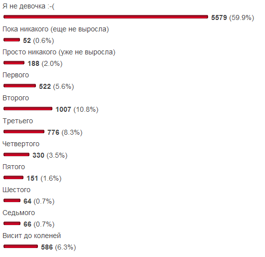
I wanted to avoid typicality: sales, apartments, simple returns , - how much is possible? Therefore, the subject area of our sample is eternal both in the context of Habr and outside its context. Not so long ago, a survey “What size do you have breasts?” Was published on SamiKy blog. Given that it included two answer choices for eliminating an irrelevant audience, there is some confidence in the likelihood of the sample. For convenience, the results are shown here:
purpose
As part of our mini-study, we compare 2 data sets with a normal distribution:
- (ND1) options from the third (no longer grown) to the ninth (sixth size),
- (ND2) the same options, but add optimists to the zero size (have not yet grown) and include the seventh size in the data.
Experienced statisticians it is obvious that the changes of the second option, we distribute the distribution from the normal. By the end of the article, we will have enough information to formally justify it.
')
Research progress
First, let's put our data sets into variables:
data = c(rep(0, 184), rep(1, 510), rep(2, 996), rep(3, 763), rep(4, 327), rep(5, 147), rep(6, 60)) data_ol = c(data, rep(0, 51), rep(7, 65)) x.txt = " " # The function c "sticks together" its arguments into a single vector; the function rep (x, y) returns a vector from y of x values. For example, rep (0, 184) returns a vector of one hundred eighty-four zeros. In the recommendations of Google and in several other sources, there was an opinion that it is useless to use the symbol of equality for assignment, it is better - "<-". Knowledgeable people, please state in the comments sufficiently strong justification to write 2 characters instead of one. For the author personally, this alternative renders the inconvenience of the ": =" operator from the Pascal language.
Now you can build histograms:
par(mfrow=c(1, 2)) hist(data, breaks=0:7, right=F, col="seagreen", main=" 1", xlab=x.txt, ylab=" ") hist(data_ol, breaks=0:8, right=F, col="slateblue1", main=" 2", xlab=x.txt, ylab=" ") The first line is needed to display the histograms side by side. Without it, the second histogram will overwrite the first. Here is what happened:

Reminds the result of the survey, right? True, a feature of our research is that the data is generated on the basis of a histogram. But this step is not meaningless, because
- LJ has a non-linear scale (most likely due to the number of votes in the first answer);
- Both histograms are depicted on the same scale and oriented vertically, which allows us to make a comparison with the probability density function of the normal distribution .
The next step makes little sense for such a discretized dataset as ours. It is shown here only for familiarization with the density function, which builds a more “smoothed” (read, averaged) histogram on the sample.
plot(density(data), type="l", col="seagreen", lwd=2, main=" 1") plot(density(data_ol), type="l", col="slateblue1", lwd=2, main=" 2") Result:

Calculate the sample parameters of the distributions.
mu = mean(data) mu mu_ol = mean(data_ol) mu_ol var(data) var(data_ol) sig = sd(data) sig sig_ol = sd(data_ol) sig_ol library(PerformanceAnalytics) skewness(data) skewness(data_ol) kurtosis(data)# excess kurtosis (-3) kurtosis(data_ol) Results:
| ND | Expectation | Dispersion | Standard deviation | Skewness asymmetry | Excess kurtosis |
|---|---|---|---|---|---|
| one | 2.408437 | 1.708542 | 1.307112 | 0.4124443 | 0.1001578 |
| 2 | 2.465034 | 2.17858 | 1.476001 | 0.7198767 | 0.7943986 |
As can be seen from the table, changes in the second data set
- hardly changed the average expected value
- increased random variation
- the distortion of the distribution to the right was increased almost 2 times (the right “tail” of the distribution density was extended),
- almost 8 times increased the thickness of the "tails" (compared with the normal distribution).
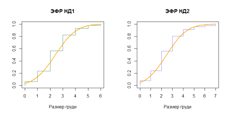
Let us compare the empirical distribution functions (EGF) with the distribution functions ( cumulative distribution function ) of the corresponding normal distributions (N (2.408437, (1.307112) 2 ) and N (2.465034, (1.476001) 2 )).
n1 = length(data) plot(sort(data), (1:n1)/n1, type="S", col="seagreen", main=" 1", xlab=x.txt, ylab="") x = seq(0, 6, by=0.25) lines(x, pnorm(x, mean=mu, sd=sig), type="l", col="orange", lwd=2) n2 = length(data_ol) plot(sort(data_ol), (1:n2)/n2, type="S", col="slateblue1", main=" 2", xlab=x.txt, ylab="") x2 = seq(0, 7, by=0.25) lines(x2, pnorm(x2, mean=mu_ol, sd=sig_ol), type="l", col="orange", lwd=2) Conclusion:
From the distribution functions we move on to quantiles ( quantile ), inverse to the distribution functions.
quantile(data) quantile(data_ol) qnorm(p=c(0, .25, .5, .75, 1), mean=mu, sd=sig) qnorm(p=c(0, .25, .5, .75, 1), mean=mu_ol, sd=sig_ol) In our particular case, the stage is rather boring, because Samples differ only by the hundredth percentile:
| Distribution | q 0 | q .25 | q .5 | q .75 | q 1 |
|---|---|---|---|---|---|
| ND1 | 0 | 2 | 2 | 3 | 6 |
| N (2.408437, (1.307112) 2 ) | -Inf | 1.526803 | 2.408437 | 3.290070 | Inf |
| ND2 | 0 | 2 | 2 | 3 | 7 |
| N (2.465034, (1.476001) 2 ) | -Inf | 1.469486 | 2.465034 | 3.460582 | Inf |
And if ND1 quartiles resemble the normal distribution, at least with rounding, then ND2 even this does not help.
The quantile scheme ( normal QQ plot ) is not very useful for our highly discretized samples. Mentioned in order to illuminate the function qqnorm.
qqnorm((data-mu)/sig, col="seagreen") abline( 0, 1, col="orange", lwd=2) qqnorm((data_ol-mu_ol)/sig_ol, col="slateblue1") abline( 0, 1, col="orange", lwd=2) The result is not exciting, but cheerful:

And completes the list of visual findings box with a mustache ( boxplot ).
boxplot(data, outchar=T, main=" 1", ylab=x.txt) boxplot(data_ol, outchar=T, main=" 2", ylab=x.txt) Graphics:
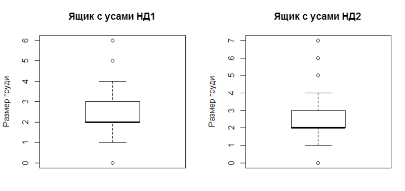
The construction clearly reflects the robust characteristics of the sample (resistant to the presence of outliers ):
- first and third quartile (upper and lower borders of the rectangle),
- second quartile (median, thickened by horizontal line),
- confidence interval (upper and lower "mustache", all outside these limits are considered emissions),
- in fact, emissions (circles outside the "whiskers").
In this case, the confidence interval is considered approximately as the distance from the first / third quartile by 1.5 interquartile range. For details -? Boxplot.
Conclusion
ND1 deviates less than ND2 from the normal distribution in mind:
- smaller values of asymmetry and kurtosis,
- a smaller difference in quantiles of the distribution with selective expectation and selective standard deviation compared to the quantiles of the sample.
Additional Information
Alternative introductory materials in R (eng.):
The second and third links are part of the official documentation. If there are links to efficient introductory articles on the great and mighty, write - add.
The main purpose of the article is to attract public attention to R as an analysis tool. If any of the knowledgeable people presents more in-depth material, I will be sincerely glad and happy to get acquainted.
Proofreaders - in a personal. The rest - welcome to the comments.
Thank you all for your attention.
Source: https://habr.com/ru/post/160373/
All Articles