Crossbrowser CSS3 Reverse Background Animation
Good day, dear readers of Habr. There are wonderful CSS properties with which you can set the reverse movement of the animation - animation-direction: alternate and animation-direction: alternate-reverse (not to be confused with the animation-direction: reverse property, which sets the reverse direction ), but today they do not support most modern browsers. I want to talk about how to make cross-browser reverse background animation.
')
Set the background color (pattern.png - texture in this example) and the page height equal to the height of the browser window:
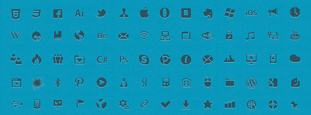
The animated part of the background is the icons whose image will be the background of the elements with the class .icons. The width is equal to the width of the background image.
leadicons.png (4898px * 32px)

In CSS there are two classes of movement-left, which is assigned an animation with a movement to the left and movement-right, which is assigned to an animation with a movement to the right:
It is important that the movement of elements with the .icons class starts from different positions, so all elements must have different background-position properties, and in the animation functions themselves, the margin property changes.
Generating animation functions:
Create elements with the .icons class:
It is possible to implement this example using one animation, in which only background-position will change. In this case, you will need to use the remarkable Principle of Cicada (more on this is written here ). Then specify the reverse motion of the animation.
Thank you all for your attention
Jsfiddle example
HTML
<html> <head></head> <body id="body"><body> </html> ')
CSS
Set the background color (pattern.png - texture in this example) and the page height equal to the height of the browser window:
html{ height: 100%; min-height: 100%; } body{ background:url('http://www.netcribe.com/images/pattern.png') repeat fixed left center #0296BA; overflow:hidden; } The animated part of the background is the icons whose image will be the background of the elements with the class .icons. The width is equal to the width of the background image.
leadicons.png (4898px * 32px)
.icons{ background-image:url('http://www.netcribe.com/images/leadicons.png'); background-repeat:repeat-x; height:60px; width:4898px; clear:both; /*animation-duration*/ -webkit-animation-duration:200s; -moz-animation-duration:200s; -ms-animation-duration:200s; -o-animation-duration:200s; animation-duration:200s; /*animation-iteration-count*/ -webkit-animation-iteration-count:infinite; -moz-animation-iteration-count:infinite; -ms-animation-iteration-count:infinite; -o-animation-iteration-count:infinite; animation-iteration-count:infinite; } In CSS there are two classes of movement-left, which is assigned an animation with a movement to the left and movement-right, which is assigned to an animation with a movement to the right:
.move-left{ /*animation-name*/ -webkit-animation-name:movement-left; -moz-animation-name:movement-left; -ms-animation-name:movement-left; -o-animation-name:movement-left; animation-name:movement-left; } .move-right{ /*animation-name*/ -webkit-animation-name:movement-right; -moz-animation-name:movement-right; -ms-animation-name:movement-right; -o-animation-name:movement-right; animation-name:movement-right; } Javascript
It is important that the movement of elements with the .icons class starts from different positions, so all elements must have different background-position properties, and in the animation functions themselves, the margin property changes.
CSS styles using animation-direction:
.icons{ background-image:url('http://www.netcribe.com/images/leadicons.png'); background-repeat:repeat-x; height:60px; width:4898px; clear:both; /*animation-duration*/ -webkit-animation-duration:200s; -moz-animation-duration:200s; -ms-animation-duration:200s; -o-animation-duration:200s; animation-duration:200s; /*animation-iteration-count*/ -webkit-animation-iteration-count:infinite; -moz-animation-iteration-count:infinite; -ms-animation-iteration-count:infinite; -o-animation-iteration-count:infinite; animation-iteration-count:infinite; /*animation-name*/ -webkit-animation-name:movement; -moz-animation-name:movement; -ms-animation-name:movement; -o-animation-name:movement; animation-name:movement; } .move-left{ /*animation-direction*/ -webkit-animation-direction:alternate; -moz-animation-direction:alternate; -ms-animation-direction:alternate; -o-animation-direction:alternate; animation-direction:alternate; } .move-right{ /*animation-direction*/ -webkit-animation-direction:alternate-reverse; -moz-animation-direction:alternate-reverse; -ms-animation-direction:alternate-reverse; -o-animation-direction:alternate-reverse; animation-direction:aalternate-reverse; } javascipt <script src="http://yandex.st/jquery/1.8.2/jquery.min.js"></script> $(document).ready(function(){ var clientWidth, clientHeight, x, y, z; clientWidth = $("html").width(); clientHeight = $("html").height(); margin = 4898 - parseInt(clientWidth); x=Math.ceil(clientHeight/60); // .icons y=0; // background-position z=Math.ceil(4898/(2*x)); // background-position $("#body").css({'width':clientWidth,'height':clientHeight}); Generating animation functions:
$("#body").append('<style>@keyframes movement-left {from {} to {margin-left: '+ -margin +'px;}} @keyframes movement-right {from {} to {margin-left: 0px;} @-moz-keyframes movement-left {from {} to {margin-left: '+-margin+'px;}} @-moz-keyframes movement-right {from {} to {margin-left:0px;} @-ms-keyframes movement-left {from {} to {margin-left: '+ -margin +'px;}} @-ms-keyframes movement-right {from {} to {margin-left: 0px;}} @-o-keyframes movement-left {from {} to {margin-left: '+ -margin +'px;}} @-o-keyframes movement-right {from {} to {margin-left: 0px;}} @-webkit-keyframes movement-left {from {} to {margin-left: '+ -margin +'px;}} @-webkit-keyframes movement-right {from {} to {margin-left: 0px;}} </style>'); Create elements with the .icons class:
for(var i=0;i<x;i++){ if(i%2==0){ $("#body").append('<div style="background-position:'+y+'px 0;" class="icons move-left">'); } else{ $("#body").append('<div style="background-position:'+y+'px 0; margin-left: '+ -margin +'px" class="icons move-right">');}y+=z;} }); Why change the margin when you can only change the background-position:
In this case, the distance to the final position specified in the background-position of all the element will be different, as well as the speed of movement. What makes the animation look awful
Principle of cicada
It is possible to implement this example using one animation, in which only background-position will change. In this case, you will need to use the remarkable Principle of Cicada (more on this is written here ). Then specify the reverse motion of the animation.
Thank you all for your attention
Source: https://habr.com/ru/post/160347/
All Articles