Design online store. Let simplicity help customers buy
We develop an engine for creating an online store and get a lot of questions from our customers. One of the most frequent is how to make a good online store design with a limited budget. In this article, we would like to show different approaches to the composition of the design elements of an online store. The recommendations are based on the specifics of customer treatment, trends in Western online stores and our subjective notions of convenience.
Online Store Homepage
')
I really like the rule 7 + -2, which says that a person at a time can perceive only 7 + -2 objects. Read more about the rule here.
How to apply this axiom to the design of sites? Take for example the site demo-ultimate.advantshop.net. There is a logo, navigation, phone, directory, search and a central slider with special offers, a small reference bar on top - it practically does not change the composition. Everything, nothing else. Notice that everything I listed fit into seven words: it looks normal.

What is below the slider? Three blocks with special offers. Hits, news, discounts.

And even lower - four information blocks.

Everything again fit into seven blocks. Please note there is no information whose purpose would be unclear. The blocks are clearly expressed. Scenarios for what to do are clear: link, button. Simplicity is what it aspires for when developing an online store. This is especially true of the main page.
Take another example. Let's look at the main page of one of the online clothing stores on our engine.

Authorization, search, logo, phone, category, central slider. Everything is very simple. It is simplicity that creates success: people do not need to strain to remember something. The consumer clearly reflects in his head the central message that you are trying to convey to him.
Another example is an online auto parts store, in which there are millions of them.
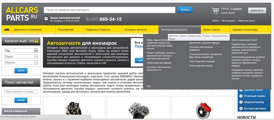
If you look at the project from the position of 7 + -2, then the layout does not strictly follow the rule. But, in general, the simplicity of the design is respected. Logo, search, phone, category, filter, search by code, advertising banners, text. More difficult, but fit into the rule 7 + -2, which can be considered acceptable.
Catalog, filters
What is the trouble of modern directories? Some online stores try to use back-end directories (for internal company processes), as directories for customers.
And the client wants to see a catalog that is convenient for selecting and searching for goods. Keep this in mind during the design and do not load the client with a catalog that lists your suppliers or manufacturers.
Sometimes there are catalogs in which categories are not uniform. For example, “cars”, “appliances”, “for men” ... It is easy to get confused in such a directory. It happens, you go into a category, and there are 30 subcategories.
There are online stores who like to send a person to a page that is lost in the catalog - it is unclear where the client is now.
Remember that the correct structuring of the catalog is very important for the consumer, because he does not know as much about the product as you know.
Our client, an online store of security and video surveillance systems, after a slight change in categories, received a clear response from the market: first, the sales volume fell, and after that, it straightened and began to grow.
Filter and compare products
It should be understood that the filter and the comparison of goods - an integral part of the purchase of goods in the online store. Only by choosing, the client can resolve their doubts when buying.
But there are difficulties with filters: giving the user a lot of opportunities to filter products, the system does not help, but only confuses.
Filters are undoubtedly useful when searching for the right product item, but many online stores produce zero result when filtering. Why was it allowed to filter? So you do not need to use filters.
Heterogeneous structuring
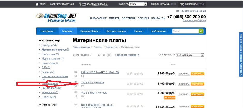
There is a very good reception - to categorize goods in various directions, for example, by product category and brand. But many online stores do not give this opportunity to their users. Although sometimes, along with the standard search in the catalog for groups of products, there is an obvious need to search by brand or, for example, by size.
Some online stores make a mistake by mixing the product and trying to categorize it in different directions, but in the same directory. For example, the category “shoes” is used in one directory, and the size range is already used in it. Sometimes this is permissible, but you need to remember that there is an opportunity to make the withdrawal of goods for the user more convenient.
Catalog, product categories
Let's look at an example of filing a category. Based on it, we can describe some approaches to the composition of the catalog.
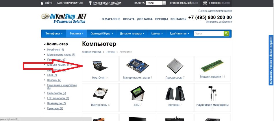
On the left - subcategories. Right (main part) - pictures of subcategories. This feature is better to use when categorizing a higher level, when the client has just started to go through the category tree.
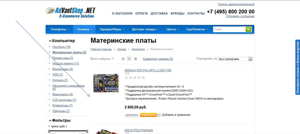
This is how a list of products in a category can look. Only two columns: on the left of the category, on the right - the product with a description. Here the approach changes in the direction of displaying the goods. We recommend enabling users to choose the form of presentation of the issuance of goods.
When there are few descriptions, there are no photos and it is necessary to issue more positions per page, the list of goods can be issued in this form - as a list.
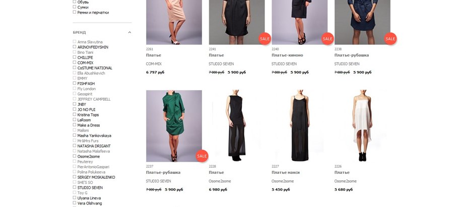
A picture, if it has a product, can be a working tool, so it is more important than a description. Let's look at the implementation of filters and the catalog display in the online clothing store. The catalog is displayed in the form of pictures of the goods, and just below - the description of the goods.
The user can minimize the unnecessary filters and filter, depending on their requests, on one page. This approach combines two tasks - the categorization of goods and the filter. I recommend to look at such a composition.
Consider the categorization of goods and the display of filters on the example of an online store of spare parts. Categories - on top. On the left - a narrowly oriented filter, search by part number, the list of products in the category is carried out in full.
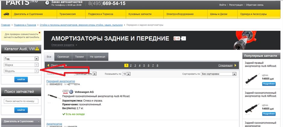
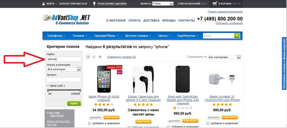
An important element is the display of the search. After selecting a search, it is possible to search more - the search field is displayed on the left. The navigation feed depends on the tasks of the resource and the number of loaded commodity items. If you work with a large number of commodity items, the approach has the right to life.
Accents and visuals
Consider accents - visual elements for attracting attention, which should highlight the main thing, offer an alternative, focus attention. With accents, usually always overkill. If the online store does not initially contain the functionality of accents, but you really want to make them, the site turns into a gypsy camp, but not a concise resource.
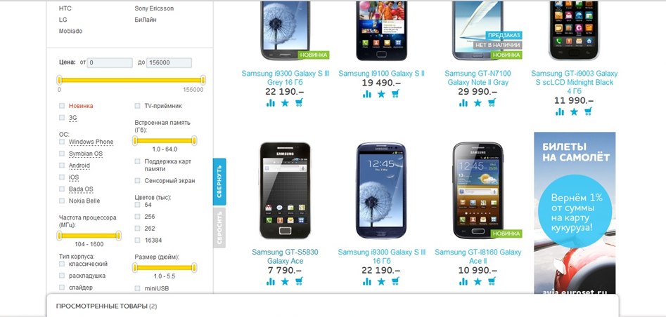
Let's look at the possible implementation of visual accents. One of the accents, which is rare, but is found in online stores - product tags. As you can see by example - they are quite organically able to fit into the issue.
The Euroset online store interestingly resolved the issue of selling additional services - plane tickets. The offer is in the product line. An interesting move.
And here is an example of a promotional offer on one of the online clothing stores. The central visual is convenient and allows you to clearly focus on the proposal. It will definitely catch your eye - the focus is on the main page and does not interfere. Beautiful central plate - it is convenient and simple. The user sees it immediately and is not distracted by anything.

Design depends on the quantity of goods
It is clear that the approaches to the composition, design of an online store is very dependent on its scale. An online store containing 100 items and an online store containing a million items will have different approaches to design prototypes.
What are standard scale errors? It's simple: the most common mistakes are trying to use the online store templates for a large number of products for a small store. And vice versa - try to load a large amount of goods into a template for a small amount of goods.
Keep this in mind when designing an online store, or have conceived to recycle it.
General recommendations for the components:
One product - one page with a description of the product.
Up to ten products - a page with a primitive categorization, maximum - two categories. Display products must be on the main page.
Up to 100 products - many online stores start with this. Accordingly, we remember the rule of seven + - two. For the first level there will be, for example, five or nine categories, and the product will lie inside. Correctly distribute the product into categories: it is desirable that out of 100 products in one category were not all 90. In this case, the categories will not be balanced. Here three-level categorization can be used, if the two products no longer fit. Remember that it is possible to display categories and the third level on the main page, if appropriate.
Up to 1000 products are recommended to think about additional categorization. For example, if you have a clothing store, you can place not only categories (pants, skirts, raincoats), but also categorization by brand.
Owning a store with an assortment of up to 1000 products, you should think about searching, although up to 1000 with correct categorization is not critical.
Up to 10,000 products are 95% of online stores. Search - required. Categorization is a must. Filters - required. Put yourself in the user's place.
Some online stores grow to such an assortment and usually catch all the problems of scale: the product is looked for worse with increasing assortment. It is clear that for such online stores and the fourth level categorization.
The product must be categorized using a different key (for example, for an online gift store, you must enter the category “For men / women”), or use several categorization parameters. The search should work, it will also be appropriate to use the search by key field, for example, by part number or date.
findings
The design of the online store, the composition of the blocks of the online store is always the answer to the question “How will the customer be comfortable?” Put yourself in the user's place, try to find the product on the website with yourself: it will become much clearer what the design should be, what it not enough, and that - obviously too much.
Online Store Homepage
')
I really like the rule 7 + -2, which says that a person at a time can perceive only 7 + -2 objects. Read more about the rule here.
How to apply this axiom to the design of sites? Take for example the site demo-ultimate.advantshop.net. There is a logo, navigation, phone, directory, search and a central slider with special offers, a small reference bar on top - it practically does not change the composition. Everything, nothing else. Notice that everything I listed fit into seven words: it looks normal.
What is below the slider? Three blocks with special offers. Hits, news, discounts.
And even lower - four information blocks.
Everything again fit into seven blocks. Please note there is no information whose purpose would be unclear. The blocks are clearly expressed. Scenarios for what to do are clear: link, button. Simplicity is what it aspires for when developing an online store. This is especially true of the main page.
Take another example. Let's look at the main page of one of the online clothing stores on our engine.
Authorization, search, logo, phone, category, central slider. Everything is very simple. It is simplicity that creates success: people do not need to strain to remember something. The consumer clearly reflects in his head the central message that you are trying to convey to him.
Another example is an online auto parts store, in which there are millions of them.
If you look at the project from the position of 7 + -2, then the layout does not strictly follow the rule. But, in general, the simplicity of the design is respected. Logo, search, phone, category, filter, search by code, advertising banners, text. More difficult, but fit into the rule 7 + -2, which can be considered acceptable.
Catalog, filters
What is the trouble of modern directories? Some online stores try to use back-end directories (for internal company processes), as directories for customers.
And the client wants to see a catalog that is convenient for selecting and searching for goods. Keep this in mind during the design and do not load the client with a catalog that lists your suppliers or manufacturers.
Sometimes there are catalogs in which categories are not uniform. For example, “cars”, “appliances”, “for men” ... It is easy to get confused in such a directory. It happens, you go into a category, and there are 30 subcategories.
There are online stores who like to send a person to a page that is lost in the catalog - it is unclear where the client is now.
Remember that the correct structuring of the catalog is very important for the consumer, because he does not know as much about the product as you know.
Our client, an online store of security and video surveillance systems, after a slight change in categories, received a clear response from the market: first, the sales volume fell, and after that, it straightened and began to grow.
Filter and compare products
It should be understood that the filter and the comparison of goods - an integral part of the purchase of goods in the online store. Only by choosing, the client can resolve their doubts when buying.
But there are difficulties with filters: giving the user a lot of opportunities to filter products, the system does not help, but only confuses.
Filters are undoubtedly useful when searching for the right product item, but many online stores produce zero result when filtering. Why was it allowed to filter? So you do not need to use filters.
Heterogeneous structuring
There is a very good reception - to categorize goods in various directions, for example, by product category and brand. But many online stores do not give this opportunity to their users. Although sometimes, along with the standard search in the catalog for groups of products, there is an obvious need to search by brand or, for example, by size.
Some online stores make a mistake by mixing the product and trying to categorize it in different directions, but in the same directory. For example, the category “shoes” is used in one directory, and the size range is already used in it. Sometimes this is permissible, but you need to remember that there is an opportunity to make the withdrawal of goods for the user more convenient.
Catalog, product categories
Let's look at an example of filing a category. Based on it, we can describe some approaches to the composition of the catalog.
On the left - subcategories. Right (main part) - pictures of subcategories. This feature is better to use when categorizing a higher level, when the client has just started to go through the category tree.
This is how a list of products in a category can look. Only two columns: on the left of the category, on the right - the product with a description. Here the approach changes in the direction of displaying the goods. We recommend enabling users to choose the form of presentation of the issuance of goods.
When there are few descriptions, there are no photos and it is necessary to issue more positions per page, the list of goods can be issued in this form - as a list.
A picture, if it has a product, can be a working tool, so it is more important than a description. Let's look at the implementation of filters and the catalog display in the online clothing store. The catalog is displayed in the form of pictures of the goods, and just below - the description of the goods.
The user can minimize the unnecessary filters and filter, depending on their requests, on one page. This approach combines two tasks - the categorization of goods and the filter. I recommend to look at such a composition.
Consider the categorization of goods and the display of filters on the example of an online store of spare parts. Categories - on top. On the left - a narrowly oriented filter, search by part number, the list of products in the category is carried out in full.
An important element is the display of the search. After selecting a search, it is possible to search more - the search field is displayed on the left. The navigation feed depends on the tasks of the resource and the number of loaded commodity items. If you work with a large number of commodity items, the approach has the right to life.
Accents and visuals
Consider accents - visual elements for attracting attention, which should highlight the main thing, offer an alternative, focus attention. With accents, usually always overkill. If the online store does not initially contain the functionality of accents, but you really want to make them, the site turns into a gypsy camp, but not a concise resource.
Let's look at the possible implementation of visual accents. One of the accents, which is rare, but is found in online stores - product tags. As you can see by example - they are quite organically able to fit into the issue.
The Euroset online store interestingly resolved the issue of selling additional services - plane tickets. The offer is in the product line. An interesting move.
And here is an example of a promotional offer on one of the online clothing stores. The central visual is convenient and allows you to clearly focus on the proposal. It will definitely catch your eye - the focus is on the main page and does not interfere. Beautiful central plate - it is convenient and simple. The user sees it immediately and is not distracted by anything.
Design depends on the quantity of goods
It is clear that the approaches to the composition, design of an online store is very dependent on its scale. An online store containing 100 items and an online store containing a million items will have different approaches to design prototypes.
What are standard scale errors? It's simple: the most common mistakes are trying to use the online store templates for a large number of products for a small store. And vice versa - try to load a large amount of goods into a template for a small amount of goods.
Keep this in mind when designing an online store, or have conceived to recycle it.
General recommendations for the components:
One product - one page with a description of the product.
Up to ten products - a page with a primitive categorization, maximum - two categories. Display products must be on the main page.
Up to 100 products - many online stores start with this. Accordingly, we remember the rule of seven + - two. For the first level there will be, for example, five or nine categories, and the product will lie inside. Correctly distribute the product into categories: it is desirable that out of 100 products in one category were not all 90. In this case, the categories will not be balanced. Here three-level categorization can be used, if the two products no longer fit. Remember that it is possible to display categories and the third level on the main page, if appropriate.
Up to 1000 products are recommended to think about additional categorization. For example, if you have a clothing store, you can place not only categories (pants, skirts, raincoats), but also categorization by brand.
Owning a store with an assortment of up to 1000 products, you should think about searching, although up to 1000 with correct categorization is not critical.
Up to 10,000 products are 95% of online stores. Search - required. Categorization is a must. Filters - required. Put yourself in the user's place.
Some online stores grow to such an assortment and usually catch all the problems of scale: the product is looked for worse with increasing assortment. It is clear that for such online stores and the fourth level categorization.
The product must be categorized using a different key (for example, for an online gift store, you must enter the category “For men / women”), or use several categorization parameters. The search should work, it will also be appropriate to use the search by key field, for example, by part number or date.
findings
The design of the online store, the composition of the blocks of the online store is always the answer to the question “How will the customer be comfortable?” Put yourself in the user's place, try to find the product on the website with yourself: it will become much clearer what the design should be, what it not enough, and that - obviously too much.
Source: https://habr.com/ru/post/160245/
All Articles