New design of the online publication "ToWave"
A little more than a month ago, a contest from the online edition of ToWave.ru was held at Habré, in which it was proposed to Habrayusers to express ideas, comments and suggestions on the development of the project. The prizes were interesting - three tablets Samsung Galaxy Tab 2 7.0 P3110 8Gb, two tablets Samsung Galaxy S WiFi 5.0 8Gb and useful books. I, unfortunately, noticed the competition only a few days after the start, and most of the useful ideas and tips were already expressed. But, as they say, it is better to see once than read a hundred times.
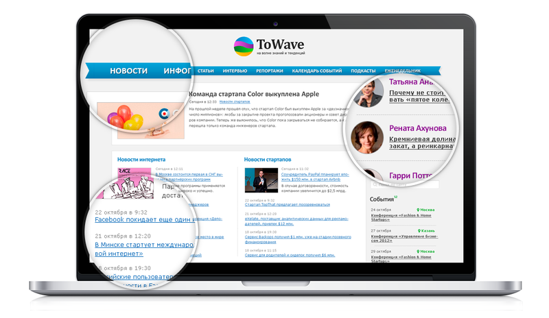
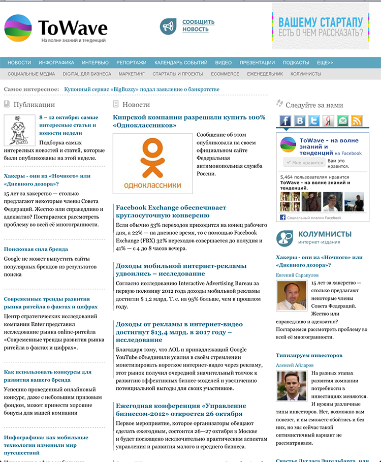
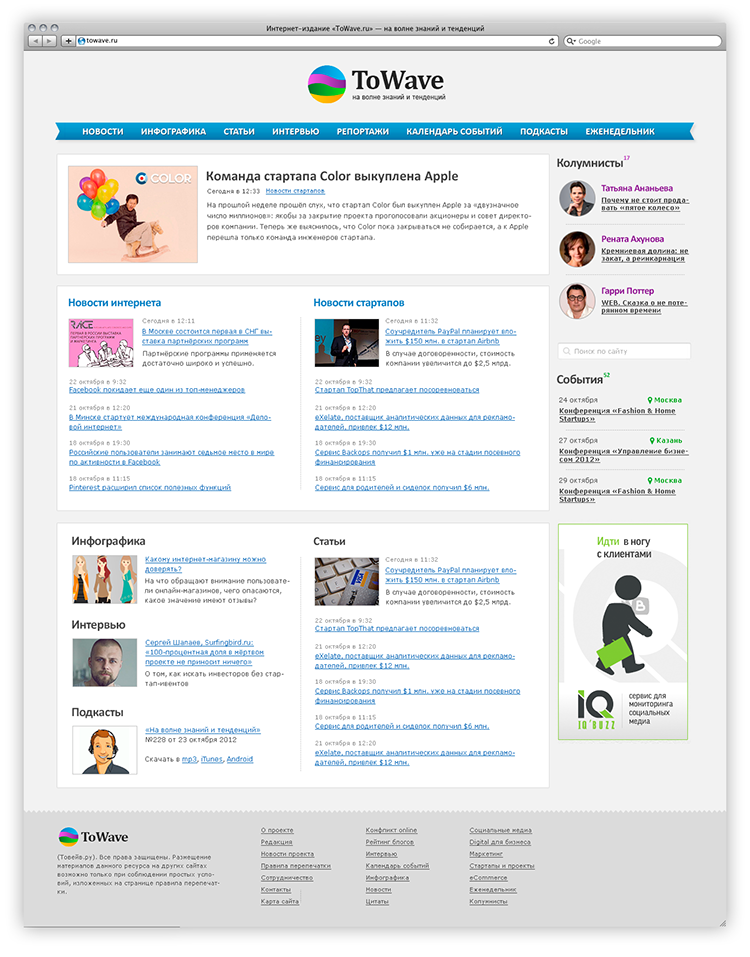
Therefore, I decided to dilute the comments with a visual representation of the design. A big drawback of the old version of the site was the poor readability of news and articles - the greatest value of the resource. In the resulting design, I wanted to reduce the amount of information "garbage" and improve typography (clickable):
')

inturist : When I conceived the competition, I thought that most criticism would be about the content. It is always helpful to hear whether the project is going in that direction. But unexpectedly, the site itself caused more criticism, which was not expected. Moreover, we see it every day! But somehow they were fascinated by the search for the best content delivery and did not notice that the site itself cares about the user no less.
Moreover, the criticism expressed by the design was so badly beat that it could not wait for the completion of the competition and within a day after the first remarks, they began to redo the site little by little. The very idea that we are trying for the readers, and it turns out to be not very comfortable to read, was unbearable.
Well, when we removed the second top menu, additional blocks, and began to edit the layout - Cyril published his design sketch. And it became clear that you need to redo everything and dramatically.
grokru : The contest is over, I won one of the Samsung Galaxy Tab 2 7.0 P3110 8Gb, and the inturist suggested working on the design of the other pages. I had to break my head over the main one: a lot of equivalent content, it was necessary to accurately present it on the page. Here's how the site looked before (there are even earlier screenshots in this habratopic ):
It was necessary to minimize the number of interface elements, visually separate different types of content. The result was this concept (clickable):
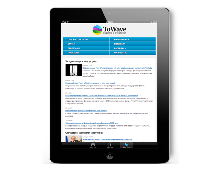
There was a mobile version of the site, but it was decided to make the design responsive. Navigation has been implemented on the basis of technology, which I wrote on Habré not very long ago.

The layout was entrusted to me, so the process could experiment with a different presentation of content on the site. At this stage, added a bit of contrast (this mainly concerned typography). The result was the final version of the redesign of the online publication ToWave.ru .
A small lyrical digression associated with several recent habratopics about the work of a web designer and coder: recently I have been developing a design mainly for the foreign Internet. And that's what's interesting: there is no such confrontation there, because the web-designer is an expert who can design, draw design and typeset in html. You must admit that this is a little different from the ideas of a web designer in RuNet, where it is considered that this profession is purely creative. In general, I write it off on the distinction of mentalities.
Layouts design in full size .
Source: https://habr.com/ru/post/159813/
All Articles