How to make an iPhone app better?
It has long been going to do a parsing of the interfaces and the logic of interaction of some iOS applications. On the one hand, this is a good exercise for me as a designer, on the other hand, suddenly, I’m right in my thoughts, and the developers will listen and improve their creations, even if they are not in this article.
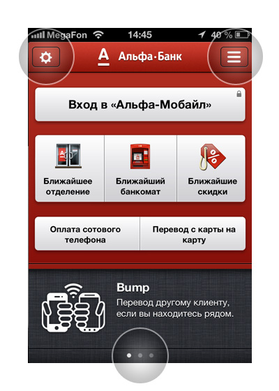
After updating the program to version 3.0, many pleasant solutions have appeared here. For example, the slider, telling about the functions, decorated very discreetly and stylishly.

Also interesting and beautifully implemented the function of the buttons "Settings" and "Advanced." They move the screen left and right, respectively, the same can be done with a swipe. But, when you are in the left menu and choose any sub-item, for example, “Your bank cards”, it moves to the center, it is more logical to do the opposite.

The most inconvenient in this application is the small arrows to switch over the selected period, sometimes it’s impossible to hit them, for such elements it is worthwhile to impose a limit on the minimum object size - for example, 90 pixels.
')
The key function of the application is to add expenses / incomes - for this, the “plus” button serves, it seems to me that it should be placed in the middle in the middle, such as in an instagram and other similar applications, then there will be no problem arising from using the phone with different hands. At the same time, if you hold the phone with your left hand, then you have to reach into this area.

This application is just a pleasure to use. Here is a beautifully implemented slider, which allows the most informative, but does not take up much space. Throughout the application, the fonts are perfectly matched, especially in the toolbar below: narrow and readable.

The “News” button, which brings back, in my opinion, is located in the most logical place for such buttons. Most of the time I use the iPhone with my left hand, but there were no problems with the interaction in this program. Icons in Tab-Bar are very organic and recognizable, economically located without signatures, on the other hand, since there are only three of them, they are not at all crowded.
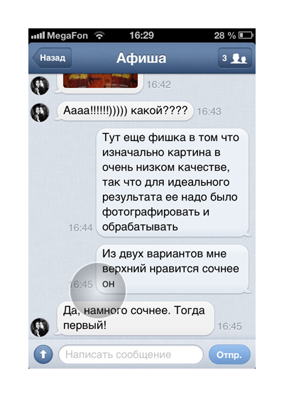
In the new VKontakte application, the dialogues are perfectly implemented, delicate “babbles” with the text skillfully pack the text, the text size and the background color are perfectly matched. But what is missing for most programs where there is correspondence is the preservation of those links, contacts and addresses that were encountered in the dialogues. Often you have to scroll through the whole story, sometimes very far to get to the link that you suddenly needed.

And here the slider is also very appropriately used. The toolbar contains four icons for which you can no longer use signatures. The main button “Write Tweet” is located in the upper right corner, most applications use this particular zone - it's convenient, nothing to say.

Most of all I liked the implementation of the Share button. The icon itself does not cause any associations with its function at all, but how the symbols of social networks pop up is made interesting and non-standard.
In the toolbar again incomprehensible icons and some even out of place. For example, “Settings” or “Help” is better to move to the upper right corner, instead of the “Trailer” button. The light texture would not hurt the background in this window and it would be still good to combine the purchase function and the cost in one button.
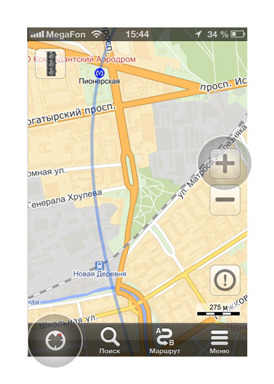
The ideal size of buttons for one-handed control on the go, the translucency of which allows you to work comfortably with the card, but they are not lost. The icon “Determine Location” without a signature, most likely because of a long name, is immediately understandable, but the other icons have quite bright metaphors - they could also be left without names.
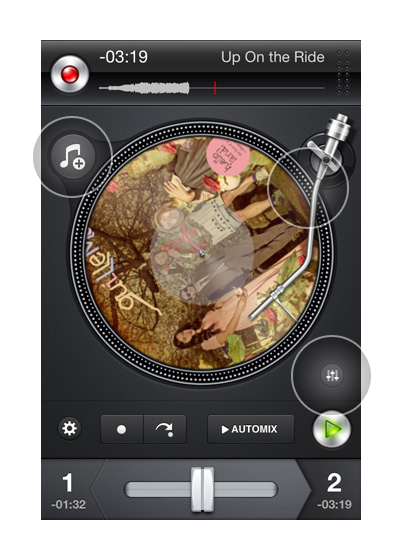
Everything is logical and perfectly implemented. Music track selection button combined with a record is beautiful and convenient. The only "but" is the small settings buttons, but since there is a lot of space around them, it’s pretty easy to get into them.

It is very bad when the application makes the user strain, especially when it is connected with his vision - the small print needs to be increased. While the bottom is a beautiful area in which you can place a hint or an example of a search, or even a slider ...

I still do not understand what the logic is to write a large letter "p" in the price tag, above the price. The button for booking is green: on the one hand, this is good, but on the other, it was worth making it the same color as the price tag in order to link them through the color. It is better to change the color scale of the price tag, repainting it in green.
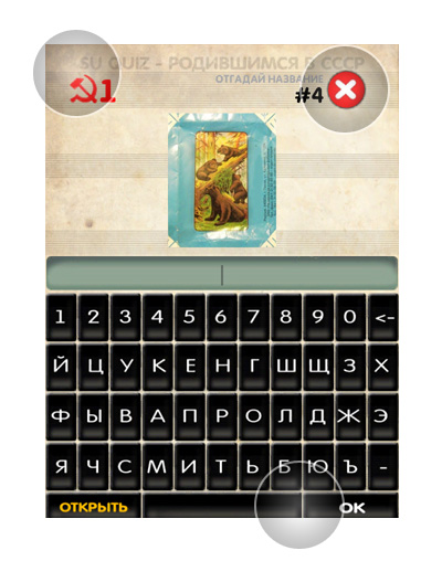
The buttons of the bottom row are very small. The “Open” and “OK” buttons, which play one of the main roles, could be placed next to the input field and arranged as more important buttons.
Red elements from the top constantly distract attention, especially the symbol to close, which is difficult to get used to, firstly, because of the appearance, and secondly, because of its location. It is worth moving to a corner and making it “quiet”, or it can even be replaced with a “Back” or “Menu” button ...
My thoughts will seem obvious to someone, but it seems to me that there will be a benefit from such a small review of good and bad decisions. Ready to discuss controversial issues and explore the topic further.
I posted a review of ten more applications on the Planet iPhone website . If there are developers who are interested in receiving my assessment and criticism of their own application - send, I will try to pay attention.
1. Alfa Bank

After updating the program to version 3.0, many pleasant solutions have appeared here. For example, the slider, telling about the functions, decorated very discreetly and stylishly.

Also interesting and beautifully implemented the function of the buttons "Settings" and "Advanced." They move the screen left and right, respectively, the same can be done with a swipe. But, when you are in the left menu and choose any sub-item, for example, “Your bank cards”, it moves to the center, it is more logical to do the opposite.
2. My expenses

The most inconvenient in this application is the small arrows to switch over the selected period, sometimes it’s impossible to hit them, for such elements it is worthwhile to impose a limit on the minimum object size - for example, 90 pixels.
')
The key function of the application is to add expenses / incomes - for this, the “plus” button serves, it seems to me that it should be placed in the middle in the middle, such as in an instagram and other similar applications, then there will be no problem arising from using the phone with different hands. At the same time, if you hold the phone with your left hand, then you have to reach into this area.
3. The Verge

This application is just a pleasure to use. Here is a beautifully implemented slider, which allows the most informative, but does not take up much space. Throughout the application, the fonts are perfectly matched, especially in the toolbar below: narrow and readable.

The “News” button, which brings back, in my opinion, is located in the most logical place for such buttons. Most of the time I use the iPhone with my left hand, but there were no problems with the interaction in this program. Icons in Tab-Bar are very organic and recognizable, economically located without signatures, on the other hand, since there are only three of them, they are not at all crowded.
4. VKontakte 2

In the new VKontakte application, the dialogues are perfectly implemented, delicate “babbles” with the text skillfully pack the text, the text size and the background color are perfectly matched. But what is missing for most programs where there is correspondence is the preservation of those links, contacts and addresses that were encountered in the dialogues. Often you have to scroll through the whole story, sometimes very far to get to the link that you suddenly needed.
5. Twitter

And here the slider is also very appropriately used. The toolbar contains four icons for which you can no longer use signatures. The main button “Write Tweet” is located in the upper right corner, most applications use this particular zone - it's convenient, nothing to say.
6. MaxiFilm

Most of all I liked the implementation of the Share button. The icon itself does not cause any associations with its function at all, but how the symbols of social networks pop up is made interesting and non-standard.
In the toolbar again incomprehensible icons and some even out of place. For example, “Settings” or “Help” is better to move to the upper right corner, instead of the “Trailer” button. The light texture would not hurt the background in this window and it would be still good to combine the purchase function and the cost in one button.
7. Yandex.Maps

The ideal size of buttons for one-handed control on the go, the translucency of which allows you to work comfortably with the card, but they are not lost. The icon “Determine Location” without a signature, most likely because of a long name, is immediately understandable, but the other icons have quite bright metaphors - they could also be left without names.
8. djay for iPhone

Everything is logical and perfectly implemented. Music track selection button combined with a record is beautiful and convenient. The only "but" is the small settings buttons, but since there is a lot of space around them, it’s pretty easy to get into them.
9. Airbnb

It is very bad when the application makes the user strain, especially when it is connected with his vision - the small print needs to be increased. While the bottom is a beautiful area in which you can place a hint or an example of a search, or even a slider ...

I still do not understand what the logic is to write a large letter "p" in the price tag, above the price. The button for booking is green: on the one hand, this is good, but on the other, it was worth making it the same color as the price tag in order to link them through the color. It is better to change the color scale of the price tag, repainting it in green.
10. USSR logos [ Google Play ]

The buttons of the bottom row are very small. The “Open” and “OK” buttons, which play one of the main roles, could be placed next to the input field and arranged as more important buttons.
Red elements from the top constantly distract attention, especially the symbol to close, which is difficult to get used to, firstly, because of the appearance, and secondly, because of its location. It is worth moving to a corner and making it “quiet”, or it can even be replaced with a “Back” or “Menu” button ...
***
My thoughts will seem obvious to someone, but it seems to me that there will be a benefit from such a small review of good and bad decisions. Ready to discuss controversial issues and explore the topic further.
I posted a review of ten more applications on the Planet iPhone website . If there are developers who are interested in receiving my assessment and criticism of their own application - send, I will try to pay attention.
Source: https://habr.com/ru/post/159545/
All Articles