Convenient interface Habra?

The Habr interface has not undergone any radical changes over the entire period of its existence, but the administration is constantly improving the usability of the site by adding small useful features. I propose a list of some possible improvements and urge the habrovchan to discuss the interface of Habr in the comments.
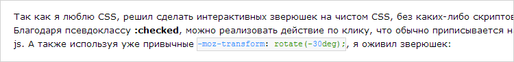
Inline code
The introduction of the source tag has greatly improved the appearance of many topics, but it lacks the simple addition of inline code to the text:
')
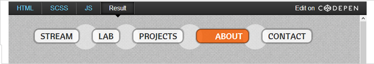
Embed code
Now there are many services that allow you to display a demonstration of the code directly in the text of the article, for example CodePen :
Lightbox
The habrastorage service compresses large images, but it would be great if, when loading a large image, it would produce a finished design with a preview and full size, which would only be added to the topic.
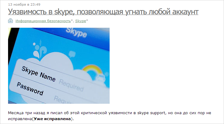
Pictures in the center
This is strange, but now there is no possibility to arrange the image in the center of the content, so some articles look like this:
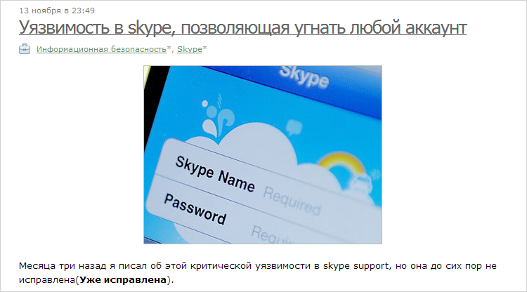
And maybe a little better:
Indentation
When creating a habratopic, many markup elements behave very strangely, for example, the headers (h1-h6) are indented from below, but not from above. In many articles, the text "sticks" to pictures, lists and code, or vice versa, the elements are too far from each other. Here is a simple example:
You can simply "eat" unnecessary line breaks and add the necessary indents.
Additional flags
It’s great that such a thing as flags was introduced on Habré, but there are more different types of materials on the site, for example, you can enter the selection flag:

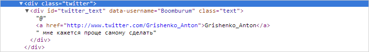
Twitter profile
Now the situation in the profiles is a bit strange: the last tweet is displayed under the nickname, but you can find out the username in the service only by looking at the source code of the block! For example at Boomburum :

Mobile devices
I do not dream of adaptive habr, but reading the topics on the tablet and especially the smartphone would be more convenient if the right sidebar just went below the content without causing extra horizontal scrolls.
And what would you add to this list?
Source: https://habr.com/ru/post/159401/
All Articles