Behind the scenes - Media Query Mario
In this habratopic talk will be about creating a demo Media Query Mario , which was mentioned in the digest Zfort # 30 .
I love every new tech demo that gets to my browser. The fact that people sometimes combine them can blow the brain with its complexity and creativity.
After visiting WebDevConf 2012 in mid-October, I felt the very, sublime inspiration that a good conference gives. Returning from a conference in London, I noticed a tweet about Mozilla Dev Derby, and, still inspired, decided to contribute. The result was a technical demo of Media Query Mario , which is a mixture of media queries, CSS3 animations and HTML5 audio.
Where to begin?
I began to think about the idea, guided by the list of technologies with which I wanted to experiment the most. It seemed to me quite logical to delve into CSS animation for some time and mix them with media queries - the main theme of this Dev Derby. Give CSS control over the animation instead of JavaScript - it sounds good.
')
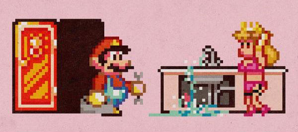
Mario 3 was the first thing that came to mind. I wanted to get a two-dimensional side - scroller , and, since I'm obsessed with retro games, I immediately thought of Mario. Anyone who is not just interested in the games about Mario will understand that Mario 3 was the only possible candidate for the role (if someone disagrees, then I will always have arguments to prove that this is the best two-dimensional Mario).
After the publication of the demo, I was asked, why use CSS animations, when other technologies could be better suited? The main reason is that I just wanted to see what they are capable of. There are many demos that demonstrate the coolness of canvas and SVG, but mine is not intended to promote CSS animations. I just wanted to evaluate their current state, and start a conversation that they also have their own scope.
I limited myself to just one rule in the implementation: use CSS for animation wherever possible. If something could be done with CSS, then I had to do it with it, regardless of performance and complexity of implementation. To what I expected to see performance, I'll be back later.
First press any button.
One of the first problems I encountered was to understand the width of the screen at which the user would view all this. It was important not only when designing the size of the animations, it was important to determine which piece of the level would be shown to the user at a time. The larger the piece is viewed, the more animation you need at a time.
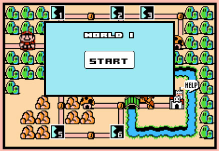
After a little reflection on what Mario 3 was, it seemed to me that it makes sense to use the original menu screen to control it. In addition to being responsible for loading the demo, it will also make sure that the user resized the window before starting the animation. I controlled this with a media request with a condition hiding the start button of the animation:
@media screen and (max-width: 320px), (min-width: 440px) { .startBtn { display:none; } } When planning the animation itself, I wanted to match the original gameplay as much as possible. To make it easier, I found a video of passing a level at a pace that I could repeat. The video helped me to plan the necessary resources and speed of animation, and to reflect on how I would animate various enemies and power-ups.
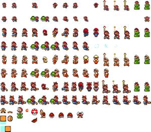
Having finished with the planning of the structure, I just had to get the resources. As expected, it was easy to find original pictures, sprites and sound files from the game on the Internet. On NESMaps and Mario Mayhem, I picked up maps of the level and sprites of characters and objects, and on The Mushroom Kingdom I found suitable sounds. The pictures had to be edited a bit, but they still allowed me to start quickly and well.
Here is what was used further for the animation:
Go!
So, by this time I had a thoughtful idea and suitable resources in my hands, and was already ready to combine them in code.
To begin with, I learned the specifics of CSS animations. Several resources really helped me out. MDN ( Mozilla Developer Network ) is an excellent starting point, which in this case was no exception. I would also recommend that you read any of these wonderful articles by Peter , Chris or David - all of them are a great introduction to the topic.
I will not go deep into the material of these articles, but I will note the key properties that I used myself. For the sake of brevity, I’ll omit all the prefixes, but if you try to repeat something yourself, you don’t need to forget about them, they are necessary for correct operation in various browsers.
A quick note to make: when using new CSS3 features, using a preprocessor like LESS or SASS can make life a lot easier, and I would strongly recommend that you look in their direction. Using mixins hides vendor prefixes and removes them from the code you are working with directly, avoids clutter in the code and saves a lot of time when changing CSS properties globally.
Before we start exploring specific techniques, we need to understand that animation consists of two main parts: animation properties and keyframes associated with it.
Animation properties
An animation can be created using several related properties. Here are the main properties that I used:
// , animation-name: mario-jump; //, , animation-duration: 500ms; // animation-timing-function: ease-in-out; // , animation-delay: 0s; // animation-iteration-count: 1; // animation-fill-mode: forwards; The use of the
animation-fill-mode properties in the demo was especially important, as it tells the animation to apply the final styles at the end of playback. Without this, the element will return to the state in which it was before the animation.For example, if
animation-fill-mode not set when we move the left edge of an object 30px from its original position to 0px, then after the animation it will return to the 0px position. And if fill-mode is forwards , then the element will remain in its final position.Keyframes
The
@keyframes rule allows you to specify animation steps. At its most basic level, this rule can be written as: @keyframes mario-move { from { left:0px; } to { left:200px; } } Where
from and to are keywords for 0% and 100% animation, respectively. To show a more complex example, let's take a look at the code that animates the Mario leap between several platforms: @keyframes mario-jump-sequence { 0% { bottom:30px; left: 445px; } 20% { bottom:171px; left: 520px; } 30% { bottom:138px; left: 544px; } 32% { bottom:138px; left: 544px; } 47% { bottom:228px; left: 550px; } 62% { bottom:138px; left: 550px; } 64% { bottom:138px; left: 550px; } 76% { bottom:233px; left: 580px; } 80% { bottom:253px; left: 590px; } 84% { bottom:273px; left: 585px; } 90% { bottom:293px; left: 570px; } 100% { bottom:293px; left: 570px; } } If the above animation lasts 1 second, Mario will move from the
bottom: 30px; left: 445px; position bottom: 30px; left: 445px; bottom: 30px; left: 445px; in 0 seconds (0% of animation) in the bottom: 138px; left: 520px; position bottom: 138px; left: 520px; bottom: 138px; left: 520px; for the first 200 ms (or 20%). And so on, from the first keyframe to the last.Action animation
Animations from the demo can be divided into three categories according to their type:
- Movements , such as jumping Mario or a coin, popping out of the box with a question.
- Sprites management , i.e. control the background image of characters and objects.
- Looping any animation that you need to repeat a certain number of milliseconds or seconds.
Move
Moving is about 75% of the entire animation of the demo. For example, the movement of the character (running or jumping), the emergence of power-ups and strikes the box with the question. The difference between motion animations is set by the
animation-timing-function , animation-duration and animation-delay properties.The
animation-timing-function property helps control the speed of the animation throughout its duration. Wherever possible, I used easing functions, such as ease-in or ease-in-out , because otherwise I would have to describe each animation step in too much detail. But when it did not help the desired effect, I made the animation-timing-function linear and used key frames to achieve the result I needed.
An example of a moving animation can be seen here .
Sprites
To control the
background-position characters and objects, I used the step-end function: .mario { animation-timing-function: step-end; ... } Initially, I thought that I would need to use JavaScript to control sprites, adding and removing classes from elements. However, after experimenting with
step-end internals, I found the perfect combination.To see this in action, look at the simple animation of Mario's movement and the transformation of Mario after eating a mushroom .
However, using
step-end in this way is not so painless. To my surprise, I found a glitch in webkit, which manifested itself at the intersection of several media queries and made the animation render differently than it was supposed to. I note that this application of CSS animations is a borderline case for the browser's render engine, but it really was a Chromium bug, and I hope that it will be fixed in the future.Looping
Each time the animation should last for some time, the looping was set by setting
animation-iteration-count : // 5 animation-iteration-count: 5; // animation-iteration-count: infinite; An example of this from the demo can serve as the rotation of the fireball .
Thus, of the three types of animation, the whole demo was constructed. The final stage was the voice acting.
Voice acting
Although I previously downloaded all the
.wav sound files I needed, I had to convert them to a format that is available for HTML5 audio - .ogg and .mp3 . I used Switch Audio Convertor (on a Mac) for this, but any other software is perfect.After converting the files, I needed to determine in which format I could give them to the browser. For this, I had to use several JS lines:
var audio = new Audio(); // var canPlayOgg = !!audio.canPlayType && audio.canPlayType('audio/ogg; codecs="vorbis"') !== ""; var canPlayMP3 = !!audio.canPlayType && audio.canPlayType('audio/mp3') !== ""; Then I created a function that set some default parameters for each of the sounds, and also added a suitable extension to the file name.
// function createAudio (audioFile, loopSet) { var tempAudio = new Audio(); var audioExt; //, if (canPlayMP3) { audioExt = '.mp3'; } else if (canPlayOgg) { audioExt = '.ogg'; } tempAudio.setAttribute('src', audioFile + audioExt); //set the source file tempAudio.preload = 'auto'; // //, ( ) tempAudio.loop = (loopSet === true ? true : false); return tempAudio; } var audioMarioJump = createAudio("soundboard/smb3_jump"); // Then it remains only to play sounds at the right time, in sync with the animation. To listen to the
animationstart and animationend events (or in WebKit, webkitAnimationStart and webkitAnimationEnd ), I needed JS. So I learned to catch the moments of the beginning and end of animations, and play the sound suitable for the situation.When the event handler fires, you can access the
animationName property, which we can use as an identifier. mario.addEventListener('animationstart', marioEventListener); function marioEventListener(e) { if (e.animationName === 'mario-jump') { audioMarioJump.play(); } } If you have several
animationstart events for one element (for example, Mario in the demo), you can handle animationName with the help of the switch construction.Since I wrote this demo, I have found that using
Keyframe Event JS shim from Joe Lambert can be oriented to each individual keyframe of the animation, which gives even more control.End of the game
I received more positive feedback about this demo than I ever imagined. As with any other hack (the post is taken from hacks.mozilla.org, approx. Translator ), there is still a lot of work to be done, but I think it would be more important to put everything I learned into my next project. I think the demo showed that CSS animations can be used to create impressive effects by writing really simple code.
Sophisticated CSS animations are already capable of showing good performance, but their creation is still very tiring. Of course, there are tools that simplify the task, such as Adobe Edge Animate and Sencha Animator, but they produce CSS animations wrapped in JS. This is a failure, as for me, since the power of CSS animations is that they can work without relying on other technologies. I'm not sure that there is any way to get around the need to write them manually, but if suddenly someone knows something like that, I would love to know about it in the comments.
Returning to my previous commentary, in which I compared CSS animations using canvas and SVG, I believe that all of them are worthy candidates when choosing technology for animations. However, the sooner the time barrier spent on creating such complex animations falls, the more suitable and relevant places for their application will open in our daily work.
Yes, the animation ends where Mario flies diagonally into space. This is not a bug, but a simple flaw.
Source: https://habr.com/ru/post/159315/
All Articles