Animals on CSS3 transitions & transforms
It's time
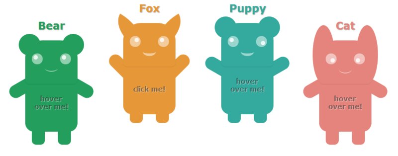
One fine evening I saw one funny picture with such animals and decided to breathe life into them. I decided to do this for the sake of a
Over 65% of users can already see transitions in action.
CSS
Demo Code on jsfiddle
Since I love CSS, I decided to make interactive little animals in pure CSS, without any scripts.
Thanks to the : checked pseudo- class , you can implement a click action, which is usually assigned to js. And also using the already familiar pseudo-classes : hover and : active , I revived the little animals:
.pavepy .body .hand.left, .pavepy:hover .body .hand.right, input:checked + .pavepy .body .hand.right, input:checked + .pavepy:hover .body .hand.left, input:checked + .pavepy.fox .head .ear.right { -webkit-transform: rotate(-30deg); -moz-transform: rotate(-30deg); -ms-transform: rotate(-30deg); -o-transform: rotate(-30deg); transform: rotate(-30deg); } Disclaimer. Some properties I deliberately omitted, so that there was not too much code.
CSS Transitions or they smile!
Despite the impressive browser support for this property without a prefix, I decided to use the full entry with all the prefixes:
.pavepy .head > .nose { width: 30px; height: 15px; top: 55px; border-bottom: 2px solid rgba(255,255,255,.5); border-radius: 50%; margin: 0 auto; position: relative; -webkit-transition: all 0.3s; -moz-transition: all 0.3s; -ms-transition: all 0.3s; -o-transition: all 0.3s; transition: all 0.3s; } .pavepy:hover .head > .nose, input:checked + .pavepy .head > .nose { border-bottom: 6px solid rgba(255,255,255,.5); } Let it be a nose, but they are smiling. Change the thickness of the lower border at a 50% radius. It turns out a very funny effect.
')
CSS Transforms or they wave to us!
Consider the example of the movement of "pens" of our little animals.
When you hover the mouse, the handles should rise 30 degrees from the horizon line. Since the handles are initially lowered (noteworthy, also by 30 degrees), then you do not need to produce extra code, and we simply combine the turning properties for the left hand and right hand when pointing, and the right hand and left hand when pointing:
.pavepy .body .hand.left, .pavepy:hover .body .hand.right { -webkit-transform: rotate(-30deg); -moz-transform: rotate(-30deg); -ms-transform: rotate(-30deg); -o-transform: rotate(-30deg); transform: rotate(-30deg); } Chanterelle ears are similarly turned. There, a rotation of 30 degrees is also chosen, so that a few more lines for the ears are added to the code above.
.pavepy .head > .ear { width: 50px; height: 50px; border-radius: 50%; /* */ } .pavepy.fox .head > .ear { top: -10px; width: 80px; /* , , */ -webkit-transition: all 0.5s; -moz-transition: all 0.5s; -ms-transition: all 0.5s; -o-transition: all 0.5s; transition: all 0.5s; } /* */ .pavepy.fox .head > .ear.left {border-radius: 0 100%; left: -25px;} /* */ .pavepy.fox .head > .ear.right {border-radius: 100% 0; right: -25px;} Jump using: checked
Taking the most common input with type = 'checked' , we can use the pseudo-class: checked
At the clique, I decided that the little animals jump up and freeze there. To do this, using the transitions, I changed the height of the legs, the indentation from the bottom for the little animals.
So that the animal did not fade when you hover the mouse when it is in the: checked state, it was decided to raise the handles a little more: 45 degrees.
To click on the little animals react everywhere, the input was made transparent, and the entire width and height:
.wrapper > ul li input { display: block; opacity: 0; position: absolute; width: 100%; height: 100%; /* */ left: 0; top: 0; } Changing text
Properties opacity , delay in transitions and no magic. There are two text and text1 blocks:
.pavepy .body .text { margin: 0px auto; /* */ padding-top: 35px; position: relative; /* absolute, margin: 0 auto*/ text-align: center; text-shadow: 1px 1px 1px rgba(255, 255, 255, 0.506); width: 80px; z-index: 10; /* */ -webkit-transition: all 0.5s 0.3s; -moz-transition: all 0.5s 0.3s; -ms-transition: all 0.5s 0.3s; -o-transition: all 0.5s 0.3s; transition: all 0.5s 0.3s; } .pavepy:hover .body .text { opacity: 0; /* , */ } .pavepy .body .text2 { margin: -18px auto; /* , */ position: relative; text-align: center; text-shadow: 1px 1px 1px rgba(255, 255, 255, 0.506); width: 80px; z-index: 5; /* , */ opacity: 0; /* - */ -webkit-transition: all 0.5s 1.0s; -moz-transition: all 0.5s 1.0s; -ms-transition: all 0.5s 1.0s; -o-transition: all 0.5s 1.0s; transition: all 0.5s 1.0s; /* delay 1 */ } .pavepy:hover .body .text2 { opacity: 1; } Bugs
I did not spend long hours in installing different versions of browsers, but I still found a few curiosities:
- Opera: in the latest version (12.10), if we return the animals to the ground, the transitions do not work correctly - a jerk happens. In the previous version of Opera, this is not;
- Opera: the psevdlass : active does not work because of problems with the layers: input and div- parent of the animal;
- Chrome: for some reason there is a shake of the rounded edges of the blocks;
- Basically, the flight is normal, in IE10 everything works as smoothly as possible, in Opera it slows down on a weak machine, while Chrome smoothly does everything. Safari also did not let us down.
PS: For the properties opacity, box-shadow, border-radius, text-shadow, I did not prefix it, since unprefixed variations had long been introduced. Transitions without prefixes have been added to Firefox, Opera, and Internet Explorer 10, but more recently.
PS 2: Plans to teach them to make sounds, blink and bring in a more pleasant and unique look.
Source: https://habr.com/ru/post/159161/
All Articles