Designer's letter to layout makers
After reading the next article and comments to it, I was once again convinced that the word “designer” for programmers is synonymous with a good half of the word forms of the “Big Dictionary of Russian Russian Mat”.
In the vastness of this site, in view of the specific audience of the resource, people often like to express their indignation towards the work methods of the beginner “designers”. But you need to understand that a frequent encounter with an unprofessional level of work is due to the low cost of designers chosen for cooperation and a little more than a complete lack of communication between the designer and the techie (the desire "to eat the fish and go to the chandelier").
The designer, who appreciates his time, loves order in his work, paints the folders and names the layers with imputed names, and sometimes even leaves “footnotes in photoshop in difficult to understand places” instantly moves to the next level with the appropriate price tag. And even if finances allow you to use their services - they are not very easy to find, since the ratio between "novice designers" and "layer designers-with-skill-naming" tends to 80% - 20% or even 90% - ten%.
')
In view of the above, and the seething feeling of resentment that overwhelms me, for such a small group of “right designers” who are scribbled with the same designers as dropouts, calling them all with the obscene word “designer” with a touch of bile, I decided to express my point of view on what is happening and write the next letter in the chain for the person receiving the layout from the "right designer" with claims to his account.
Hi <% username>, which is destined to impose my layout!
I know that you are a pro. Most likely you follow the trends in web development, you are interested in frameworks, you practice responsive layout, you read the HTML5 specifications in the toilet, and before going to bed you repeat CSS3 properties in alphabetical order. I also hope that for you the “professional” is the one who thinks in the work on the task not only about himself but also about the people who will work with your brainchild after you and work before you and you value them and your work.
Therefore, out of respect for you and as a recommendation, I want to give you some tips on working with my layout, so that our cooperation will lead us to the expected result, which perhaps we can be proud of in the future.
I know that the layout makers are besy with the layouts in which the banal rules of propriety and care for the neighbor are not followed, with heaps of nameless layers, a complete lack of hierarchy and any logic of distribution of layers in the layout, font sizes not rounded to the whole, etc. About this already written not one article.
Now imagine that designers are just as upset when they see inconsistencies in the sizes, indents, fonts, colors or missing styles / effects on the finished website.
Therefore, I tried to make this layout convenient for your work, I read all thematic articles on Habré, and my homepage in the browser is ilovepsd . And I just ask you to be CAREFUL to all details in the layout. You can call it pixel-perfect or simply “zadrotstvo”, but my job is not only to impose effects on the buttons, but also in many other details understandable to me alone. Therefore, I ask you to make up everything that you see in the layout “as it is” and not to think about the meanings of my work.
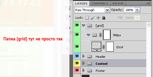
For general convenience, I used the grid / * here the description or name with a link * /, which you will most likely see in the uppermost folder called “grid” in the layers palette.
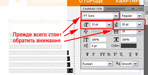
Pay attention to the font used, it is not standard and I attached it in a zip-archive to the letter. And also check the distance between the lines and the size of the main text and several types of headings.
You can immediately set the colors for all text, links, etc. All their views are present on the “File_name.psd” page and are repeated on the entire site, even if I made a mistake somewhere and having missed it with a pipette turned the blue link into a dark blue one.
Please note that shadows and other effects are not standard for me, so if you implement them with a code, check the settings, colors, distances, direction, blur force, etc.
The blocks had round corners that did not appear by chance, just as the font was not accidentally so and aligned on the left side and the color was not accidental either, but for some reason known to me and the customer alone, so don’t lose them either.
Maybe you do not like the color that I used in the layout, or you think that “A and so will come down, at such an angle the shadow looks even better. And I read somewhere that the links should be blue and underlined! ” But let's not waste our professional time on doing someone else's work, and the designer who created this blasphemy will be rewarded according to his merits.
I wish you all the benefits of <% username> and may the day come when designers and techies will live together.
In the vastness of this site, in view of the specific audience of the resource, people often like to express their indignation towards the work methods of the beginner “designers”. But you need to understand that a frequent encounter with an unprofessional level of work is due to the low cost of designers chosen for cooperation and a little more than a complete lack of communication between the designer and the techie (the desire "to eat the fish and go to the chandelier").
The designer, who appreciates his time, loves order in his work, paints the folders and names the layers with imputed names, and sometimes even leaves “footnotes in photoshop in difficult to understand places” instantly moves to the next level with the appropriate price tag. And even if finances allow you to use their services - they are not very easy to find, since the ratio between "novice designers" and "layer designers-with-skill-naming" tends to 80% - 20% or even 90% - ten%.
')
In view of the above, and the seething feeling of resentment that overwhelms me, for such a small group of “right designers” who are scribbled with the same designers as dropouts, calling them all with the obscene word “designer” with a touch of bile, I decided to express my point of view on what is happening and write the next letter in the chain for the person receiving the layout from the "right designer" with claims to his account.
LETTER
Hi <% username>, which is destined to impose my layout!
I know that you are a pro. Most likely you follow the trends in web development, you are interested in frameworks, you practice responsive layout, you read the HTML5 specifications in the toilet, and before going to bed you repeat CSS3 properties in alphabetical order. I also hope that for you the “professional” is the one who thinks in the work on the task not only about himself but also about the people who will work with your brainchild after you and work before you and you value them and your work.
Therefore, out of respect for you and as a recommendation, I want to give you some tips on working with my layout, so that our cooperation will lead us to the expected result, which perhaps we can be proud of in the future.
I know that the layout makers are besy with the layouts in which the banal rules of propriety and care for the neighbor are not followed, with heaps of nameless layers, a complete lack of hierarchy and any logic of distribution of layers in the layout, font sizes not rounded to the whole, etc. About this already written not one article.
Now imagine that designers are just as upset when they see inconsistencies in the sizes, indents, fonts, colors or missing styles / effects on the finished website.
Therefore, I tried to make this layout convenient for your work, I read all thematic articles on Habré, and my homepage in the browser is ilovepsd . And I just ask you to be CAREFUL to all details in the layout. You can call it pixel-perfect or simply “zadrotstvo”, but my job is not only to impose effects on the buttons, but also in many other details understandable to me alone. Therefore, I ask you to make up everything that you see in the layout “as it is” and not to think about the meanings of my work.
GRID
For general convenience, I used the grid / * here the description or name with a link * /, which you will most likely see in the uppermost folder called “grid” in the layers palette.
FONTS
Pay attention to the font used, it is not standard and I attached it in a zip-archive to the letter. And also check the distance between the lines and the size of the main text and several types of headings.
You can immediately set the colors for all text, links, etc. All their views are present on the “File_name.psd” page and are repeated on the entire site, even if I made a mistake somewhere and having missed it with a pipette turned the blue link into a dark blue one.
EFFECTS
Please note that shadows and other effects are not standard for me, so if you implement them with a code, check the settings, colors, distances, direction, blur force, etc.
NO STEP TOWARDS
The blocks had round corners that did not appear by chance, just as the font was not accidentally so and aligned on the left side and the color was not accidental either, but for some reason known to me and the customer alone, so don’t lose them either.
Maybe you do not like the color that I used in the layout, or you think that “A and so will come down, at such an angle the shadow looks even better. And I read somewhere that the links should be blue and underlined! ” But let's not waste our professional time on doing someone else's work, and the designer who created this blasphemy will be rewarded according to his merits.
I wish you all the benefits of <% username> and may the day come when designers and techies will live together.
Source: https://habr.com/ru/post/159141/
All Articles