Types of adaptive layouts
Every day there are more and more websites with adaptive layout. When designing such a design, the first thing that a developer thinks about is a general presentation of content on devices with different screen sizes. In this article I described some types (layouts) of adaptive layouts.
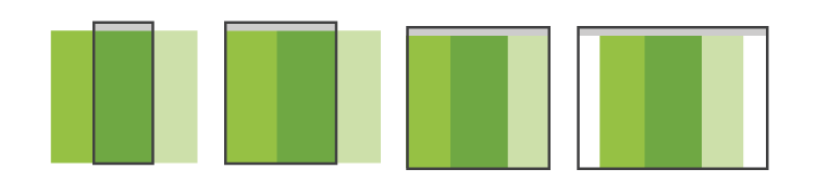
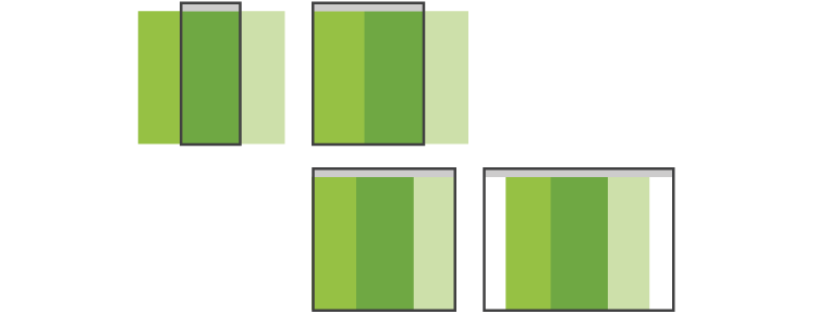
Rubber
Simple to implement and obvious to the user type of content presentation. The main blocks are compressed to the width of the screen of the mobile device, where this is not possible - they are rebuilt into one long tape. This layout is very easy to implement using responsive CSS frameworks, such as Twitter Bootstrap.
')
Examples:
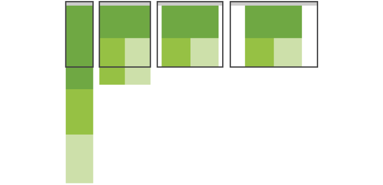
Block transfer
The obvious way for a multi-column site: when reducing the width of the screen, additional blocks (sidebars) are transferred to the bottom of the layout.
Examples:
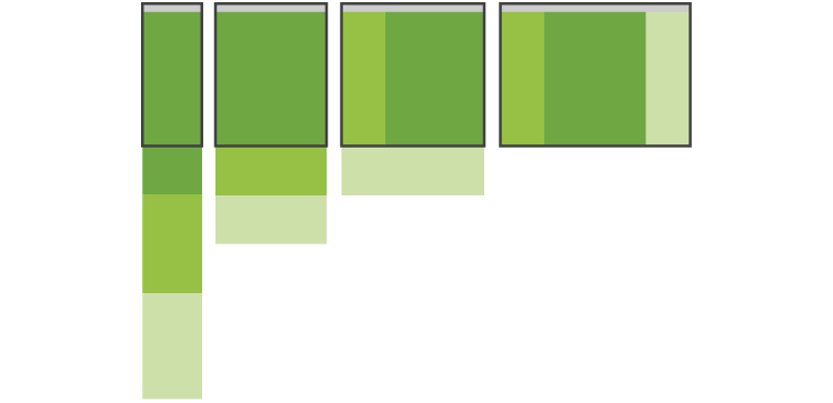
Switch layouts
This method is most convenient when reading a site from various devices: a separate layout is developed for each screen resolution. The method is laborious, therefore, less popular than the previous two.

Examples:
Adaptability "little blood"
A very simple way that is suitable for uncomplicated sites. Achieved by elementary scaling of images and typography. Not very popular, because does not have the flexibility.

Examples:
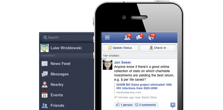
Panels
The way that came from mobile applications, where an additional menu can appear at horizontal or vertical tapes. The main drawback is the non-obviousness of actions for the user: it is very unusual to see mobile navigation on a website. But I think, over time, the method will become quite popular.
An example of panels in a mobile application:
Sample panels on sites:
The models presented above are not universal solutions, for each project it is necessary to choose the most suitable method for the needs and possibilities.
Useful sites:
- mediaqueri.es - gallery adaptive sites
- Blog with the original Luke Wroblewski
- Brad Frost blog
Source: https://habr.com/ru/post/158703/
All Articles