Administration Panel Update
In the days of my youth, I had the opportunity to lead on Habré blogs of some companies, so the knowledge of the "weak points" obtained then was not superfluous when developing new functions. Today we presented to the companies a new administration panel - under the cut I propose to familiarize everyone with it.

This is how the main page of the corporate blog administration panel looked like before:
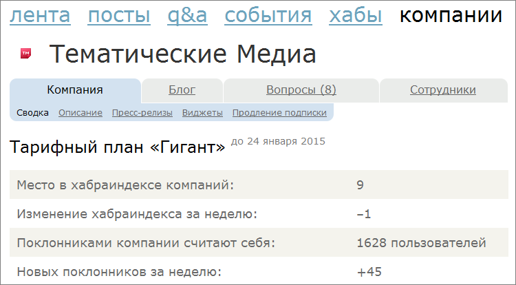
This interface coped with its task, but I still wanted to change something. First of all, the menu of the administration panel itself: the number of possibilities grew and they had to be pushed through the existing horizontal menu by hook or by crook, within which we rested. Secondly, the design: I wanted to update the interface, make it more modern.
')
Therefore, the first thing we did was to abandon the horizontal menu (which is now used on the entire site) in favor of the vertical one, which made it possible to contain all the necessary sections. At the same time, there was a place for new sections that may appear in the future.
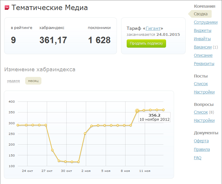
It's no secret that companies start blogs on Habré not because they have nothing to do - everyone sets certain tasks for themselves. To assess the effectiveness (KPI) of these tasks on Habré and before there was enough information, but there is always something to improve. So a simple admin home page has become a more informative flight control center. Now on the main page there is information about the company's position in the rating, its habraindo and the number of subscribers - not only in the form of text values, but also in the form of quite visual graphs (the choice fell on Flotcharts ). Now any manager or marketing manager can enter the admin area and independently assess the dynamics of the company's development on the site: does the rating increase, are its employees trying, etc.
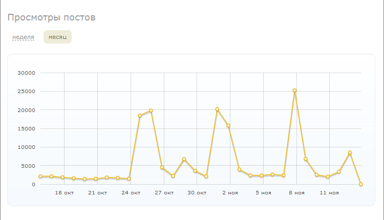
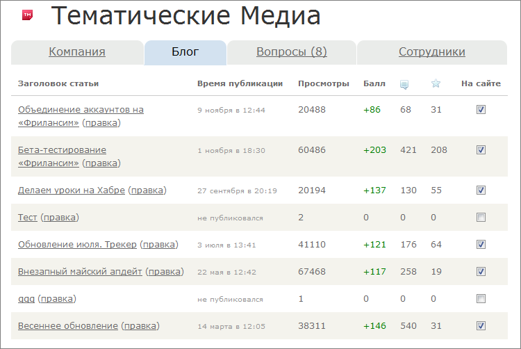
For a quantitative and qualitative assessment of the work, there remained a page with a list of all publications, where all the information necessary for analysis is displayed in a tabular format: who created and published a publication (or draft), how many views it had received, rating, comments, and favorites.
It was:
It became:
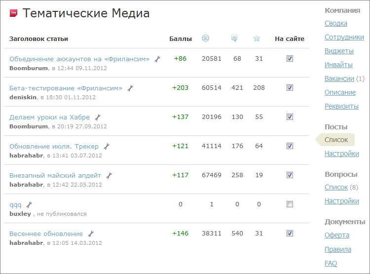
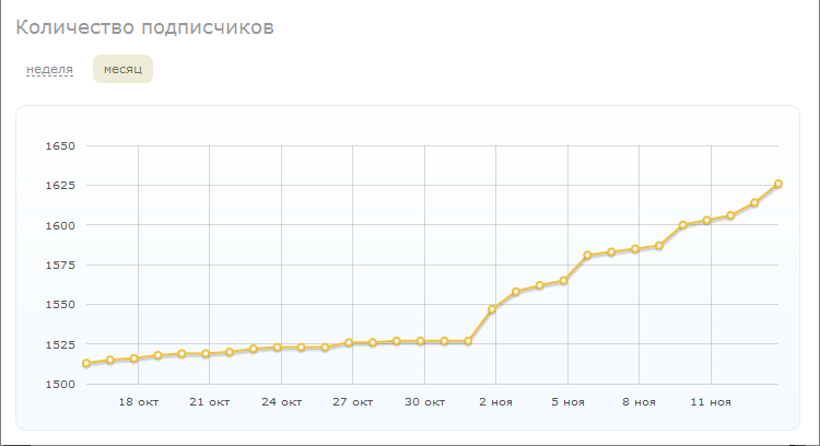
After studying these data after a month or two of work, it becomes easy to adjust the vector of development of the blog: you can immediately see which articles like the public, and which are not very. Later we will try to visualize this information so that everything is even clearer.
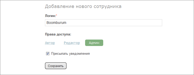
Previously, adding a new author to the company's blog was a ritual. The employee had to indicate that he worked in the company, and the administrator - to assign him the necessary access rights. The problem was that the access rights to the blog were so flexible that many companies confused them. All settings were in a fairly dense plate, to accommodate a new element in which it became impossible.

We have simplified this process. Now all employees are divided into 4 categories: just an employee (a subscriber who indicated that he works in a company, but does not have any access to a blog), a journalist (can only publish to a blog), an editor (can edit all blog publications) and an administrator (omnipotent).

Adding a new employee is implemented by “Sadgest” - you can assign the necessary rights immediately. And in order to always be able to see everyone who has at least some rights, they made a separate page in one place. Separately, they only carried out the setting of system notifications, so that you can turn off notifications for those who should not receive them.
Surely many of you noticed that there are blocks of different design in the right columns of corporate blogs: someone inserted an interactive social networking widget, someone just beautiful pictures with special offers - who is ready for that.

The problem was that, firstly, not everyone knew about these widgets, secondly, not everyone knew what to insert into them and how (previously there was just an html-form), and thirdly, for security reasons We were there all kinds of filters.
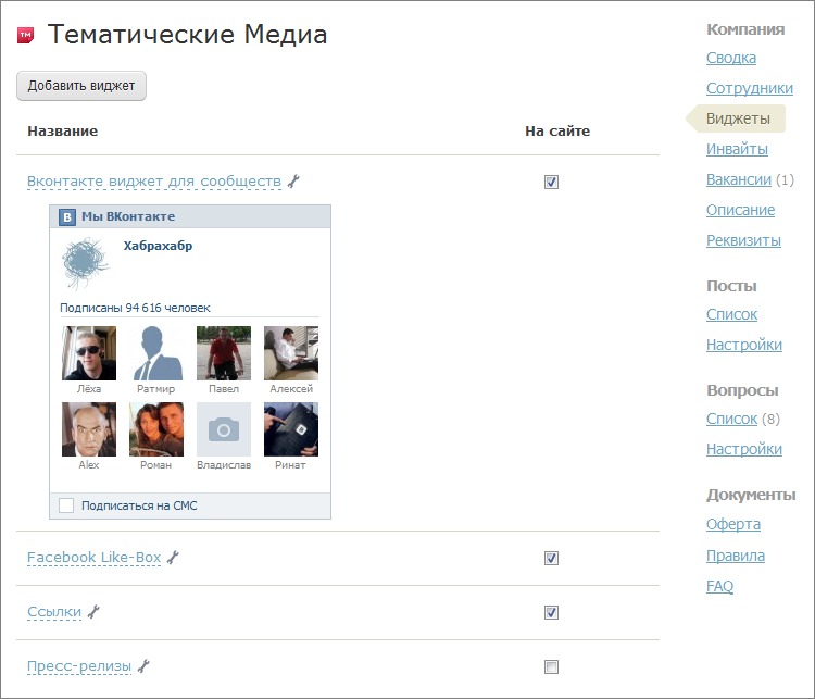
There are 4 standard widgets to choose from: a broadcast of the existing RSS feed, a block of links (to projects, applications, and so on) and two social blocks from Vkontakte and Facebook. If we dealt with a Western resource right away, then we had to dig deeper from VK. The fact is that I wanted to simplify the work of clients as much as possible, so that in the widget settings they only had to insert a link to the community (with an alias, such as vk.com/habr ), which will be the basis of the widget content. But in the constructor of the community widgets, you have to use not the alias, but the community ID, which not everyone knows how to find. And there was no “converter” between the alias and the ID.
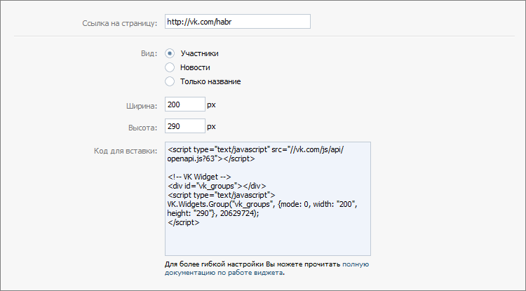
Developers of Vkontakte came to the rescue, who made a new method for the API, thanks to which it became possible to use both the group name and its identifier.
Now if you activate all the widgets, the right column of the site will be in the same style - clean and neat. Moreover, the tariff plans "Business" and "Giant" still have the ability to add arbitrary widgets.
As you know, our company has a project "Huntim", where only the most interesting IT-vacancies live. When buying a corporate blog, each company receives a certain amount of “cartridges” for hunting. Now, if the company has a blog on the site, jobs with “Huntim” will be translated into it. You can find out about vacancies in a particular company without leaving Habra.
By the way, if earlier everything was limited to a simple translation of vacancies into blocks in the right column, now thematic targeting has appeared: an illustrator's vacancy is unlikely to appear in the PHP hub, and a NGINX guru's vacancy in the hub about sound processing. In addition to the offers of a permanent job from “Khantim”, a block of proposals appeared with remote work from our new project “Freelance”. So look more often at these blocks - there would be a desire to work, but there will be work!
Initially, this function worked in manual mode and with pre-moderation. We were worried about the fact that companies “broke wood” and made the appearance of the site (albeit within one blog) unrecognizable. Very soon, our clients "reassured" and we gave them the opportunity to change everything on their own. Now the branding function of the corporate blog has come up to a new level: companies have the opportunity to create templates, switching between which is carried out in a couple of clicks. In the event that the New Year theme of the design could be activated in one click, to the chiming clock. There can be as many templates as you like: for “every day”, for promotions and special offers, for all seasons, holidays and different phases of the moon.

I wanted to do exactly as the designer drew, namely, with vivid sketches of templates, and not with textual names, as originally planned. After a long search, we stopped at the url2png service, which allows us to take the necessary screenshots of the page.
Examples of branded blogs (clickable):


The rest of the little things are related only to the companies themselves, from which we still accept proposals for improving the service.
Well, if you, dear username, have read this far, then there is one nice little thing for you too: there is a citation button in the form of writing comments, so you don’t need to remember how to write
Successes.
This is how the main page of the corporate blog administration panel looked like before:
This interface coped with its task, but I still wanted to change something. First of all, the menu of the administration panel itself: the number of possibilities grew and they had to be pushed through the existing horizontal menu by hook or by crook, within which we rested. Secondly, the design: I wanted to update the interface, make it more modern.
')
Therefore, the first thing we did was to abandon the horizontal menu (which is now used on the entire site) in favor of the vertical one, which made it possible to contain all the necessary sections. At the same time, there was a place for new sections that may appear in the future.
Dashboard
It's no secret that companies start blogs on Habré not because they have nothing to do - everyone sets certain tasks for themselves. To assess the effectiveness (KPI) of these tasks on Habré and before there was enough information, but there is always something to improve. So a simple admin home page has become a more informative flight control center. Now on the main page there is information about the company's position in the rating, its habraindo and the number of subscribers - not only in the form of text values, but also in the form of quite visual graphs (the choice fell on Flotcharts ). Now any manager or marketing manager can enter the admin area and independently assess the dynamics of the company's development on the site: does the rating increase, are its employees trying, etc.
For a quantitative and qualitative assessment of the work, there remained a page with a list of all publications, where all the information necessary for analysis is displayed in a tabular format: who created and published a publication (or draft), how many views it had received, rating, comments, and favorites.
It was:
It became:
After studying these data after a month or two of work, it becomes easy to adjust the vector of development of the blog: you can immediately see which articles like the public, and which are not very. Later we will try to visualize this information so that everything is even clearer.
Employees
Previously, adding a new author to the company's blog was a ritual. The employee had to indicate that he worked in the company, and the administrator - to assign him the necessary access rights. The problem was that the access rights to the blog were so flexible that many companies confused them. All settings were in a fairly dense plate, to accommodate a new element in which it became impossible.
We have simplified this process. Now all employees are divided into 4 categories: just an employee (a subscriber who indicated that he works in a company, but does not have any access to a blog), a journalist (can only publish to a blog), an editor (can edit all blog publications) and an administrator (omnipotent).
Adding a new employee is implemented by “Sadgest” - you can assign the necessary rights immediately. And in order to always be able to see everyone who has at least some rights, they made a separate page in one place. Separately, they only carried out the setting of system notifications, so that you can turn off notifications for those who should not receive them.
Widgets
Surely many of you noticed that there are blocks of different design in the right columns of corporate blogs: someone inserted an interactive social networking widget, someone just beautiful pictures with special offers - who is ready for that.
The problem was that, firstly, not everyone knew about these widgets, secondly, not everyone knew what to insert into them and how (previously there was just an html-form), and thirdly, for security reasons We were there all kinds of filters.
There are 4 standard widgets to choose from: a broadcast of the existing RSS feed, a block of links (to projects, applications, and so on) and two social blocks from Vkontakte and Facebook. If we dealt with a Western resource right away, then we had to dig deeper from VK. The fact is that I wanted to simplify the work of clients as much as possible, so that in the widget settings they only had to insert a link to the community (with an alias, such as vk.com/habr ), which will be the basis of the widget content. But in the constructor of the community widgets, you have to use not the alias, but the community ID, which not everyone knows how to find. And there was no “converter” between the alias and the ID.
Developers of Vkontakte came to the rescue, who made a new method for the API, thanks to which it became possible to use both the group name and its identifier.
http://api.vk.com/method/groups.getById?gid=team&callback=jsonpCallback Now if you activate all the widgets, the right column of the site will be in the same style - clean and neat. Moreover, the tariff plans "Business" and "Giant" still have the ability to add arbitrary widgets.
Jobs
As you know, our company has a project "Huntim", where only the most interesting IT-vacancies live. When buying a corporate blog, each company receives a certain amount of “cartridges” for hunting. Now, if the company has a blog on the site, jobs with “Huntim” will be translated into it. You can find out about vacancies in a particular company without leaving Habra.
By the way, if earlier everything was limited to a simple translation of vacancies into blocks in the right column, now thematic targeting has appeared: an illustrator's vacancy is unlikely to appear in the PHP hub, and a NGINX guru's vacancy in the hub about sound processing. In addition to the offers of a permanent job from “Khantim”, a block of proposals appeared with remote work from our new project “Freelance”. So look more often at these blocks - there would be a desire to work, but there will be work!
Branding
Initially, this function worked in manual mode and with pre-moderation. We were worried about the fact that companies “broke wood” and made the appearance of the site (albeit within one blog) unrecognizable. Very soon, our clients "reassured" and we gave them the opportunity to change everything on their own. Now the branding function of the corporate blog has come up to a new level: companies have the opportunity to create templates, switching between which is carried out in a couple of clicks. In the event that the New Year theme of the design could be activated in one click, to the chiming clock. There can be as many templates as you like: for “every day”, for promotions and special offers, for all seasons, holidays and different phases of the moon.
I wanted to do exactly as the designer drew, namely, with vivid sketches of templates, and not with textual names, as originally planned. After a long search, we stopped at the url2png service, which allows us to take the necessary screenshots of the page.
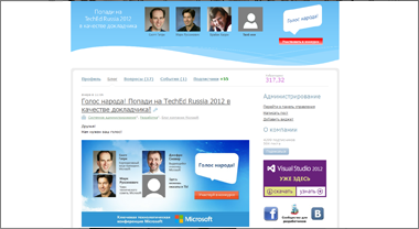
Examples of branded blogs (clickable):
The rest of the little things are related only to the companies themselves, from which we still accept proposals for improving the service.
Well, if you, dear username, have read this far, then there is one nice little thing for you too: there is a citation button in the form of writing comments, so you don’t need to remember how to write
blockquote :) Quote on health!Successes.
Source: https://habr.com/ru/post/158621/
All Articles