WPF: Custom Window
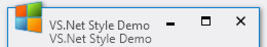
The other day, after a long break, it was necessary to work on WPF, and there was a desire to replace the annoying standard Windows 7 windows with something more inspiring, say in the style of Visual Studio 2012:

I didn’t want to switch to Windows 8 for the sake of this, as well as add links to metro-like libraries to projects and deal with them - this will be the next step. In the meantime, it was interesting to spend the evening and achieve such a result with minimal changes to the working code. Looking ahead, I’ll say that the result, as planned, turned out to be pretty clear: a fragment of the following code, with the exception of a few attributes omitted for clarity, this is the window from the first screenshot. All changes are limited to the task of style.
')
 Then I will focus on key points and pitfalls when creating a window style. The demo project is available on github , if you want to explore the source yourself or just use this style without going into details.
WPF does not work with the NC area. NC, also known as the “Non-client area”, also known as the “non-client part”, also known as chrome, is processed at a lower level. If you wanted to change any of the window elements - a border, an icon, a title or a button, then the first advice that comes up during the search is to remove the window style and redo everything yourself. Entirely.
In the entire history of the development of WPF, little has changed in this respect. Fortunately, I had the source code from Alex Yakhnin's old post on Office 2007 styling, which he wrote while working on a demo project to popularize WPF for Microsoft, so I did not threaten to start from scratch.
 As a result, we need to get one style, and if possible, without additional controls: in the XAML project tree, the style code is located in the CustomizedWindow directory, and the main window is in the project root.
I wanted to avoid adding new libraries to the project, but to keep the ability to easily transfer the style to another application, which determined such a structure.
The style for a window, like for any other control in WPF, is set using the ControlTemplate. The contents of the window will be shown by the ContentPresenter, and the functionality that is easier to do in the c # code will be connected via the x: Class attribute in the ResourceDictionary. Everything is very standard for XAML.
Immediately, we define the window control buttons in the Studio 2012 style. This will be the only additional global style in case later there is a desire to use such buttons in the application.
We need the functionality of a regular button, but with very primitive rendering - in fact, only the background and the content.
The images on the buttons are most easily done “in vector”. For example, maximize looks like this:
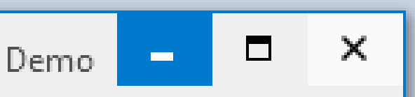
For the title text we use the standard font Segoe UI. The only feature here is to make sure that the text is drawn without blurring, otherwise the window title will look ... it will look bad - as in the second line in the screenshot.
By the way, for the Path on the buttons EdgeMode = "Aliased" was used for the same purpose, and
For text in WPF 4+, the long-awaited opportunity to indicate that it will be displayed on the display, and not on the “ideal device,” has appeared, which made it possible to achieve acceptable clarity on our non-ideal screens.
Another interesting feature associated with the "geometry of Windows 7" when opening the window to full screen. Windows cheats, scaling the window so that the entire border goes beyond the edge of the screen, leaving only the client part of the window on the monitor. Naturally, Windows does not draw the border anymore and for standard windows everything works as expected. WPF does not work at all and, for windows like us, there is a risk of losing a part of the image or starting drawing on a nearby monitor if it is connected.
The remaining details are less significant, but if you're interested, welcome to the source .
In addition to the reaction to the buttons and icon, the window should move and resize when dragging by the title, by the edges and corners. It is easiest to set the corresponding hot zones using invisible controls. An example for the upper left (northwest) corner.
With the presence of the Class attribute in the resources, the methods of this class can be simply called by name as usual event handlers, which we used. The handlers themselves, such as MinButtonClick and OnSizeNorthWest, look something like this:
DragSize then calls WinAPI ( source ) and causes Windows to go into window resizing mode as before the pre-Net times.
If you wish, you can use WindowChrome on .Net 4.0, but you will have to add additional libraries, such as WPFShell (thanks to afsherman for the hint).
Almost done. Set up triggers to control interface changes when a window changes state. Let's go back to XAML and, for example, force StatusBars to change color depending on the Window.IsActive value.
Please note that this style does not affect the window of the window, but on the controls placed in our window. Remember the very first piece with custom code?
This is the style of this StatusBar that we have set now. If desired, and the time, you can also set the style for other classes of controls, for example, correct the ScrollBar so that it also matches the desired style. But this will be an exercise for the next free evening.
Everything. It remains for us to only connect the style to the project via application resources:
And you can use it in any window.

- D.
PS Once again, the link to the source code on github for those who immediately scrolled down for her.
I didn’t want to switch to Windows 8 for the sake of this, as well as add links to metro-like libraries to projects and deal with them - this will be the next step. In the meantime, it was interesting to spend the evening and achieve such a result with minimal changes to the working code. Looking ahead, I’ll say that the result, as planned, turned out to be pretty clear: a fragment of the following code, with the exception of a few attributes omitted for clarity, this is the window from the first screenshot. All changes are limited to the task of style.
')
December 3 update: an alternative implementation has been added to the repository using new classes in .Net 4.5 (WindowChrome.Demo project), which allowed to avoid a significant part of native programming with WinAPI.
<Window ... Style="{StaticResource VS2012WindowStyle}"> <DockPanel> <StatusBar> <TextBlock>Ready</TextBlock> <StatusBarItem HorizontalAlignment="Right"> <ResizeGrip /> </StatusBarItem> </StatusBar> <TextBox Text="Hello, world!" /> </DockPanel> </Window> Main problem
WPF does not work with the NC area. NC, also known as the “Non-client area”, also known as the “non-client part”, also known as chrome, is processed at a lower level. If you wanted to change any of the window elements - a border, an icon, a title or a button, then the first advice that comes up during the search is to remove the window style and redo everything yourself. Entirely.
<Window AllowsTransparency="true" WindowStyle="None"> ... In the entire history of the development of WPF, little has changed in this respect. Fortunately, I had the source code from Alex Yakhnin's old post on Office 2007 styling, which he wrote while working on a demo project to popularize WPF for Microsoft, so I did not threaten to start from scratch.
As a result, we need to get one style, and if possible, without additional controls: in the XAML project tree, the style code is located in the CustomizedWindow directory, and the main window is in the project root.I wanted to avoid adding new libraries to the project, but to keep the ability to easily transfer the style to another application, which determined such a structure.
Create a style
The style for a window, like for any other control in WPF, is set using the ControlTemplate. The contents of the window will be shown by the ContentPresenter, and the functionality that is easier to do in the c # code will be connected via the x: Class attribute in the ResourceDictionary. Everything is very standard for XAML.
<ResourceDictionary x:Class="Whush.Demo.Styles.CustomizedWindow.VS2012WindowStyle"> <Style x:Key="VS2012WindowStyle" TargetType="{x:Type Window}"> <Setter Property="Template"> <Setter.Value> <ControlTemplate TargetType="{x:Type Window}"> <!-- XAML , --> <ContentPresenter /> <!-- XAML --> </ControlTemplate> </Setter.Value> </Setter> </Style> </ResourceDictionary> Immediately, we define the window control buttons in the Studio 2012 style. This will be the only additional global style in case later there is a desire to use such buttons in the application.
We need the functionality of a regular button, but with very primitive rendering - in fact, only the background and the content.
Button style xaml
<Style x:Key="VS2012WindowStyleTitleBarButton" TargetType="{x:Type Button}"> <Setter Property="Focusable" Value="false" /> <Setter Property="Template"> <Setter.Value> <ControlTemplate TargetType="{x:Type Button}"> <Grid> <Border x:Name="border" Background="Transparent" /> <ContentPresenter /> </Grid> <ControlTemplate.Triggers> <Trigger Property="IsMouseOver" Value="True"> <Setter TargetName="border" Property="Background" Value="#FFF" /> <Setter TargetName="border" Property="Opacity" Value="0.7" /> </Trigger> <Trigger Property="IsPressed" Value="True"> <Setter TargetName="border" Property="Background" Value="{StaticResource VS2012WindowBorderBrush}"/> <Setter TargetName="border" Property="Opacity" Value="1" /> <Setter Property="Foreground" Value="#FFF"/> </Trigger> </ControlTemplate.Triggers> </ControlTemplate> </Setter.Value> </Setter> </Style> The images on the buttons are most easily done “in vector”. For example, maximize looks like this:
<Path StrokeThickness="1" RenderOptions.EdgeMode="Aliased" Data="M0,0 H8 V8 H0 V0 M0,1 H8 M0,2 H8" /> For the title text we use the standard font Segoe UI. The only feature here is to make sure that the text is drawn without blurring, otherwise the window title will look ... it will look bad - as in the second line in the screenshot.
By the way, for the Path on the buttons EdgeMode = "Aliased" was used for the same purpose, and
For text in WPF 4+, the long-awaited opportunity to indicate that it will be displayed on the display, and not on the “ideal device,” has appeared, which made it possible to achieve acceptable clarity on our non-ideal screens.
<TextBlock TextOptions.TextRenderingMode="ClearType" TextOptions.TextFormattingMode="Display" > ... Another interesting feature associated with the "geometry of Windows 7" when opening the window to full screen. Windows cheats, scaling the window so that the entire border goes beyond the edge of the screen, leaving only the client part of the window on the monitor. Naturally, Windows does not draw the border anymore and for standard windows everything works as expected. WPF does not work at all and, for windows like us, there is a risk of losing a part of the image or starting drawing on a nearby monitor if it is connected.
The remaining details are less significant, but if you're interested, welcome to the source .
Animate the window
.Net 4.0
In addition to the reaction to the buttons and icon, the window should move and resize when dragging by the title, by the edges and corners. It is easiest to set the corresponding hot zones using invisible controls. An example for the upper left (northwest) corner.
<Rectangle x:Name="rectSizeNorthWest" MouseDown="OnSizeNorthWest" Cursor="SizeNWSE" Fill="Transparent" VerticalAlignment="Top" HorizontalAlignment="Left" Width="5" Height="5" /> With the presence of the Class attribute in the resources, the methods of this class can be simply called by name as usual event handlers, which we used. The handlers themselves, such as MinButtonClick and OnSizeNorthWest, look something like this:
void MinButtonClick(object sender, RoutedEventArgs e) { Window window = ((FrameworkElement)sender).TemplatedParent as Window; if (window != null) window.WindowState = WindowState.Minimized; } void OnSizeNorthWest(object sender) { if (Mouse.LeftButton == MouseButtonState.Pressed) { Window window = ((FrameworkElement)sender).TemplatedParent as Window; if (window != null && window.WindowState == WindowState.Normal) { DragSize(w.GetWindowHandle(), SizingAction.NorthWest); } } } DragSize then calls WinAPI ( source ) and causes Windows to go into window resizing mode as before the pre-Net times.
.Net 4.5
In 4.5, the convenient classes SystemCommands and WindowChrome appeared . When added to a window, WindowChrome takes over the functions of changing the size, position, and state of the window, leaving us with more “global” problems. <Setter Property="WindowChrome.WindowChrome"> <Setter.Value> <WindowChrome NonClientFrameEdges="None" GlassFrameThickness="0" ResizeBorderThickness="7" CaptionHeight="32" CornerRadius="0" /> </Setter.Value> </Setter> If you wish, you can use WindowChrome on .Net 4.0, but you will have to add additional libraries, such as WPFShell (thanks to afsherman for the hint).
Almost done. Set up triggers to control interface changes when a window changes state. Let's go back to XAML and, for example, force StatusBars to change color depending on the Window.IsActive value.
XAML for StatusBar
<Style.Resources> <Style TargetType="{x:Type StatusBar}"> <Style.Triggers> <DataTrigger Value="True" Binding="{Binding IsActive, RelativeSource={RelativeSource AncestorType=Window}}"> <Setter Property="Foreground" Value="{StaticResource VS2012WindowStatusForeground}" /> <Setter Property="Background" Value="{StaticResource VS2012WindowBorderBrush}" /> </DataTrigger> <DataTrigger Value="False" Binding="{Binding IsActive, RelativeSource={RelativeSource AncestorType=Window}}" > <Setter Property="Foreground" Value="{StaticResource VS2012WindowStatusForegroundInactive}" /> <Setter Property="Background" Value="{StaticResource VS2012WindowBorderBrushInactive}" /> </DataTrigger> </Style.Triggers> </Style> </Style.Resources> Please note that this style does not affect the window of the window, but on the controls placed in our window. Remember the very first piece with custom code?
<Window ... Style="{StaticResource VS2012WindowStyle}"> ... <StatusBarItem HorizontalAlignment="Right"> ... </Window> This is the style of this StatusBar that we have set now. If desired, and the time, you can also set the style for other classes of controls, for example, correct the ScrollBar so that it also matches the desired style. But this will be an exercise for the next free evening.
Putting it all together
Everything. It remains for us to only connect the style to the project via application resources:
<Application ... StartupUri="MainWindow.xaml"> <Application.Resources> <ResourceDictionary> <ResourceDictionary.MergedDictionaries> <ResourceDictionary Source="Styles/CustomizedWindow/VS2012WindowStyle.xaml" /> </ResourceDictionary.MergedDictionaries> </ResourceDictionary> </Application.Resources> </Application> And you can use it in any window.
- D.
PS Once again, the link to the source code on github for those who immediately scrolled down for her.
Source: https://habr.com/ru/post/158561/
All Articles