How to succeed with your mobile app
Most applications fail. This cruel reality leads many frustrated developers to the conclusion, often subconsciously, that succeeding in the App Store is the same as getting rich on a gold rush: you have to be damn lucky.
The idea of "good luck" is a dangerous sedative that alleviates the pain of failure. And pain is a good thing. It shows that something is going wrong. If my application crashes, I want to know why . Instead of blaming the universe, why not see what the guys from tap tap tap and Tapbots do in order to achieve success again and again.
')
Despite the fact that the perfect adherence to this formula is impossible, work in this direction will dramatically increase your chances of success. These principles are developed for iOS, but many of them can be applied to other platforms.
Any successful application has a foundation for a whole idea, since it is the idea that determines the ultimate potential for success. Avoid the temptation to immediately rush to implement ideas after an insight during a shower. A little research in advance can save you many future problems.
Phill Ryu ( @phillryu ) has in the portfolio an impressive list of top applications: Clear, The Heist and Classics, in brief. His secret of testing ideas for strength is quite simple: find a niche . The App Store hides many niches for applications in quality, UX and innovation. Niches are good because they by nature tend to be filled. Here are a couple of examples:

Clear : among thousands of to-do applications, Clear fills the innovation area in the interface. Entering into an already overcrowded category looks illogical, but the largest categories have the greatest prospects if you can be an innovator in it.
Tweetbot : Twitter bought Tweetie and simplified it in order to please the majority. And Tweetbot has filled a niche in the field of full-featured use of Twitter.
iTranslate Voice : The release of Siri has intrigued the world, instantly creating niches for applications that are similar to Siri's behavior, but offer different functionality. Each new technology brings with it new niches.
Of course, the fruits that hang low are already all torn off, but there are still a lot of empty niches, especially in terms of design. Find a niche for yourself and fill it.
Most applications do not make money. If income is important to you, it is not worth figuring out which applications are profitable and which are not. Based on the theory of the two Marco Arment aprons, I assume that three categories of applications are profitable, and one is not.
Hit applications:
Examples: Clear ($ 3) and iTranslate ($ 1).
Niche Premium Applications:
Examples: OmniFocus ($ 10) and Proloquo2Go ($ 190).
Top premium apps:
Examples: TomTom GPS ($ 50), Pandora ($ 3.99 monthly subscription), and freemium games that achieve great benefits per user at the expense of add-ons and credits.
Most failed apps:
Developers read inspirational stories of millionaires who have earned on applications, look at the amazing number of devices that are sold every day, and start over-the-top optimistic forecasts for their relatively ordinary applications. They conclude that if they can grab at least a piece of the market, they can sell their application for $ 0.99 and get rich.
But this does not work. The ruthless reality strikes a crushing blow on the very first day of sales, when the application is downloaded only six times, and then mostly friends and households. But her hands and itched to bring to life the idea of the application, but it was too unoriginal to become a hit.
Your application idea may also fall under this category. Do not lose sight of this.
Creating a profitable application is difficult . David Barnard, the Cubby App's brilliant mind, suggests that future income items can rely on pure freemium , setting a value based on the impression made. Generate a large number of downloads and creatively find ways to give highly valued users the opportunity to pay more. This type of creative monetization is almost not tested on non-gaming applications, but this is what makes this industry so exciting.
I literally mean: write something down. Obkromsayte your idea to the core, and in one sentence convey the essence of your application and its market orientation. Apple does this for its own applications and you should do the same.
For example:
After you decide on the essence of the application, try on the ideas of possible features on it and discard the superfluous.
Apple culture revolves around superior design. And the fact that Apple demonstrations are always well made is not a coincidence. Design is the most important part of creating a successful application.
Like websites, applications are easily accessible. If the application does not instantly make it clear what it is necessary for, the user will not experience great remorse when removing it. The title of the popular Steve Krug book embraces our challenge as usability designers: do not make me think. Like a well-designed door handle, the interface itself fully explains its purpose.
Several abstracts in this direction:
Hit the bull's eye
Every cool feature adds complexity to the application. Polish the application, screens and even the elements on each screen to shine. Good design is more about saying “No” to good ideas, rather than generating them.
The to-do list application on the left allows cool features to get in the way of the main destination.
Consider UI conventions
Users have certain expectations about how the behavior of the interface should relate to the principles of their operating system and the main applications used daily. Pay attention to UI agreements ( iOS Human Interface Guidelines , Android User Interface Guidelines ) and be sure you understand them before you ignore them.
Think like a human being
Users in the head have certain patterns of what is happening in the world. Do not design based on database restrictions or programming, but rely on how users think about their surroundings.

Don't make me work
Users are lazy. They do not want to read the instructions and hate typing. The best applications provide the absolute minimum necessary for the functioning of the application user actions.

Do Usability Testing
Do not be intimidated by target tracking and focus groups. Do everything in your power! Usually problems with usability manifest themselves, simply by presenting the interface to several potential users. Ask a few questions (“what do you think, what does this application do? How do you accomplish task X?”), And watch them. Do this immediately and often throughout the entire design and development process.
A welcome opening animation in Weightbot , a comedic copy at Everyday , increasing satisfaction when you cross over Clear ; by providing little benefit, these little things elicit a powerful emotional response . These applications show individuality. You either love or hate them, but you definitely don’t forget them and most likely share them.
Convenience is not enough now. The best apps go a long way in creating to start paying attention to the little things that make the app amazing. Simon Schmid has written a comprehensive guide to emotional design , but here are a few of the initial theses applicable to applications:
Appearance matters
Beautiful apps sell better, deliver more fun to use, and leave the impression more useful than inconspicuous. While beauty may lie in rich gradients, textures and shadows, try to bring a touch of elegance, simplicity and taste. Use schemorphism (an interface that copies physical objects) only when it helps to solve problems, and not distract. If you are unfamiliar with the basic principles of graphic design, the design book for non-designers Robin Williams is a good starting point.
Experiment with sound.
Sound in user interfaces is a sophisticated, powerful and unexplored tool everywhere. Experiment to see if sounds can improve your application.
Touch is magic
Apple engineers are not stopping work before their products begin to be perceived correctly. And this is exactly why the scrolling of the first iPhone “slides like clockwork”. If an object does not respond instantly when touched, it immediately reminds you that you are using a computer and not directly controlling the object.
Gestures can create a strong relationship between the interface and the user, but they can also disappoint with confusion, being incorrectly implemented. Experiment with new interactions and do not stop until each transition and metaphor begins to create a pleasant impression.
Relive your words
In most cases, users do not like formal notifications and error messages. Why not please them with unusual, witty or even funny messages! And users will get a pleasant surprise.
Create a different animation.
Whether moving elements on the screen or transitions between screens, the animation can express individuality and give users a sense of integrity and perfection in the process of navigating the application.
Do not neglect your icon
The icon gives people the very first impression of your application. And also it occupies a precious place on the main screen of the user. The best icons are simple but catchy; they stand out without being motley. The icon at the same time should look beautiful in large sizes, and being small it should normally be read inside the application folder on the main screen.
Your choice of technology affects the overall impression of the application and, as a result, its success in the App Store.
The principle “create once, deploy everywhere” is a terrible recipe for mediocre applications.
To begin with, this method is a myth in itself. Different operating systems contain different principles and patterns of interface construction. Unlike games, where your own interface is desired, one single interface deployed on different platforms brings an unfamiliar interaction experience for each.

In the best case, we can create once and improve everywhere. Applications like Zipcar have successfully used this approach. Unfortunately, Zipcar is an exception to the rules of applications with partial optimization. And there are reasons for this.
For a deeper overview of cross-platform assumptions , read the full review of Aral Balkan.
Being perfectly written and documented, the code does not concern the end user, but affects the ability to produce timely and relevant updates that may be necessary for continued success.
Also, buggy, unmanaged code has an impact on the end user. Users do not care for a good reason if the application crashed or their data was deleted - the brand is to blame. I have seen cases where only this circumstance did not allow the promising application to thunder.
Hourly rates can be misleading. At the same time, a bad programmer will create one raw module, and an experienced programmer can write three stable modules. If you decide that you don’t like a bad programmer, it’s likely that the new programmer will start writing everything from scratch, since only the author can deal with the old code. By contrast, quality code can be easily reused later on.
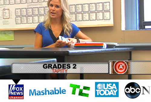
If you have a marketing department, that's cool, but “popular marketing” by a developer or designer can be even more effective. Believe me, when I started, my name meant nothing to anyone. Now my work is known thanks to Apple, Mashable, TechCrunch, The Huffington Post, Fox News and many others. From all this, marketing did not leave even a penny, except for the cost of several sites.
Many developers consider marketing to be what they should do after launching the application. But this is far from the case.
A massive start is critical , especially for low-cost applications. If the start does not advance your application to the top charts, then most likely it will sink into oblivion along with thousands of other applications that run every week. An application that is not in the top charts is almost invisible to most users.
After launching, reviews of the application here and there will not help much to bring it to the charts. This is how the App Store rating algorithms work. Algorithms of ratings change over time, but so far roughly based on the sale in a period of time, say within four days, mostly on the last day. This means that how successfully you are marketing today does not affect your rating in a week, and makes fragmented press coverage useless. Only a concentrated marketing explosion will work. Running is your most important chance to show the app to the world.
According to this, App Savvy's author Ken Yarmosh characterized application marketing as a crescendo. Application marketing should be dealt with at the very beginning and, gradually increasing the pace, end with an explosive start.
Contacts is everything. They are the power of your marketing machine. The absence of contacts means the absence of a warm reception, and in the presence of thousands of competing applications trying to attract the attention of the press, a warm reception is very expensive.

Get in touch with Apple employees, journalists, as well as prominent designers and community developers.
Understand that Apple, TechCrunch and tap tap tap are run by ordinary people. Many of them are cool and love to communicate and promote people with great products and ideas. Make a list of people you can connect with and actively look for opportunities to do this.
Head to where they are.
Be cool don't spam
The fact that you have the opportunity to talk with someone does not mean that the interlocutors are interested in you. First make a meaningful contact. And then they will start asking what cool things you can do. When you show your work, ask for advice or opinion. This usually happens smoothly and gives a considerable return.
Give and will receive
Build strong contacts with people, thinking about their desires and needs. It may turn out that an important person asks a technical question on Twitter, to which you have an answer, or writes something about which you have thoughts. Be ready to answer! Do this several times and maybe they will notice. Finally, remember that people have egos — make it clear that you value their work.
Write interesting things
Refer to insightful articles and maybe even write in your own blog about the things you have learned. People like to read honest journaling and application analysis. Sites like iDevBlogADay can advertise your articles to the community.
You do not want your launch to fail? Therefore, a few weeks before launch, start the propaganda machine. The idea behind this is to build a fan base that first downloads your app on launch day.
After the Apple Design Award win, my application was covered in almost all technical publications that I could have dreamed of, but despite this, all the publications contributed to a smaller number of downloads of the application than when Apple itself highlighted it.
But how do you ultimately ensure that Apple allocates your application? Thousands of apps come out every week and only a select few go to the main App Store page .

First, the application must be special. It should be of some interest to Apple. Does it have an elegant design? Does it paint the Apple platform? Is there something similar on other platforms? Any of these characteristics increases your chances of success. The good news is that among the thousands of applications coming out, only a few are particularly highlighted by the design that is discussed here.
Secondly, you need to get Apple's attention. Contacts created inside Apple can be invaluable. The basic rule here is to create your own hype before Apple allocates you .Apple has a team of editors. They also find applications for subsequent coverage. You need to know the places in which they are looking. In my experience, they may be looking for apps that are moving up the charts. To do this, you need to generate a large number of sales on the immediate launch day. You need only a few hundred sales to get into the charts in most categories. In addition, consider the places where you will look for new high-quality applications; Apple may also be visiting these places.
Reviews of journalists will help create a feeling that you can rely on, the initial flow of downloads and visibility for famous people and Apple employees. Achieve press attention at least a week or two before launch — these people are usually always busy, and you will receive feedback just in time for launch.
In this part, you need to contact your good friends among tech-community and journalists, show them the previews of the application and ask if they want to learn more.
After you have exhausted all contacts, start a cold call.
The greatest power of the campaign to promote your application can be found when using the fan base. Sonico Mobile , our latest application partner, Languages, recently released iTranslate Voice. It became a real hit number 1 without much promotion from Apple. How? Sonico advertised iTranslate Voice to its thirty millionth base of its iTranslate application users and conducted a large-scale email distribution.
Creating a fan base takes time. Take care that your fans simply sign up for an email newsletter, click on a Facebook page or follow a Twitter account. Also think about the mass market features of free apps to build a multi-million fan base. Barter-based advertising services like Swappit allow you to create a credit of trust, and later take full advantage of it during a big launch.
Success is measured in different ways. The first version of Grades brought less than $ 10,000, but it was the cornerstone in building the path to the Apple Design Award, and a lot of priceless contacts. Now our company specializes in launching top applications such as Languages, which more than compensate for the costs of Grades.
Successful monetization is difficult, but easier if you move forward. As soon as you consistently produce high-quality applications, your brand will become recognized by the press and Apple, your team will gain invaluable experience and you will have a fan base. This is definitely a slow game, but the rewards can be truly awesome. And this is an amazing feeling: to know that millions of people enjoy the fruit of your work.Learn from your mistakes, do not compromise and leave a mark on the universe! .
The idea of "good luck" is a dangerous sedative that alleviates the pain of failure. And pain is a good thing. It shows that something is going wrong. If my application crashes, I want to know why . Instead of blaming the universe, why not see what the guys from tap tap tap and Tapbots do in order to achieve success again and again.
')
Despite the fact that the perfect adherence to this formula is impossible, work in this direction will dramatically increase your chances of success. These principles are developed for iOS, but many of them can be applied to other platforms.
Idea
Any successful application has a foundation for a whole idea, since it is the idea that determines the ultimate potential for success. Avoid the temptation to immediately rush to implement ideas after an insight during a shower. A little research in advance can save you many future problems.
Find a niche
Phill Ryu ( @phillryu ) has in the portfolio an impressive list of top applications: Clear, The Heist and Classics, in brief. His secret of testing ideas for strength is quite simple: find a niche . The App Store hides many niches for applications in quality, UX and innovation. Niches are good because they by nature tend to be filled. Here are a couple of examples:
Clear, Tweetbot and iTranslate Voice.
Clear : among thousands of to-do applications, Clear fills the innovation area in the interface. Entering into an already overcrowded category looks illogical, but the largest categories have the greatest prospects if you can be an innovator in it.
Tweetbot : Twitter bought Tweetie and simplified it in order to please the majority. And Tweetbot has filled a niche in the field of full-featured use of Twitter.
iTranslate Voice : The release of Siri has intrigued the world, instantly creating niches for applications that are similar to Siri's behavior, but offer different functionality. Each new technology brings with it new niches.
Of course, the fruits that hang low are already all torn off, but there are still a lot of empty niches, especially in terms of design. Find a niche for yourself and fill it.
Money up front!
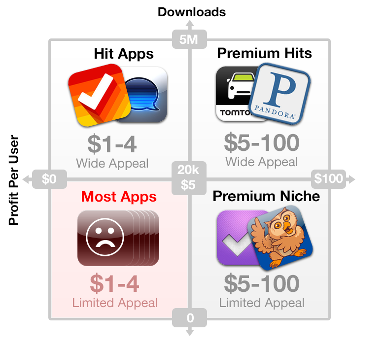
Most applications do not make money. If income is important to you, it is not worth figuring out which applications are profitable and which are not. Based on the theory of the two Marco Arment aprons, I assume that three categories of applications are profitable, and one is not.
Applications can be divided into categories by profitability per user and the number of downloads. Zoom.
Hit applications:
- large volume, low price;
- designed for almost everyone, aimed at impulse shoppers who browse the top charts and listings of popular applications;
- massive launches based on intensive marketing campaigns;
- require tens of thousands, if not hundreds of thousands of downloads to achieve significant success.
Examples: Clear ($ 3) and iTranslate ($ 1).
Niche Premium Applications:
- small volume, high price;
- aimed at a specific target audience;
- users come to the application through thorns and are able to pay a large amount to improve their lives;
- a large profit per user makes available and scalable to use traditional methods of attracting customers (banner advertising)
Examples: OmniFocus ($ 10) and Proloquo2Go ($ 190).
Top premium apps:
- large volume and revenue per user;
- the only possible development option for funded startups who need to make a big profit;
- rare but useful.
Examples: TomTom GPS ($ 50), Pandora ($ 3.99 monthly subscription), and freemium games that achieve great benefits per user at the expense of add-ons and credits.
Most failed apps:
- small volume and revenue per user;
- even if such applications attract little attention, the low price and small attractiveness do not lead to significant success.
Developers read inspirational stories of millionaires who have earned on applications, look at the amazing number of devices that are sold every day, and start over-the-top optimistic forecasts for their relatively ordinary applications. They conclude that if they can grab at least a piece of the market, they can sell their application for $ 0.99 and get rich.
But this does not work. The ruthless reality strikes a crushing blow on the very first day of sales, when the application is downloaded only six times, and then mostly friends and households. But her hands and itched to bring to life the idea of the application, but it was too unoriginal to become a hit.
Your application idea may also fall under this category. Do not lose sight of this.
Creating a profitable application is difficult . David Barnard, the Cubby App's brilliant mind, suggests that future income items can rely on pure freemium , setting a value based on the impression made. Generate a large number of downloads and creatively find ways to give highly valued users the opportunity to pay more. This type of creative monetization is almost not tested on non-gaming applications, but this is what makes this industry so exciting.
Formulate a statement
I literally mean: write something down. Obkromsayte your idea to the core, and in one sentence convey the essence of your application and its market orientation. Apple does this for its own applications and you should do the same.
For example:
“The Grades app shows students how many points they need to score for the next exam.”If you cannot convey your main idea in one sentence, it is too complicated. And mobile applications should focus on the brilliant execution of a single task, since the target market should immediately want your application, looking only at one screenshot.
After you decide on the essence of the application, try on the ideas of possible features on it and discard the superfluous.
Design
Apple culture revolves around superior design. And the fact that Apple demonstrations are always well made is not a coincidence. Design is the most important part of creating a successful application.
Don't make me think
Like websites, applications are easily accessible. If the application does not instantly make it clear what it is necessary for, the user will not experience great remorse when removing it. The title of the popular Steve Krug book embraces our challenge as usability designers: do not make me think. Like a well-designed door handle, the interface itself fully explains its purpose.
Several abstracts in this direction:
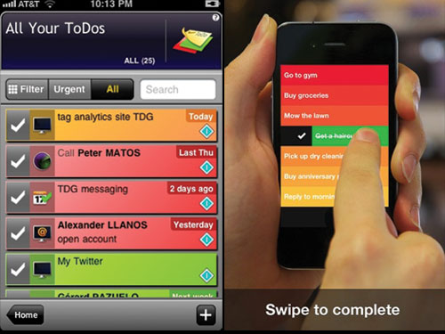
Hit the bull's eye
Every cool feature adds complexity to the application. Polish the application, screens and even the elements on each screen to shine. Good design is more about saying “No” to good ideas, rather than generating them.
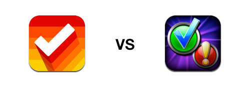
The to-do list application on the left allows cool features to get in the way of the main destination.
Clear (on the right) contested everything, and only the essence remained.
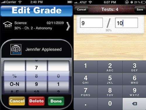
Consider UI conventions
Users have certain expectations about how the behavior of the interface should relate to the principles of their operating system and the main applications used daily. Pay attention to UI agreements ( iOS Human Interface Guidelines , Android User Interface Guidelines ) and be sure you understand them before you ignore them.
Trying to stand out, the evaluation input field interface on the left neglects the basic principles of navigation. On the same screen of my application (on the right), Grades, a special style is applied to the familiar principles of iOS interfaces.
Think like a human being
Users in the head have certain patterns of what is happening in the world. Do not design based on database restrictions or programming, but rely on how users think about their surroundings.
The RedLaser scanning interface first suggested that users take a picture of the bar code of interest (left). The application immediately became a hit when they made the interface correspond to the work of the real barcode scanner. Guidance, signal, ready (right).
Don't make me work
Users are lazy. They do not want to read the instructions and hate typing. The best applications provide the absolute minimum necessary for the functioning of the application user actions.
TripIt (left) is good, but the welcome screen suggests a small motivation for users to register. If the application works without an account created, allow the user to explore the application and register later; otherwise, provide the user with a step-by-step guide to encourage logging in as TuneWiki (on the right).
Do Usability Testing
Do not be intimidated by target tracking and focus groups. Do everything in your power! Usually problems with usability manifest themselves, simply by presenting the interface to several potential users. Ask a few questions (“what do you think, what does this application do? How do you accomplish task X?”), And watch them. Do this immediately and often throughout the entire design and development process.
Get emotional
A welcome opening animation in Weightbot , a comedic copy at Everyday , increasing satisfaction when you cross over Clear ; by providing little benefit, these little things elicit a powerful emotional response . These applications show individuality. You either love or hate them, but you definitely don’t forget them and most likely share them.
Convenience is not enough now. The best apps go a long way in creating to start paying attention to the little things that make the app amazing. Simon Schmid has written a comprehensive guide to emotional design , but here are a few of the initial theses applicable to applications:
Appearance matters
Beautiful apps sell better, deliver more fun to use, and leave the impression more useful than inconspicuous. While beauty may lie in rich gradients, textures and shadows, try to bring a touch of elegance, simplicity and taste. Use schemorphism (an interface that copies physical objects) only when it helps to solve problems, and not distract. If you are unfamiliar with the basic principles of graphic design, the design book for non-designers Robin Williams is a good starting point.
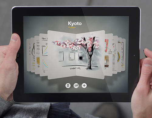
Paper for iPad from Fifty Three.
Experiment with sound.
Sound in user interfaces is a sophisticated, powerful and unexplored tool everywhere. Experiment to see if sounds can improve your application.
The sounds, clicks and buzzes of the Tapbots application are exactly what you expect from a robot control.
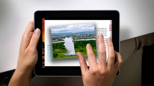
Touch is magic
Apple engineers are not stopping work before their products begin to be perceived correctly. And this is exactly why the scrolling of the first iPhone “slides like clockwork”. If an object does not respond instantly when touched, it immediately reminds you that you are using a computer and not directly controlling the object.
All images and objects in Our Choice can directly control the fingers.
Gestures can create a strong relationship between the interface and the user, but they can also disappoint with confusion, being incorrectly implemented. Experiment with new interactions and do not stop until each transition and metaphor begins to create a pleasant impression.
Relive your words
In most cases, users do not like formal notifications and error messages. Why not please them with unusual, witty or even funny messages! And users will get a pleasant surprise.
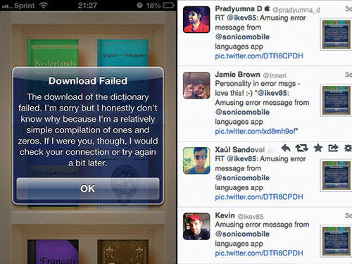
In my latest application, Languages, the ingenious error message not only softened the blow from the error received while downloading, but also made people want to tweet about it.
Create a different animation.
Whether moving elements on the screen or transitions between screens, the animation can express individuality and give users a sense of integrity and perfection in the process of navigating the application.
Users opening Weightbot for the first time enjoy watching the robot open itself.
Do not neglect your icon
The icon gives people the very first impression of your application. And also it occupies a precious place on the main screen of the user. The best icons are simple but catchy; they stand out without being motley. The icon at the same time should look beautiful in large sizes, and being small it should normally be read inside the application folder on the main screen.
The Clear icon (left) is highlighted in that it uses a bright color scheme and one simple form. The icon on the right contains too many incoherent colors and shapes in order to be recognizable and attractive.
Programming
Your choice of technology affects the overall impression of the application and, as a result, its success in the App Store.
Use native technology
The principle “create once, deploy everywhere” is a terrible recipe for mediocre applications.
To begin with, this method is a myth in itself. Different operating systems contain different principles and patterns of interface construction. Unlike games, where your own interface is desired, one single interface deployed on different platforms brings an unfamiliar interaction experience for each.
Facebook tried to use HTML5 for years. When they finally switched to the native code, they managed to improve performance by 200% and increase the average user rating from two to five stars.
In the best case, we can create once and improve everywhere. Applications like Zipcar have successfully used this approach. Unfortunately, Zipcar is an exception to the rules of applications with partial optimization. And there are reasons for this.
- The principle “create once and improve everywhere” uses a bottom-up approach in design, in which programming significantly influences the design of the application. This approach suppresses the use of innovation in design, seducing you to trivia, bringing everything under the lowest common denominator.
- Technologies such as PhoneGap essentially push your application into a browser window that executes JavaScript code. Avoid this. JavaScript applications tend to work slowly, intermittently, unnaturally and with errors, since JavaScript is still not ready to meet native tasks.
- Tools like Appcelerator are compiled into native code. Productivity at the same time significantly increases, but flexibility and stability of a pure native code is lost. Since you do not have access to the code that is executed on the phone, it becomes more difficult to cope with errors. It also becomes more difficult to apply new technologies right away and you are losing to competitors who can start using fresh technologies on the day they appear.
- The bottom line: choose technology based on your design, not design, based on technology. First create your application design for different platforms. And after that, check whether it will be appropriate to use something like Appcelerator to implement your designs without unnecessary compromises.
For a deeper overview of cross-platform assumptions , read the full review of Aral Balkan.
Code quality matters
Being perfectly written and documented, the code does not concern the end user, but affects the ability to produce timely and relevant updates that may be necessary for continued success.
Also, buggy, unmanaged code has an impact on the end user. Users do not care for a good reason if the application crashed or their data was deleted - the brand is to blame. I have seen cases where only this circumstance did not allow the promising application to thunder.
Hourly rates can be misleading. At the same time, a bad programmer will create one raw module, and an experienced programmer can write three stable modules. If you decide that you don’t like a bad programmer, it’s likely that the new programmer will start writing everything from scratch, since only the author can deal with the old code. By contrast, quality code can be easily reused later on.
Marketing
If you have a marketing department, that's cool, but “popular marketing” by a developer or designer can be even more effective. Believe me, when I started, my name meant nothing to anyone. Now my work is known thanks to Apple, Mashable, TechCrunch, The Huffington Post, Fox News and many others. From all this, marketing did not leave even a penny, except for the cost of several sites.
Start right away
Many developers consider marketing to be what they should do after launching the application. But this is far from the case.
A massive start is critical , especially for low-cost applications. If the start does not advance your application to the top charts, then most likely it will sink into oblivion along with thousands of other applications that run every week. An application that is not in the top charts is almost invisible to most users.
After launching, reviews of the application here and there will not help much to bring it to the charts. This is how the App Store rating algorithms work. Algorithms of ratings change over time, but so far roughly based on the sale in a period of time, say within four days, mostly on the last day. This means that how successfully you are marketing today does not affect your rating in a week, and makes fragmented press coverage useless. Only a concentrated marketing explosion will work. Running is your most important chance to show the app to the world.
According to this, App Savvy's author Ken Yarmosh characterized application marketing as a crescendo. Application marketing should be dealt with at the very beginning and, gradually increasing the pace, end with an explosive start.
Make friends
Contacts is everything. They are the power of your marketing machine. The absence of contacts means the absence of a warm reception, and in the presence of thousands of competing applications trying to attract the attention of the press, a warm reception is very expensive.
I compiled Twitter lists of Apple employees , journalists and prominent iOS developers to help me find contact opportunities. Use on health!
Get in touch with Apple employees, journalists, as well as prominent designers and community developers.
Understand that Apple, TechCrunch and tap tap tap are run by ordinary people. Many of them are cool and love to communicate and promote people with great products and ideas. Make a list of people you can connect with and actively look for opportunities to do this.
Head to where they are.
- Twitter is a good place to start - almost everyone involved in tech-industry tweets.
- Comments on relevant blogs and emails to authors can be a good way to make contact.
- Personal contacts are the most powerful, so try to get on the Apple Worldwide Developers Conference (WWDC) and other conferences held by Apple. Local meetings are also good.
Be cool don't spam
The fact that you have the opportunity to talk with someone does not mean that the interlocutors are interested in you. First make a meaningful contact. And then they will start asking what cool things you can do. When you show your work, ask for advice or opinion. This usually happens smoothly and gives a considerable return.
Give and will receive
Build strong contacts with people, thinking about their desires and needs. It may turn out that an important person asks a technical question on Twitter, to which you have an answer, or writes something about which you have thoughts. Be ready to answer! Do this several times and maybe they will notice. Finally, remember that people have egos — make it clear that you value their work.
Write interesting things
Refer to insightful articles and maybe even write in your own blog about the things you have learned. People like to read honest journaling and application analysis. Sites like iDevBlogADay can advertise your articles to the community.
Create a buzz
You do not want your launch to fail? Therefore, a few weeks before launch, start the propaganda machine. The idea behind this is to build a fan base that first downloads your app on launch day.
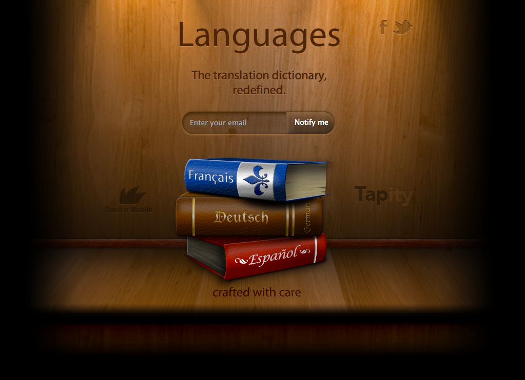
Teaser sites like this one can help you create anticipation and collect email addresses. Zoom.
- Create Twitter and Facebook accounts for your application. This will give potential fans an easy way to follow and link to your application. Use your account to post previews, news and contests. You can even use your account to follow people who are potentially interested in the application. They will see that you have folded them and may be interested.
- Create a teaser site with a registration form to create a mailing list. Include something there to entice people - an attractive design, a beautiful screenshot, and maybe even a video.
- Create a video clip. Nothing compares to a video clip when you need to create hype. The buzz around Clear video illustrates this well. It is also the easiest way to show the press what your application is.
- Launch a closed beta version. Your beta testers will be your biggest fans, because they will feel involved in creating the application.
Light up
After the Apple Design Award win, my application was covered in almost all technical publications that I could have dreamed of, but despite this, all the publications contributed to a smaller number of downloads of the application than when Apple itself highlighted it.
But how do you ultimately ensure that Apple allocates your application? Thousands of apps come out every week and only a select few go to the main App Store page .
Only a few apps stand out on the main Apple App Store page.
First, the application must be special. It should be of some interest to Apple. Does it have an elegant design? Does it paint the Apple platform? Is there something similar on other platforms? Any of these characteristics increases your chances of success. The good news is that among the thousands of applications coming out, only a few are particularly highlighted by the design that is discussed here.
Secondly, you need to get Apple's attention. Contacts created inside Apple can be invaluable. The basic rule here is to create your own hype before Apple allocates you .Apple has a team of editors. They also find applications for subsequent coverage. You need to know the places in which they are looking. In my experience, they may be looking for apps that are moving up the charts. To do this, you need to generate a large number of sales on the immediate launch day. You need only a few hundred sales to get into the charts in most categories. In addition, consider the places where you will look for new high-quality applications; Apple may also be visiting these places.
Advertise in the press
Reviews of journalists will help create a feeling that you can rely on, the initial flow of downloads and visibility for famous people and Apple employees. Achieve press attention at least a week or two before launch — these people are usually always busy, and you will receive feedback just in time for launch.
Getting press attention to your application is an important part of a good marketing strategy.
In this part, you need to contact your good friends among tech-community and journalists, show them the previews of the application and ask if they want to learn more.
After you have exhausted all contacts, start a cold call.
Create a fan base
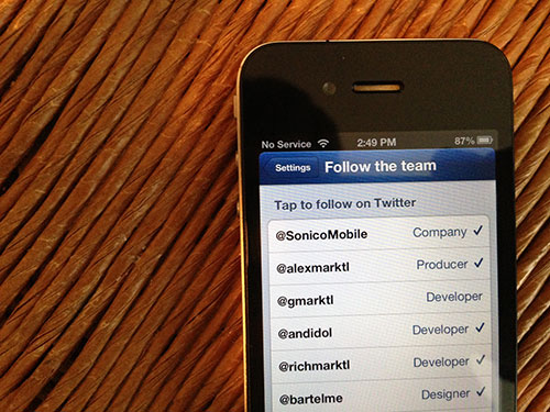
The greatest power of the campaign to promote your application can be found when using the fan base. Sonico Mobile , our latest application partner, Languages, recently released iTranslate Voice. It became a real hit number 1 without much promotion from Apple. How? Sonico advertised iTranslate Voice to its thirty millionth base of its iTranslate application users and conducted a large-scale email distribution.
All Sonico applications allow users to easily follow a company on Twitter or subscribe to a newsletter.
Creating a fan base takes time. Take care that your fans simply sign up for an email newsletter, click on a Facebook page or follow a Twitter account. Also think about the mass market features of free apps to build a multi-million fan base. Barter-based advertising services like Swappit allow you to create a credit of trust, and later take full advantage of it during a big launch.
Conclusion
Success is measured in different ways. The first version of Grades brought less than $ 10,000, but it was the cornerstone in building the path to the Apple Design Award, and a lot of priceless contacts. Now our company specializes in launching top applications such as Languages, which more than compensate for the costs of Grades.
Successful monetization is difficult, but easier if you move forward. As soon as you consistently produce high-quality applications, your brand will become recognized by the press and Apple, your team will gain invaluable experience and you will have a fan base. This is definitely a slow game, but the rewards can be truly awesome. And this is an amazing feeling: to know that millions of people enjoy the fruit of your work.Learn from your mistakes, do not compromise and leave a mark on the universe! .
Source: https://habr.com/ru/post/157823/
All Articles