WPF: 4 options buttons with icon and text
I think that everyone (or almost everyone), from those who come to WPF from WinForms, at first feels confused about the functionality of standard controls.
It would seem - here it is - the familiar control.
It is very similar to the old friend from WinForms. Even the signature of the usual methods is either completely identical, or has undergone a slight transformation (well, for example, the Enabled property received the prefix Is). There are a lot of settings for controls, it is dazzled by the visualization parameters.
But with a little closer acquaintance and an attempt to tighten the usual ways of building an interface on XAML, that very confusion comes.
How so? Well, doesn’t the button have an Image property? You're kidding, right?
The fact of the matter is that WPF (more precisely, XAML) has a completely different ideology of interface organization. Basic controls are only basic (sorry for tautology) functionality. The simplicity of the base controls is compensated for by the powerful pattern and style mechanisms.
There are also third-party libraries of components, but they, most often, are either useless, or hopelessly outdated, or heavily paid.
Not so long ago, I once again faced the need to solve this very simple (seemingly) task. I have worn out all of Google with requests like “XAML button with image” “WPF button image text”, etc.
')
Among the dozens of reviewed results, there were obvious both obvious (and at the same time inconvenient) solutions, and more sophisticated ones.
A small digression number 1
After the very first experiments, it became obvious that XAML and png icons are incompatible. I won’t be spreading for a long time why this is the case - there is enough literature on this topic, I’ll just say that in the end it turns out to be ugly, and inconvenient, and non-functional. Blurred images, superimposed effects and animation look depressing, etc ...
But do not be upset - online tens and hundreds of resources with vector images.
The best I've found is SyncFusion Metro Studio 2 (not an ad). This is a free product that has 1,700 vector icons and means for outputting these icons in XAML. The result is obtained in the form of a complex element, from which it is enough to copy only the Path, which describes the very geometry of the icon.
I do this with this element - I add a ResourceDictionary named Icons.xaml to the project and put all the icons I need into it:
But let's go back to the ways of implementing the button with the icon.

Well, it would seem, everything is in place. There is a button, it has an icon and text. Those who believe that everything is so simple and will try to organize such an approach with a beautiful and stylish interface will soon be disappointed. And here's why: a simple style setting leads to a swelling of XAML by duplicating the description of the parameters of elements right in the form code. 10 buttons - 10 identical descriptions. A simple change of the type “let's paint the text on the buttons green” turns into a tedious copy-paste and an even bigger swelling of the form.
And let's write "your button with blackjack and you know what else"?
Inherit from Button and add a DependencyProperty for ContentControl , through which the content for the icon can be set from the XAML form. I will not dwell on the implementation details (below there will be a link to the sources, it will be possible to read there), but I will describe the minuses - the contents of the button will have to be set from the constructor of the heir to C #. From here we get a lot of obvious and non-obvious problems, not to mention the fact that it does not smell very good.
Let's create UserControl on which we will place only one button. In UserControl we will create DependencyProperty , through which we will set an icon for ContentControl , which lies in the button. This method deserves a medal for maximum clumsiness. It inherits almost all the flaws of the previous methods, and adds many of its own. In the form code, we get a UserControl , but lose the button. We lose together with all the properties and events. The author of the idea proposes to pull out all that was lost through those DependencyProperty , in general, you understand. It becomes incomprehensible for what we fought.
I relate this method to non-obvious and sophisticated. In the original article, the author offers to set the image via AttachedProperty . Looking ahead, I’ll say that I chose this method for use in my product, and I’ll describe it in as much detail as possible. It is not without some drawbacks at the development stage (I will describe below), but still I liked it more than others. In the original, the author used the icon in the form of a png image, I also modified the way to use the vector icon and added buns.
Each XAML developer came up with Attached properties when, for example, set the Grid.Column property to the control .
If in three words, then this idea is a bit like the Extension from Linq. You can register a property whose value can be set to any DependencyObject . It looks like this (example from MSDN):
This code registers the IsBubleSource property. As a result, any DependencyObject , for example, the same Button , can set its value:
The general meaning of this code is when setting the IsBubbleSource property for a button, we automatically fall into the SetIsBubbleSource method, which sets the value. When getting the value, respectively, we fall into the GetIsBubbleSource method. This all happens automatically; all you have to do is to write methods with the names Set and Get, the rest is up to the platform.
Despite the fact that not so little code is written, Button itself from such an operation is neither hot nor cold - it just becomes a repository of a separate value that you can ask and ask. Of course, you can implement sly logic in the SetIsBubbleSource and GetIsBubbleSource methods, which will lead element to Button , extract content from it, and perform various operations with the content, but this smells bad again, you don’t need to.
Small digression 2
In the original, the author uses the name of the class EyeCandy and the namespace of the project, but this is too long and I hope that I will be forgiven for the abbreviation - namespace Ext and the name of the class E.
We add the following class to the WPF project:
What is going on here? We registered the Attached Icon property of the FrameworkElement type with a default value of null.
Now create a template for our button. I will not dwell on the explanation of “what templates are and how they work” - if someone doesn’t know this, there is a lot of information on the network.
So, we add to our project a ResourceDictionary named Styles.xaml (if all of a sudden there is no style resource in the project). In this ResourceDictionary, add the following code:
This ResourceDictionary entry describes the pattern of any button in our project. This template sets the normal layout for the WPF button, but overrides its contents. The content is the StackPanel , in which ContentControl and TextBlock are located , i.e. in the same way as in the very first example. In addition, in the template, I set the following behavior for the icon - if the button is set to IsEnabled == False , then the icon gets 50% transparency and becomes similar to inactive.
Add 4 simple buttons to our form. Let's assign each button its own text, for example, like this: Content = “Button 1” .
Run the application.
Identical icons on each button of the application is not what we want, and it is here that we use our secret weapon - the Ext.E class and the AttachedProperty mechanism.
So, go to our resource file Styles.xaml and add a new namespace to it :
After that we go down below and in the button template we find the line in which ContentControl is created and its content is set:
Replace the second line:
This line causes ContentControl to access the Ext.E.Icon property of the button and get its content from it. After that, it remains to add code that sets the value of the Ext.E.Icon property to the button itself. This is done in the code of the form on which the button is created.
Primitive version of the button with the icon ready. Changing the value of IconTriangle for the names of other resources, you can set various icons on the buttons. At the same time, in contrast to the first three methods, we retain all its innate ability to stylize the button (with the exception of the ability to change the structure of the Content , of course). The content of the button is not set from C #, and all properties with events remain in place.
If we try to use this button in a real project, we will encounter the following:
More specifically, everything is customizable, but only in the template, i.e. for all buttons at once, but cloning templates is a rake and a complete inconvenience. We did not fight for it.
Expand the Ext.E class. Add there two more AttachedProperty
The source code in one archive will be at the end of the article, so I will not duplicate the similar methods of the Ext.E class in the article.
I will describe only the changes that need to be made in the Button template.
The dimensions of ContentControl are associated with the IconSize value:
StackPanel Orientation Associated With Orientation Value
As a result, the button received additional parameters, and we can write this:
As a result of simple manipulations, you can get such a zoo (the first button IsEnabled = “False” ):
 "
"
They all relate to the process and development tools:
- XAML designer VisualStudio 2010 responds to a similar description of the button something like this:

- Blend 4 and VisualStudio 2012 behave better, but also with features:
But this concerns only the Designer, in the runtime mode, everything works as it should.
Perhaps (and even most likely) I described the bike, but the fact that in two days of searching I did not find a more acceptable free implementation suggests that not everything is fine on this front.
In addition, I got the opportunity to deal a bit with the mechanism for expanding standard controls in a non-standard way and with this mechanism you can find mass.
Thank you for attention.
UPD: The article was updated due to the fact that a solution was found to the problem using the same icon on different buttons.
UPD2: I thank onikiychuka for a sensible suggestion.
Source
WPF Control Development - 3 Ways to build an ImageButton
blogs.msdn.com/b/knom/archive/2007/10/31/wpf-control-development-3-ways-to-build-an-imagebutton.aspx
Using Attached Properties to Create a WPF Image Button
www.hardcodet.net/2009/01/create-wpf-image-button-through-attached-properties
Custom dependency properties
msdn.microsoft.com/en-ru/library/ms753358.aspx
SyncFusion Metro Studio 2
www.syncfusion.com/downloads/metrostudio
It would seem - here it is - the familiar control.
It is very similar to the old friend from WinForms. Even the signature of the usual methods is either completely identical, or has undergone a slight transformation (well, for example, the Enabled property received the prefix Is). There are a lot of settings for controls, it is dazzled by the visualization parameters.
But with a little closer acquaintance and an attempt to tighten the usual ways of building an interface on XAML, that very confusion comes.
How so? Well, doesn’t the button have an Image property? You're kidding, right?
The fact of the matter is that WPF (more precisely, XAML) has a completely different ideology of interface organization. Basic controls are only basic (sorry for tautology) functionality. The simplicity of the base controls is compensated for by the powerful pattern and style mechanisms.
There are also third-party libraries of components, but they, most often, are either useless, or hopelessly outdated, or heavily paid.
Not so long ago, I once again faced the need to solve this very simple (seemingly) task. I have worn out all of Google with requests like “XAML button with image” “WPF button image text”, etc.
')
Among the dozens of reviewed results, there were obvious both obvious (and at the same time inconvenient) solutions, and more sophisticated ones.
A small digression number 1
After the very first experiments, it became obvious that XAML and png icons are incompatible. I won’t be spreading for a long time why this is the case - there is enough literature on this topic, I’ll just say that in the end it turns out to be ugly, and inconvenient, and non-functional. Blurred images, superimposed effects and animation look depressing, etc ...
But do not be upset - online tens and hundreds of resources with vector images.
The best I've found is SyncFusion Metro Studio 2 (not an ad). This is a free product that has 1,700 vector icons and means for outputting these icons in XAML. The result is obtained in the form of a complex element, from which it is enough to copy only the Path, which describes the very geometry of the icon.
I do this with this element - I add a ResourceDictionary named Icons.xaml to the project and put all the icons I need into it:
<ResourceDictionary xmlns="http://schemas.microsoft.com/winfx/2006/xaml/presentation" xmlns:x="http://schemas.microsoft.com/winfx/2006/xaml"> <!-- Resource dictionary entries should be defined here. --> <Path x:Key="IconTriangle" x:Shared="False" Stretch="Uniform" Data="M50.25,133.5 L49.75,158.25 76,147.25 z" Fill="Black" Stroke="Black"/> </ResourceDictionary> But let's go back to the ways of implementing the button with the icon.
The first and most obvious way is to describe the required Content buttons directly in the form code.
<Button HorizontalAlignment="Center" VerticalAlignment="Center"> <StackPanel Orientation="Horizontal"> <ContentControl Width="16" Height="16" Margin="4" Content="{StaticResource IconTriangle}"/> <TextBlock HorizontalAlignment="Center" VerticalAlignment="Center">Button</TextBlock> </StackPanel> </Button> Well, it would seem, everything is in place. There is a button, it has an icon and text. Those who believe that everything is so simple and will try to organize such an approach with a beautiful and stylish interface will soon be disappointed. And here's why: a simple style setting leads to a swelling of XAML by duplicating the description of the parameters of elements right in the form code. 10 buttons - 10 identical descriptions. A simple change of the type “let's paint the text on the buttons green” turns into a tedious copy-paste and an even bigger swelling of the form.
The second obvious way is to inherit from Button.
And let's write "your button with blackjack and you know what else"?
Inherit from Button and add a DependencyProperty for ContentControl , through which the content for the icon can be set from the XAML form. I will not dwell on the implementation details (below there will be a link to the sources, it will be possible to read there), but I will describe the minuses - the contents of the button will have to be set from the constructor of the heir to C #. From here we get a lot of obvious and non-obvious problems, not to mention the fact that it does not smell very good.
The third obvious way is to create a UserControl .
Let's create UserControl on which we will place only one button. In UserControl we will create DependencyProperty , through which we will set an icon for ContentControl , which lies in the button. This method deserves a medal for maximum clumsiness. It inherits almost all the flaws of the previous methods, and adds many of its own. In the form code, we get a UserControl , but lose the button. We lose together with all the properties and events. The author of the idea proposes to pull out all that was lost through those DependencyProperty , in general, you understand. It becomes incomprehensible for what we fought.
Fourth way - AttachedProperty
I relate this method to non-obvious and sophisticated. In the original article, the author offers to set the image via AttachedProperty . Looking ahead, I’ll say that I chose this method for use in my product, and I’ll describe it in as much detail as possible. It is not without some drawbacks at the development stage (I will describe below), but still I liked it more than others. In the original, the author used the icon in the form of a png image, I also modified the way to use the vector icon and added buns.
So, quite a bit of theory. What is this most AttachedProperty
Each XAML developer came up with Attached properties when, for example, set the Grid.Column property to the control .
If in three words, then this idea is a bit like the Extension from Linq. You can register a property whose value can be set to any DependencyObject . It looks like this (example from MSDN):
public class AquariumObject { public static readonly DependencyProperty IsBubbleSourceProperty = DependencyProperty.RegisterAttached( "IsBubbleSource", typeof(Boolean), typeof(AquariumObject), new FrameworkPropertyMetadata(false, FrameworkPropertyMetadataOptions.AffectsRender) ); public static void SetIsBubbleSource(UIElement element, Boolean value) { element.SetValue(IsBubbleSourceProperty, value); } public static Boolean GetIsBubbleSource(UIElement element) { return (Boolean)element.GetValue(IsBubbleSourceProperty); } } This code registers the IsBubleSource property. As a result, any DependencyObject , for example, the same Button , can set its value:
<Button AquariumObject.IsBubbleSource="True">Button</Button> The general meaning of this code is when setting the IsBubbleSource property for a button, we automatically fall into the SetIsBubbleSource method, which sets the value. When getting the value, respectively, we fall into the GetIsBubbleSource method. This all happens automatically; all you have to do is to write methods with the names Set and Get, the rest is up to the platform.
Despite the fact that not so little code is written, Button itself from such an operation is neither hot nor cold - it just becomes a repository of a separate value that you can ask and ask. Of course, you can implement sly logic in the SetIsBubbleSource and GetIsBubbleSource methods, which will lead element to Button , extract content from it, and perform various operations with the content, but this smells bad again, you don’t need to.
Getting to the practical part
Small digression 2
In the original, the author uses the name of the class EyeCandy and the namespace of the project, but this is too long and I hope that I will be forgiven for the abbreviation - namespace Ext and the name of the class E.
We add the following class to the WPF project:
using System.Windows; using System.Windows.Controls; using System.Windows.Media; namespace Ext { public class E { public static readonly DependencyProperty IconProperty; static E() { var metadata = new FrameworkPropertyMetadata(null); IconProperty = DependencyProperty.RegisterAttached("Icon", typeof(FrameworkElement), typeof(E), metadata); } public static FrameworkElement GetIcon(DependencyObject obj) { return (FrameworkElement)obj.GetValue(IconProperty); } public static void SetIcon(DependencyObject obj, FrameworkElement value) { obj.SetValue(IconProperty, value); } } } What is going on here? We registered the Attached Icon property of the FrameworkElement type with a default value of null.
Now create a template for our button. I will not dwell on the explanation of “what templates are and how they work” - if someone doesn’t know this, there is a lot of information on the network.
So, we add to our project a ResourceDictionary named Styles.xaml (if all of a sudden there is no style resource in the project). In this ResourceDictionary, add the following code:
<ResourceDictionary xmlns="http://schemas.microsoft.com/winfx/2006/xaml/presentation" xmlns:x="http://schemas.microsoft.com/winfx/2006/xaml" xmlns:Microsoft_Windows_Themes="clr-namespace:Microsoft.Windows.Themes;assembly=PresentationFramework.Aero"> <Style x:Key="ButtonFocusVisual"> <Setter Property="Control.Template"> <Setter.Value> <ControlTemplate> <Rectangle Margin="2" SnapsToDevicePixels="true" Stroke="{DynamicResource {x:Static SystemColors.ControlTextBrushKey}}" StrokeThickness="1" StrokeDashArray="1 2"/> </ControlTemplate> </Setter.Value> </Setter> </Style> <!-- Resource dictionary entries should be defined here. --> <LinearGradientBrush x:Key="ButtonNormalBackground" EndPoint="0,1" StartPoint="0,0"> <GradientStop Color="#F3F3F3" Offset="0"/> <GradientStop Color="#EBEBEB" Offset="0.5"/> <GradientStop Color="#DDDDDD" Offset="0.5"/> <GradientStop Color="#CDCDCD" Offset="1"/> </LinearGradientBrush> <SolidColorBrush x:Key="ButtonNormalBorder" Color="#FF707070"/> <Style TargetType="{x:Type Button}"> <Setter Property="FocusVisualStyle" Value="{StaticResource ButtonFocusVisual}"/> <Setter Property="Background" Value="{StaticResource ButtonNormalBackground}"/> <Setter Property="BorderBrush" Value="{StaticResource ButtonNormalBorder}"/> <Setter Property="BorderThickness" Value="1"/> <Setter Property="Foreground" Value="{DynamicResource {x:Static SystemColors.ControlTextBrushKey}}"/> <Setter Property="HorizontalContentAlignment" Value="Center"/> <Setter Property="VerticalContentAlignment" Value="Center"/> <Setter Property="Padding" Value="1"/> <Setter Property="Template"> <Setter.Value> <ControlTemplate TargetType="{x:Type Button}"> <Microsoft_Windows_Themes:ButtonChrome x:Name="Chrome" BorderBrush="{TemplateBinding BorderBrush}" Background="{TemplateBinding Background}" RenderMouseOver="{TemplateBinding IsMouseOver}" RenderPressed="{TemplateBinding IsPressed}" RenderDefaulted="{TemplateBinding IsDefaulted}" SnapsToDevicePixels="true"> <VisualStateManager.VisualStateGroups> <VisualStateGroup x:Name="CommonStates"> <VisualState x:Name="Normal"/> <VisualState x:Name="MouseOver"/> <VisualState x:Name="Pressed"/> <VisualState x:Name="Disabled"> <Storyboard> <DoubleAnimationUsingKeyFrames Storyboard.TargetProperty="(UIElement.Opacity)" Storyboard.TargetName="IconContent"> <EasingDoubleKeyFrame KeyTime="0" Value="0.5"/> </DoubleAnimationUsingKeyFrames> </Storyboard> </VisualState> </VisualStateGroup> </VisualStateManager.VisualStateGroups> <StackPanel> <ContentControl Content="{StaticResource IconTriangle}" Width="16" Height="16" x:Name="IconContent" Margin="4" RenderTransformOrigin="0.5,0.5" IsEnabled="{Binding IsEnabled, ElementName=Chrome}"> <ContentControl.Effect> <DropShadowEffect Opacity="0" BlurRadius="2"/> </ContentControl.Effect> <ContentControl.RenderTransform> <TransformGroup> <ScaleTransform/> <SkewTransform/> <RotateTransform/> <TranslateTransform/> </TransformGroup> </ContentControl.RenderTransform> </ContentControl> <TextBlock x:Name="textBlock" Margin="4" TextWrapping="Wrap" Text="{TemplateBinding Content}" VerticalAlignment="Center" HorizontalAlignment="Center"/> </StackPanel> </Microsoft_Windows_Themes:ButtonChrome> <ControlTemplate.Triggers> <Trigger Property="IsKeyboardFocused" Value="true"> <Setter Property="RenderDefaulted" TargetName="Chrome" Value="true"/> </Trigger> <Trigger Property="ToggleButton.IsChecked" Value="true"> <Setter Property="RenderPressed" TargetName="Chrome" Value="true"/> </Trigger> <Trigger Property="IsEnabled" Value="false"> <Setter Property="Foreground" Value="#ADADAD"/> </Trigger> </ControlTemplate.Triggers> </ControlTemplate> </Setter.Value> </Setter> </Style> </ResourceDictionary> This ResourceDictionary entry describes the pattern of any button in our project. This template sets the normal layout for the WPF button, but overrides its contents. The content is the StackPanel , in which ContentControl and TextBlock are located , i.e. in the same way as in the very first example. In addition, in the template, I set the following behavior for the icon - if the button is set to IsEnabled == False , then the icon gets 50% transparency and becomes similar to inactive.
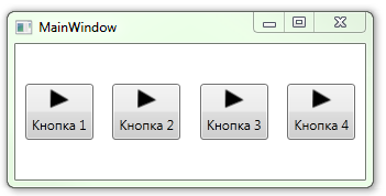
Add 4 simple buttons to our form. Let's assign each button its own text, for example, like this: Content = “Button 1” .
Run the application.
Identical icons on each button of the application is not what we want, and it is here that we use our secret weapon - the Ext.E class and the AttachedProperty mechanism.
So, go to our resource file Styles.xaml and add a new namespace to it :
xmlns:Ext="clr-namespace:Ext" After that we go down below and in the button template we find the line in which ContentControl is created and its content is set:
<ContentControl Content="{StaticResource IconTriangle}" .../> Replace the second line:
<ContentControl Content="{Binding (Ext:E.Icon), RelativeSource={RelativeSource TemplatedParent}}" .../> This line causes ContentControl to access the Ext.E.Icon property of the button and get its content from it. After that, it remains to add code that sets the value of the Ext.E.Icon property to the button itself. This is done in the code of the form on which the button is created.
<Button Ext:E.Icon="{StaticResource IconTriangle}" Content=" 1" /> Primitive version of the button with the icon ready. Changing the value of IconTriangle for the names of other resources, you can set various icons on the buttons. At the same time, in contrast to the first three methods, we retain all its innate ability to stylize the button (with the exception of the ability to change the structure of the Content , of course). The content of the button is not set from C #, and all properties with events remain in place.
Let's go a little further
If we try to use this button in a real project, we will encounter the following:
- The size of the icon is not configurable.
- The orientation of the button (vertical or horizontal) is not adjustable.
More specifically, everything is customizable, but only in the template, i.e. for all buttons at once, but cloning templates is a rake and a complete inconvenience. We did not fight for it.
Expand the Ext.E class. Add there two more AttachedProperty
- IconSize double
- Orientation type Orientation
The source code in one archive will be at the end of the article, so I will not duplicate the similar methods of the Ext.E class in the article.
I will describe only the changes that need to be made in the Button template.
The dimensions of ContentControl are associated with the IconSize value:
<ContentControl Content="{Binding (Ext:E.Icon), RelativeSource={RelativeSource TemplatedParent}}" Width="{Binding (Ext:E.IconSize), RelativeSource={RelativeSource TemplatedParent}}" Height="{Binding (Ext:E.IconSize), RelativeSource={RelativeSource TemplatedParent}}" .../> StackPanel Orientation Associated With Orientation Value
<StackPanel Orientation="{Binding (Ext:E.Orientation), RelativeSource={RelativeSource TemplatedParent}}"> As a result, the button received additional parameters, and we can write this:
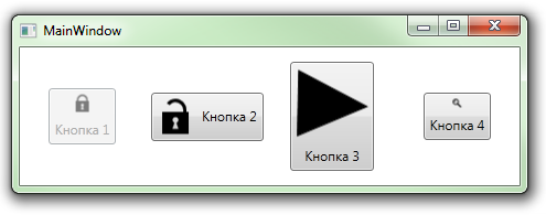
<Button Ext:E.Icon="{StaticResource IconTriangle}" Ext:E.IconSize="32" Ext:E.Orientation="Horizontal" Content=" 1"/> As a result of simple manipulations, you can get such a zoo (the first button IsEnabled = “False” ):
"And finally, I will mention the limitations
They all relate to the process and development tools:
- XAML designer VisualStudio 2010 responds to a similar description of the button something like this:
- Blend 4 and VisualStudio 2012 behave better, but also with features:
- After changing the Ext.E class, it is better to reload the development environment. Without this, changes are often not detected and designers swear that the added or changed properties do not exist.
- According to an algorithm I have not installed, the values set by the button using AttachedProperty are then visible to the designer, then no. More often not visible, and the form looks like something like this:

But this concerns only the Designer, in the runtime mode, everything works as it should.
Perhaps (and even most likely) I described the bike, but the fact that in two days of searching I did not find a more acceptable free implementation suggests that not everything is fine on this front.
In addition, I got the opportunity to deal a bit with the mechanism for expanding standard controls in a non-standard way and with this mechanism you can find mass.
Thank you for attention.
UPD: The article was updated due to the fact that a solution was found to the problem using the same icon on different buttons.
UPD2: I thank onikiychuka for a sensible suggestion.
Source
Useful links:
WPF Control Development - 3 Ways to build an ImageButton
blogs.msdn.com/b/knom/archive/2007/10/31/wpf-control-development-3-ways-to-build-an-imagebutton.aspx
Using Attached Properties to Create a WPF Image Button
www.hardcodet.net/2009/01/create-wpf-image-button-through-attached-properties
Custom dependency properties
msdn.microsoft.com/en-ru/library/ms753358.aspx
SyncFusion Metro Studio 2
www.syncfusion.com/downloads/metrostudio
Source: https://habr.com/ru/post/157337/
All Articles