What's wrong with windows 8
It so happened that I was a loyal user of Windows, and put the “eight” almost as soon as the final release was released. The fact that the axis came out, to put it mildly, is ambiguous, you already know without me - just read the news and reviews on the Internet. Since the reviews are rather fragmented, it’s difficult to compose a whole picture of them, so I wrote my own analysis of the guilty and Windows 8 files.

I will start with the shortcomings, because it's easier - all the problems of the new Windows have one word in the root: Metro. The intentions of Microsoft designers are clear: to cross ahorse and a quivering doe, a mobile metro-interface with a relatively small screen and large, finger-oriented tile icons with the traditional desktop Windows interface.
The compact panel of the old "Start" was replaced by a whole screen. There is more space for applications, but now the trivial thing - launching another application - takes too much attention. A simple user script: the user is watching a certain video and wants to simultaneously launch some other application, for example, Skype. A Windows 7 user simply presses the Start button, starts Skype, almost without distracting from the video. A Windows 8 user should now first pause the video before launching Skype - or, during the transition to the Start panel, he will simply drop out of view for a couple of seconds.
')
The “Start” screen (it’s also a panel with Metro applications) obviously claims to replace the desktop and the old Start with functionality at the same time, while not giving access to some of the functionality (taskbar), and the desktop itself quietly exists in parallel, although its meaning — when it is no longer the start page — is completely incomprehensible. That is, two entities of the same purpose - one unfinished, the other unfinished - exist in parallel, confusing the user. And if you add duplication of applications here - for example, there is just a desktop Skype, and there is its version for “Start” - then the picture of an attempt to brutally fuck the consumer brain becomes almost criminal in color.
Let's say Google Chrome offers the user a “restart in Windows 8 mode”. In practice, this means only the same Google Chrome in full screen mode. This is an important point - the so-called "Metro-mode" is just a full-screen mode without a taskbar.
The extermination of the taskbar is the second whale on which the Win8 interface rests. Let us examine it in more detail.
The benefits of the taskbar are obvious - this is a status bar that shows the time, basic parameters (network, sound, etc.), running or fixed applications, and, earlier, the Start button, which gave even more features. The taskbar is also present in mobile OSs - and, for example, on Android, its capabilities are constantly expanding. In Windows Phone 7, judging by the reviews, the situation is slightly different - when launching applications, the taskbar is hidden. The decision is controversial, but understandable - in the mobile interface, the usable area is worth its weight in gold. But for users of desktops and laptops, the lack of usable space is a problem in the second ten of the list of priorities! And most applications can, if desired, be launched in full screen with one touch of the F11 key. It turns out that Microsoft limits the necessary functionality in favor of standardization with the interfaces of mobile devices - by definition, more limited capabilities. This is called degradation.
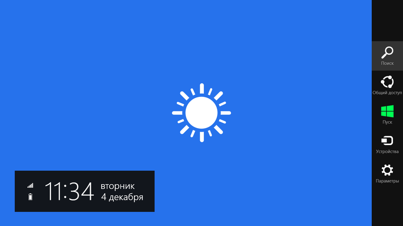
Alternatively, users in the Metro and the usual mode offered a truncated copy of the taskbar, pop-up on the cursor. A new way to control the interface - a hybrid control finger and mouse - the third problem point interface Windows 8.
If you hover the mouse in the upper or lower right corner, a truncated analog of the taskbar will pop up, where you can crawl into a search or restart your computer. In the lower left corner you will find the transition to the Start screen ", and in the upper left - something like a list of recently launched applications.
There were almost no pop-up items in Windows before. The only exception I know is the collapsible taskbar, which pops up when you hover the mouse back, but this functionality is not very popular. In the rest - here you have the taskbar, where all the main icons are, here is the Start button, where all the others click on the button, you will get the result. However, turning to the Metro-interface sets new tasks - what should the user do when the full-screen application is running, provided that most windows-users do not know how to use keyboard shortcuts? The solution came in the form of pop-up panels - point the mouse there and get the following. A classic case of solving a problem that you yourself have created. And okay, the decision would be sensible.

Pop-up menus are very bad. This decision came from the web, and its weaknesses are also known from there. Managing pop-up menus is too dependent on the accuracy of pointing the cursor - which makes it necessary to pay more attention to such actions than it should.
But this can still be adjusted - worse, that sometimes this panel pops up randomly from one reckless movement of the mouse. This is not a tragedy, and even almost not annoying - but leaves the impression of a sloppy, raw decision. Instead of the interface honed over the years - some patches.
Obviously, the creators saw Windows 8 as a kind of transition to a completely new interface. Instead of a desktop with chaos of icons, there is a strict Start panel, instead of a taskbar, a context menu, instead of chaos of old programs for Windows, launched on a full screen, executed according to the guidelines of the new Windows style of the application. We wanted the best, in short. As a result, Windows 8 turned out: a child of incest, born from birth usability-schizophrenia.
Easy transition - Windows 8 rolls over the "seven" without much strain somewhere in an hour - or faster, if the hardware allows. In this case, you can choose to save all user files, installed programs and interface settings - and they will be saved. For example, I was worried about my MS Office starter - MS no longer gives free Word, so I would be sorry to lose it when reinstalling. However, he, like the rest of the program, survived. Even the saved passwords in the browser did not fly away.
Before updating, Windows Installer will tell you which drivers may have problems after installation - they will need to be reinstalled. In the release candidate version there were problems, for example, with some antiviruses - but by the release of Windows 8 most manufacturers have updated software, and there will be at least problems. Compared to what it was before, this is no longer just an improvement, but a qualitative leap forward.
Online user account. In recent years, Microsoft, by hook or by crook, tried to make me get a Live ID, which I eventually did just out of curiosity - there was no use for it because I don’t use Windows mail and don’t use their instant messengers. But finally, they made a logical step in linking a user account with a Live ID account. This solution fits into a certain sequence: in Windows 7 for the first time it was recognized that the OS is mainly used to access the Internet - a wi-fi connection appeared during the installation of the system. Windows 8 is ripe for understanding that without full integration into web services it is impossible to win competition for the future. And, using their immense resources, they quickly reduce the backlog of Google.
Sounds of Windows Sounds have become more pleasant - an important trifle. The old sounds of Windows, especially when you do something wrong, sounded ringing in my ears. Feeling as if you had come to the wrong door, and you with a rag across your face: “Get out of here!” Now the alarm sounds as if they were wrapped in a thick cloth, and the message reads like a polite “Sorry, you are not here.” Being sensitive enough to acoustic comfort, I can say that this is a fat plus to the sensations of using the system, despite all of the above.
Speed -? This point is questionable, since a slight acceleration in some detail is accompanied by an increased number of glitches. As for Metro applications, the situation there is generally the opposite - they are very slow and hard to launch. So far, Windows 8 resembles a powerful, but constantly glochnuschy engine. Acceleration - sneezed - slows down - again acceleration. But, they say, on beeches with SSD, it works wonders. We'll see.
Windows 8 leaves a dual impression - it is a step forward and a jump to the side at the same time. Judging by the rumors about Windows Blue, Redmond realized that they had done something wrong. But I would like them to also understand what exactly they did wrong. Redrawing the desktop interface according to mobile OS patterns is an architectural insanity. Unification is a useful thing if you do it wisely and use all the capabilities of the platform to the maximum.
Personally, I see two scenarios:
1. Conservative - return the “Start” button, leave the good old desktop, show the taskbar in all applications by default, discard pop-up panels because they are useless. Like that:

2. Progressive:
If you believe the forecasts, the news about what will be next Windows, we will hear pretty soon.
I will start with the shortcomings, because it's easier - all the problems of the new Windows have one word in the root: Metro. The intentions of Microsoft designers are clear: to cross a
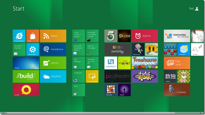
Start Screen
The compact panel of the old "Start" was replaced by a whole screen. There is more space for applications, but now the trivial thing - launching another application - takes too much attention. A simple user script: the user is watching a certain video and wants to simultaneously launch some other application, for example, Skype. A Windows 7 user simply presses the Start button, starts Skype, almost without distracting from the video. A Windows 8 user should now first pause the video before launching Skype - or, during the transition to the Start panel, he will simply drop out of view for a couple of seconds.
')
The “Start” screen (it’s also a panel with Metro applications) obviously claims to replace the desktop and the old Start with functionality at the same time, while not giving access to some of the functionality (taskbar), and the desktop itself quietly exists in parallel, although its meaning — when it is no longer the start page — is completely incomprehensible. That is, two entities of the same purpose - one unfinished, the other unfinished - exist in parallel, confusing the user. And if you add duplication of applications here - for example, there is just a desktop Skype, and there is its version for “Start” - then the picture of an attempt to brutally fuck the consumer brain becomes almost criminal in color.
Let's say Google Chrome offers the user a “restart in Windows 8 mode”. In practice, this means only the same Google Chrome in full screen mode. This is an important point - the so-called "Metro-mode" is just a full-screen mode without a taskbar.
The extermination of the taskbar is the second whale on which the Win8 interface rests. Let us examine it in more detail.
Task bar
The benefits of the taskbar are obvious - this is a status bar that shows the time, basic parameters (network, sound, etc.), running or fixed applications, and, earlier, the Start button, which gave even more features. The taskbar is also present in mobile OSs - and, for example, on Android, its capabilities are constantly expanding. In Windows Phone 7, judging by the reviews, the situation is slightly different - when launching applications, the taskbar is hidden. The decision is controversial, but understandable - in the mobile interface, the usable area is worth its weight in gold. But for users of desktops and laptops, the lack of usable space is a problem in the second ten of the list of priorities! And most applications can, if desired, be launched in full screen with one touch of the F11 key. It turns out that Microsoft limits the necessary functionality in favor of standardization with the interfaces of mobile devices - by definition, more limited capabilities. This is called degradation.
Alternatively, users in the Metro and the usual mode offered a truncated copy of the taskbar, pop-up on the cursor. A new way to control the interface - a hybrid control finger and mouse - the third problem point interface Windows 8.
Pop up panels
If you hover the mouse in the upper or lower right corner, a truncated analog of the taskbar will pop up, where you can crawl into a search or restart your computer. In the lower left corner you will find the transition to the Start screen ", and in the upper left - something like a list of recently launched applications.
There were almost no pop-up items in Windows before. The only exception I know is the collapsible taskbar, which pops up when you hover the mouse back, but this functionality is not very popular. In the rest - here you have the taskbar, where all the main icons are, here is the Start button, where all the others click on the button, you will get the result. However, turning to the Metro-interface sets new tasks - what should the user do when the full-screen application is running, provided that most windows-users do not know how to use keyboard shortcuts? The solution came in the form of pop-up panels - point the mouse there and get the following. A classic case of solving a problem that you yourself have created. And okay, the decision would be sensible.
Pop-up menus are very bad. This decision came from the web, and its weaknesses are also known from there. Managing pop-up menus is too dependent on the accuracy of pointing the cursor - which makes it necessary to pay more attention to such actions than it should.
But this can still be adjusted - worse, that sometimes this panel pops up randomly from one reckless movement of the mouse. This is not a tragedy, and even almost not annoying - but leaves the impression of a sloppy, raw decision. Instead of the interface honed over the years - some patches.
Obviously, the creators saw Windows 8 as a kind of transition to a completely new interface. Instead of a desktop with chaos of icons, there is a strict Start panel, instead of a taskbar, a context menu, instead of chaos of old programs for Windows, launched on a full screen, executed according to the guidelines of the new Windows style of the application. We wanted the best, in short. As a result, Windows 8 turned out: a child of incest, born from birth usability-schizophrenia.
Changes for the better
Easy transition - Windows 8 rolls over the "seven" without much strain somewhere in an hour - or faster, if the hardware allows. In this case, you can choose to save all user files, installed programs and interface settings - and they will be saved. For example, I was worried about my MS Office starter - MS no longer gives free Word, so I would be sorry to lose it when reinstalling. However, he, like the rest of the program, survived. Even the saved passwords in the browser did not fly away.
Before updating, Windows Installer will tell you which drivers may have problems after installation - they will need to be reinstalled. In the release candidate version there were problems, for example, with some antiviruses - but by the release of Windows 8 most manufacturers have updated software, and there will be at least problems. Compared to what it was before, this is no longer just an improvement, but a qualitative leap forward.
Online user account. In recent years, Microsoft, by hook or by crook, tried to make me get a Live ID, which I eventually did just out of curiosity - there was no use for it because I don’t use Windows mail and don’t use their instant messengers. But finally, they made a logical step in linking a user account with a Live ID account. This solution fits into a certain sequence: in Windows 7 for the first time it was recognized that the OS is mainly used to access the Internet - a wi-fi connection appeared during the installation of the system. Windows 8 is ripe for understanding that without full integration into web services it is impossible to win competition for the future. And, using their immense resources, they quickly reduce the backlog of Google.
Sounds of Windows Sounds have become more pleasant - an important trifle. The old sounds of Windows, especially when you do something wrong, sounded ringing in my ears. Feeling as if you had come to the wrong door, and you with a rag across your face: “Get out of here!” Now the alarm sounds as if they were wrapped in a thick cloth, and the message reads like a polite “Sorry, you are not here.” Being sensitive enough to acoustic comfort, I can say that this is a fat plus to the sensations of using the system, despite all of the above.
Speed -? This point is questionable, since a slight acceleration in some detail is accompanied by an increased number of glitches. As for Metro applications, the situation there is generally the opposite - they are very slow and hard to launch. So far, Windows 8 resembles a powerful, but constantly glochnuschy engine. Acceleration - sneezed - slows down - again acceleration. But, they say, on beeches with SSD, it works wonders. We'll see.
What's next?
Windows 8 leaves a dual impression - it is a step forward and a jump to the side at the same time. Judging by the rumors about Windows Blue, Redmond realized that they had done something wrong. But I would like them to also understand what exactly they did wrong. Redrawing the desktop interface according to mobile OS patterns is an architectural insanity. Unification is a useful thing if you do it wisely and use all the capabilities of the platform to the maximum.
Personally, I see two scenarios:
1. Conservative - return the “Start” button, leave the good old desktop, show the taskbar in all applications by default, discard pop-up panels because they are useless. Like that:
2. Progressive:
- permanently abandon the desktop, replacing it with the Start panel
- expand the functionality of the Start screen: add the ability to create folders there, shortcuts to files, change the background and, of course, the recycle bin (:
- return the taskbar, rejecting the pop-up panels.
If you believe the forecasts, the news about what will be next Windows, we will hear pretty soon.
Source: https://habr.com/ru/post/157331/
All Articles