Mail without deer
This post is for those who are interested in how, in Yandex, product interfaces with a multimillion audience are created. We want to tell as much as possible why we decided to create a new Trinity mail , what guided us in the work on its design, to share with you the solution of logical problems.
The most popular and important questions, the designer of the new interface, Anna Kotlyarevskaya, answered in an interview:
')
Read and see why we dared to remove advertising, why there are no group operations, where did the links to other services go, why it is impossible to disable the grouping of letters on the topic - and much more.
The audience of any mail can be divided into two types of users. The first is people who go to the post office only a few times a week and only to check notification letters: about discounts, news from social networks, etc. And the second - those who use mail for business purposes. They keep an active correspondence in it and receive and write several dozen letters every day.
The first type of users is completely satisfied with the standard webmail interface. They appreciate his familiarity and react painfully to change.
The second type of users is extremely important in the speed of work with mail: reducing the number of clicks with each action, working without losing context, the ability to quickly understand the essence of a long correspondence. We perfectly understand their problems, since we ourselves belong to this type.
To solve the problems of active users, we started developing a new mail - strict, fast, ergonomic, and without deer.
One of the main factors slowing down the work with standard webmail is the need to move from the list of letters to a specific letter and back. This always requires clicks, and the context of the page changes completely every time you go. You can significantly increase the speed of work with mail, if we exclude the need to return to the list of letters from the screen of the letter.
As part of the old interface, we tried to solve this problem like this:
Other webmails did the same:

But all these decisions are not obvious: the control with the arrow, whatever it may be, does not give an understanding of which letter the transition will take. I must say that we initially also had only arrows, and working on the problem further, we added the signatures-tips “Prev” and “Trace” to them. But it turned out that this did not add clarity: it was unclear for people what the previous letter was and what the next one was. No matter how hard we tried, these controls were never popular and did not solve the problem.
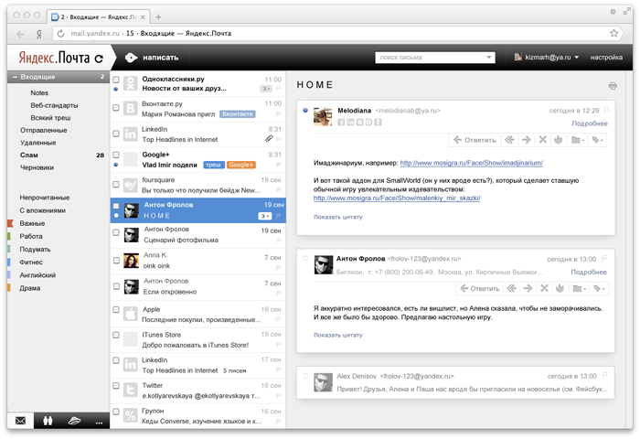
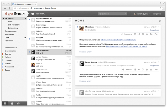
A natural solution to the problem of simplifying navigation in the mail is to have both a list of letters and a letter on one screen. That is, a three-pane interface. And it has long been implemented by numerous desktop clients.
For the web, this solution was very time consuming due to the difference in technology. The fact is that clients download letters to the user's computer and store them there, which ensures fast work with mail, which has no space for requests to the server and waiting for a response from it. Historically, the Web could not boast of such speed, because it strongly depends on a large number of factors: browsers, computer performance, Internet connection speed. That is why complex interfaces on the web appear late.
Often, when designing such web interfaces, the designer faces a number of problems. Some solutions and discoveries have to be adapted due to technological constraints, and the implementation of others is to wait for months, because only after the design or prototype developers begin to think about how to make the “future”.
So it was with a three-pane interface: we started designing it long before we found the possibility of its technical implementation. Having set the task of “making the future” to the developers, we began studying the existing solutions. They looked for their strengths and weaknesses, analyzed how they developed in order to find the best solution based on their experience.
For example, the Windows 8 email client inspired us with its minimalism and cleanliness.
Designers of the Rambler company created an excellent screen for group operations on letters in the new interface of their mail.
Gmail's three-pane interface displays a conversation in the form of a chat with the order of the letters “old above fresh”. This logic confused us because different chronologies are used in the adjacent columns.
Apple Mail showed an elegant solution to threads and generally served as an excellent benchmark for the level of quality that you want to strive for.
In general, we carefully studied a dozen more three-pane interfaces, among which were also:
Microsoft Outlook
New Outlook
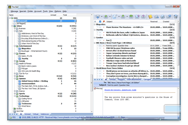
The bat
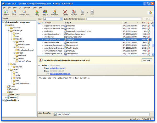
Mozilla thunderbird
Sparrow
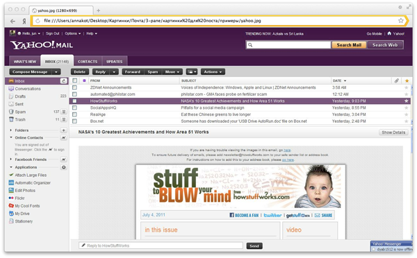
Yahoo! Mail
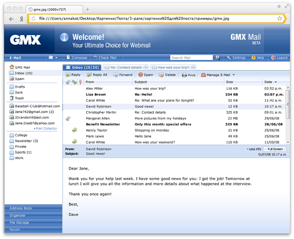
GMX
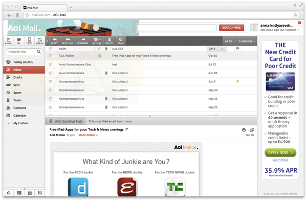
Aol Mail
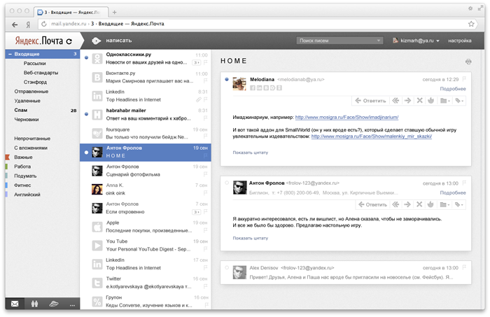
One of the first layouts, created on the basis of almost 2009 model year mail, looked like this:
Some changes to the interface were made with the development of the core. So, for example, the style of counters of letters in the left column was changed, underlining of folders was unnecessary, the head of the letter was reduced. After the development of Eva , the look of the list of letters has changed:
So, having made the interface three-panel, we overcame the main barrier, reducing the speed of work with mail. But there remained one more important factor slowing down the business correspondence: in order to read the long discussion, it was necessary to open the letters one by one, clicking on each of them.
It is worth saying that in our main interface there is no such problem, since for the majority of our users, real long correspondences are quite rare. When threads appear in it, people will have to get used to something new, and this is always painful. However, in the new interface for active correspondence, the priorities are reversed: speed is extremely important, which means that threads are absolutely necessary.
First, we wanted to show the thread as a single dialogue, where the beginning is from above, and the end from below - as in a normal chat. But we remembered in time that the different chronology of the letters in two adjacent columns, as was done in Gmail, did not suit us. They discarded this idea and moved on.
We decided not to break the standard sorting of letters in the mail, when the first letter is from the bottom, the next ones are from above, and support it in threads. In addition, Apple Mail did that to us, so there was someone to be here.
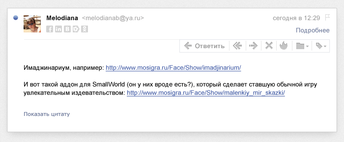
The right panel of the new mail began to look like this:
This solution seems surprising in its simplicity and clarity. It does not break any habits, clearly shows that the letters remained separate entities, and does not force the user to understand the logic of displaying threads.
The menu that appears in each letter in the thread helps this. The place that it occupied before remained almost empty. Logically, there should be controls for working with the whole thread, and, most likely, it will be so over time. But now, while the new mail is not yet familiar to our users, the presence of such a global toolbar will lead to errors: people are not used to grouping letters and do not expect that by clicking on one button in the menu you can do something with several letters at once. In order to avoid such mistakes, we made an intermediate decision: remove the group work controls and show them only after active selection of all the letters in the thread. We will further develop this solution.
Having received the first prototype with threads, we found the need to display the status of each letter inside the thread: what is read and what is not. It was not immediately obvious, because it seemed that the correspondence should behave like a regular letter: opened it - and it was immediately “read”, there is no need to complicate something. But then it would turn out that the important habit of active users is not maintained: mark individual letters unread, then to return to them. If you mark several letters in a thread unread, the interface, of course, should give feedback.
Trying to minimize the number of different visual tools, we thought about using the same indicator of unreadability within the thread as in the list of letters - making the text bold. But immediately realized that this is a bad decision. While reading letters in a thread, the text, when its status “jumps”, changes. It turned out that unread letters will have to be distinguished somehow in a new way:
As a result, to highlight unread emails, we decided to use the point customary for desktop email clients. It is clearly visible, but its disappearance does not interfere with reading.

There was one more important question: which of the letters should be shown when opening a thread in which there are several unread messages? The freshest or oldest of them?
The main argument for the most recent letter was that, being guided in the list of letters, a person sees the name of the sender and the first line of the most recent letter from the thread. Therefore, while maintaining the expectation of the user, it is precisely this that should be shown in an open thread - what I clicked on, I got it.
The argument for showing the oldest of the unread was the need to show the same place where the person stopped last time. It was not easy to choose one of the options.
We decided to make a prototype with one of the solutions and try to use it in work. So we came to an understanding of what to show in a thread, where several unread letters, the freshest letter is impossible. Opening such a thread, you had to scroll it to the right place every time in order to read from the beginning to the end, and not vice versa.
The second option was better. It turned out that the basic principle works well here: you need to show the interface in the state in which the user left it. We were absolutely satisfied with the following prototype, in which, when opening a thread, the oldest of unread letters was displayed.
So, we were already pleased with the basic behavior of the interface. It remained to change a thousand cosmetic details and nuances of interaction.
At a certain stage of the work, we came to the understanding that one more requirement should be included in the task: a new mail should give the impression of a desktop application. And we set out to analyze the parameters for which we do not reach table-top quality and eliminate the differences.
The links in the list of letters changed color to black, since we wanted to emphasize that the new mail is not a hypertext page that should comply with all web canons, but a single-screen desktop application.
The three-pane interface, on the screen of which there are already so many things, clearly did not fit the height of the standard portal “header” of Yandex services.
And we began to cut it. First like this:

Then:

And then:

At the same time, we found that neutral black-gray colors are very much in line with our new mail, making it as calm and non-irritating as possible.
Honestly, such an abbreviation “caps” was not easy for us. The fact is that the “caps” of many Yandex services are unified, so that people can more easily navigate the Portal. In addition, they help them to get acquainted with adjacent services of Yandex and start using them. In short, depriving the portal menu service, you need to be aware of some of the risks.
But still, we decided to make this change, because initially we did not treat the new mail as an interface, which we will begin to install to all users as the main one. But if the interface becomes popular by itself, we will return the portal menu to it.
To save space, we reduced the width of the left column, removing the banner from there. In addition, it allowed the list of tags to evolve and no longer crowded, giving place to the banner.

Receive such mail:
For some reason, our interface still looked like a house of cards, unreconciled and redundant. Desktop interfaces are neutral, stable and compliant, like a mechanical typewriter. Such an interface can not be plastic and disperse, it must be solid. Blocks do not have the right to twitch and jump, each of them must have its own strictly defined place. Neatness in this regard plays an important role: if the eye cannot highlight accents, focus attention on what is necessary, stumble over random lines and graphic noise, then the whole picture collapses.
We carefully get rid of the noise, leaving only the information. Sometimes it was not easy to find a balance: the product was created for active work with the mail, which means that many geek functions in it should have remained. For example, the flags in the list of letters were left at hand, but the horizontal dividers between the letters were thrown out as unnecessary - the letters themselves are perfectly separated from each other if they are helped by a modular grid:

To preserve the stability of the desktop, we tried to eliminate the possibility of twitching and jumping blocks. The rule here is simple - if we showed something on the page, it should remain in the same place until full load and keep the same dimensions. Not everything here was implemented in the first version, but we continue to work.
In modern desktop applications in the list of letters there are no checkboxes. And our interface checkboxes make it look complicated. It is clear that web interfaces can do without them, you only need to think over how to replace them so that the system remains operational. It was necessary to understand what means would allow people to allocate several letters without checkboxes.
Here we again decided to use the desktop habits of people: select many letters with the Shift key, as well as when holding the held mouse on the list. Considering how to ensure that this behavior does not overlap with the drag-n-drop that our users are used to, we implemented it in a prototype.
By the way, one nuance here remains unresolved: we did not dare to select the letters by pressing Ctrl, because we were afraid to interrupt the standard browser shortcut to open the link in a new tab. Perhaps in the near future we will decide on this, after all, we have already shown by all interface means that the elements in the list of letters are not links, one should not expect standard reference behavior from them. Here, rather, it is already appropriate to open a letter in a new tab on a double-click, again drawing an analogy with applications (yes, it is not obvious, but you don’t need to).
Of course, the gap checkboxes was not an easy decision. It was immediately clear that any change of checkboxes would not be obvious, and before finding a way to single out several letters, a person would stumble. However, we clearly understood that it is possible to deprive the checkbox interface only at one moment - before launch. Later this cannot be done - people will develop habits, certain expectations from the interface will be formed. And at the time of launching the entire interface for users is new and unknown: there are no habits, no requirements, you can afford more. The lack of checkboxes took us one step closer to the desktop application and made it possible to greatly reduce the amount of noise.
It was unexpectedly nice to feel the familiar logic of the desktop in the browser window.
So, we faced the following tasks:
1. Reduce the number of clicks for each action, to ensure work without losing context, to provide an opportunity to quickly understand the essence of a long correspondence.
2. New mail was supposed to give the impression of a desktop application.
It seems that all problems are solved, and the project team agreed with this. Of course, there are things that we still have to polish, so that the interface becomes more solid and tangible.
We continue to work out all the joints and connections of its elements. This part of the work often remains undervalued in web interfaces, and it greatly influences the overall feel of the product.
The borders of the input are nicely adapted to the background color.
On the cap there is a light texture hinting at the material surface.
The cap lies on the entire post on top, as evidenced by the nature of the shadow under it. There is an understandable physical model of space organization.
Letters have a clear border and a clear shadow, which separates the letter well from the background.

Surfaces become harder, and their joints are clearer.
In the meantime, we are working on this, you can try our new mail in beta mode.
The most popular and important questions, the designer of the new interface, Anna Kotlyarevskaya, answered in an interview:
')
Read and see why we dared to remove advertising, why there are no group operations, where did the links to other services go, why it is impossible to disable the grouping of letters on the topic - and much more.
Task
The audience of any mail can be divided into two types of users. The first is people who go to the post office only a few times a week and only to check notification letters: about discounts, news from social networks, etc. And the second - those who use mail for business purposes. They keep an active correspondence in it and receive and write several dozen letters every day.
The first type of users is completely satisfied with the standard webmail interface. They appreciate his familiarity and react painfully to change.
The second type of users is extremely important in the speed of work with mail: reducing the number of clicks with each action, working without losing context, the ability to quickly understand the essence of a long correspondence. We perfectly understand their problems, since we ourselves belong to this type.
To solve the problems of active users, we started developing a new mail - strict, fast, ergonomic, and without deer.
Analysis
One of the main factors slowing down the work with standard webmail is the need to move from the list of letters to a specific letter and back. This always requires clicks, and the context of the page changes completely every time you go. You can significantly increase the speed of work with mail, if we exclude the need to return to the list of letters from the screen of the letter.
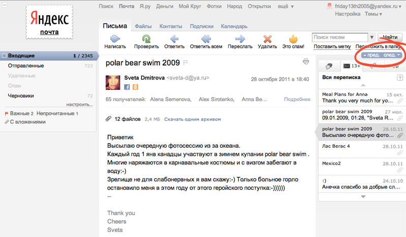
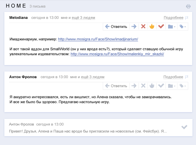
As part of the old interface, we tried to solve this problem like this:
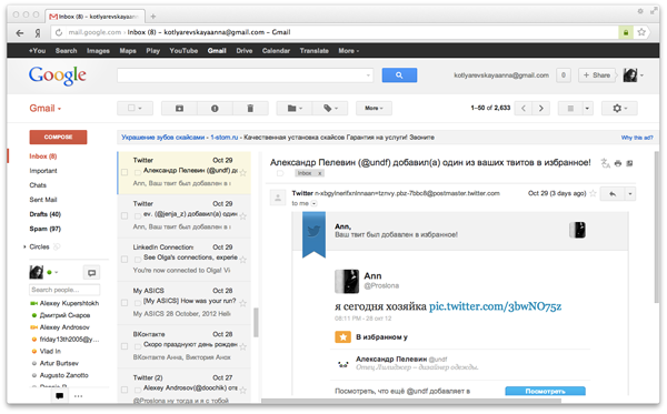
Other webmails did the same:
But all these decisions are not obvious: the control with the arrow, whatever it may be, does not give an understanding of which letter the transition will take. I must say that we initially also had only arrows, and working on the problem further, we added the signatures-tips “Prev” and “Trace” to them. But it turned out that this did not add clarity: it was unclear for people what the previous letter was and what the next one was. No matter how hard we tried, these controls were never popular and did not solve the problem.
A natural solution to the problem of simplifying navigation in the mail is to have both a list of letters and a letter on one screen. That is, a three-pane interface. And it has long been implemented by numerous desktop clients.
For the web, this solution was very time consuming due to the difference in technology. The fact is that clients download letters to the user's computer and store them there, which ensures fast work with mail, which has no space for requests to the server and waiting for a response from it. Historically, the Web could not boast of such speed, because it strongly depends on a large number of factors: browsers, computer performance, Internet connection speed. That is why complex interfaces on the web appear late.
Often, when designing such web interfaces, the designer faces a number of problems. Some solutions and discoveries have to be adapted due to technological constraints, and the implementation of others is to wait for months, because only after the design or prototype developers begin to think about how to make the “future”.
So it was with a three-pane interface: we started designing it long before we found the possibility of its technical implementation. Having set the task of “making the future” to the developers, we began studying the existing solutions. They looked for their strengths and weaknesses, analyzed how they developed in order to find the best solution based on their experience.
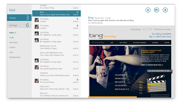
For example, the Windows 8 email client inspired us with its minimalism and cleanliness.
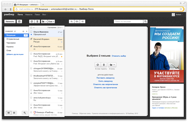
Designers of the Rambler company created an excellent screen for group operations on letters in the new interface of their mail.
Gmail's three-pane interface displays a conversation in the form of a chat with the order of the letters “old above fresh”. This logic confused us because different chronologies are used in the adjacent columns.
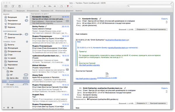
Apple Mail showed an elegant solution to threads and generally served as an excellent benchmark for the level of quality that you want to strive for.
In general, we carefully studied a dozen more three-pane interfaces, among which were also:
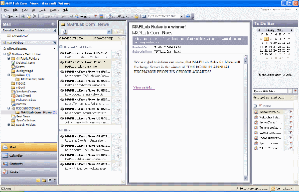
Microsoft Outlook
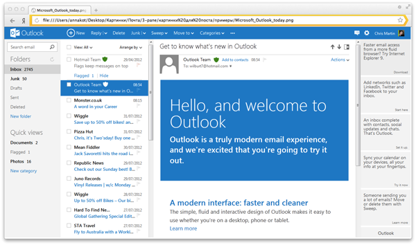
New Outlook
The bat
Mozilla thunderbird
Sparrow
Yahoo! Mail
GMX
Aol Mail
The first approach to the projectile
One of the first layouts, created on the basis of almost 2009 model year mail, looked like this:
Some changes to the interface were made with the development of the core. So, for example, the style of counters of letters in the left column was changed, underlining of folders was unnecessary, the head of the letter was reduced. After the development of Eva , the look of the list of letters has changed:
Three columns were not enough
So, having made the interface three-panel, we overcame the main barrier, reducing the speed of work with mail. But there remained one more important factor slowing down the business correspondence: in order to read the long discussion, it was necessary to open the letters one by one, clicking on each of them.
It is worth saying that in our main interface there is no such problem, since for the majority of our users, real long correspondences are quite rare. When threads appear in it, people will have to get used to something new, and this is always painful. However, in the new interface for active correspondence, the priorities are reversed: speed is extremely important, which means that threads are absolutely necessary.
First, we wanted to show the thread as a single dialogue, where the beginning is from above, and the end from below - as in a normal chat. But we remembered in time that the different chronology of the letters in two adjacent columns, as was done in Gmail, did not suit us. They discarded this idea and moved on.
We decided not to break the standard sorting of letters in the mail, when the first letter is from the bottom, the next ones are from above, and support it in threads. In addition, Apple Mail did that to us, so there was someone to be here.
The right panel of the new mail began to look like this:
This solution seems surprising in its simplicity and clarity. It does not break any habits, clearly shows that the letters remained separate entities, and does not force the user to understand the logic of displaying threads.
The menu that appears in each letter in the thread helps this. The place that it occupied before remained almost empty. Logically, there should be controls for working with the whole thread, and, most likely, it will be so over time. But now, while the new mail is not yet familiar to our users, the presence of such a global toolbar will lead to errors: people are not used to grouping letters and do not expect that by clicking on one button in the menu you can do something with several letters at once. In order to avoid such mistakes, we made an intermediate decision: remove the group work controls and show them only after active selection of all the letters in the thread. We will further develop this solution.
Having received the first prototype with threads, we found the need to display the status of each letter inside the thread: what is read and what is not. It was not immediately obvious, because it seemed that the correspondence should behave like a regular letter: opened it - and it was immediately “read”, there is no need to complicate something. But then it would turn out that the important habit of active users is not maintained: mark individual letters unread, then to return to them. If you mark several letters in a thread unread, the interface, of course, should give feedback.
Trying to minimize the number of different visual tools, we thought about using the same indicator of unreadability within the thread as in the list of letters - making the text bold. But immediately realized that this is a bad decision. While reading letters in a thread, the text, when its status “jumps”, changes. It turned out that unread letters will have to be distinguished somehow in a new way:
As a result, to highlight unread emails, we decided to use the point customary for desktop email clients. It is clearly visible, but its disappearance does not interfere with reading.
There was one more important question: which of the letters should be shown when opening a thread in which there are several unread messages? The freshest or oldest of them?
The main argument for the most recent letter was that, being guided in the list of letters, a person sees the name of the sender and the first line of the most recent letter from the thread. Therefore, while maintaining the expectation of the user, it is precisely this that should be shown in an open thread - what I clicked on, I got it.
The argument for showing the oldest of the unread was the need to show the same place where the person stopped last time. It was not easy to choose one of the options.
We decided to make a prototype with one of the solutions and try to use it in work. So we came to an understanding of what to show in a thread, where several unread letters, the freshest letter is impossible. Opening such a thread, you had to scroll it to the right place every time in order to read from the beginning to the end, and not vice versa.
The second option was better. It turned out that the basic principle works well here: you need to show the interface in the state in which the user left it. We were absolutely satisfied with the following prototype, in which, when opening a thread, the oldest of unread letters was displayed.
Again the challenge
So, we were already pleased with the basic behavior of the interface. It remained to change a thousand cosmetic details and nuances of interaction.
At a certain stage of the work, we came to the understanding that one more requirement should be included in the task: a new mail should give the impression of a desktop application. And we set out to analyze the parameters for which we do not reach table-top quality and eliminate the differences.
Decision
List of letters
The links in the list of letters changed color to black, since we wanted to emphasize that the new mail is not a hypertext page that should comply with all web canons, but a single-screen desktop application.
"Cap"
The three-pane interface, on the screen of which there are already so many things, clearly did not fit the height of the standard portal “header” of Yandex services.
And we began to cut it. First like this:
Then:
And then:
At the same time, we found that neutral black-gray colors are very much in line with our new mail, making it as calm and non-irritating as possible.
Honestly, such an abbreviation “caps” was not easy for us. The fact is that the “caps” of many Yandex services are unified, so that people can more easily navigate the Portal. In addition, they help them to get acquainted with adjacent services of Yandex and start using them. In short, depriving the portal menu service, you need to be aware of some of the risks.
But still, we decided to make this change, because initially we did not treat the new mail as an interface, which we will begin to install to all users as the main one. But if the interface becomes popular by itself, we will return the portal menu to it.
Left column
To save space, we reduced the width of the left column, removing the banner from there. In addition, it allowed the list of tags to evolve and no longer crowded, giving place to the banner.
Receive such mail:
We get rid of noise and inaccuracies
For some reason, our interface still looked like a house of cards, unreconciled and redundant. Desktop interfaces are neutral, stable and compliant, like a mechanical typewriter. Such an interface can not be plastic and disperse, it must be solid. Blocks do not have the right to twitch and jump, each of them must have its own strictly defined place. Neatness in this regard plays an important role: if the eye cannot highlight accents, focus attention on what is necessary, stumble over random lines and graphic noise, then the whole picture collapses.
We carefully get rid of the noise, leaving only the information. Sometimes it was not easy to find a balance: the product was created for active work with the mail, which means that many geek functions in it should have remained. For example, the flags in the list of letters were left at hand, but the horizontal dividers between the letters were thrown out as unnecessary - the letters themselves are perfectly separated from each other if they are helped by a modular grid:
To preserve the stability of the desktop, we tried to eliminate the possibility of twitching and jumping blocks. The rule here is simple - if we showed something on the page, it should remain in the same place until full load and keep the same dimensions. Not everything here was implemented in the first version, but we continue to work.
In modern desktop applications in the list of letters there are no checkboxes. And our interface checkboxes make it look complicated. It is clear that web interfaces can do without them, you only need to think over how to replace them so that the system remains operational. It was necessary to understand what means would allow people to allocate several letters without checkboxes.
Here we again decided to use the desktop habits of people: select many letters with the Shift key, as well as when holding the held mouse on the list. Considering how to ensure that this behavior does not overlap with the drag-n-drop that our users are used to, we implemented it in a prototype.
By the way, one nuance here remains unresolved: we did not dare to select the letters by pressing Ctrl, because we were afraid to interrupt the standard browser shortcut to open the link in a new tab. Perhaps in the near future we will decide on this, after all, we have already shown by all interface means that the elements in the list of letters are not links, one should not expect standard reference behavior from them. Here, rather, it is already appropriate to open a letter in a new tab on a double-click, again drawing an analogy with applications (yes, it is not obvious, but you don’t need to).
Of course, the gap checkboxes was not an easy decision. It was immediately clear that any change of checkboxes would not be obvious, and before finding a way to single out several letters, a person would stumble. However, we clearly understood that it is possible to deprive the checkbox interface only at one moment - before launch. Later this cannot be done - people will develop habits, certain expectations from the interface will be formed. And at the time of launching the entire interface for users is new and unknown: there are no habits, no requirements, you can afford more. The lack of checkboxes took us one step closer to the desktop application and made it possible to greatly reduce the amount of noise.
It was unexpectedly nice to feel the familiar logic of the desktop in the browser window.
Conclusion
So, we faced the following tasks:
1. Reduce the number of clicks for each action, to ensure work without losing context, to provide an opportunity to quickly understand the essence of a long correspondence.
2. New mail was supposed to give the impression of a desktop application.
It seems that all problems are solved, and the project team agreed with this. Of course, there are things that we still have to polish, so that the interface becomes more solid and tangible.
PS
We continue to work out all the joints and connections of its elements. This part of the work often remains undervalued in web interfaces, and it greatly influences the overall feel of the product.
The borders of the input are nicely adapted to the background color.
On the cap there is a light texture hinting at the material surface.
The cap lies on the entire post on top, as evidenced by the nature of the shadow under it. There is an understandable physical model of space organization.
Letters have a clear border and a clear shadow, which separates the letter well from the background.
Surfaces become harder, and their joints are clearer.
In the meantime, we are working on this, you can try our new mail in beta mode.
Source: https://habr.com/ru/post/156917/
All Articles