30 CSS frameworks for responsive web design
Noticed, recently, at any mention of Twitter Bootstrap, at least one person notes that "too much of it has become." Most people are satisfied, but some have already become boring and they want something new. Therefore, I decided to write an article with a collection of css frameworks, I think everyone can find something for themselves. At the same time we will make the Internet more diverse.

I apologize to those who hate him, but still it is impossible not to mention him in this list.
A very common and widely used framework about which many articles have already been written, so I’ll just briefly list its features:
Based on this, we can say that Bootstrap is all-in-one that will satisfy any developer’s needs, which makes it so popular.
')
The developer claims that this is not a framework, and not a set of blanks, and says that this is a quick and easy way to create a responsive web site.
The following features are highlighted on the official website:
Markup and nothing more.
Markup 1140px, designed for 1280px-monitors. On lower resolution monitors, it becomes rubber and adapts to the width of the browser window. After a certain point, it uses media queries to transfer the mobile version, which puts the columns in a stack, so that the information retains its meaning.
If you are developing sites with a page width of 1140 pixels, this is probably what you need.

Also already mentioned here more than once, so the description is immediately:
I did not find a single mention on Habré, although maybe the search broke ...
Looking for a responsive design, but hate rubber markings? I think it will suit you. The bottom line is this: create many repetitive columns with a fixed width, center them around the window, and that’s it! Adapted not by pixels, but by columns. Those columns that go beyond the limits of the view are hidden and the layout is rebuilt. The official site of this framework is adapted to the resolution of 320, 480, 600, 900 and 1900 pixels.
There are templates on LESS, SCSS, HTML base, template for Photoshop.
Quite an interesting idea, I recommend at least to go and see how it looks.
"The framework with which you are already familiar." By filling reminds Bootstrap.
HTML5 and CSS3 template for creating responsive, cross-browser websites with excellent typography.
Full support for Ruby on Rails, requires the installation of the compass gem. A very simple installation and configuration process, variable width of columns and indents, any number of columns. It is also possible to switch to 1140px markup.
"A good start for a design in which device resolution is removed from the equation."
On the official website there are examples of all three types of display design using media queries.
The developer of this framework used the box-sizing css-property to create a solution that allows the use of fixed spaces between the columns (em / rem) and rubber columns. The distance between the columns will remain the same for all breakpoints, associated with the basic font-size.
The columns are determined by proportions, for example, one second, one third, and can be used as many times as you like, even inside another column. There is also support for IE8, and slightly different markup for IE7 and below. Written in SASS.
Also recently mentioned on Habré, declares itself as the most advanced adaptive framework for the front end.
GGS divides the screen into 18 even-numbered columns. The outermost columns are faces; 16 columns for design remain. Columns can be combined to form an 8-column layout for tablets, or 4-column for phones. With this solution, GGS covers resolutions from 240px to 2560px.
It is rather not a framework, but a tool for generating templates using HTML5, CSS3 and jQuery.

For owners of netbooks - you need to scroll down, I myself did not immediately understand where I got.
320 and Up is a lightweight, easy-to-use responsive template for web design. I changed my principle from “first design for small screens” to “content first, then markup”.
HTML5 and CSS3 development kit, which provides a foundation for the rapid development of a website design. The framework was built in compliance with typographic standards, and combines the principles of layout with rubber columns, basic layout and adaptive design "first for mobile devices."
Columnal is a “remix” of several other markup. Rubber label taken from 1140 CSS Grid, additional features taken from the 960 Grid System. The width is 1140px, rubber, so it will match the width of most browsers.
Ingrid is a lightweight CSS markup rubber system whose goal is to reduce the need to use classes or individual types. Because of this, it becomes less intrusive and easier to rebuild for adaptive layout. It is also an expandable system that is easy to customize for your own purposes.
YAMB is a toolkit for web designers that allows you to cost responsive websites faster. YAMB websites will be optimized for screens with a width of 320 to infinity.
Less Framework 4 contains 4 layouts and three sets of typography, all based on a single grid.
Versions of typesetting: standard, for tablets, for mobile devices and wide for mobile devices
Each layout is based on 68px wide columns and 24px indents. Only the number of columns and the width of the indentation changes.


Minimal, but at the same time sufficient adaptive framework.

"Freymork for serious web developers."
HTML KickStart is a set of HTML5, CSS, JS (jQuery) files that provide basic design for sites, freeing developers from design work.
In order to create a website, it is not necessary to deal with complex engines and their administrative panels. Simpliste is a very easy-to-use HTML template for projects in which you need to create one or a couple of pages with a simple structure. If you want to create a simple information page, and the less code you need to write, and kilobytes to load, the better, then “Simpliste” is just what you need.
Article on Habré: Simpliste
A framework that supports 12-column and 16-column grid width 960px.
Ps. If you find errors or incorrect use of terminology - please write in the LAN, I will correct it.
UPD: Noted about 960.gs, added three more adaptive.
UPD2: Added 4 frameworks from tigerforce and Agel_Nash .
Twitter Bootstrap
I apologize to those who hate him, but still it is impossible not to mention him in this list.
A very common and widely used framework about which many articles have already been written, so I’ll just briefly list its features:
- Language - LESS
- 12 column adaptive markup, support for mobile devices, tablets and monitors, examples of classes: .span3, .span8
- Many components, buttons, drop-down menus, own style of input fields, lists, headers, tags, icons, alerts, tabs, progress bars, tooltips, "accordion", "carousel", and so on.
- Different Javascript Plugins
- Complete documentation
- Scaffolding support, including applying Bootstrap-style to already created HTML
- A large community that writes new plugins that fit the design completely.
Based on this, we can say that Bootstrap is all-in-one that will satisfy any developer’s needs, which makes it so popular.
')
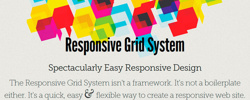
Responsive Grid System
The developer claims that this is not a framework, and not a set of blanks, and says that this is a quick and easy way to create a responsive web site.
The following features are highlighted on the official website:
- You can specify any number of columns, from 2 to 12. Example of column classes: .1of4, .2of7, and so on
- Easy to connect to existing site
- "Rubber" columns, scaled to any width
- You do not need to use the classes .last and .end
- Content is placed first, then markup is selected.
- Use breakpoint (default is 480 pixels)
- You can specify that, at low resolution, the columns do not stack into a stack of 1 column per line, for example, divide the 12 columns into three lines by 4 columns
- Do not require deep knowledge of mathematics (you must be able to count to 12)
Markup and nothing more.
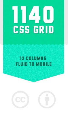
1140 CSS Grid
Markup 1140px, designed for 1280px-monitors. On lower resolution monitors, it becomes rubber and adapts to the width of the browser window. After a certain point, it uses media queries to transfer the mobile version, which puts the columns in a stack, so that the information retains its meaning.
- 12 column markup, examples of column classes: .threecol, .fourcol, and so on
- Mobile versions, suitable for any devices that support CSS or media queries, they can also include x2 images for Retina-displays
- Photoshop template available
- The markup has been tested on new and old computers, laptops, netbooks, tablets, smartphones, and even old Nokia
- Chrome, Safari, Firefox, IE 7, IE 8 support, partial support for IE 6
- Up to 40px padding between columns
- Pictures are compressed to the width of the column in which they are located; indication of the width and height of the picture is not recommended.
If you are developing sites with a page width of 1140 pixels, this is probably what you need.
Skeleton
Also already mentioned here more than once, so the description is immediately:
- 12 column markup, 960px maximum, examples of column classes: .three columns alpha, .two columns omega
- The framework includes typography, buttons and forms.
- Uses many media queries
- Support for Chrome, Safari, Firefox, IE 7 and higher, mobile versions of browsers
- There are extensions for Wordpress, Drupal, as well as gems for Rails
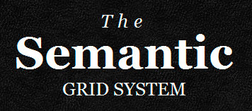
The semantic grid
I did not find a single mention on Habré, although maybe the search broke ...
- Ability to set the width of columns and spaces between them, choose the number of columns, switch between pixels and percentages
- No .grid_x classes required in markup
- Adaptive
- Languages LESS, SCSS, Stylus
- Uses tags article, header, aside
- There is a fixed and “rubber” markings, the ability to fill the window to the full width, multi-level columns
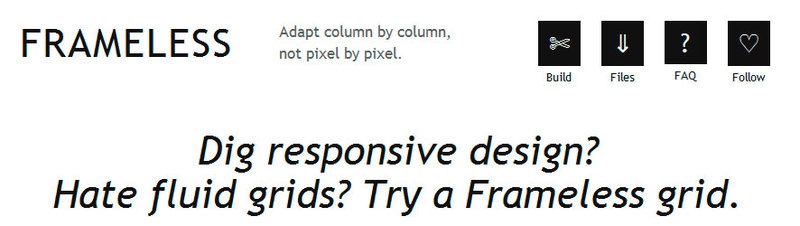
Frameless grid
Looking for a responsive design, but hate rubber markings? I think it will suit you. The bottom line is this: create many repetitive columns with a fixed width, center them around the window, and that’s it! Adapted not by pixels, but by columns. Those columns that go beyond the limits of the view are hidden and the layout is rebuilt. The official site of this framework is adapted to the resolution of 320, 480, 600, 900 and 1900 pixels.
There are templates on LESS, SCSS, HTML base, template for Photoshop.
Quite an interesting idea, I recommend at least to go and see how it looks.
Gumby framework
"The framework with which you are already familiar." By filling reminds Bootstrap.
- 960-pixel “hybrid” markup, 12 or 16 columns, examples of classes: .seven columns, .five columns
- Built-in elements: forms, buttons, drop-down menus and tabs
- Javascript toggles and drawers
- Photoshop templates available
Gridless
HTML5 and CSS3 template for creating responsive, cross-browser websites with excellent typography.
- DBY-approach - the framework removes all the boring details of the development of web sites and web applications
- Comes with everything that you are already tired of doing at the beginning of each new project. Includes CSS, typography, a well-organized folder structure, IE fixes and other useful stuff.
- Mobile-first adaptive markup, adapts to the width of the device
- IE 6/7/8 support thanks to Respond.js
- Very simple and straightforward, there are no pre-installed markup systems or non-semantic classes. It is a starting point, it needs to be edited, customized and rewritten to meet its requirements.
Adaptive Markup for Compass (SUSY)
Full support for Ruby on Rails, requires the installation of the compass gem. A very simple installation and configuration process, variable width of columns and indents, any number of columns. It is also possible to switch to 1140px markup.
The Goldilocks Approach
"A good start for a design in which device resolution is removed from the equation."
- The framework uses a combination of Em, max-width, media queries and templates to make the design resolution independent
- Contains two well-commented CSS files that define three types of media queries: multicolumn, with narrow columns, and single-column.
- Also includes good out-of-box typography.
- It is an attempt to create an adaptive layout that will be completely independent of the device.
On the official website there are examples of all three types of display design using media queries.
Proportional grids
The developer of this framework used the box-sizing css-property to create a solution that allows the use of fixed spaces between the columns (em / rem) and rubber columns. The distance between the columns will remain the same for all breakpoints, associated with the basic font-size.
The columns are determined by proportions, for example, one second, one third, and can be used as many times as you like, even inside another column. There is also support for IE8, and slightly different markup for IE7 and below. Written in SASS.
Foundation 3
Also recently mentioned on Habré, declares itself as the most advanced adaptive framework for the front end.
- Flexible layout that allows you to quickly place elements on the page, and offering multi-level speakers, can be adapted to any size, from phones to TV screens
- Rapid prototyping, there are many styles and elements to speed up the creation of working prototypes that can be polished and immediately sent to production
- Included are forms, buttons, tabs, and so on.
- No need to customize the display on each screen size separately
- Developed by SASS
Amazium
- 1200px layout
- Adaptive 12 column design. Example class - .grid_12, .grid_8
- Typography installed
- Different types of numbered and unordered lists
- Ability to hide items at certain permissions
- Custom forms and tables
- Using media queries
- Adaptive images and video
Golden Grid System
GGS divides the screen into 18 even-numbered columns. The outermost columns are faces; 16 columns for design remain. Columns can be combined to form an 8-column layout for tablets, or 4-column for phones. With this solution, GGS covers resolutions from 240px to 2560px.
- Rubber proportional padding between columns
- The proportions of all the markup elements, including fonts, frames, and so on, are preserved.
- Golden Gridlet - button for the developer, showing the columns involved in the layout
- HTML markup, CSS, LESS, SCSS, JS are available.
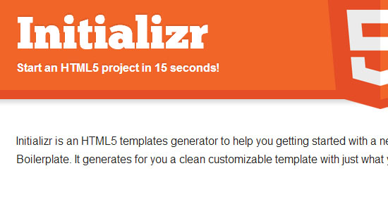
Initializr
It is rather not a framework, but a tool for generating templates using HTML5, CSS3 and jQuery.
- Allows you to create templates based on HTML5 Boilerplate, Bootstrap, or on an adaptive template.
- Documentation is available in Russian and other languages.
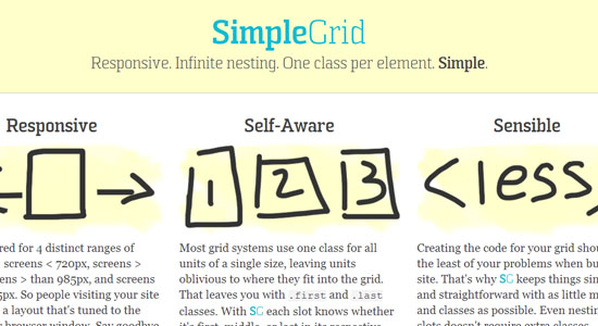
Simple grid
- Supports 4 screen sizes: up to 720, over 720, over 985, and over 1235px
- The visitor receives a layout that is configured exactly for his screen size.
- You do not need to use the classes .first and .last
- Simple as far as possible, classes and markup
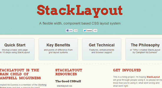
Stack layout
- Total 12 class names
- Easy transition to semantic class names
- Flexible fixed layout
- Easy setup of indents between columns
320 and Up
For owners of netbooks - you need to scroll down, I myself did not immediately understand where I got.
320 and Up is a lightweight, easy-to-use responsive template for web design. I changed my principle from “first design for small screens” to “content first, then markup”.
- Five CSS3 media query values: 480, 600, 768, 992 and 1382px
- The “atmosphere” of the design (colors, textures, typography) is separated from the layout.
- Bootstrap styles for buttons, shapes, and tables
- Modernizr , Selectivizr , adaptive type tester and design tester
- LESS and SASS support
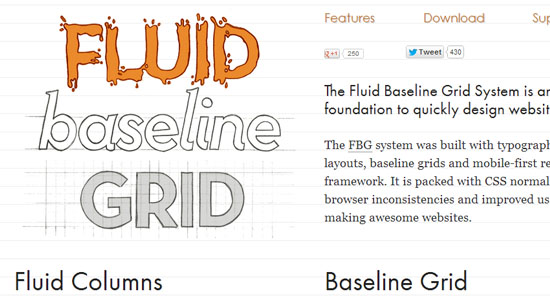
Fliud baseline grid
HTML5 and CSS3 development kit, which provides a foundation for the rapid development of a website design. The framework was built in compliance with typographic standards, and combines the principles of layout with rubber columns, basic layout and adaptive design "first for mobile devices."
- Configurable number of columns, there is an online tool for generating the corresponding CSS
- Built-in typography
- Support IE 6 and up
- Multiple breakpoints, sizes from mobile devices to desktops
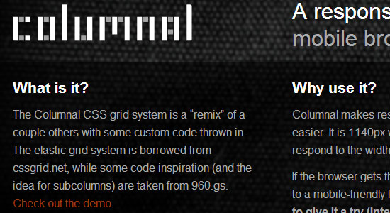
Columnal
Columnal is a “remix” of several other markup. Rubber label taken from 1140 CSS Grid, additional features taken from the 960 Grid System. The width is 1140px, rubber, so it will match the width of most browsers.
- Built-in CSS debugger showing the structure of any layout element
- Ability to place multiple columns inside the parent
- There are prefixes and suffixes to add extra space before or after the contents.
- CSS classes for vertical indents
- PDF for markup
- Templates
Ingrid Framwork
Ingrid is a lightweight CSS markup rubber system whose goal is to reduce the need to use classes or individual types. Because of this, it becomes less intrusive and easier to rebuild for adaptive layout. It is also an expandable system that is easy to customize for your own purposes.
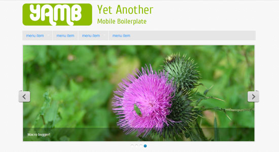
Yet Another Mobile Boilerplate
YAMB is a toolkit for web designers that allows you to cost responsive websites faster. YAMB websites will be optimized for screens with a width of 320 to infinity.
- Adaptive Markup
- Drop-down menus with the possibility of unlimited sub-levels and captions
- For small screens, drop-down menus are automatically converted into lists for selection.
- Adaptive slideshows with headers, the ability to add them to the content of the website
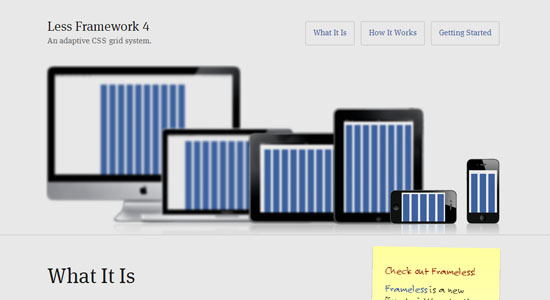
Less Framework 4
Less Framework 4 contains 4 layouts and three sets of typography, all based on a single grid.
Versions of typesetting: standard, for tablets, for mobile devices and wide for mobile devices
Each layout is based on 68px wide columns and 24px indents. Only the number of columns and the width of the indentation changes.
- CSS Generator Present
- There are Rails gems, various templates, a plugin for Compass, and so on.
ResponsiveAeon
- The adaptive grid of this framework is expressed as a percentage, uses media queries, HTML5 and JS.
- Support for all HTML5 elements: article, aside, details, figcaption, figure, footer, header, hgroup, menu, nav, section, dialog, audio, canvas, video
- 1104px page width
- Additional CSS and JS style files and the like are available.
Titan framework
- Based on the 960 Grid System and has the same class names.
- 12 and 16-column nets
- Photoshop templates in multiple resolutions
Gridiculous
- Supports page width from 320 to 1200px
- You can set a fixed maximum width of 960px, 640px, 320px
- Nested column support
- Adaptive images and video
tigerforce added the following three frameworks:
Kube
Minimal, but at the same time sufficient adaptive framework.
- There are several types of mesh, classes are described as "half", "third", and so on.
- Includes typography and various elements: forms, buttons, tables, links.
- A ready-made CSS file is available for download, or LESS for developers.
- Supports Chrome, Firefox, Safari, Opera, IE 8+
inuit.css
"Freymork for serious web developers."
- Based on SASS, Object Oriented
- Suitable for designers who want to focus on design, not code, and web developers who recognize the importance of abstractions and the OOP approach.
- The design of elements is not included, the developer of this framework suggests using Bootstrap.
- There is a port on the LESS
HTML KickStart
HTML KickStart is a set of HTML5, CSS, JS (jQuery) files that provide basic design for sites, freeing developers from design work.
- Built many elements, forms, tables, buttons, tabs, galleries, lightboxes, slideshows, icons, menus and tables
- Typography included
- 12-column adaptive markup
- Adaptive maps, video and calendar
The following framework is suggested by Agel_Nash
Simpliste
In order to create a website, it is not necessary to deal with complex engines and their administrative panels. Simpliste is a very easy-to-use HTML template for projects in which you need to create one or a couple of pages with a simple structure. If you want to create a simple information page, and the less code you need to write, and kilobytes to load, the better, then “Simpliste” is just what you need.
Article on Habré: Simpliste
The following framework is non-adaptive, but it has an additional JS library for loading the corresponding CSS, and underlies several adaptive
960 Grid System
A framework that supports 12-column and 16-column grid width 960px.
- It is possible to move elements by adding additional classes without moving the elements themselves inside HTML
- There is an alternative version with a 24-column grid.
Ps. If you find errors or incorrect use of terminology - please write in the LAN, I will correct it.
UPD: Noted about 960.gs, added three more adaptive.
UPD2: Added 4 frameworks from tigerforce and Agel_Nash .
Source: https://habr.com/ru/post/156747/
All Articles