Metro User Interface: Web Design Description and Examples
The new interface in the Metro style is a key feature of the mobile OS Windows Phone 7. But not only its one: it is already clear that this user interface will be used by Microsoft in all products, including the flagship Windows 8. Thus, the Metro interface one way or another will exist for a long time, and it is worth it to get to know him better.
In this article we will focus on the interface: the principles of its work, the grid, the structure and the main elements.
What is Metro, what is it used for, etc.
')
Metro is a new "design language" from Microsoft. The new concept is aimed at changing the logic of construction and operation of the operating system and applications, as well as the interaction between the user and the electronic device.
The basic principles of construction and appearance were largely borrowed from information systems of transport nodes. Inscriptions and graphic elements within these systems have quite specific requirements: very high readability and visual perception of information, the absence of distracting elements, a clear and clear idea of all external elements.

Ideally, a person should quickly perceive the information presented on them, and receive clear and unambiguous instructions on the necessary actions. But not only that: the appearance should be pleasant, neat and leave a good impression on the user.
For over a year, Microsoft representatives have been actively talking about the concept and features of the new interface. Judging by the fact that the texts of speeches by various specialists are very similar, the information was carefully prepared and verified by the PR department. On the one hand, in the modern world, it is quite natural. On the other hand, losing a live connection and emotional contact with the authors, with the designers. They see a copy, but not the original. People are trying to deal with it with live performances of the authors.
So Metro style. Microsoft calls it "our new design language."

For the Metro style, Microsoft developed its own principles, used by Microsoft to create its own operating system and applications. The company recommends the development of third-party applications that use the same principles.
The main principle of the system is its focus on user content. In the end, when working with an electronic device, the user wants to access his trial data or solve some of the other tasks quickly, conveniently and minimally distracted by other things. The role of the interface is to quickly and conveniently direct users to where he can do what he wants. The interface loses its “face” value of the device, turns into just a pointer to the path to the function requested by the user. Following this logic, Microsoft calls this “clear” interface: remove all the background and decorative elements that only distract the user, leaving only the most important things. This should facilitate the user's navigation and perception of information.
Of course, the interface should have a nice appearance and leave a good impression. But beauty cannot be at the expense of simplicity, speed and availability of information. Designers have left not so many tools to work. But Microsoft believes that the funds are sufficient to achieve the desired results.
First, we must pay attention to the features of fonts and their attributes. The size, style and location of the inscription itself can tell a lot. Sometimes a visual impression of the inscription can be even stronger than the information component ─ and this should be used.
For Windows Phone 7, Microsoft developed the special Segoe font family .
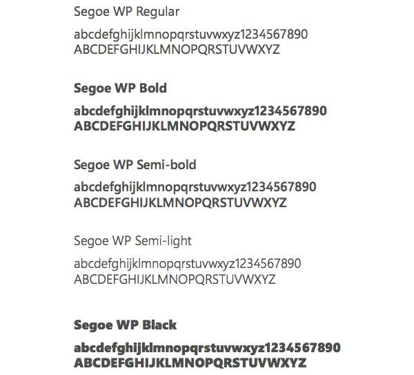
When developing fonts, special attention was paid to their readability. The font remains readable even at very small sizes. Finally, and this is particularly underlined by Microsoft, the font is just visually beautiful.
Another important task: the interface must be dynamic and focused on movement. It is quite difficult to explain in words, but the idea is that the design and appearance of the interface itself should push users to move forward, to show him that there are even more features and additional information. For example, a well-known interface feature, when part of the title of the next page appears on the right side of the screen.
In the Metro concept, a very important role is played by the interface animation. It must "distract and entertain the user." A beautifully animated interface with interesting transitions and effects creates a very good impression of working with it. Animation makes the interface bright. Microsoft strongly recommends strengthening this impression. For example, active elements and buttons should respond when pressed.
Moving from one screen to another should be done with an animated effect.
The system provides many different, sometimes very interesting types of animation.
For example, in the mail client, when you go from the Inbox to the folder for a particular message, the sender's name and the subject of the message do not disappear from the screen, they remain “fly” on the new screen. When you click on the “Send” button, the message drops and flies over the top of the screen. By the way, the animation is implemented by the built-in system of tools, that is, before, the developers had to invent and create all the effects manually, now for this it is enough to tell the system what type of animation you would like to see. This facilitates the work of developers.
Animated transitions can be masked during the processing of user commands by the system. Ideally, a well-thought-out animation is one that the user will not notice at all that the application “thinks”. Thanks to the beautiful animation, he will not notice at all that the transition from one page to another takes some time.
Microsoft advises to stop copying objects and real-world effects in a virtual interface, but instead recommends more active use of the opportunities provided by virtual space. Thus, the transition to iconography and infographics contributes to the Metro interface.
Menus today are almost always built on icons, that is, on static images that allow you not only to find, but also to run the application.
In general, an icon is a kind of application identifier, which is static. Thus, the developers intend to create the most attractive icons for applications, as a rule, buttons in the style (3D, etc.) because the visual component is important.
The feature of infographics is that the menu item should not only ensure the launch of the application, but also provide the user with the necessary information associated with this application: current status, new notifications, other information.
Thus, for the user, the main menu is not only a bootloader, but a full information board, where he can observe new system events, and react quickly.
In this brief description of the ideology of the Metro interface, we used the advice of Microsoft, omitting all secondary elements, and focusing on the main thing.
Metro UI Patented Concept
On August 18, 2011, the USPTO agency approved the patent application from Microsoft, which sounds rather abstract: “Visual movement for user interface feedback”. The excerpt from the document, which is an abstract description of the interface, directly indicates the characteristics of MetroUI.

"An aspect of the user interface that provides visual feedback in response to user input. For example, the edges of the screen can be used to create visual cues for the user, for example, indicating that he has reached the end of the scrolling list. Another example of such feedback is that some parallel interface elements can be moved separately and at different speeds in response to user actions. Another example is the simulation of inertia during the movement of user interface elements used to provide a more natural look of touch input. Various combinations of these functions have been described in the patent. "
Proof of patent is very important for Microsoft. Indeed, in the near future, the interfaces of all the main products of this company will be in some way based on this concept. Windows Phone, Xbox and Windows 8. In addition, it provides additional protection against MetroUI elements used by competitors. For example, Google has tried many times to copy various elements of MetroUI.
Metro UI style examples in web design
We have put together several Metro Style design sites for your inspiration. For most of them, from the metro features, you can highlight the grid tiles, we see inspiration on sites in other important aspects, such as type, image selection and iconography.
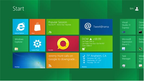
Windows user interface concept
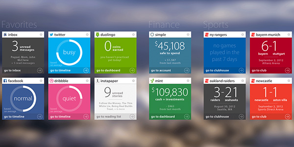
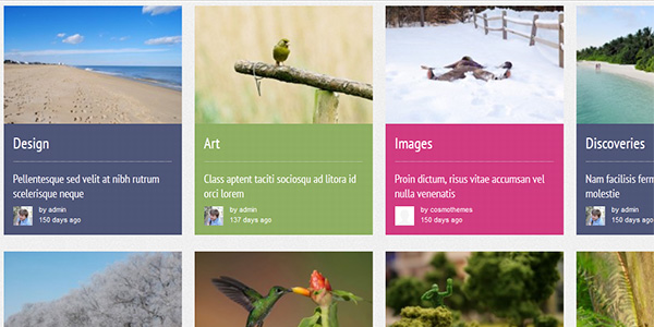
Metro Dashboard
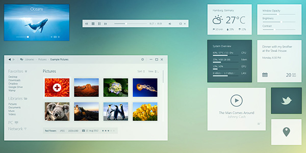
Windows 8 Day mode
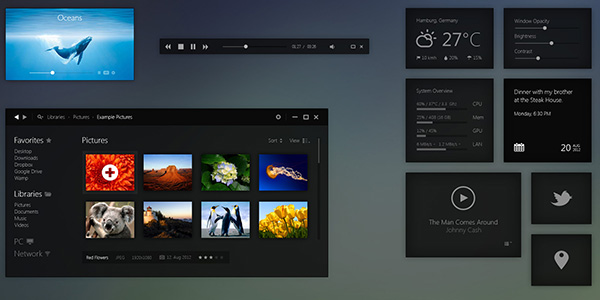
Windows 8 Night Mode
Zepppelin

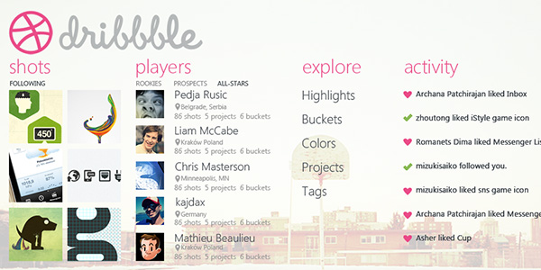
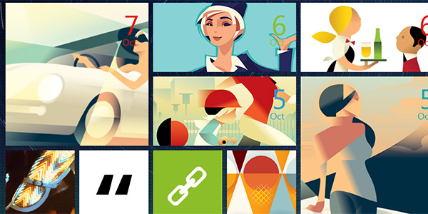
Metro Dribbble
Metro web

Metro Style Form

Experiment with Metro UI

Portfolio
Metrofy

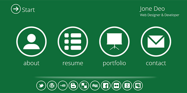
Metro - Personal Portfolio HTML5 / CSS3 vCard
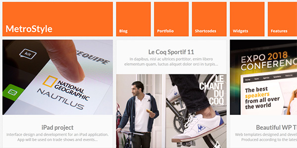
MetroStyle
Pressboard - Responsive Social Magazine Theme
Matrix - Responsive WordPress Theme
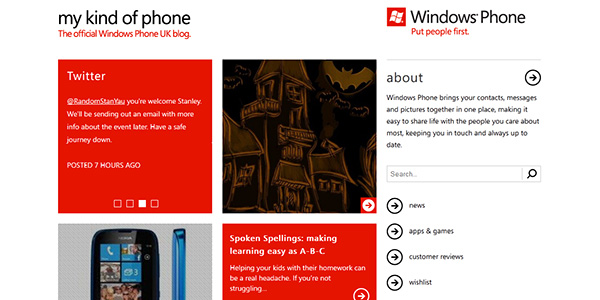
Windows Phone UK
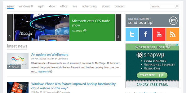
Winrumors
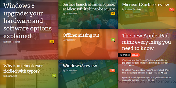
The verge
 \
\Original source.
Conclusion
In my opinion, Microsoft has created a very interesting design. We can argue about the many advantages, and not less numerous disadvantages, but at least there is an interesting concept. And most importantly, the operating system has its own face, which distinguishes it in the market.
Source: https://habr.com/ru/post/156625/
All Articles