Selection of typography for the site
The choice of typography for the site is almost as important as the design itself. It not only helps the visitor to better understand the content of your site, but also creates a certain mood. Since in this regard, the selection of the font is a very subjective thing, there are many “right options”. But in fact, the choice of typography is not as complicated as it may seem!
Since the mid-nineties, when Netscape introduced the tag to change the font of the text (now obsolete), webmasters have tried to use non-standard fonts on their websites with some success.
Throughout the history of the Internet and as new technologies emerge, several stages of typography development can be distinguished. At first, workarounds were used, for example, pictures instead of text, gradually this changed to Flash and CSS solutions, as well as Javascript.
')
Currently, various tools and technologies are available, such as Google fonts (free of charge) or Adobe Typekit (available by subscription), which make it much easier to embed custom fonts on a site. Moreover, there are online designers and editors, such as Breezi, Squarespace and Moonfruit, who can do all the work for you, generate code and provide you with a turnkey solution.

The first thing you should pay attention to is the readability of the font you choose. There may be a temptation to choose a font for its appearance, and, of course, appearance is important, but you should always remember the main reason why you publish material on the site - visitors should be able to read what you have published.

Therefore, if the font is difficult to read, it makes no sense to use it. The purpose of the publication, which contains the text - to deliver the message to the reader. If there are any difficulties, the message will not be delivered. It is better to refuse a stylish, but unreadable font, than to risk that your visitors will not be able to understand what you want to say.
Perhaps the part of the page on which users will focus is the text of the main material. There they will spend the most time reading your article, or something else, simply because it is the longest text on this page.
Therefore, it is advised not to use a complex, non-standard font. Any sans serif that is “safe for the web” will fit (more on this below). The main text is exactly the place where the previous point - readability - is the most important.
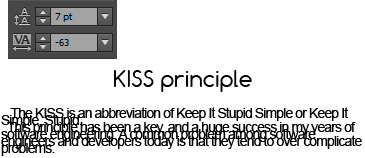
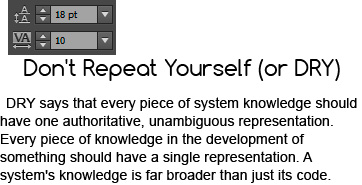
Also think about the size of the font. Each font can have different values and variations in size, so you can not argue that there is a size that is suitable for each font, but approximately 14-16 size can work fine.
Headings are also important because they will be the starting point for large amounts of text. This happens because people “scan” pages on the Internet, and do not read every line from beginning to end.
And the headlines, which show what will be said later, and small blocks of text, do not impose so many requirements on typography, hence you have more freedom to act. For a headline, you can afford a more elaborate and complex font.
Also, a large font is easier to read, you will have more freedom in choosing a font, if you use a larger font.
Also, if you are using a non-standard font, you may need to somehow specify the correct font for your headers. For example, if you use a Javascript solution to display the font on your site (for example Google Fonts, Adobe Typekit or Cufon), this will slow down the loading speed of your site. And the more the Javascript font will have to render, the slower your page will become. This is another reason why you should avoid non-standard fonts in the main text.
As already mentioned, there are no standard sizes for fonts, but if you want, you can try 32-34 size for H1, and reduce this parameter for the next level headings, because there should not be texts larger than the main heading.

You also need to mention that you have to underline the hierarchy, so the headings should stand out from the plain text. This can be done in different ways, but the simplest one used most often and recommended is to make them larger than regular text. You can also highlight them in bold, other colors, add a background or image, and so on.
If you use too many different fonts, there is a danger of making the site inconsistent. Such a site may be more confusing than explaining something. Perhaps this style has some kind of goal, but if you can not competently implement it, it is better to simply avoid this.
Of course, “the rules are designed to break them,” and you can try using three or more fonts, and you will have good results. But, in general, just two fonts can be enough for almost any purpose.
For example, one font can be used for standard text, and another for headings or other selected elements.

Headsets can be divided into two main categories: with serif (Serif) and without serif (Sans serif). Serifs are small elements at the ends of letter strokes.

Other categories also exist, such as “Script”, “Blackletter” or “Mono”, but they are not used as widely as the previous ones.
"Safe for the web" is a term used to describe the available elements, or, in other words, "safe" for use on the Internet. It applies not only to fonts, but in this context especially, it refers to fonts that are installed on most computers (PC and Mac).
They can be used on your site without any hacks, replacement methods or scripts and will be displayed correctly on all computers (at least those connected to the Internet).
I will give a small list of "safe" fonts:
Also available are other text formatting methods that you need to consider when customizing the font. Even if you have a very good font that is easily readable and perfectly suited to your design, the entire impression of the site may be spoiled if the spacing between the letters or the line height is not adjusted.
These two characteristics can make the text more readable. They can also be used to achieve a certain effect, for example, to make the letters more concise, which can improve your design. As long as they remain readable, this is acceptable.
Note on the length of lines in blocks with text: it is advisable (although this is not a strict rule), so that each line has 45-75 characters. If the line is too short, it will slow down the speed of reading the text. If the line contains too many characters, it becomes very easy to lose the line that you read, moving on to the next.

Of all the rules listed above, the most important is the readability of the text. As emphasized throughout the article, none of the rest of the vaccine should be considered as indestructible. You can try experimenting or asking for feedback from designers or any regular user.
Translation of the article Choosing the Right Typography for Your Website
Technical background
Since the mid-nineties, when Netscape introduced the tag to change the font of the text (now obsolete), webmasters have tried to use non-standard fonts on their websites with some success.
<font size="5" color="black">Black text</font> Throughout the history of the Internet and as new technologies emerge, several stages of typography development can be distinguished. At first, workarounds were used, for example, pictures instead of text, gradually this changed to Flash and CSS solutions, as well as Javascript.
')
Currently, various tools and technologies are available, such as Google fonts (free of charge) or Adobe Typekit (available by subscription), which make it much easier to embed custom fonts on a site. Moreover, there are online designers and editors, such as Breezi, Squarespace and Moonfruit, who can do all the work for you, generate code and provide you with a turnkey solution.
Font readability is above all
The first thing you should pay attention to is the readability of the font you choose. There may be a temptation to choose a font for its appearance, and, of course, appearance is important, but you should always remember the main reason why you publish material on the site - visitors should be able to read what you have published.
Therefore, if the font is difficult to read, it makes no sense to use it. The purpose of the publication, which contains the text - to deliver the message to the reader. If there are any difficulties, the message will not be delivered. It is better to refuse a stylish, but unreadable font, than to risk that your visitors will not be able to understand what you want to say.
Start by typing the main content.
Perhaps the part of the page on which users will focus is the text of the main material. There they will spend the most time reading your article, or something else, simply because it is the longest text on this page.
Therefore, it is advised not to use a complex, non-standard font. Any sans serif that is “safe for the web” will fit (more on this below). The main text is exactly the place where the previous point - readability - is the most important.
Also think about the size of the font. Each font can have different values and variations in size, so you can not argue that there is a size that is suitable for each font, but approximately 14-16 size can work fine.
Font for headlines
Headings are also important because they will be the starting point for large amounts of text. This happens because people “scan” pages on the Internet, and do not read every line from beginning to end.
And the headlines, which show what will be said later, and small blocks of text, do not impose so many requirements on typography, hence you have more freedom to act. For a headline, you can afford a more elaborate and complex font.
Also, a large font is easier to read, you will have more freedom in choosing a font, if you use a larger font.
Also, if you are using a non-standard font, you may need to somehow specify the correct font for your headers. For example, if you use a Javascript solution to display the font on your site (for example Google Fonts, Adobe Typekit or Cufon), this will slow down the loading speed of your site. And the more the Javascript font will have to render, the slower your page will become. This is another reason why you should avoid non-standard fonts in the main text.
As already mentioned, there are no standard sizes for fonts, but if you want, you can try 32-34 size for H1, and reduce this parameter for the next level headings, because there should not be texts larger than the main heading.
You also need to mention that you have to underline the hierarchy, so the headings should stand out from the plain text. This can be done in different ways, but the simplest one used most often and recommended is to make them larger than regular text. You can also highlight them in bold, other colors, add a background or image, and so on.
Two fonts enough!
If you use too many different fonts, there is a danger of making the site inconsistent. Such a site may be more confusing than explaining something. Perhaps this style has some kind of goal, but if you can not competently implement it, it is better to simply avoid this.
Of course, “the rules are designed to break them,” and you can try using three or more fonts, and you will have good results. But, in general, just two fonts can be enough for almost any purpose.
For example, one font can be used for standard text, and another for headings or other selected elements.
Font categories
Headsets can be divided into two main categories: with serif (Serif) and without serif (Sans serif). Serifs are small elements at the ends of letter strokes.
Other categories also exist, such as “Script”, “Blackletter” or “Mono”, but they are not used as widely as the previous ones.
Web-safe fonts
"Safe for the web" is a term used to describe the available elements, or, in other words, "safe" for use on the Internet. It applies not only to fonts, but in this context especially, it refers to fonts that are installed on most computers (PC and Mac).
They can be used on your site without any hacks, replacement methods or scripts and will be displayed correctly on all computers (at least those connected to the Internet).
I will give a small list of "safe" fonts:
Sans serif:
- Helvetica
- Arial
- Tahoma
- Impact
- Lucida Sans
- Verdana
- Geneva
Serif:
- Times new roman
- Georgia
- Garamond
- Palatino linotype
- Book antiqua
- Courier
- Monaco
Other notes
Also available are other text formatting methods that you need to consider when customizing the font. Even if you have a very good font that is easily readable and perfectly suited to your design, the entire impression of the site may be spoiled if the spacing between the letters or the line height is not adjusted.
These two characteristics can make the text more readable. They can also be used to achieve a certain effect, for example, to make the letters more concise, which can improve your design. As long as they remain readable, this is acceptable.
Note on the length of lines in blocks with text: it is advisable (although this is not a strict rule), so that each line has 45-75 characters. If the line is too short, it will slow down the speed of reading the text. If the line contains too many characters, it becomes very easy to lose the line that you read, moving on to the next.
findings
Of all the rules listed above, the most important is the readability of the text. As emphasized throughout the article, none of the rest of the vaccine should be considered as indestructible. You can try experimenting or asking for feedback from designers or any regular user.
Translation of the article Choosing the Right Typography for Your Website
Source: https://habr.com/ru/post/156619/
All Articles