Matrix: Reboot: Flurry new application engagement report
Mobile application analytics firm Flurry has released an updated version of its most popular study, first published three years ago. In the previous report, Mobile Applications: Money, Models, and Attachments, the company conducted an in-depth analysis of user attachment in application categories. Today, Flurry does it again, focusing on more than 700,000 applications running on the iPhone, iPad and, now, the iPad Mini.
As in the original report, Flurry again displayed the categories of applications on the chart, according to the frequency of their use. For the purposes of this study, Flurry used a 90-day hold window (displayed on the X-axis) and frequency of use per week (on the Y-axis).
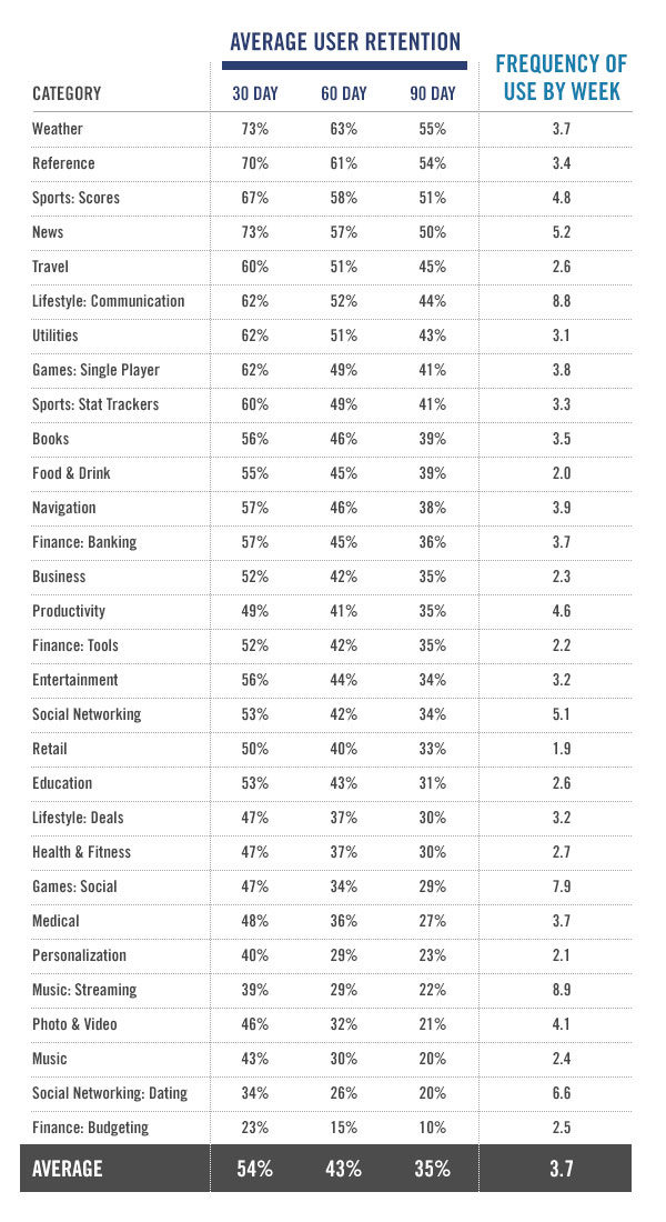
The data array includes application statistics that were used more than 1.7 billion times a week. Flurry has access to data from many applications, as 80,000 companies now use the Flurry Analytics offer in their 230,000 applications. The categories used for the new comparison were mainly inherited from the Apple App Store. However, Flurry divided some applications into their own categories. Thus, for example, they divided Social Games and Single Player Games.
')
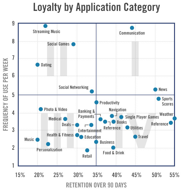
The results are divided into four sectors:
As you can see from the graph above, each sector contains many other categories of applications that can be assigned to different sectors. For example, the categories "Productivity" and "Business" are between sectors 3 and 4.
Looking at the applications distributed by sector, developers can determine the appropriate business model for them. Sectors 1 and 4 are suitable for subscription models or ad-supported models, while 2 and 3 are for download after a one-time payment, Flurry says. Also, sectors 2 and 4 (upper left and lower right) are best suited for shopping within the application. In Sector 2, developers can offer users additional content or additional features during periods of intensive use, while in Sector 4, returning users can be encouraged with new content or features during their repeat visits.
Flurry compared its data with data from the 2009 report and found that 90-day retention levels increased from 25% to 35%, while the frequency of use dropped from 6.7 to 3.7. The retention rate became higher due to the increased quality of applications, Flurry is suspected, but the frequency of their use drops due to the large number of available applications, forcing users to spray their time between the increasing number of them. In 2009 there were only 19 categories of applications, today there are already 30 of them.
As in the original report, Flurry again displayed the categories of applications on the chart, according to the frequency of their use. For the purposes of this study, Flurry used a 90-day hold window (displayed on the X-axis) and frequency of use per week (on the Y-axis).
The data array includes application statistics that were used more than 1.7 billion times a week. Flurry has access to data from many applications, as 80,000 companies now use the Flurry Analytics offer in their 230,000 applications. The categories used for the new comparison were mainly inherited from the Apple App Store. However, Flurry divided some applications into their own categories. Thus, for example, they divided Social Games and Single Player Games.
')
The results are divided into four sectors:
- Sector 1: Applications that are heavily used and to which users remain committed throughout the time. Here are the news and communication apps, as they have a stable, growing audience and the best positioning for profit from advertising or paid subscriptions, Flurry reports. These applications are sustainable for consumers.
- Sector 2: Applications that are heavily used for a limited period of time. These are applications that are becoming more and more irregular - they include music apps, dating apps, and social games. For example, dating apps are no longer needed if you have already entered into a relationship with them.
- Sector 3: Applications that are rarely used and have a high user outflow. Here are the applications for personalization (to change the background or home screen wallpaper). Such applications are rarely used after a one-time setup. These applications need a paid usage model in order to get paid by users before they get access to the content.
- Sector 4: Applications that are rarely used, but provide great benefits during use. These applications remain on the users home screen indefinitely. For example, applications for ordering rooms in hotels, air tickets, car rentals: they are not used constantly, but their value grows when the user goes on a journey.
As you can see from the graph above, each sector contains many other categories of applications that can be assigned to different sectors. For example, the categories "Productivity" and "Business" are between sectors 3 and 4.
Looking at the applications distributed by sector, developers can determine the appropriate business model for them. Sectors 1 and 4 are suitable for subscription models or ad-supported models, while 2 and 3 are for download after a one-time payment, Flurry says. Also, sectors 2 and 4 (upper left and lower right) are best suited for shopping within the application. In Sector 2, developers can offer users additional content or additional features during periods of intensive use, while in Sector 4, returning users can be encouraged with new content or features during their repeat visits.
Flurry compared its data with data from the 2009 report and found that 90-day retention levels increased from 25% to 35%, while the frequency of use dropped from 6.7 to 3.7. The retention rate became higher due to the increased quality of applications, Flurry is suspected, but the frequency of their use drops due to the large number of available applications, forcing users to spray their time between the increasing number of them. In 2009 there were only 19 categories of applications, today there are already 30 of them.
Source: https://habr.com/ru/post/155895/
All Articles