Custom CSS Filters
Getting Started with Custom CSS Filters ( C ustom C ascading S tyle S heets F ilters)
Introduction
Custom CSS filters (hereinafter referred to as CCSSF) (formerly known as CSS shaders) is a new browser feature that superimposes visual effects created by hands on the elements of an HTML document.
Custom filters are part of the Filter Effects 1.0 specification . They complement another part of this specification, defining some common CSS filters already embedded in browsers (blur, sepia, contrast, grayscale).
Built-in CSS filters
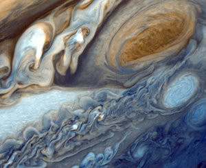
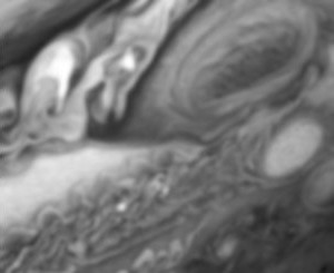
Built-in CSS filters offer functionality that is similar to filters in image editors — you have a set of pre-installed, commonly used effects in which you can only control the parameters .
For example, this image was converted to grayscale and then blur was applied:
')
(you can click on the pictures and see for yourself , the built-in CSS filters should work in a stable version of Chrome)
Custom CSS filters
Custom filters, on the other hand, allow you to create completely new types of effects, in which you can control not only the parameters of the effect itself, but also determine the essence of the applied effect using shaders .
For example, this map embedded in the document has been transformed into a real textured sphere:
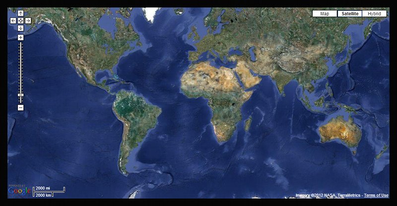
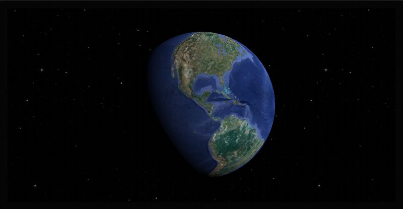
(you can click on the pictures and see for yourself , see the section How to make CSS filters work )
Built-in filters have access to functionality not available for custom ones. They can achieve more than what was originally intended by the creators of browsers.
The most noticeable built-in filters can read pixels from the specified DOM content, which means that they can do, for example, blur (See in the Restrictions section for custom filters ).
What are shaders?
The effects of custom filters are set by small programs called shaders.
Shaders define the 3D form and type of graphic elements (shaders operate with polygonal grids ).
Shaders work directly on the video card hardware. They can process large amounts of data in parallel, which means that they can be very fast, but often unnecessary compared to the typical cycle of programs running on a CPU.
CCSSF uses GLSL as a shader language.
If you are familiar with graphics programming shaders that use shader languages ( OpenGL , OpenGL ES , WebGL , DirectX ), then everything seems to be the same - the shaders used in custom CSS filters work the same way.
Shader Types
The shaders used in the CCSSF are of two types: vertex shaders (Vertex Shader) and fragmentary shaders (Fragment Shader) (they are also called pixel shaders).
Vertex shaders say where things are. They allow you to move the vertices of the grid in 3D space, deforming and rearranging objects.
Fragment shaders say what the surfaces of objects look like. They allow you to draw on objects or change the belonging of existing pixels to the exterior of objects.
In general, to be able to create a valid GPU program, you need those and other shaders. However, for custom CSS filters, only one of these types is needed, and for the missing one, the browser uses the default pass-through shader .
How do custom CSS filters work?
Modern browsers now themselves implement the use of graphic acceleration.
HTML pages are rendered by browsers as collections of textured rectangles corresponding to DOM elements .
With custom CSS filters, you cling to the browser render information stream, getting the opportunity to change the shape and appearance of these rectangles before they are drawn on the screen.
This is similar to how CSS 3D transforms work , only instead of being able to play with parameters with already defined functionality, you can run your own code for processing DOM content.
Content grid
Each DOM element with CCSSF will be transformed into a triangular grid with a mosaic defined by the user :
<img src = " cs317217.userapi.com/v317217705/37a5/ghtCCVl9SeM.jpg " alt = "image" />
Hidden text
Note translator - I didn’t find a way to insert an svg object, so I took a screenshot
By default, the grid contains only two triangles (the minimum necessary to create a rectangle).
This grid will receive the texture created for the content of the DOM element (which is usually drawn on the screen), and then your custom shaders will be applied to it.
Mesh connectivity
A grid of triangles can be created in two ways (controlled by CSS):
- attached triangles
- loose triangles
A grid with attached triangles is one unified object where adjacent triangles have common vertices. If you move a vertex, all the triangles associated with it will deform (like a sheet of cloth). This option is used by default.
A grid with detached triangles is made up of many individual triangles. Each vertex belongs to only one triangle. You can divide the grid into separate components. The mesh can contain holes, or even be completely re-modeled in the vertex shader.
The grid mosaic and connectivity must remain the same in all CSS transitions.
Shader Input Parameters
Vertex and fragment shaders can accept three types of parameters as input:
- forms (uniforms)
- attributes
- differences
Forms are parameters with a single value for all vertices and pixels of the grid (for example, the color of an object).
Attributes are individual parameters of the vertices, each vertex of the grid gets its value for each attribute (for example, the position of the vertex).
Differences are the parameters passed to the vertices of the fragments. They are specified for each vertex of the triangle and their values for points inside the triangle interpolate the GPU (for example, lighting).
Filter Effects specification also allows for a different type of input: textures . However, they are not yet implemented (and attempts to use them will silently break the shaders).
Browsers provide some default built-in parameters created and initialized for all elements to which custom CSS filters are applied.
attribute vec4 a_position; attribute vec2 a_texCoord; attribute vec2 a_meshCoord; attribute vec3 a_triangleCoord; Built-in attributes allow you to identify and find individual vertices and triangles in the grid.
uniform mat4 u_projectionMatrix; uniform vec2 u_textureSize; uniform vec4 u_meshBox; uniform vec2 u_tileSize; uniform vec2 u_meshSize; Embedded forms provide information about DOM element data that is common to the entire grid.
varying vec2 v_texCoord; Built-in differences provide texture coordinates in case the effect uses default shaders.
Exact definitions of these parameters can be found in the Filter Effects specialization ( attributes , forms , differences ).
Caution : at the moment, not all built-in parameters from this specialization are implemented.
For example, there are no u_textureSize and u_meshSize forms . You can solve this problem by personally identifying them in CSS.
Also, the difference v_texCoord does not work yet, so you will need to create your own difference to transfer the texture coordinates from the a_texCoord attribute to the vertex shader.
You can follow the progress of implementation of custom CSS filters in this edition of the WebKit “master” issue .
In addition to the built-in parameters, you can also describe your forms for effect through CSS styles .
.shaded { -webkit-filter: custom(url(distort.vs) mix(url(tint.fs) normal source-atop), distortAmount 0.5, lightVector 1.0 1.0 0.0); } // ( ) ... uniform float distortAmount; uniform vec3 lightVector; ... All this allows you to control the effects from the outside. In particular, the values for the forms described in CSS will be interpolated when using CSS transitions .
Caution : the number of available slots for forms and differences is limited and depends on the specific GPUs (the same applies to attributes , but for CSS filters they cannot be used).
Here you can see how many shader parameters are available on your system for WebGL (these numbers should be the same for CCSSF; some slots are assigned to the built-in parameters).
How to use custom CSS filters on my site?
CCSSF is applied in the same way as other CSS styles using style . It looks like this:
<style> .shader { -webkit-filter: custom(url(shaders/crumple.vs) mix(url(shaders/crumple.fs) normal source-atop), 50 50, amount 0, strength 0.2, lightIntensity 1.05); } </style> Or so, if you use only the fragment shader:
<style> .shader { -webkit-filter: custom(none mix(url(shaders/tint.fs) normal source-atop), amount 0); } </style> Similarly, using none instead of a fragment shader will not work (for now). In this situation, the solution is to substitute an empty fragment shader.
You give the browser a link to the GLSL shaders source code and specify their parameters via CSS styles. The browser will take care to compile the shaders into binaries and apply them to the HTML content.
When you already have shaders, applying them to HTML is easy - you just work with them as you would with regular CSS styles.
<div class="shader"> You can use CSS transitions with custom CSS filters, for example, to dynamically change the effect when you hover over an element of the page.
-webkit-transition: -webkit-filter ease-in-out 1s; CCSSF parameters will be interpolated the same way as inline CSS properties.
How to get working CCSSF?
Caution : this technology is very new and can be roughly implemented. Details may change, some features may not work, and there may be bugs in the implementation.
This post reflects the state of affairs in September 2012. If since then something is not working as described, it will be useful to google to be aware of the exact syntax and behavior.
At the moment, custom CSS filters are working in the current Chrome Canary build (the exact version at the time of creating the record is 24.0.1278.0).
Download Chrome Canary here:

tools.google.com/dlpage/chromesxs
CCSSF should work in Windows and OSX (I use Windows 7).
Even if your OS and browser support them, everything can rest against an old or weak GPU or into improper drivers (System requirements are roughly the same as specified here - WebGL compatibility check )
Custom CSS filters are not enabled by default, so Chrome must be run from the console with the following key:
chrome --enable-css-shaders An easy way to get the included CSS shaders in Chrome on Windows is to create a shortcut on Chrome Canary and add the --enable-css-shaders parameter to the "target" field.
The alternative is to make a batch file with the command specified above.
In the new versions of Chrome Canary there is a special flag in the interface, in the special tab “Flags” (Search “Enable CSS Shaders”):
chrome://flags/ How to make sure CCSSF work?
See this example .
If you see spherical planets, congratulations, they work;).

If you see only rectangular pictures, then something went wrong; S.

Please note that some of the examples are randomly found on the Internet and may break over time. For example, effects that work in Chromium’s early custom builds of May 2012 do not work in the latest Chrome Canary.
Caution : for some reason, the implementation is not stable now. It may happen that at one moment CCSSF is working, and at another - it is already broken, even during page reload or cyclic transitions on the same page.
In such cases:
- reload page
- close tab and open page in new tab
- restart browser
Shaders broken in one tab can kill shaders in all other tabs (and shaders will remain broken even if the pages are reloaded).
During the first page load, shaders may also work on partially rendered DOM elements. In this case, close the tab and open the page again, reload does not help.
Limitations of custom filters
Access to content
The shaders used in CCSSF cannot read the pixels of the textures of the DOM content in any way, and yet they cannot directly draw pixels on the screen .
These restrictions appeared as a reaction to timing attacks , when the robber 3rd party shader, built into the site, could be used to read the site content (depending on the source of the pixel color, different shader code was used).
The only way you can interact with the pixels of a DOM element is to switch to your calculated colors from the original ones using the following parameters built-in fragment shaders css_ColorMatrix , css_MixColor

Caution : the spec says that you can also use gl_FragColor to create solid color values.
This is not working yet.
WebGL solves this problem in a different way, by providing access only to “clean” content (created on the same server or directly allowed by cross-domain access for 3rd party servers).
The negative side of the shader approach is that it is not compatible with many interesting types of applications, and the positive one is that CSS shaders can be applied to any content.
Mesh size
Another limitation, at least in the current implementation, is a fixed number of triangles per mosaic grid.
You cannot have a grid of more than 20,000 odd triangles. Therefore, it is recommended to render using indexed triangles with 16-bit numbers, limiting the number of vertices to 65.536.
How to create your own CSS effects?
All you need is a browser and a text editor. The shaders used in the CCSSF are plain text files.
Workflow is the same as with HTML + CSS layout: you make changes, refresh the page in the browser and see if it worked out or not.
There is a tool from Adobe called CSS FilterLab , which makes it easier to edit the effect parameters.
Caution : compiling a shader into a binary is a relatively slow operation. If you have a lot of shaders, they can significantly slow down the loading of the page.
For WebGL, Chrome has implemented caching of already used shader binaries , this can help.
What are the shaders used in custom CSS filters?
A simple vertex shader looks like this:
precision mediump float; attribute vec4 a_position; uniform mat4 u_projectionMatrix; void main() { gl_Position = u_projectionMatrix * a_position; } A simple fragment shader looks like this:
precision mediump float; void main() { float r = 1.0; float g = 1.0; float b = 1.0; float a = 1.0; css_ColorMatrix = mat4( r, 0.0, 0.0, 0.0, 0.0, g, 0.0, 0.0, 0.0, 0.0, b, 0.0, 0.0, 0.0, 0.0, a ); } Writing precision has no effect on desktop OpenGL , but works on mobile devices using OpenGL ES. However, they must be specified in order for the current implementation to work.
For HTML content, shaders are applied as follows:
<style> .shader { -webkit-filter: custom(url(simple.vs) mix(url(simple.fs) normal source-atop), 1 1) } </style> <body> <div class="shader"> Hello world! </div> <body> This is a minimal CSS style using both fragmentary and vertex shaders applied on a simple mosaic grid with two attached triangles (1 column x 1 row).
How to create a custom effect?
Now let's see how to create a slightly simplified version of the spherical effect, similar to the one used here .
We'll start with a flat texture with DOM content (first image). We want to wrap it in a sphere and attach shadows, as if it were a 3D object lit with direct light (second picture).


See here for a working example .
Mesh deformation
All mesh deformations occur in the vertex shaders.
First, we need to find a way to wrap a rectangular plane in the shape of a sphere, and then apply a shadow later.
We will start with a simple rectangular grid lying in 2D space with uniformly distributed vertex positions. We need to pick up some kind of mapping of these 2D positions in the 3D sphere.
We can get the coordinates of the vertices of the original plane through the built-in attribute a_position provided by the browser. We need to declare a variable before we can use it:
attribute vec4 a_position; We will remember this attribute in a local variable, which we will later modify (because the attributes are read-only):
vec4 position = a_position; A common operation in computer graphics is texturing with a href = " en.wikipedia.org/wiki/UV_mapping "> UV mapping , when a rectangular pattern is wrapped around a grid using 2D texture coordinates. It sounds very similar to what we need.
One of the built-in grid attributes provided by the browser is a two-component vector a_texCoord with vertex texture coordinates.
attribute vec2 a_texCoord; The texture coordinates are called U and V, they are in the interval 0 ... 1 for each axis and they draw the grid vertices along the length and height of the picture.
To obtain the coordinates X, Y, Z corresponding to our U and V coordinates, we will use the transformation between the spherical coordinate system (it is also called polar) and the rectangular coordinate system :
x = r * sin( θ ) * cos( φ ) y = r * sin( θ ) * sin( φ ) z = r * cos( θ ) The spherical coordinate system uses the following coordinates:
- radius r
- zenith (inclination) θ (span [0 ... π])
- azimuth (azimuth) φ (span [0 ... 2π])
Let the user determine the radius via the CSS form :
uniform float sphereRadius; And we will map the U and V coordinates to the azimuth and zenith:
vec3 computeSpherePosition( vec2 uv, float r ) { vec3 p; float fi = uv.x * PI * 2.0; float th = uv.y * PI; px = r * sin( th ) * cos( fi ); py = r * sin( th ) * sin( fi ); pz = r * cos( th ); } vec3 sphere = computeSpherePosition( a_texCoord, sphereRadius ); Now we can move between the original flat position and the new spherical position, which we have just calculated using the built-in GLSL function (linear interpolation between two values).
uniform float amount; We will use the user-provided form parameters to control the transition (the form parameter from CSS can be interpolated by the browser using CSS transitions).
position.xyz = mix( position.xyz, sphere, amount ); Finally, we can replace the vertices of the grid by writing to the built-in GLSL variable that transforms our calculated position according to the gl_Position matrix provided by the browser:
gl_Position = u_projectionMatrix * position; Surface shading
Shading is calculated by combining vertex and fragment shaders.
Shading: Vertex Shaders
In the vertex shader, we will calculate the lighting for each vertex and pass it as a difference to the fragment shader, where we will use it to change the color of the DOM texture.
For shading, we will use a simple Lambert scatter model .
Reflection light is considered as the scalar product of the normal vector of the surface and the normalized vector of the direction of light.
We need the position of the light and the surface normal for each vertex.
We will allow the user to define the position of the light source as a three-component lightPosition vector form , passed through CSS:
uniform vec3 lightPosition; We will normalize using the normalize function built into GLSL:
vec3 lightPositionNormalized = normalize( lightPosition ); Next, we need to calculate the normal for a flat and spherical surface.
The surface normal is usually considered on the CPU side, since you need to work with a connected mesh and have access to all the triangle vertices at the same time (the shader sees only one vertex at a time).
However, here we are dealing with simple geometric shapes, so we can calculate normals analytically.
For the normal plane, we cheat a little bit: the correct normal plane must be directed from the monitor, perpendicular to the XY plane.
But such a normal will give us an unmodified DOM element, in some places a little shaded, and this will be unnatural compared to the rest of the page elements that do not have shaders superimposed.
Therefore, we use a vector directed to the light source as the normal to the surface.
vec3 planeNormal = lightPositionNormalized; This will allow the undeformed element to always be fully lit.
For the sphere normal, we will use a simple analytic formula. The normal of a sphere on a surface is the normalized vectors from the center of the sphere to its surface:
vec3 sphereNormal = normalize( position.xyz ); To obtain an adequate normal for our transition state, we will simply go from the normal to the sphere normal and normalize this transition vector:
vec3 normal = normalize( mix( planeNormal, sphereNormal, amount ) ); Finally, we can calculate the illumination according to the Lambert formula using the dot function built into GLSL and fix the negative values with the max formula:
float light = max( dot( normal, lightPositionNormalized ), 0.0 ); With the last action of the vector shader, we will transmit the light intensity to the fragment shader through the difference :
varying float v_light; v_light = light; Shading: Fragment Shader
The fragment shader will be very simple, everything heavy was mastered in the vertex shader.
Take the light intensity from the difference :
varying float v_light; And use it to modulate color coefficients (we will not change transparency):
float r, g, b; r = g = b = v_light; And we use them to get the css_ColorMatrix transition matrix :
css_ColorMatrix = mat4( r, 0.0, 0.0, 0.0, 0.0, g, 0.0, 0.0, 0.0, 0.0, b, 0.0, 0.0, 0.0, 0.0, 1.0 ); In our case, we get a color equivalent to this:
gl_FragColor = vec4( r, g, b, 1.0 ) * sourceColor; Final Vertex Shader
Download
Hidden text
precision mediump float;
// Inline Attributes
attribute vec4 a_position;
attribute vec2 a_texCoord;
// Embedded Forms
uniform mat4 u_projectionMatrix;
// Forms submitted via CSS
uniform float amount;
uniform float sphereRadius;
uniform vec3 lightPosition;
// Differences
varying float v_light;
// Constants
const float PI = 3.1415;
// Create the perspective matrix
vec3 computeSpherePosition (vec2 uv, float r) {
vec3 p;
float fi = uv.x * PI * 2.0;
float th = uv.y * PI;
px = r * sin (th) * cos (fi);
py = r * sin (th) * sin (fi);
pz = r * cos (th);
return p;
}
// Main
void main () {
vec4 position = a_position;
// Mapim Plane To Sphere Using UV Coordinates
vec3 sphere = computeSpherePosition (a_texCoord, sphereRadius);
// Transition from plane to sphere
position.xyz = mix (position.xyz, sphere, amount);
// Set the position of the vertex
gl_Position = u_projectionMatrix * position;
// Calculate the light
vec3 lightPositionNormalized = normalize (lightPosition);
vec3 planeNormal = lightPositionNormalized;
vec3 sphereNormal = normalize (position.xyz);
vec3 normal = normalize (mix (planeNormal, sphereNormal, amount));
float light = max (dot (normal, lightPositionNormalized), 0.0);
// Pass in the difference
v_light = light;
}
Final Fragment Shader
Download
Hidden text
precision mediump float;
varying float v_light;
void main () {
float r, g, b;
r = g = b = v_light;
css_ColorMatrix = mat4 (r, 0.0, 0.0, 0.0,
0.0, g, 0.0, 0.0,
0.0, 0.0, b, 0.0,
0.0, 0.0, 0.0, 1.0);
}
varying float v_light;
void main () {
float r, g, b;
r = g = b = v_light;
css_ColorMatrix = mat4 (r, 0.0, 0.0, 0.0,
0.0, g, 0.0, 0.0,
0.0, 0.0, b, 0.0,
0.0, 0.0, 0.0, 1.0);
}
CSS style
Download
Hidden text
.shader {
-webkit-filter: custom (url (sphere.vs) mix (url (sphere.fs) normal source-atop),
16 32, amount 1, sphereRadius 0.35, lightPosition 0.0 0.0 1.0);
-webkit-transition: -webkit-filter ease-in-out 1s;
}
.shader: hover {
-webkit-filter: custom (url (sphere.vs) mix (url (sphere.fs) normal source-atop),
16 32, amount 0, sphereRadius 0.35, lightPosition 0.0 0.0 1.0);
}
-webkit-filter: custom (url (sphere.vs) mix (url (sphere.fs) normal source-atop),
16 32, amount 1, sphereRadius 0.35, lightPosition 0.0 0.0 1.0);
-webkit-transition: -webkit-filter ease-in-out 1s;
}
.shader: hover {
-webkit-filter: custom (url (sphere.vs) mix (url (sphere.fs) normal source-atop),
16 32, amount 0, sphereRadius 0.35, lightPosition 0.0 0.0 1.0);
}
Some more examples of custom effects.
- Burn shader
- Dissolve shader
- Crumple shader
- Dots shader
- Flip shader (variant 1)
- Flip shader (variant 2)
- Sphere shader (planets)
- Sphere shader (map)
Shader Debugging
Debugging shaders used in CCSSF is a tricky business. At least, now there is no error log in the Chrome console (as opposed to WebGL, where you can get the results of the shader compilation and, possibly, find an error or typo).
On a Mac, you can get the error output displayed in the console window from which you started Chrome, but this is not written to Windows in the console.
A possible solution is to use the GL shader validation plugin for the Sublime text editor recently created by the guys @aerotwist and @brendankenny .
Shader Profiling
Unfortunately, just like in WebGL, there is no way to see what happens on the GPU side: S.
Nevertheless, there are a couple of tricks that can be used to get some inside information about the work of shaders.
For example, if you want to find out if the effect of your effect is tied to a fragment shader, try resizing the DOM element to see if it works better on smaller elements.
Try to avoid the effects applied to full-screen items. This will be unproductive and may be a bottleneck when building a page.
If you want to see if the effect of your effect is tied to vertex shaders, try it on a grid with a different mosaic.
Remember that if you apply the effect to many elements with large mosaics on the same page, you can very quickly increase the total counter of triangles.
useful links
- Filter Effects specification
- GLSL specification
- Compositing and Blending specification
- CSS transitions specification
- CSS transforms specification
- Umbrella WebKit issue tracking CSS Shaders implementation progress
- Adobe custom CSS filter effects examples
- Introducing CSS shaders: Cinematic effects for the web
- WebGL quick reference card (includes useful GLSL reference)
- GLSL Sandbox
- CSS Shaders implemented with WebGL
Material
Hidden text
PS Translated at the request of Keyten did not try anything described above =)
Source: https://habr.com/ru/post/155447/
All Articles