Image Filter with CSS Filter Effects
In graphic editors it is very easy to change the brightness or contrast of images, to apply various filters. Recently, this can be done with CSS directly on web pages using CSS Filter Effects.
Demo / Download Source / Filter Effects 1.0 Specification
')
As usual, browsers that support this parameter can be viewed on caniuse.com :

Applying effects is very simple, for example, this design is used to convert a color image into black and white:

Sepia, ala Instagram:

In both effects, you can set the effect level from 0 to 100%.
Brightness, 50%:

brightness may be negative, the image will be darkened:
At 100% effect, the contrast does not change the image, so you can set 200%:

Effects can be combined:
So you can get a beautiful hover effect:
Blur effect:
The specification describes in detail the other effects, such as hue-rotate, invert and saturate. But they are much less applicable on live projects.
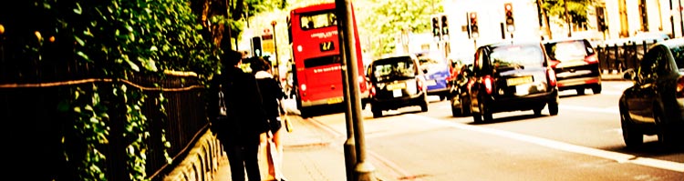
Examples from hongikat.com
Demo / Download Source / Filter Effects 1.0 Specification
')
Browser Support
As usual, browsers that support this parameter can be viewed on caniuse.com :
Effects
Applying effects is very simple, for example, this design is used to convert a color image into black and white:
img { -webkit-filter: grayscale(100%); } Sepia, ala Instagram:
img { -webkit-filter: sepia(100%); } In both effects, you can set the effect level from 0 to 100%.
Brightness, 50%:
img { -webkit-filter: brightness(50%); } brightness may be negative, the image will be darkened:
img { -webkit-filter: brightness(-50%); } At 100% effect, the contrast does not change the image, so you can set 200%:
img { -webkit-filter: contrast(200%); } Effects can be combined:
img { -webkit-filter: grayscale(100%) contrast(150%); } So you can get a beautiful hover effect:
img:hover { -webkit-filter: grayscale(0%); } img:hover { -webkit-filter: sepia(0%); } img:hover { -webkit-filter: brightness(0%); } img:hover { -webkit-filter: contrast(100%); } Blur effect:
img:hover { -webkit-filter: blur(5px); } The specification describes in detail the other effects, such as hue-rotate, invert and saturate. But they are much less applicable on live projects.
Examples from hongikat.com
Source: https://habr.com/ru/post/155353/
All Articles