Fronteers 2012 - the best client development conference, part 1
This year I was fortunate enough to attend the annual (5th in a row) conference Fronteers # fronteers12 , in Amsterdam.
The loudest client-side conference in Europe, lasted 2 days, October 4-5 in the walls of an unusual cinema Pathé Tuschinski .
')
All reports were in English, accompanied by Christian Heilmann . Under the cat links to slides and the main theses of the presentations of the first day of the conference.
Five kopecks
First of all, it is worth noting that the organization of the event was on top! It is immediately obvious that the guys from the client-side community of the Fronteers developers approached the matter very responsibly, and took into account the experience of previous conferences. To feel the lack of sockets and good Wi-Fi was not necessary (what else you need for life :).
All reports were recorded, and soon will be posted in the public domain on Vimeo .
The only thing that I didn’t like very much was the excessively long sessions of reports, 50 minutes per person was too much, which made the reports seem a bit diluted.
First day of the conference
Adapting to Responsive Design
Mark Boulton - storify
( http://instagram.com/p/QWey8vDuAt )
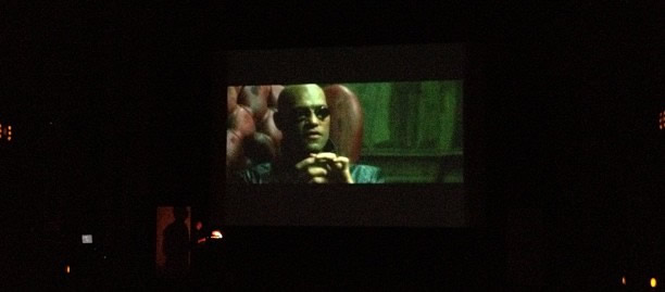
Mark began the report with a five-minute excerpt from the movie “The Matrix,” noting that Responsive Design (hereinafter RD) as the red Morphius tablet. Before that, we all lived in the world of static sites, but now we have a world of completely new opportunities.
The report highlighted three sections - business, process, content:
Business
- RD is more expensive, customers need to reckon with it
- Advertising banners hinder the development of RD, it is difficult to explain to advertising agencies that you need to draw rubber banners
Process
- First sketches on paper, not designs
- Wireframes no longer work, make live prototypes
- Standard testing no longer works, due to the need for testing on many devices
- We need cohesive development teams to quickly communicate and discuss design variations on the fly
Content
- There is no longer a “page” concept, think first of all about content.
- RD challenges content management systems (CMS)
Also, Mark mentioned an interesting report about content adaptation.
The New And Improved Developer Toolbelt
Addy Osmani - storify , slides

Constantly develop your work tools, the less we focus on them, the more work needs to be done.
Learn to love the command line, it is much easier with it than with the “three-button” GUI:
- Make it sexy - color your terminal
- Dotfiles (an interesting selection of dotfiles )
- Use autocomplete and command history
Learn your IDE! A couple of tips for Sublime Text:
- Emmet (ex-Zen Coding)
- Search code by Stack Overflow
- Snippet Library
- Make your own binds
And much more
- TodoMVC
- Debug SASS in the browser
- Source maps (currently only in Chrome Canary) allow you to track the generated styles from SASS
- Yeoman - we accelerate the development of web applications ( for Win )
- Travis - continuous integration in the cloud
- Tincr - Chrome plugin that allows you to edit files directly in the browser
Constantly check yourself whether you are using the best available tools for work.
A Pixel is not a Pixel
Peter-Paul Koch - storofy , slides
The speaker told us about three types of pixels:
- CSS Pixels - what we work with on the web
- Device pixels - real pixels on the screen (resolution), media queries are set for them.
- Density-independent pixels - virtual pixels, not used in web development. Were invented not to break the interface, increasing the density of pixels on the screens
And talked about the types of viewport (both are measured in CSS pixel):
- Layout viewport - real viewport
- Visible - visible (when zooming on a mobile device)
Further, it was a question of position: fixed on the mob. devices, but the best solution, unfortunately, has not been disclosed.
The meaning of using Responsive Design in equating the width of the site to the width of the screen device (width = device-width) with:
<meta name=”viewport” content=”width=device-width” /> It is worth mentioning an interesting device - CamHolder , which was used during the report.
At the recently held Forum of Technologies from Mail.ru, Vadim Makeev also spoke about the types of pixels.
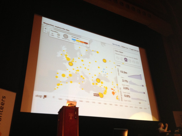
Using JS to Build Up
Alex Graul - stotify slides
( http://twitpic.com/b0w9ua )
Alex talked about data visualization on the web:
- d3.js - a library that allows you to visualize data using SVG and HTML / CSS
- Modest maps
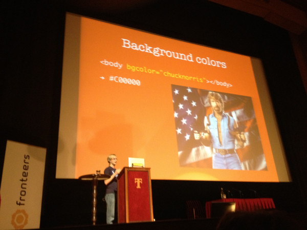
Ten things I didn't know about HTML
Mathias Bynens @mathias - storify
Matthias started with a story about interesting facts about reading color code in HTML. You can specify any word, and the browser, after reading the familiar letters in the color code, will give the color to its discretion, for example, “chucknoriss”:
( http://twitpic.com/b0wymk )
The colors of the names of the conference participants .
Then he opened the topic of quotes in HTML and CSS , in fact, you can write all the values without quotes, but in some cases, such code may break. And I mentioned valid variable names in JS .
A minimal, valid HTML document can consist only of doctype and title. The rest is added by the browser, and the undefined html tags, body, can even be styled through CSS.
Another interesting fact is that not all characters are considered the same in JS, for example, mathematical symbols, they can produce the value “2” - an example .
Style guides are the new Photoshop
Stephen hay slides
( http://image.slidesharecdn.com/fronteers2012-121004104049-phpapp01/95/slide-30-728.jpg )
Photoshop is not suitable for creating interfaces, design sites, and do not draw pictures. It is impossible to accurately represent the final result of the implementation of the design drawn in the editor. Responsive Design is very difficult to design and refine in Photoshop.
Use new tools to generate HTML prototypes like Adobe Edge. The code should not be production level. Customers are delighted when they can see the design developments on many devices at once.
Do not draw pictures in Photoshop, immediately make style guides, this will help in supporting the design, and developers.
Then he Stephen hinted that you should not be afraid of the command line, but you need to use its features to the maximum. After that, he talked about interesting tools to help develop his style guides:
- Dexy - tool for generating style guides.
- Phantom.js and Casper.js - to automate testing and create screen shots
- Jinja - python template engine
Accessibility panel
Antoine Hegeman, Bor Verkroost, Bram Duvigneau & Chris Heilmann - storify
Instead of discussing abstract concepts of accessibility on the web, we were lucky to hear the information directly, from the original source. Three developers who have all sorts of physical disabilities were invited to the web access section.
The main theses of the section:
- The menus appearing on the hover should have “spare space”, so that they would not disappear, at the slightest missing
- Screen readers are very important semantics, especially in the headers, they are navigated on the web
- The text should be text, and can be found by searching the page.
- It is useful to specify the site language in the HTML attribute, for voice over
- Improve HTML semantics with ARIA
In the question and answer section, I asked why it’s impossible to determine the user's physical defects from the web in order to provide cleaner content. They replied that it is not permissible to identify user deficiencies, for the same reasons as the definition of the user on the basis of race, discrimination.
A little more on the topic of accessibility on the web - Leah recently announced a handy tool that allows you to conveniently check the contrast of colors .
More CSS secrets: Another 10 things you don't know about CSS
Lea Verou @leaverou - slides , slides from last year

(from slides)
Leah, like last year, talked about interesting CSS tricks. There is no sense to retell here, I advise you to view the slides and feel the examples live.
Reference
- @FronteersConf
- Fronteers at lanyrd
- Video recording of reports
- Public Outline on Github
- Slides from the report on the conference from Vladimir Kuznetsov
I'll be back
In the near future I will prepare the second part of the report, in which I will include the theses from the Jam Session , where a couple of our compatriots spoke. Stay tuned!
Source: https://habr.com/ru/post/155157/
All Articles