New HabrAjax Theme
 HabAjax - a script that has been around for about a year, performs a lot of small and large work on the design of the site pages. Starting from about 20 page processing functions, it developed and gained new features. It is supported by 3 main browsers - Firefox, Opera, Chrome and a few moved away from the support of the 4th browser - Safari. Its main goal is to make the pages more compact and with a smaller amount of graphic garbage - elements that you can do without.
Following some changes in the layout and content of the site, another version of the user script was released (0.892). This time - with a number of changes regarding appearance. There is already a standard theme and another one, ZenComment, in the “compact” modification. But then the idea arose to improve the combination of the standard layout and the HabrAjax script to eliminate a lot of minor design flaws that make up the overall impression of convenience. And it turned out that the standard theme is quite strongly transformed, although this time there were no ZenComment styles. Many elements of the ZenComment styles were copied to HabrAjax, and the rest of the CSS refinements complement minor design inconsistencies.
In close-up, the designer’s hand didn’t add to the styles, despite the fact that more than 3 months ago the cry was thrown: “Everyone is fighting for design!” (There is a section on this on the official script page ). Therefore, it is possible that the global design of the site will remain somewhat affected. But in the docking of small parts (elimination of graphic debris, excessive projections, microscopic dimensions of links, elephant buttons), there is progress. Items that are added by scripts are, if possible, processed by styles.
What happened - can be seen from the screenshots. If earlier 90% of readers liked the old design, then among their ranks the new (very similar to the old) design should get a lot of fans. At the same time, more than 30 script functions are supported, to which new ones continue to be added.
')
On the first screenshots: the whole tape:
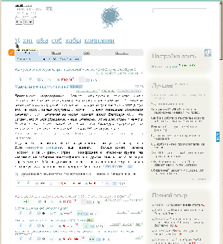
, question-answer:

, the beginning of comments in the article:
Here is a relatively small use of styles, the very new kind of pure HabrAjax .
For comparison - it is with additional styles, a series of screenshots with applied ZenComment styles.
- Notification tracker and mail. Noticeable numbers, different colors, always within the window. Non-repetition of links.
- Tape with annotations and questions. Company blog. Abbreviated hubs. Hub profile marks. Doubles of dates in articles, without duplicates - in questions.
- Uploaded comment to the article Shows the percentage of visible and invisible parts of the article.
- A loaded question with answers. Sample code in the answer. Checkbox "Solution" on CSS. The time of loading the issue.
- The end of the article is the beginning of comments. Coloring of the authors and the number of their answers.
- Similar posts - viewed by hovering the mouse over the button.
- User Menu In the upper right corner. Abbreviated links to comments, articles, your questions, your answers.
- The search field on hover - 3 buttons: on the site, in Google, in Yandex. Ctrl + click - in a new window. Enter - in a half-height frame.
- Main menu (on hover - several links to sections and time-day of the page jump.)
- Questions-answers Clarifications, similar, author's answers, input of tags Source, nailed footer.
- Search the same list with uploading articles and comments.
- Tape - All (Articles, questions, from companies, from the sandbox.)
The most recent changes in 1-3 days
From the latest additions you can list such.
* in the left corner of the menu is now not uninformative "le [nta]", and page load time and day of the week; the link leads to the same tape; the moment of reading a single page is on the left of the site menu. In the same place, the day of the week, while the days of the week for the dates "today" and "yesterday" are not indicated anywhere else (fighting informational garbage); the moment of reading articles on Ajax (uploading of articles) is shown at the bottom of the article on the collapse panel of the article or comments;
* input image arguments: Ctrl + click on the button above the input field - with the argument align = right, Shift + click - with the argument align = left, Ctrl + Shift + click - with the argument align = center;
* air is released from dates: it is not necessary to know from the watch that they show “today”, from yesterday's date the word “yesterday” is enough, from the current year it is not necessary to find out every time what it is, and from the old dates it is useful to know the days of the week;
* The headings of the questions are somewhat smaller than the headings of the articles and made oblique, so that in the general tape they can be easily distinguished from the articles and they do not take up space;
* giant headlines have long been replaced by a script for adaptive - the longer the name, the smaller the font. But the small font begins to lose in readability, if it is not contrast. Improved header contrast;
* The names of the hubs are shifted to the right, as in ZenComment, and shortened (by customization); the dates are the same, because the line for the date is somehow very luxurious for the news feed; and hub names that compete with article names are also out of place on the left side of the tape;
* dates are duplicated in captions (info panels) - because it is useful to see the date both at the top and bottom of the annotation (and, moreover, of the full article), but in questions where there is no annotation, the dates at the top are removed because they interfere more with the text of the question than in the dashboard;
* less words - more signs on the answer button. Numerous identical words tire on the site, where already a lot of meaningful verbal information. It is better to see the words “2 answers” and 2 checkboxes instead of them, but click not on the exact word or sign, but on the area of the whole answer button.
* not a link, but a button on the comments to the article, highlighted button color. As for answers, the transition to comments is better read if it also looks like a button. And, of course, it is more convenient not to aim at a couple of numbers, but to get into a larger button, on which these numbers are written.
* approximate dates based on the article number in the URL. Now it’s enough to hover over the article link (including 3 random articles at the bottom of the page) to see the month and year of publication;
* same for question and answer. Although the section has existed for 2 years, it’s so convenient to see the date when a similar question was asked. And the dates of similar questions are not officially. Hovering the mouse corrects this space.
Changes made a few days ago
* Blocks "Similar posts" and "Similar answers" crawled to the new place you liked - on the button under the article, but above the comments. In September, this block of week 3 tried on this place officially, but never caught on there. But during this time, a script was made that changes the block to a falling list, which seems to be successful - it does not take up space, it also does not exist in the sidebar, but it is always at hand for the only time when you want to see similar article headers;
* the heading of all comments is highlighted with a khaki background, as in ZenComment; it helps to visually notice it when scrolling the page;
* placement of the buttons for entering tags in the input field and the backlight borrowed from ZenComent;
* Languages for the “source” tag are scattered in 2 buttons; all 216 colors are scattered on 3 buttons, 72 each (not very good, but we'll see);
* “Preview” and “Write” are placed at some distance, as in ZenComment;
* graphic garbage - underline links in the sidebar. After all, there - all the texts - links. With an unwavering hand we digress from the traditions of the official site; the same - in 3 links below
* 5 types of flags on pure CSS: allow the flexibility to customize the size and color and made much smaller than the basic site flags;
* transparent buttons "Next" from ZenComment are added to the clean HabrAjax;
* hiding unnecessary blocks from the right migrated from ZenComment and had the opportunity to choose the settings of the script. For example, for those to whom the section "Work" is irrelevant, have the ability to turn it off;
* processing the presentation of 3 links below - centering in height, unequal widths, depending on the size of the text, soft design, approximate dates in the tips;
* finally, the fixed-up panel has been removed at the top of some companies;
* user menu - links are rearranged so that they do not jump when the menu is opened; removal of duplicate links when notifying messages and tracker; click on the entire area of the menu area performs an action (the area of links is stretched without leaving dead areas);
Changes in the last 1-2 months
* all external links open in a new window ; as a sign of an external link - up arrow after it; if there is no arrow, then this is a link to the site, which means that there is an approximate publication date in the tooltip;
* the event message in the ribbon is minimized (if the setting is turned on) to 2 letters - there is neither block nor garbage, but when you hover over the line, the title and the date of the event are read;
* footer stuck to the bottom - changing the DOM so that the footer is stuck to the bottom of the window for low pages;
An old, but characteristic change:
* links in the "live" slightly rearranged; because we do not want to go to the personal page of the commentator, but we want to read his comment: link - to a comment. And by the title of the article we want to get on the article - a link to the article;
It is written a lot, but it’s better to see it once and use 3 days to get an idea of the amount of amenities.
It would be nice to reduce the footer to 3 lines, as in ZenComment. But there are already so many borrowings ... It is in the plans.
If the heightened contrast of the headings still doesn’t look good enough, or there is another comment on usability, please write constructively, especially with suggestions for improvement. Until now, the overwhelming majority of comments were without suggestions, which did not prevent the author and a number of users from using the previous version of the script and styles for a year.
In March of this year, there was a survey on how many users the script had and on which browsers it was used. On the example of 60 responses, the pattern of distribution by browsers is visible and only slightly by OS. pollservice.ru/p/dd12f28d55258167c83e/results
If you used the script and wish to take part in the survey - log in here: pollservice.ru/p/dd12f28d55258167c83e .
UPD: I will immediately answer the above: thanks for criticism, but more constructive suggestions would be needed. In addition, the functionality is disabled - in the screenshots, they are simply demonstrated in the usual and intended form. I use these functions constantly and they are introduced consciously - each element performs its role. Much has been described in innovations, some already existed for a long time, about a year.
Source: https://habr.com/ru/post/154923/
All Articles